Florence Souvenir Design Project
Anna Chiara Taliani

Souvenir x Florence
Mandragora
Overview
This set design exercise focuses on Vitra’s iconic Shell Chair, recreated in 3D within minimal yet realistic and calming scenes. The chair becomes the central element, essential in shaping atmospheres of relaxation, lightness, and sound.
Which is our purpose?
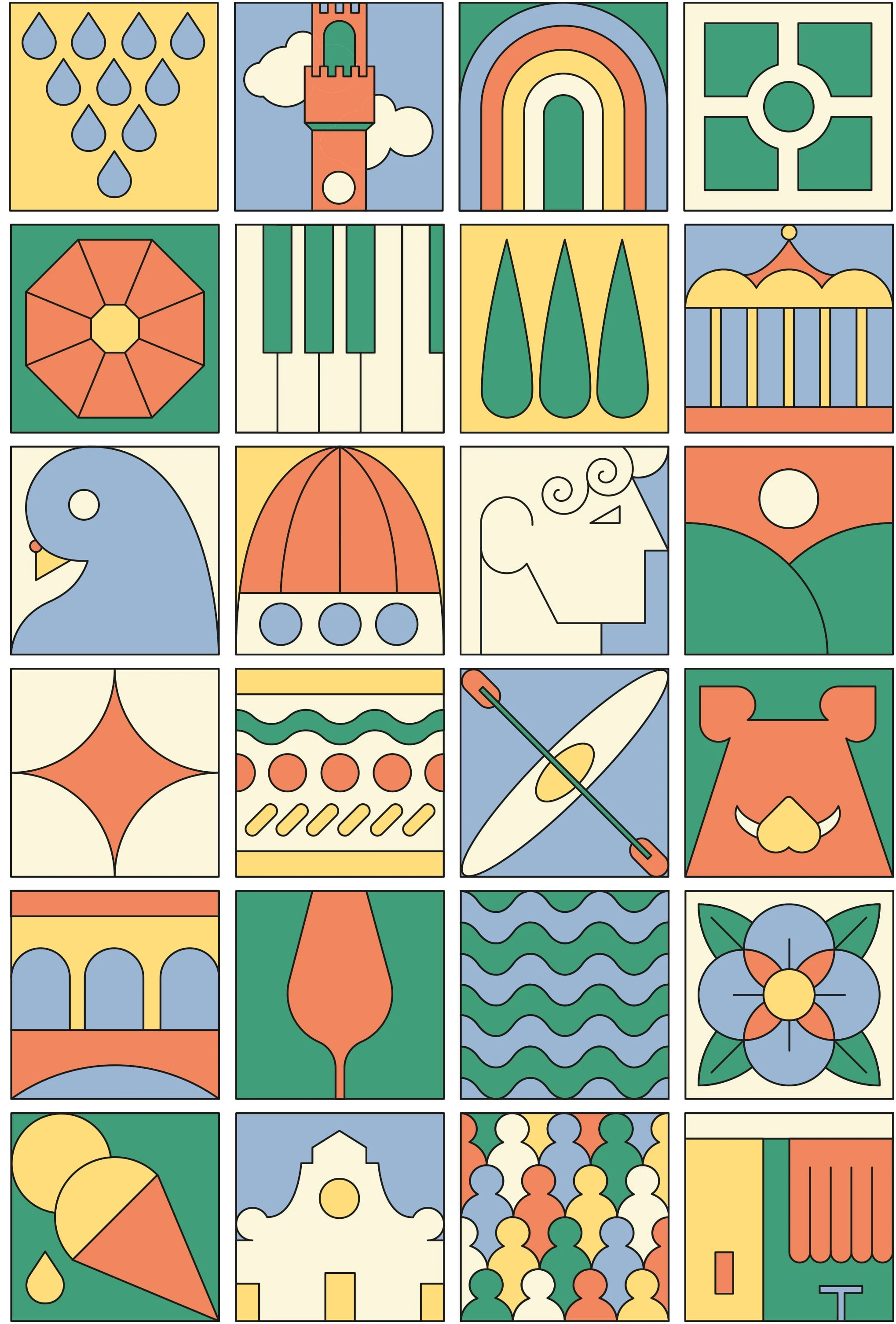
The objective of this project was to create a simple and versatile graphic illustration that effectively captures the essence of Florence, while remaining easily adaptable for different uses. By utilizing only five colors, I aimed to ensure clarity, simplicity, and flexibility in design. The illustrations, styled as intuitive icons, represent the key elements that embody Florence’s identity. The ultimate goal was to design fresh, modern, and engaging graphics suitable for souvenirs, evoking the city’s charm while offering a vibrant, minimalistic aesthetic.
Modular Illustration
The aim of the project
The illustration set was designed as a collection of intuitive, easily recognizable icons that depict various symbols and landmarks associated with Florence. These elements were intentionally simplified to maintain flexibility in both positioning and color customization. The use of green, yellow, red, and blue created a playful, harmonious color palette that conveys a sense of joy and creativity. To further enhance the design’s applicability, I developed a seamless pattern resembling a checkerboard, composed of the illustrated icons. This pattern was applied to products such as tote bags and pouches, covering their entire surface. This approach transforms the souvenirs into vibrant and dynamic representations of Florence, making them not only memorable but also visually striking. The design is deeply rooted in the insights gained from research and surveys, which revealed that tourists often prefer souvenirs that strongly evoke the essence of Florence. These include traditional items or artifacts closely tied to the city’s culture and landmarks. By simplifying Florence’s iconic imagery into accessible, playful visuals, the illustrations aim to resonate with both those who have visited and those who aspire to experience the city.
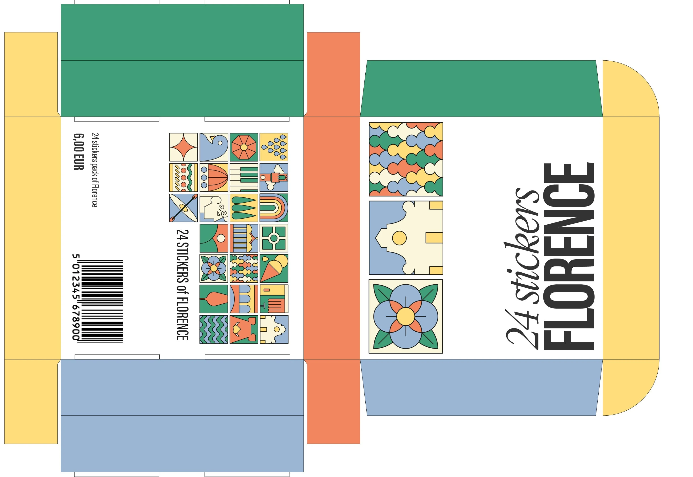
24 Stickers Pack
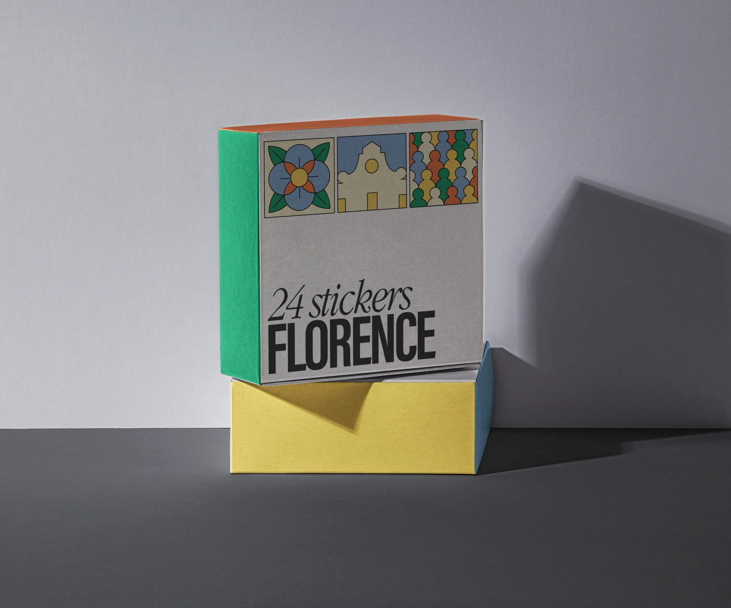
Mock up 24 Stickers Pack
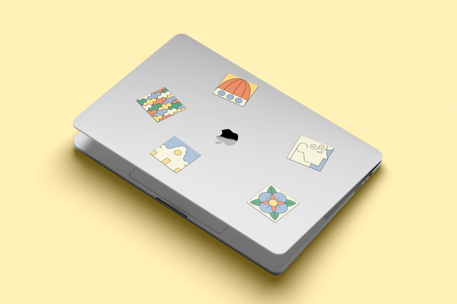
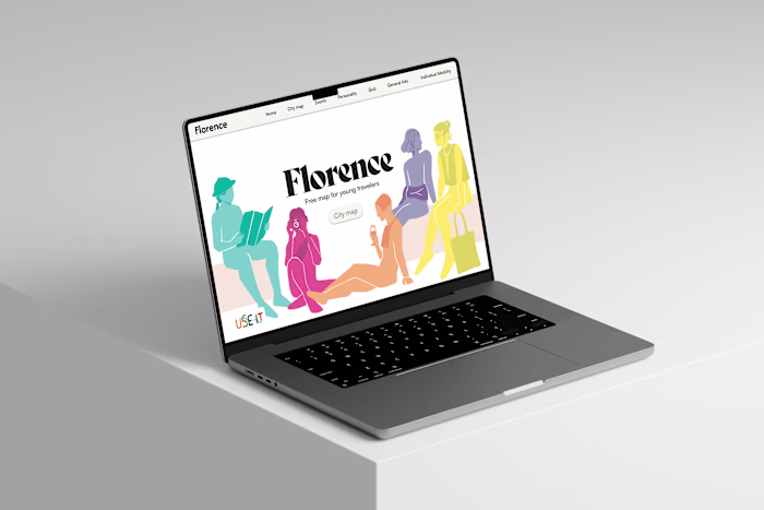
Mock up Stickers on Mac
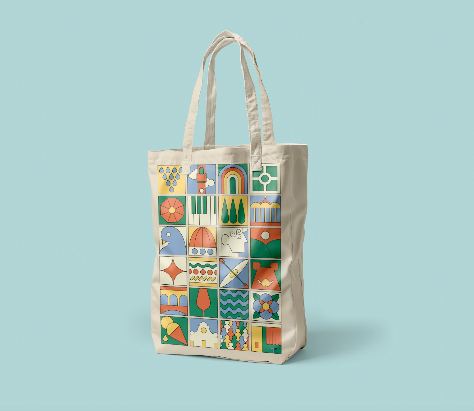
Mock up Modular illustration on tote bag
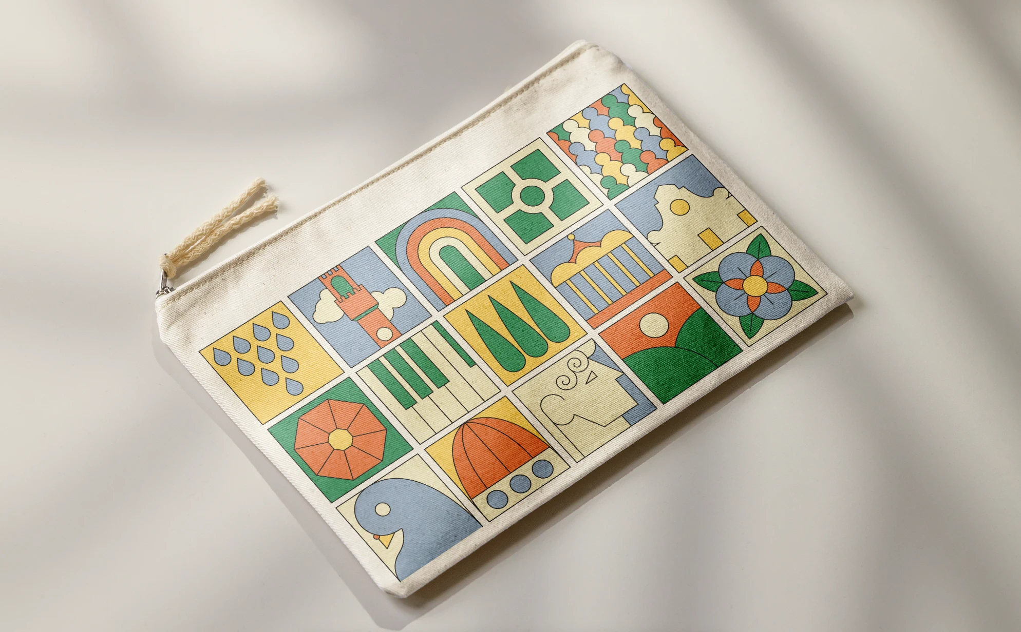
Mock up modular illustration on pouch
This graphic project encapsulates the beauty and character of Florence through a balance of simplicity and creativity. By distilling its essence into colorful, modern illustrations, the design offers a fresh take on the city’s iconic identity. The souvenirs not only serve as keepsakes for tourists but also as visually appealing items that embody Florence’s cultural and aesthetic significance. This approach bridges tradition with contemporary design, ensuring a vivid and lasting memory of the city for all who encounter these creations.
Credits
Anna Chiara Taliani
Mandragora
Accademia Italiana


Like this project
Posted Nov 8, 2025
Designed modern souvenirs capturing Florence's essence with vibrant illustrations.
Likes
0
Views
3
Timeline
Jan 1, 2025 - Feb 1, 2025