Built with Framer
DocDeck AI Landing Page Redesign
Olivier Designer
Overview
DocDeck AI automates email processing and turns forwarded emails into structured Google Docs, saving users time and reducing inbox overload.
The problem
The original landing page did the job, but it didn’t reflect the true potential of DocDeck AI. It lacked a refined visual hierarchy, clear value storytelling, and failed to lead the visitor on a conversion focused journey.
Weak visual hierarchy & crowded layout
Generic hero & call to action section
Disjointed feature and benefits presentation
No clear pricing section or plan comparison
The redesign process
Redefined visual hierarchy & layout flow
We restructured the page into a clear narrative flow:
Hero section/Value propositions
What it does (features)
How it works
Pricing plans
Frequently questions
Call to action
Each section now has enough breathing space (white space), making content easier to read and visually digestible.
Hero area optimized for clarity and conversion
Introduced a sharper, cleaner hero illustration/screenshot — immediately showing what the product does instead of relying solely on a video.
The main headline stays strong: “Automate mail handling in seconds” — but now combined with a concise subheading and prominent CTA (“Get started”) for instant clarity and action.
Reduced friction by making the CTA visible immediately, instead of burying the value behind a video.
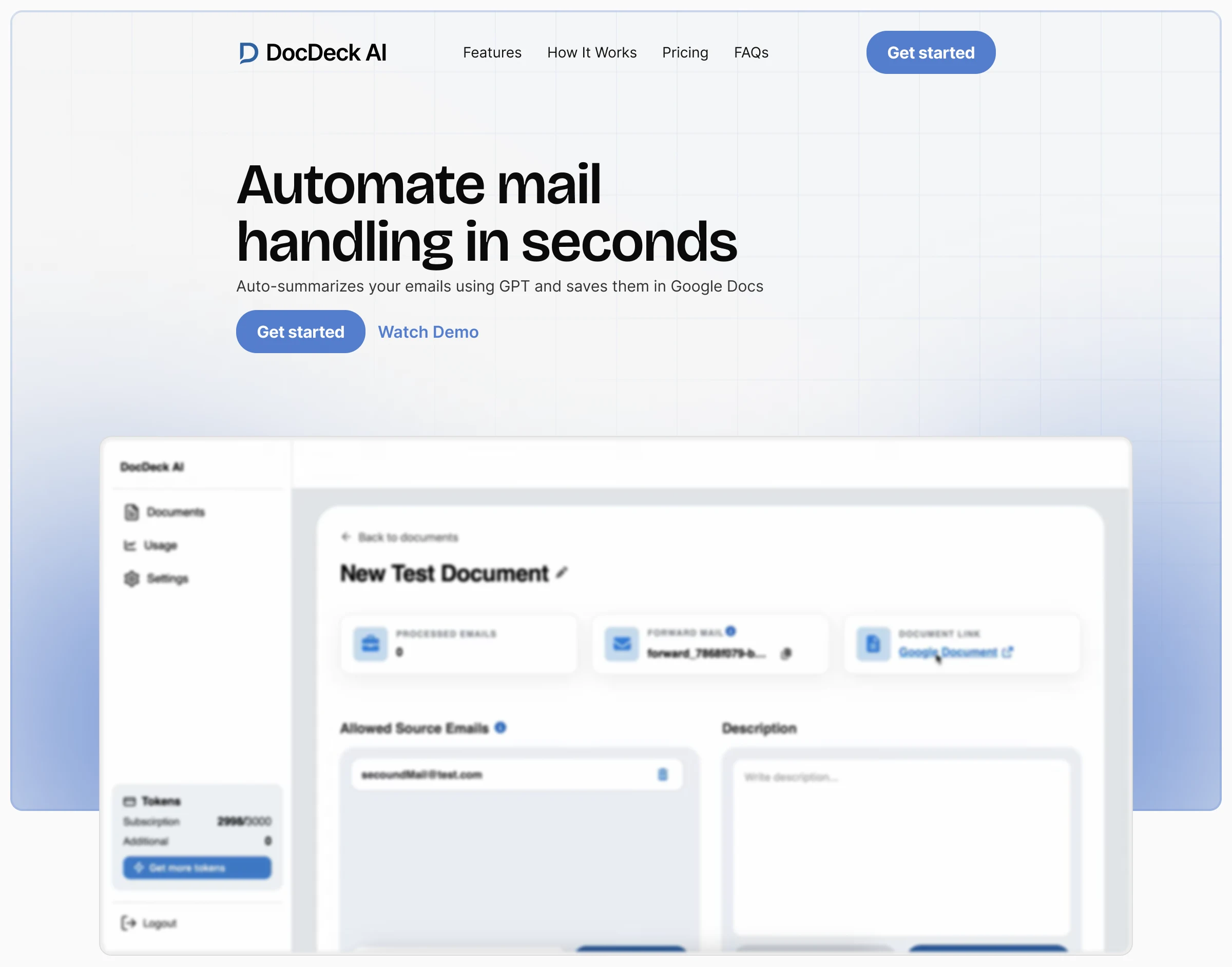
Hero section
From features → to benefits: making value obvious
Rather than listing raw feature names only, we grouped them under benefit-driven headings linking features to real outcomes: focus, speed, clarity.
This aligns with effective UX storytelling: people care less about features, and more about how those features solve their pain points.
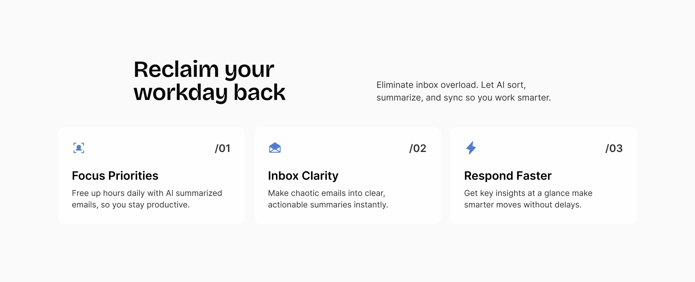
Benefits
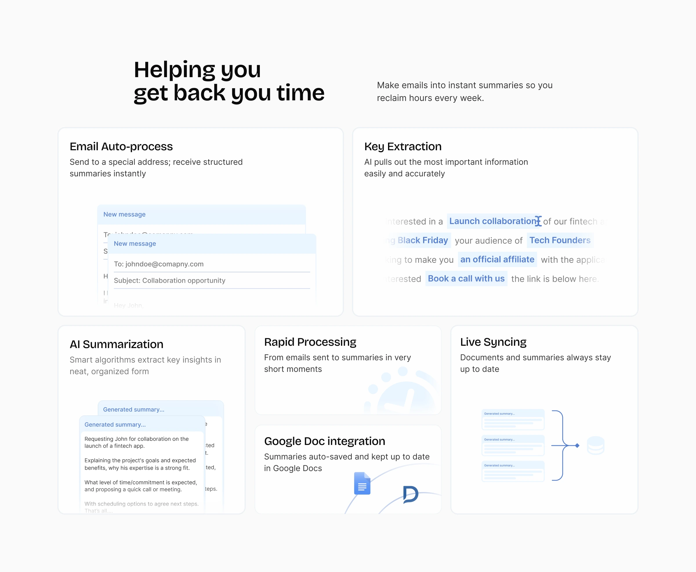
Features section
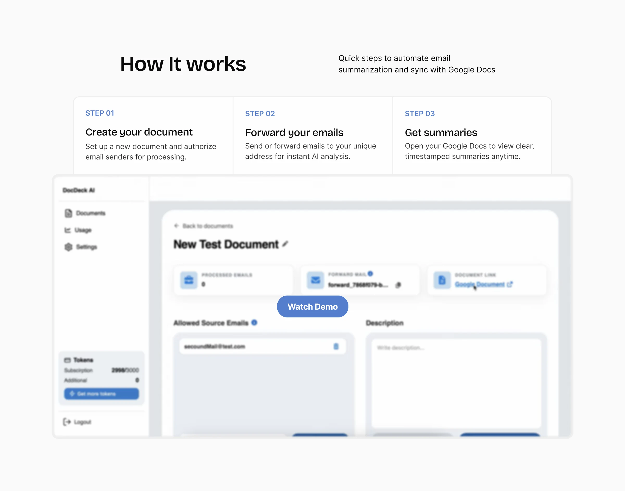
Cleared the how it works section
This section help new users visualize how the product works by eliminating technical uncertainties.
Simplified, transparent pricing
Added a dedicated pricing section with clear plan names and monthly pricing making cost visible and comparisons easy.
Reduced decision friction: visitors no longer have to hunt for pricing info helping them decide faster.
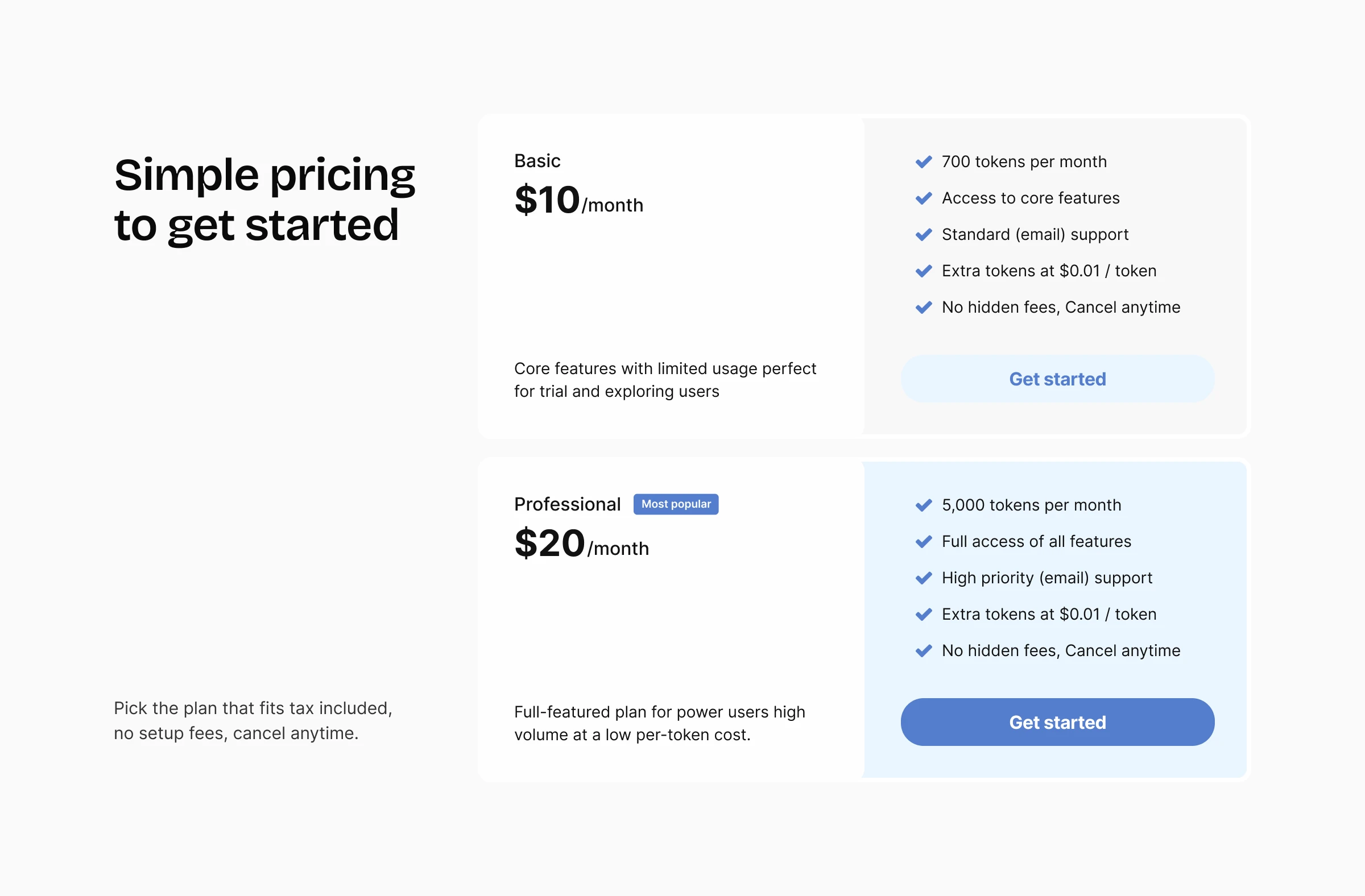
Pricing section
Added FAQ section
While not all trust-building elements (testimonials, social proof) were yet added, the new design lays the foundation for them
The FAQ section help kill most doubts or other specific questions a user could still have until this point
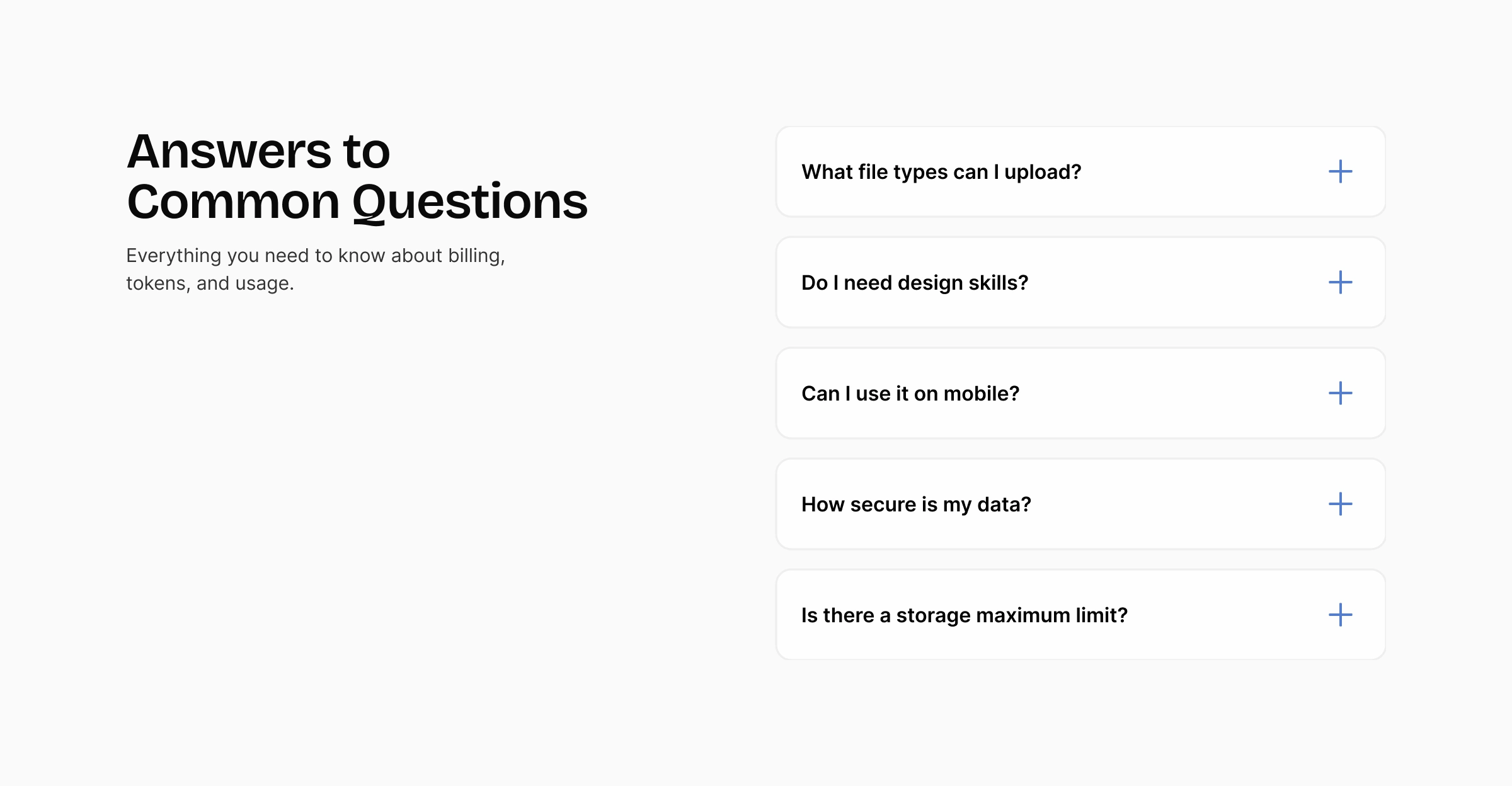
FAQ section
Hard sell call to action
To finish the page, we add a more sales-driven call to action, now that we’ve built the trust needed to support it
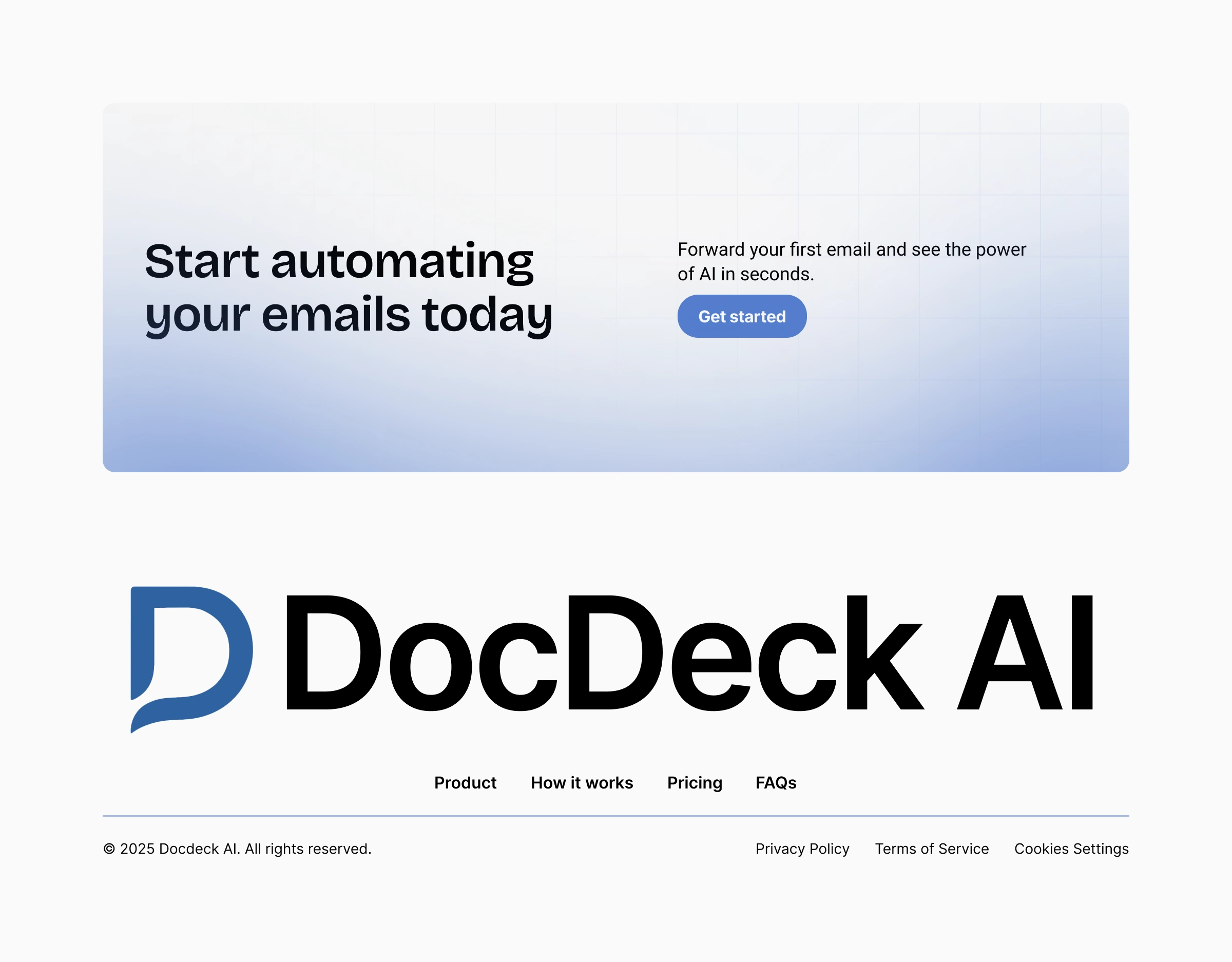
CTA & Footer
The Result created
Clarity from first glance: Any visitor landing on the page can instantly grasp what DocDeck does and why it matters.
Better flow & storytelling: Page now tells a story: “This is what you have → This is how we help → This is what you get (benefit) → This is how it works → Here’s what it costs.”
Reduced friction for action: Prominent CTA, clear price points, digestible content, all increase likelihood of conversion.
Scalable foundation: With the improved structure and hierarchy, the page becomes easier to expand with future content (testimonials, case studies, more features) without breaking layout or usability.
Softer, more modern brand presence: Aesthetic upgrades bring DocDeck closer to a polished, enterprise-ready solution (important when positioning a SaaS for founders/clients).
What We Learned & Next Steps
Even small tweaks, like reorganizing content flow or improving spacing and hierarchy can drastically improve clarity and user experience.
Showing benefit driven copy (over raw features) creates stronger emotional resonance with potential users.
CTA clarity and upfront pricing reduce friction, a key conversion lever for SaaS landing pages and websites for newly launched products
Next phases should include: A/B testing different CTAs/pricing messages; adding social proof (testimonials, real use-cases); gathering user feedback to further validate and improve conversion rates.
Thank for reading this far.
If you need to launch a website that converts from day one: Book in a call
Like this project
Posted Nov 26, 2025
Redesigned DocDeck AI's landing page for better conversion and storytelling.