Axar Inc Logo Design
Akailah Gordon
Axar Inc
WHAT?
Axar Inc is a newly established construction company entering the market in need of a strong visual foundation to represent their brand from day one.
WHY?
The company needed a logo that could carry weight in professional and institutional settings without looking new or uncertain. Clean, crisp and credible were the non-negotiables.
FOR WHO?
Professional and institutional clients who expect a mark that signals reliability and seriousness before a conversation even starts.
Scope of work
Logo Design
About the Project
Axar Inc is a newly established construction company entering the market with a clear priority: look the part from the start. The project focused entirely on creating a logo that could serve as a strong, lasting visual foundation for a brand still finding its footing.
The Goal
With minimal direction from the client, the brief came down to a feeling. Clean. Crisp. Professional. A logo that would hold up in formal contexts, print well at any size and communicate confidence without relying on trend or decoration.
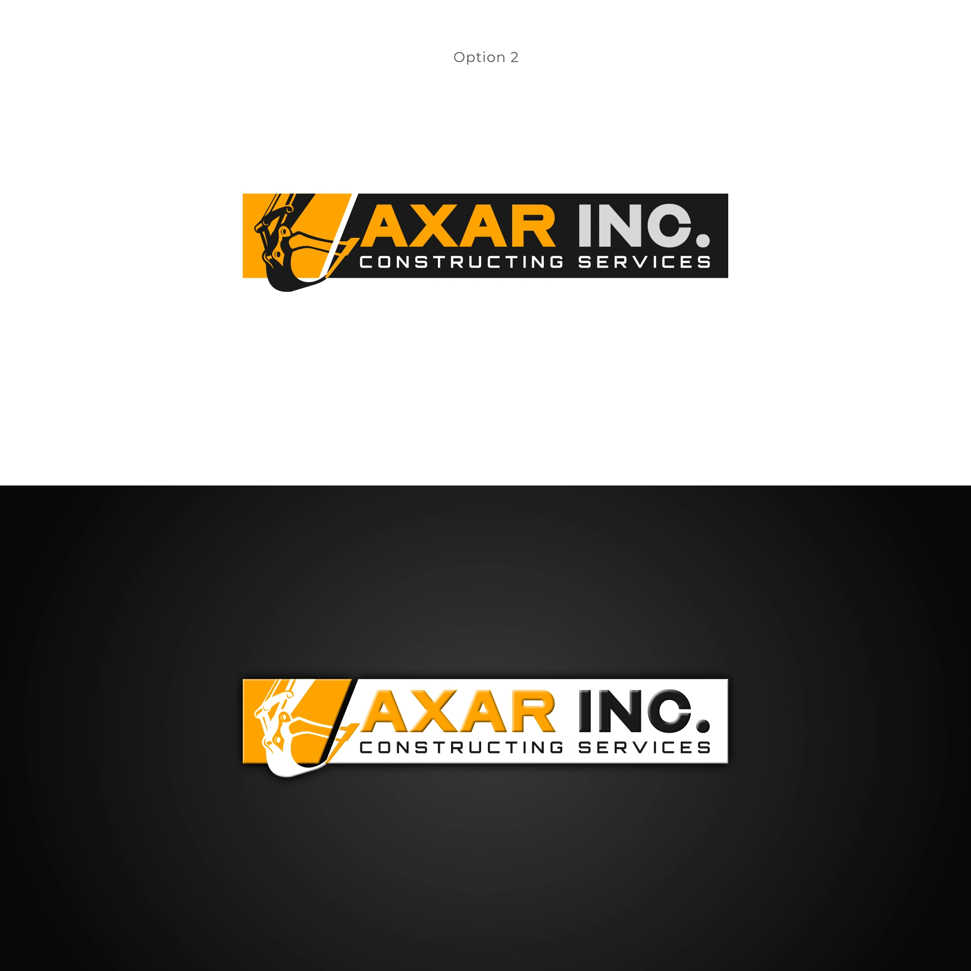
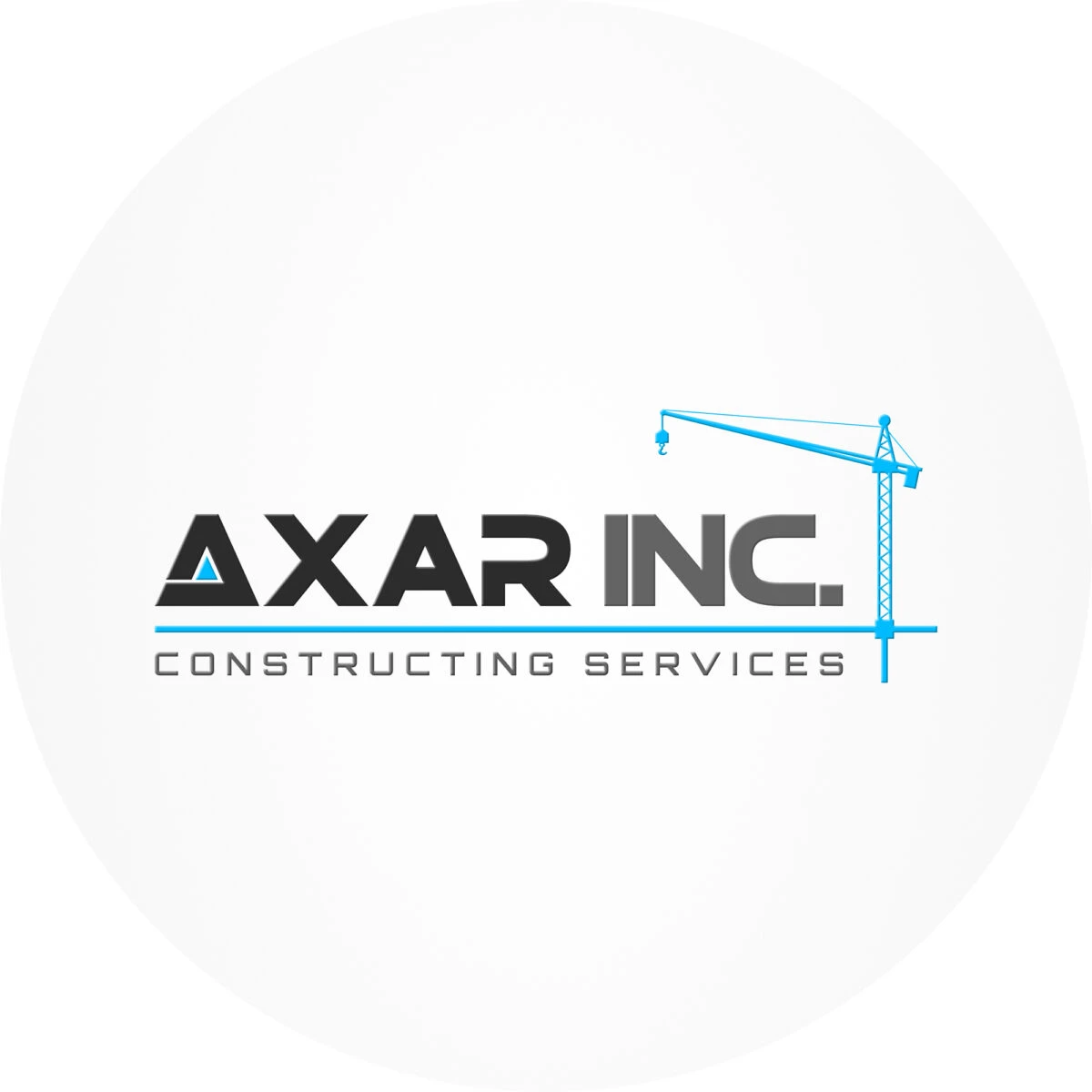
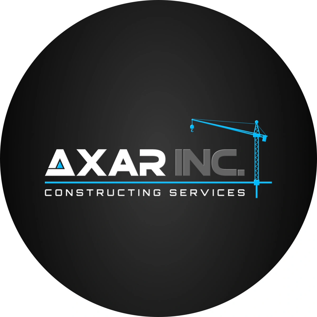
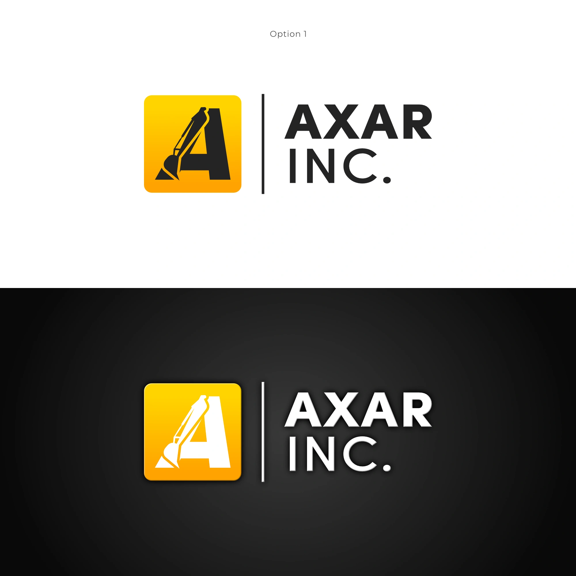
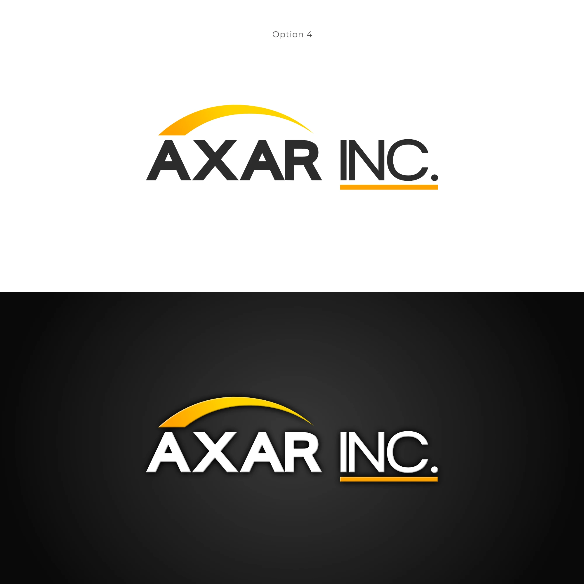
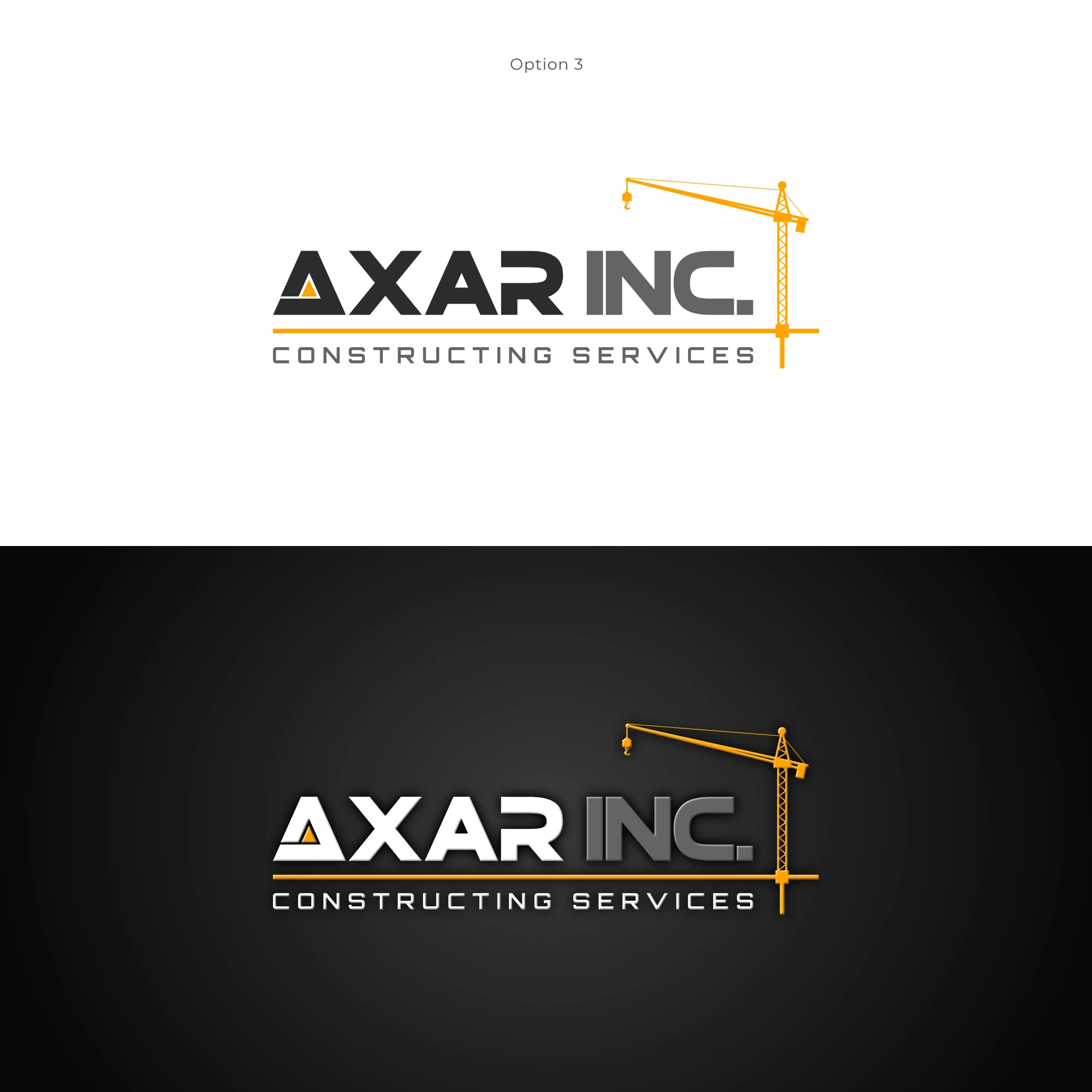
Four concepts were developed across two colour directions, construction yellow and blue, giving the client a genuine range to choose from rather than a single take-it-or-leave-it option.
Strategic Insights
When the brief is open, the standard becomes the brief. With little creative direction given, the work had to be guided by the environments the logo would need to perform in. That meant prioritising versatility, legibility and longevity over anything expressive or experimental.
Colour carried meaning before the mark did. Yellow and blue were not arbitrary. Yellow spoke to the industry directly, bold and immediately recognisable as construction. Blue offered something more measured and institutional, a signal of trust and stability for clients who needed to feel confident in who they were hiring.
A logo for a new company has to work harder. Without a reputation behind it yet, the logo was the first impression. It needed to communicate authority on its own.
Additional Concepts
Solution
Four logo concepts were developed, each explored in both yellow and blue to show how the colour direction shifted the feeling of the mark. The chosen design incorporated a crane, grounding the logo clearly in the construction industry while keeping the execution clean and geometric. The client selected the blue variation, lending the brand a professional and composed presence suited to the institutional contexts it would move in.
The Results
Axar Inc launched with a logo that does exactly what a first mark should: it looks established, holds up across applications and gives the brand a confident foundation to build from.
Like this project
Posted May 14, 2026
Created a logo for Axar Inc, a new construction company aiming for a strong brand identity.
Likes
0
Views
0