This project was built with:
dacorte.dev · Personal Portfolio
0
Content Writer
Framer Developer
Framer Designer

Figma

Framer

SEMrush
As a web designer, your portfolio is arguably the hardest project you'll ever work on. No matter how many rounds of iterations it goes through, it will never be good enough.
After almost a year without any improvements, I decided to finally redesign my old portfolio as it was, well, old (and it no longer aligned with my style).
To avoid falling in the infinite revisions rabbit hole, I decided to give myself only a weekend to design and implement it, and I honestly couldn't be happier with the result!
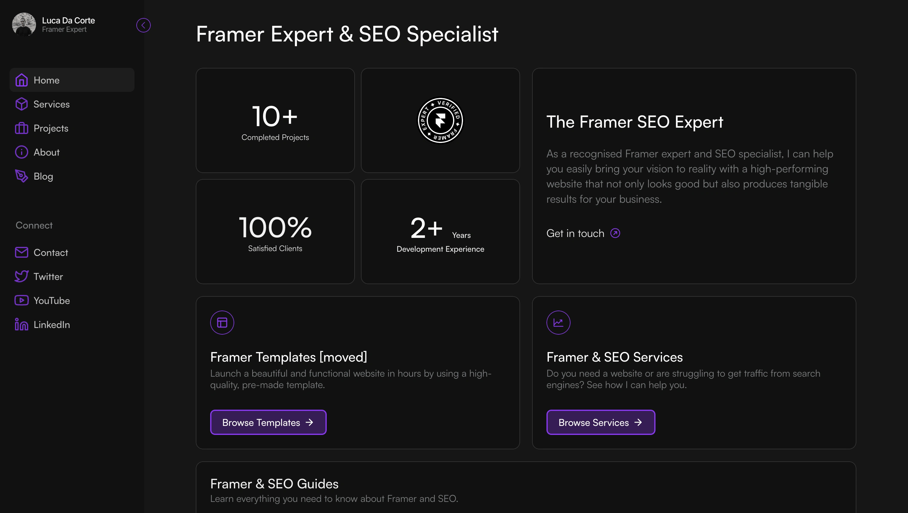
Here's a screenshot of my old portfolio's homepage:

The style wasn't bad, but there were a couple of things I didn't like:
I've come to prefer light mode lately, so I wanted a light mode portfolio as well.
It was still deeply connected to all my resources (now moved to clicks.supply), so the chances of converting visitors were much slimmer as you had too many things to focus on
So, with the site, I opted for:
A cleaner and more minimalistic style (and light :D)
More emphasis on my work, services, and testimonials rather than my resources
A much leaner website architecture, going from 10+ pages to only 2 (well, 3 if you want to count the 404 page)
Fast-forward a couple of days and here's the result:

Cool, right?
(the overlay shadow looks a bit weird when you take a full-page screenshot, but I swear it looks better on the live site 😅)
I received a lot of good feedback from the design community, so much so that I decided to turn it into a template that you can now find here (lil plug)
That's it! Hope you like it as much as I do ✌🏻
Here's the live link if you want to take a look 👉🏻 dacorte.dev
Like this project
0
Posted Nov 23, 2023
The result of a two-day design sprint to give my old portfolio a completely new look and feel. (short story inside if you are interested)
Likes
0
Views
147
Tags


Content Writer
Framer Developer
Framer Designer

Figma

Framer

SEMrush


