Santiago Cruz: Brand identity for a Latin singer-songwriter

Maria Antonia PD


SANTIAGO CRUZ
From a personal identity to a shared symbol that connects fans worldwide.
THEY SAID
"I'm working on my next album, and I need to establish my identity as an artist and songwriter. I want people to feel close, like I’m writing to them. Like every song is meant for someone, not for anyone".
I HEARD
Santiago Cruz wanted a way to connect with his fans, something personal and authentic that felt like him. His music was already honest. He just needed a visual language that carried the same intimacy and permeated every touchpoint with his fans and followers. I needed to build his brand presence and create a symbol for fans to connect with.
WHAT I DID
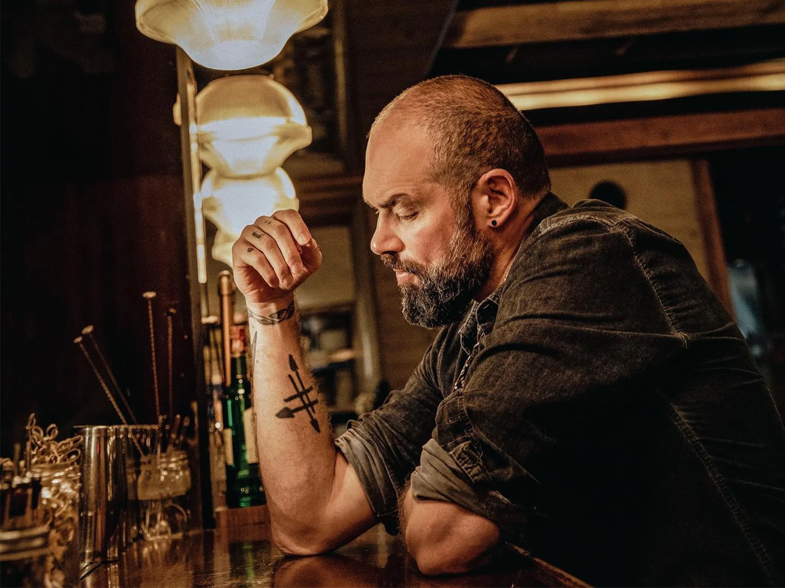
A symbol that said everything: I created a logo inspired by his surname, Cruz, which translates to cross in Spanish. I also wanted it to represent the first album, Sentidos (senses/directions in Spanish), so I created a cross made of arrows crossing in different directions. It looked hand-drawn, because it was, just like his music. The symbol became a tattoo on his arm, and later, on the arms of fans who felt part of his story.
A visual identity built from handwriting: I incorporated his handwriting throughout the album, from the title to the lyrics and in every possible detail. Fans felt like they were reading a letter from him: Something real, something just for them.
A brand true to every album: The logo was created for Sentidos, and then worked for Cruce de Caminos (Crossing Paths), and was later applied as a post stamp for A Quien Corresponda (To Whom It May Concern), where it worked for the letter-themed album. Iteration without losing its essence.
Designs that brought songs to life: I created the album cover, the photographs, the promotional pieces, all built around the same feeling of closeness and care. With each release, the symbol adapted to match the new concept, without ever losing its meaning.
An everlasting brand: Santiago’s brand is personal, and this is why it works. It gives people something to hold onto, something they want to carry. And they have been carrying it, just like he has, for 20 years now.
Santiago Cruz and the story behind his brand
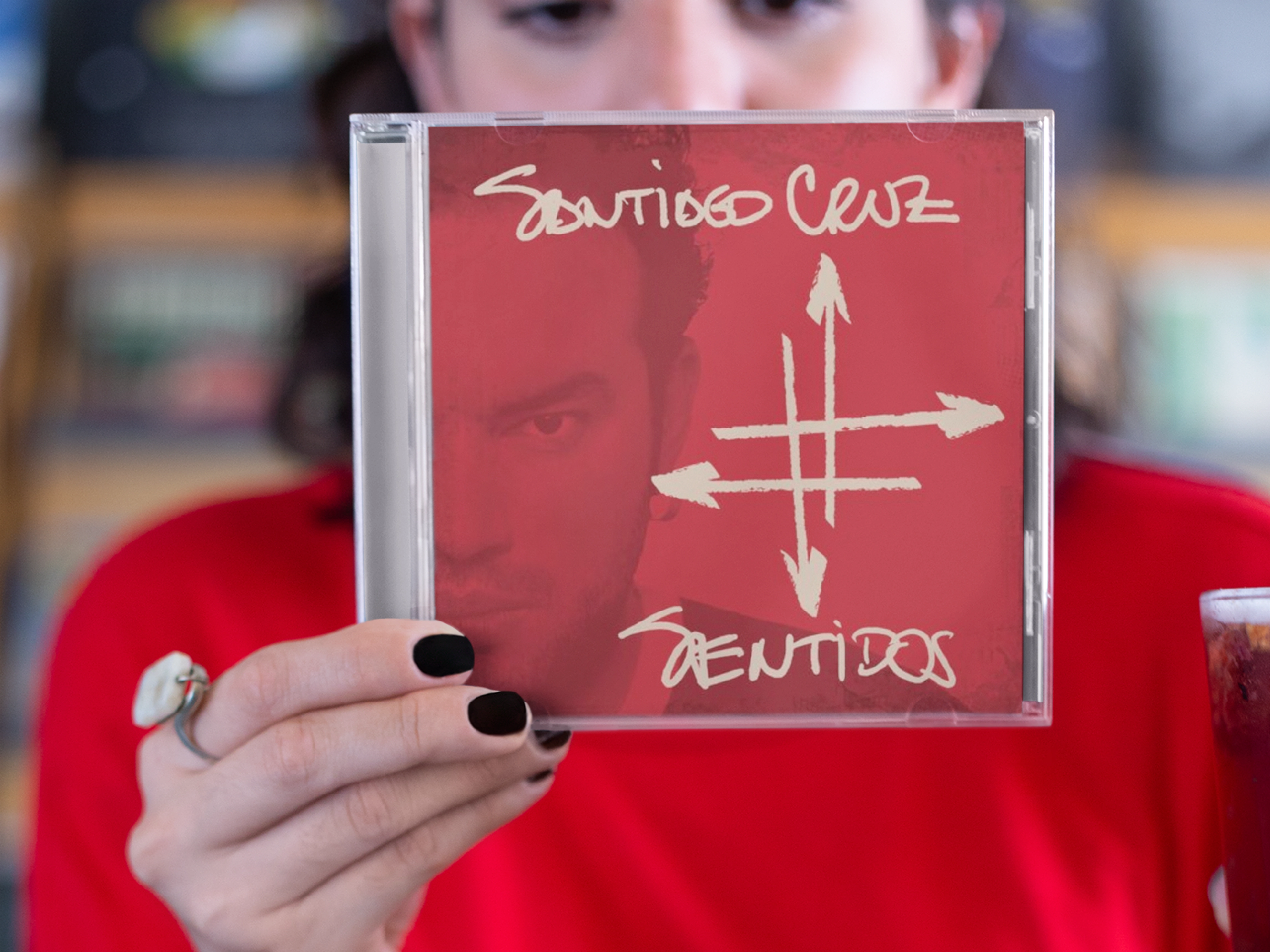
Logo for the album Sentidos
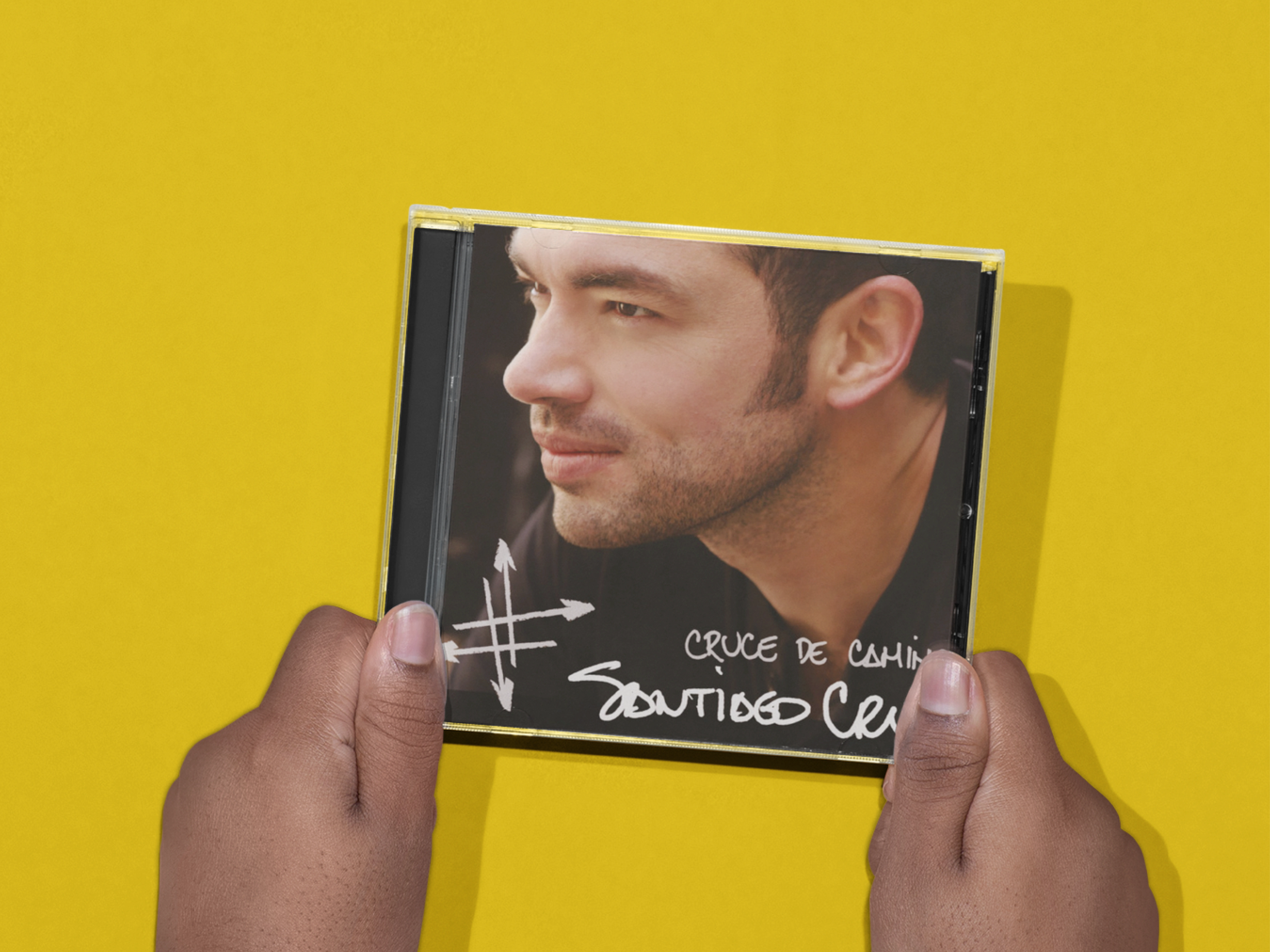
Logo for the album Cruce de Caminos
Like this project
Posted Sep 23, 2026
Full brand journey for Santiago Cruz: audit, discovery, strategy and design, turning a surname into a symbol fans have carried for over 20 years.