UI/UX Overhaul: Tailoring Agency's Digital Presence for Agritech

0


Web Designer
UX Designer
UI Designer

Adobe Illustrator

Figma

Webflow
Marketing
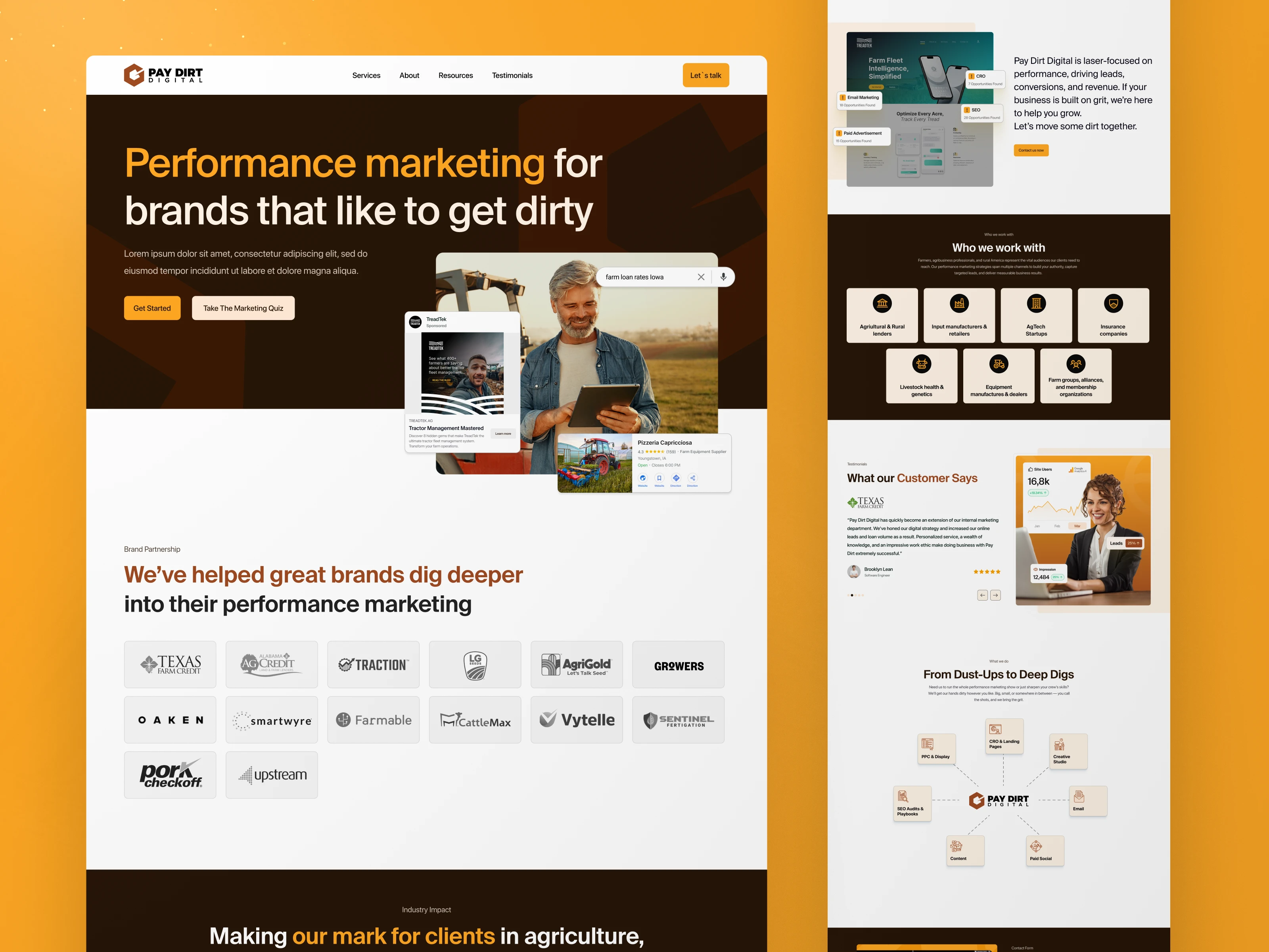
Case Study: Visual Design Refresh & UI Overhaul to align with Agritech customers
Project Category: UI/UX Modernization & Conversion-Driven Redesign
Project Overview
Client: [Pay Dert Digital]
Industry: [Agency]
Objective: Modernize the website’s visual identity and user experience (Homepage, Blog List/Detail) to align with Webris’ clean, professional aesthetics, enhance engagement, and lay groundwork for future scalability.
The Challenge
The client’s existing website faced several issues:
❌ Lacked Visual Hierarchy: Key sections like “Industry Impact” and “We’ve Got Mud on Our Boots” competed for attention.
❌ Dated Aesthetics: Inconsistent typography and color choices reduced brand credibility.
❌ Low Engagement: Blog pages lacked compelling CTAs and featured content.
Strategic Solution
1. Visual Redesign
✅ Color & Typography Refresh: Introduced a high-contrast palette paired with a modern sans-serif font for a clean, sophisticated look.
✅ Custom Illustrations (5): Created custom illustrations for different sections on website blending abstract geometric elements with subtle gradient depth.
✅ Micro-Interaction References: Provided 10+ live website examples (hover effects, scroll-triggered animations) for seamless developer implementation.
2. Conversion-Focused UI Layouts
Homepage Enhancements:
Hero Section: Custom illustration with dynamic text overlay and a fixed CTA button.
Industry Impact: Data visualizations (e.g., “+200% ROI” with animated progress bars).
Brand Partnerships: Grid of grayscale client logos with hover-to-color transitions.
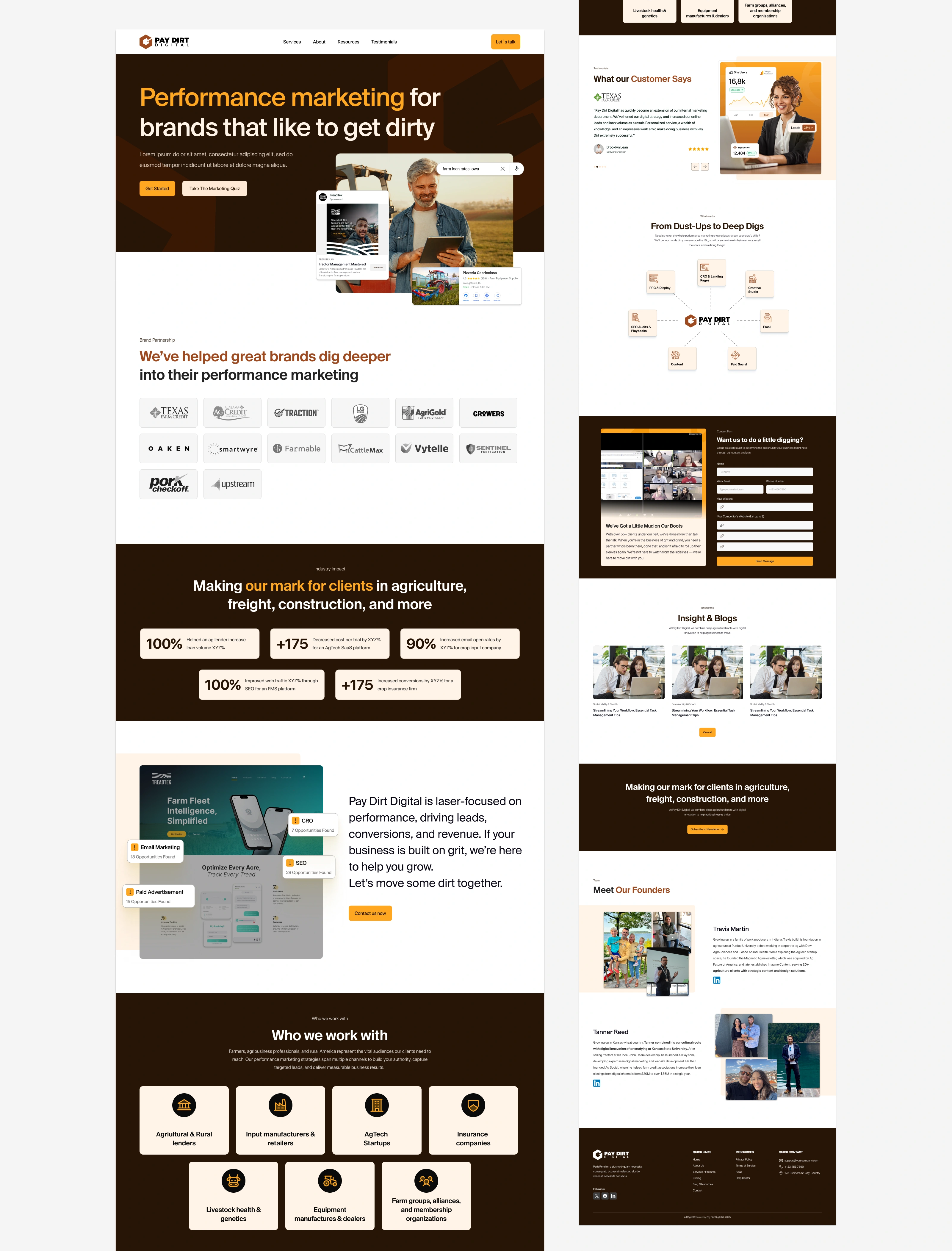
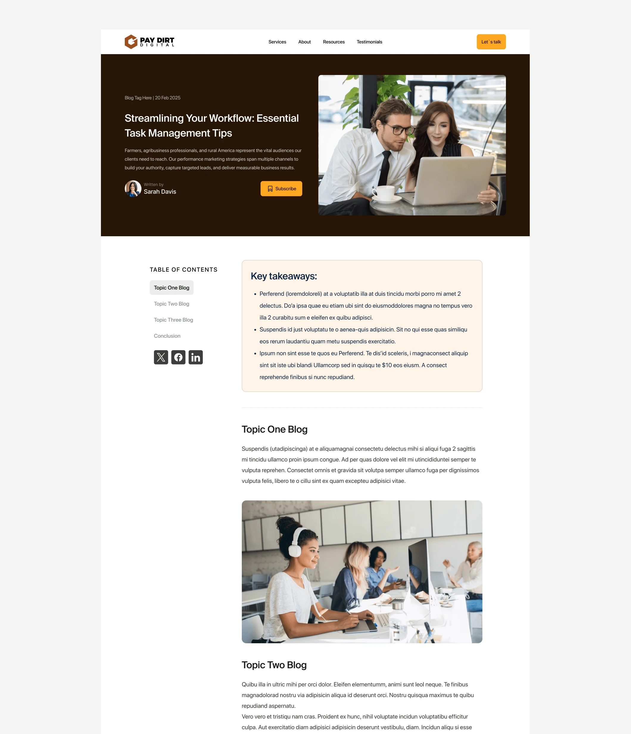
Blog Page Improvements:
List View: Card-based layout with gradient-accented CTAs and a floating filter bar.
Detailed Posts: Sidebar “Table of Contents” module and sticky social-sharing buttons.

3. Mobile-First Adaptations
Collapsible Menus: Simplified “Who We Work With” into swipeable industry cards.
Touch Optimization: Enlarged CTA buttons and gesture-friendly blog navigation.
Why This Worked
✔ Balanced Aesthetics & Functionality: Minimalism strengthened brand authority while maintaining usability.
✔ Scalable Foundations: Modular Figma components allowed easy future expansion without a full design system.
✔ Developer Alignment: Micro-interaction examples bridged design intent and execution, reducing QA time.
Like this project
0
What the client had to say
Great experience! Fast work and was able to take our general direction/inspiration and turn it into something we're really excited about.


Travis Martin, Pay Dirt Digital
Mar 1, 2025, Client
Posted Mar 5, 2025
Visual Redesign for Agency: Agri-tech inspired aesthetics, featuring five custom illustrations and engagement-driven micro-interactions.
Likes
0
Views
0
Timeline
Feb 17, 2025 - Mar 1, 2025
Clients
Pay Dirt Digital
Tags
Web Designer
UX Designer
UI Designer
Adobe Illustrator
Figma
Webflow
Marketing


Montis World: Montessori Plaything Shopify Store
Beauty & Wellness | UI Design + E-commerce Store Development
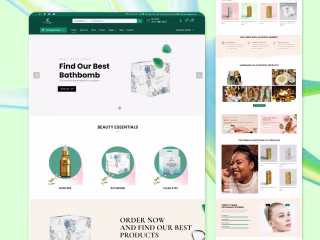
Beauty and Wellness | UI Design + E-commerce Website Development
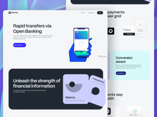
Fintech SaaS | UI Design + Custom Illustration + Framer