
This is the logo I made for a cafe name “Kettle & Kin”
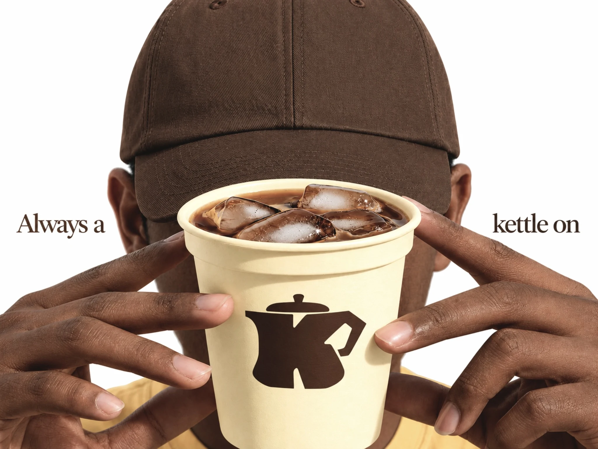
Two ideas, one letter. For Kettle & Kin, I shaped the K into a kettle so the brand reads at a glance and still feels handmade. Every curve is meant to feel like a warm cup on a slow morning.
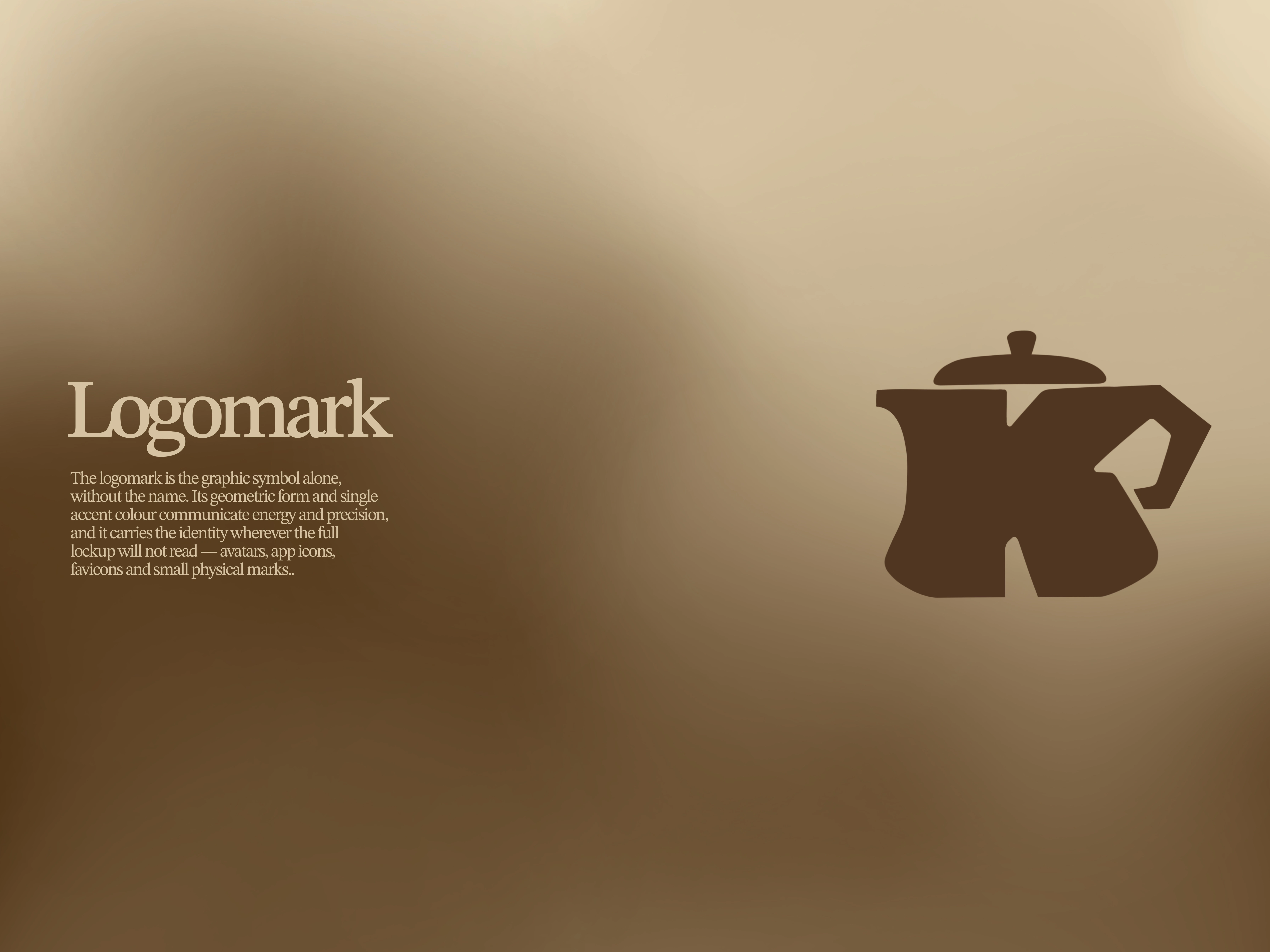
A K that holds a kettle. ☕ The wide, squat shape stands for warmth and a slow cup shared with kin, so the letter and the kettle are equally visible.
1 like · 4 views · Nov 16, 2026
Brand: Kettle & Kin is a cozy cafe built around slow mornings and shared cups. Its identity is warm and handmade, with a brown palette.


