Built with Jitter
Evermind — Full Case Study
Ariel Jędrzejczak
Your brand’s
operating system
A synchronized design and development framework for modern brands.
The idea behind Evermind was simple. I wanted to design something that feels calm and human, even though it lives in a digital world. I’ve always been drawn to design that’s close to nature like organic shapes, warm tones, soft movement. Things that make you feel something without shouting.
Evermind was built around that feeling. It’s clean, but not cold. Structured, but still alive. It’s meant to bring that sense of balance you get from good architecture or a quiet morning. The kind of digital space where everything just feels right.
I wanted to create a system that helps brands look strong and modern, but also honest and comfortable. Because design isn’t only about how it looks, it’s about how it feels to be inside it.
Every strong brand today needs movement. The animated logo became a small but meaningful detail in Evermind. It adds personality and rhythm — perfect for presentations, social posts, or motion content. It’s not just a decoration. Animation brings the brand to life and gives designers something to play with across platforms. It’s one of those subtle touches that make the whole identity feel complete.
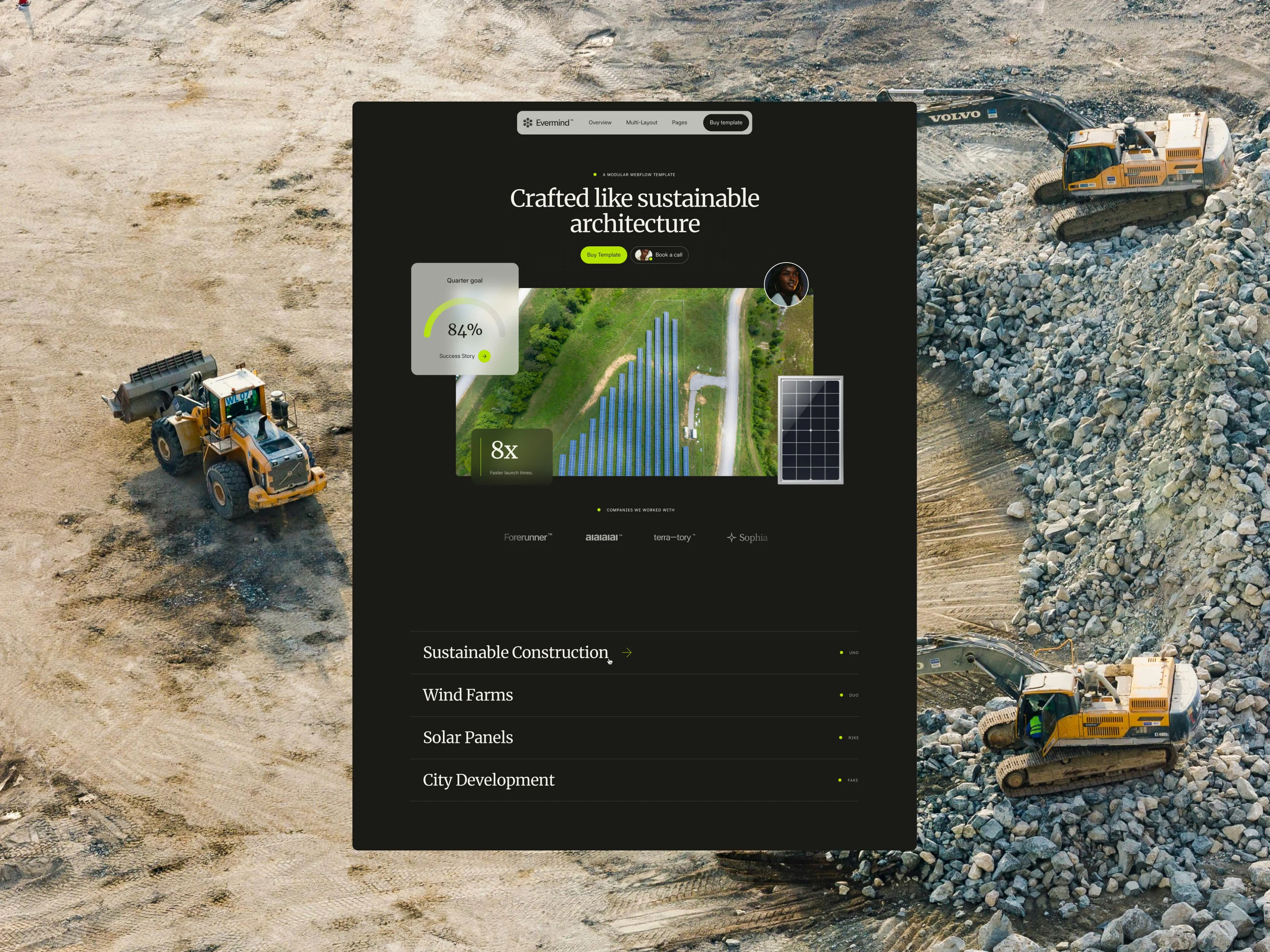
The hero section is one of the most important parts of any website. It’s the first impression — the moment when people decide if they want to stay or leave. Studies say it takes around three seconds for someone to make that choice, and that’s exactly why we spent so much time on this part.
In Evermind, the hero had to do more than just look good. It needed to communicate presence, trust, and purpose in a few seconds. The composition, typography, and animation all work together to give a calm but confident first impression — the kind that makes you want to scroll further.
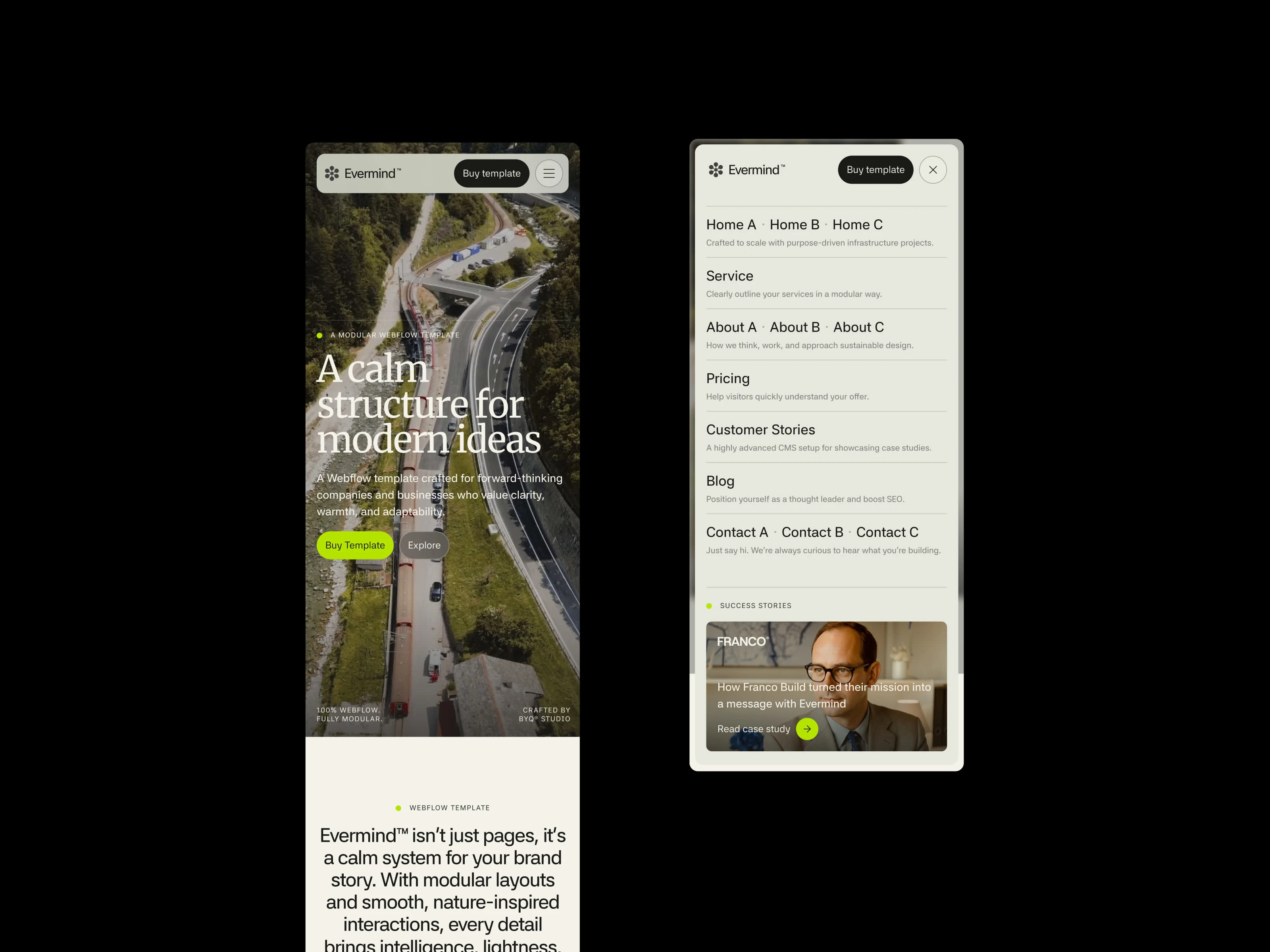
The navigation in Evermind was designed to actually help people find what they’re looking for. Each page category has its own short description, so users can instantly understand what kind of content they’ll find there. It’s not just links — it’s small signposts that make the experience feel considered and human.
On desktop, the same idea extends into a larger, more elegant structure. The menu includes access to Customer Stories directly from the navigation — something that connects the storytelling part of the brand with the practical side of the website. It’s a small detail, but it changes how you move through the whole system.
This part was one of the most interesting to build. The Case Study Slider is fully powered by the CMS and combines what’s usually separated — testimonials and full case studies. Each testimonial includes a short quote, company logo, and a direct link to read the full story.
It makes the whole section feel alive and connected. Instead of just reading what someone said, you can go deeper, see the results, and understand the story behind the collaboration. It’s a mix of data, emotion, and design that actually makes sense.
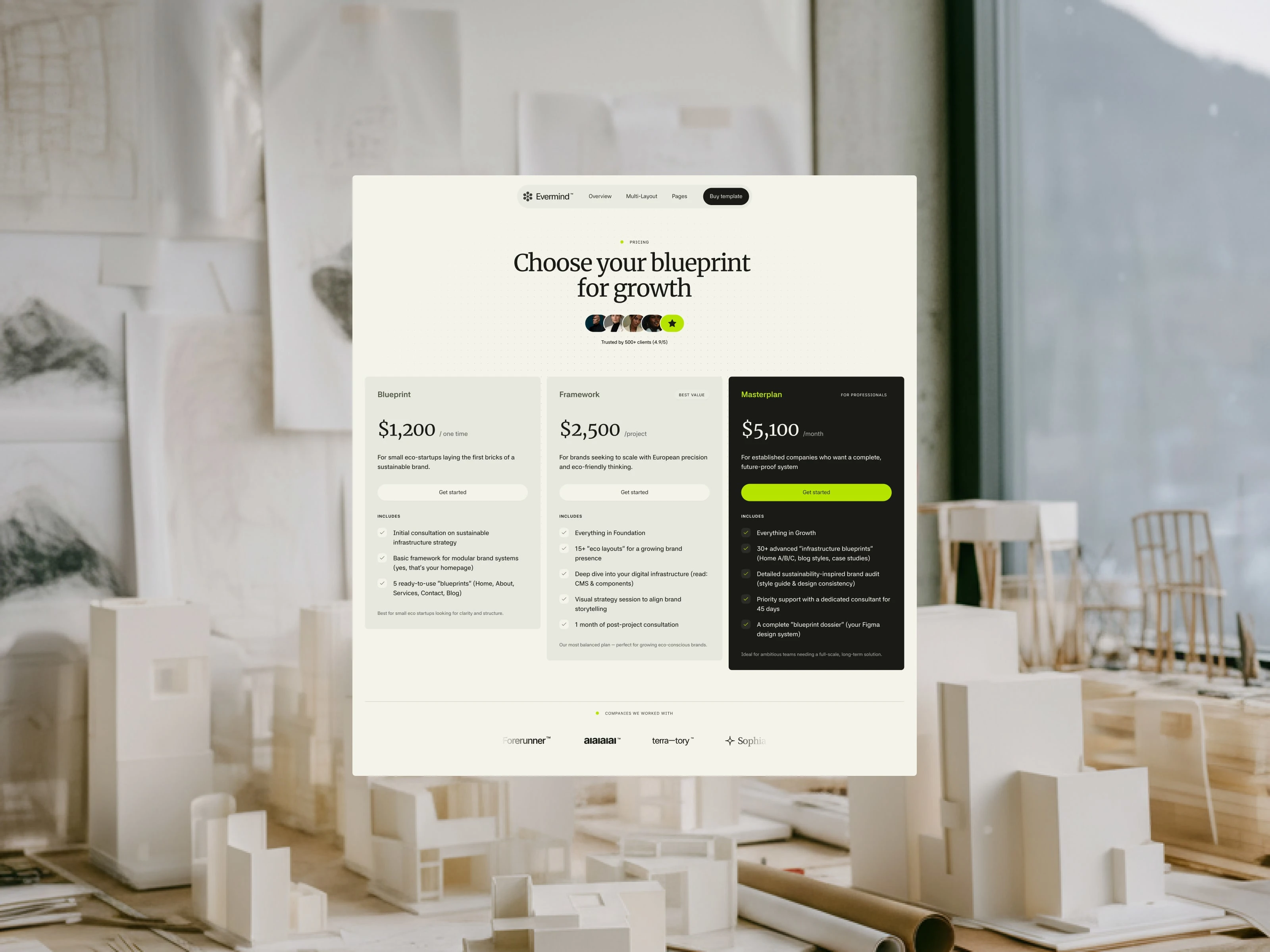
Pricing is often overlooked, but it’s one of the most important parts of a website. It’s the moment where clarity meets conversion. With Evermind, we wanted to make this section clean, simple, and structured in three tiers — so clients can immediately see what’s possible and where they fit.
It’s less about numbers and more about trust. When your pricing is transparent and well-presented, it creates confidence. That’s what this section was built to do — turn curiosity into action.
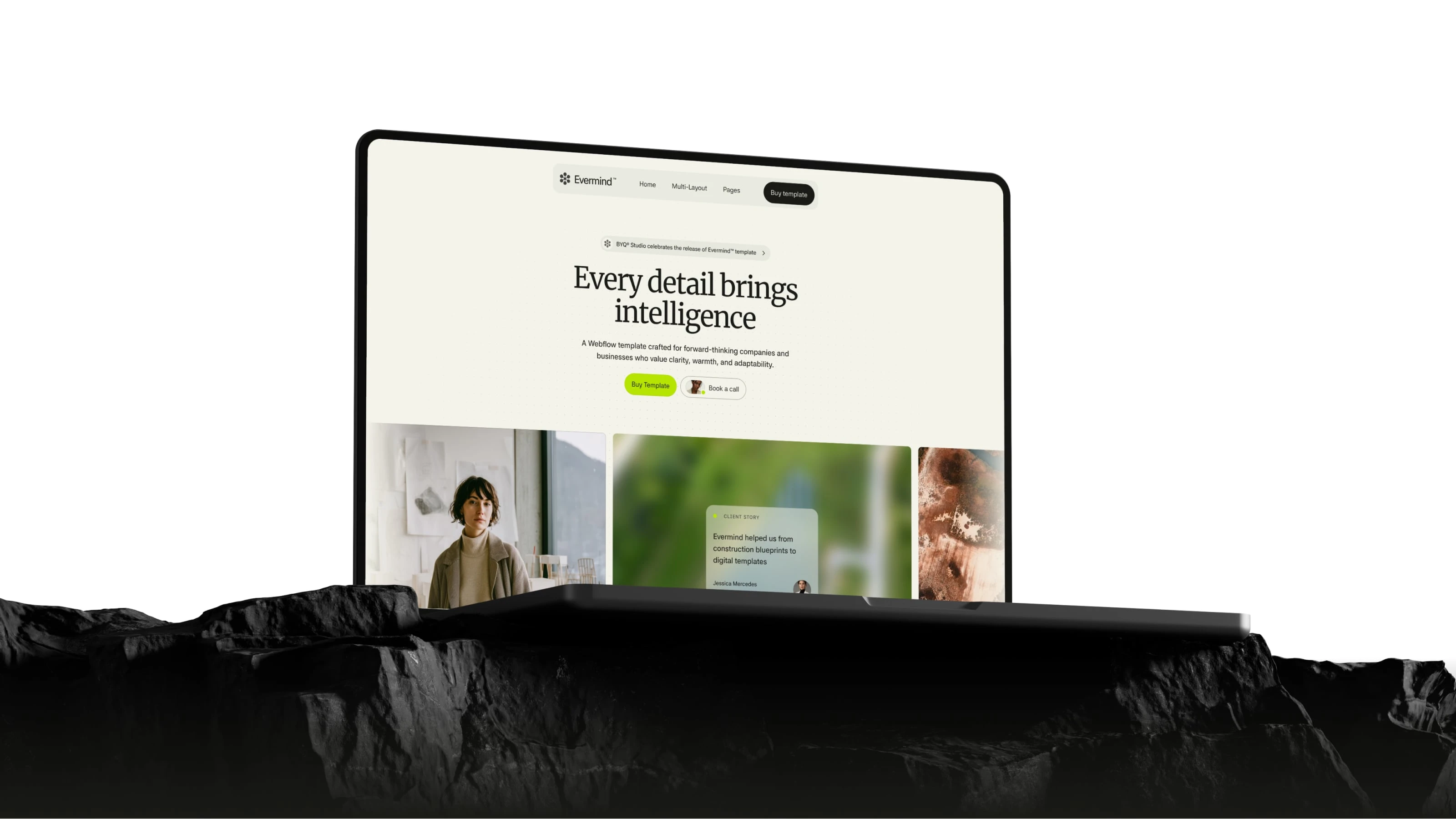
The color palette of Evermind was meant to feel warm and natural, but still modern. We didn’t want another cold corporate green or blue — it had to feel alive. That’s why we added a light neon accent that breaks the calm tones just enough to bring energy into the layout.
It’s one of those small things that people don’t consciously notice, but they feel it. The color system helps create balance — grounded but slightly electric — a visual metaphor for what the brand stands for.
Evermind is the project where I pushed my Figma skills to the limit. It’s my little design child. Everything I love about creating is in there. It’s my way of showing what design really means to me.
— Ariel Jędrzejczak
Behind the scenes
Alongside design and Webflow build, we also explored motion and marketing materials in Jitter.
Usually, this part feels a bit less sexy,but honestly, it turned out to be just as exciting.
We’ve used Jitter to create short motion pieces, looping showcases, and animations for Instagram. It’s a different kind of fun and surprisingly creative.
Here are some of the clips we shared while building Evermind.
This one was a combination of nice Jitter animations and Elevenlabs AI voice generator.
Easy and effective way of showing mobile designs
Grid-based mobile design showcase
Explore the full Figma file
You can preview the full Evermind Figma file and see how everything works. It’s all there, a complete variable-based framework built with real design and technical logic behind it.
You’ll see how the system is structured, how every spacing, color, and typography token connects with Webflow. It’s not just a bunch of screens, it’s the real foundation of the projects.
The file is view-only, so please don’t send edit requests — I get way too many emails about that. If you want full access, you can buy Figma file.
Evermind’s Figma is built on Variables, Auto Layout, and clean structure — designed exactly like we use it every day at BYQ Studio.
Thanks for scrolling
all the way down
Evermind took months of work and fine-tuning, but mostly, it was just a lot of love for design. If it made you feel something or sparked an idea, then it did its job.
Like this project
Posted Oct 20, 2025
Evermind became a world's bestselling Webflow Template in September 2025 and a reminder that real design is still built on care, patience, and detail.
Likes
2
Views
91