Bringing Apple Icons To Life
Michael Nowak
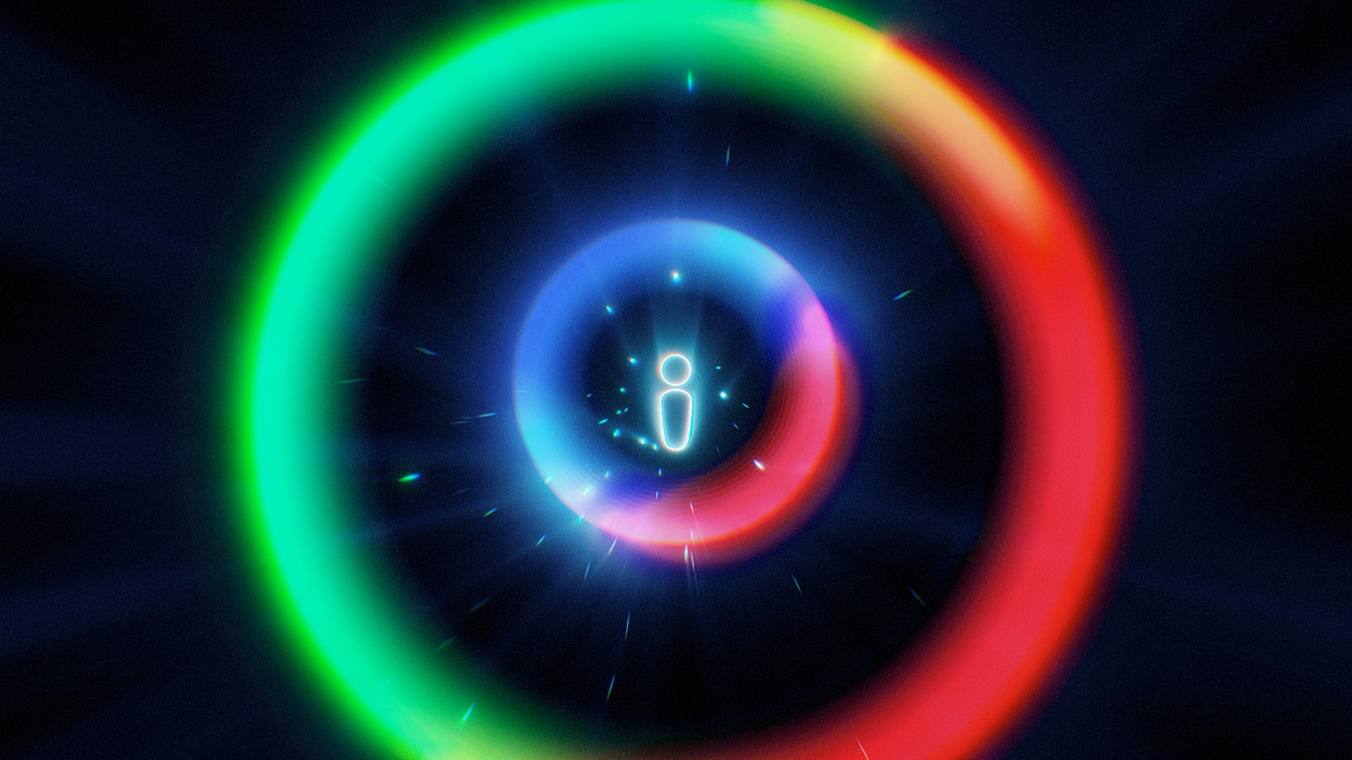
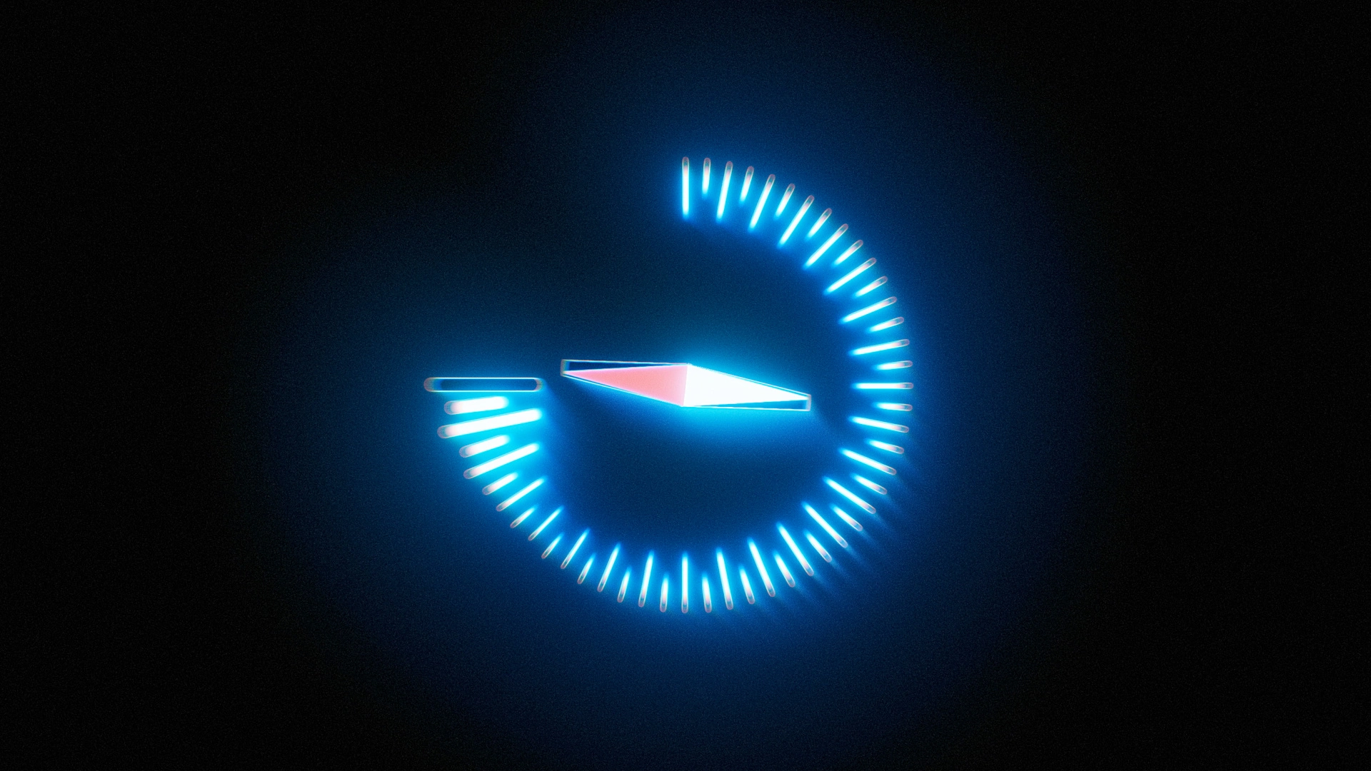
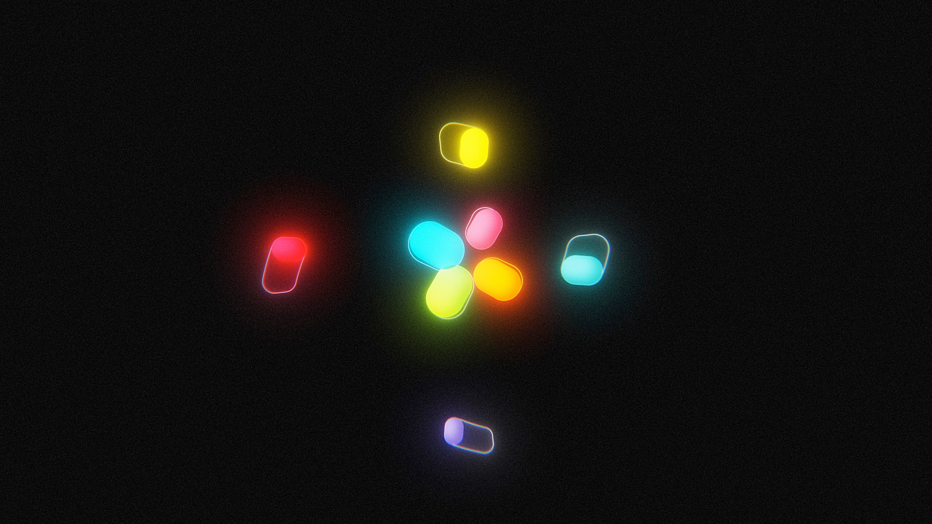
I took a set of Apple-style system icons and brought them to life with short, smooth animations. The goal was simple: keep the icons looking minimal and premium, and use motion only where it helps people understand what’s happening.
High-contrast, dark canvas that lets the icon colors and glow/light play read clearly.
Tidy, minimal layout: each piece gets room to breathe, so the motion is easy to evaluate.
Featured by Behance in the Motion Graphics and After Effects galleries
Documented a bit of process in a “Making Of” section on the page to show how the visuals come together:
Tools
After Effects (shape layers, trim paths)
Illustrator (vector setup)
Project was featured in Behance’s Motion Graphics and After Effects galleries.
Like this project
Posted Aug 31, 2025
I took a set of Apple-style system icons and brought them to life with short, smooth animations. The goal was simple: minimal and premium, and use motion.
Likes
3
Views
8
Clients
Apple