Built with Rive
Haso Mobile Shopping App Design
Adetomiwa Adewunmi
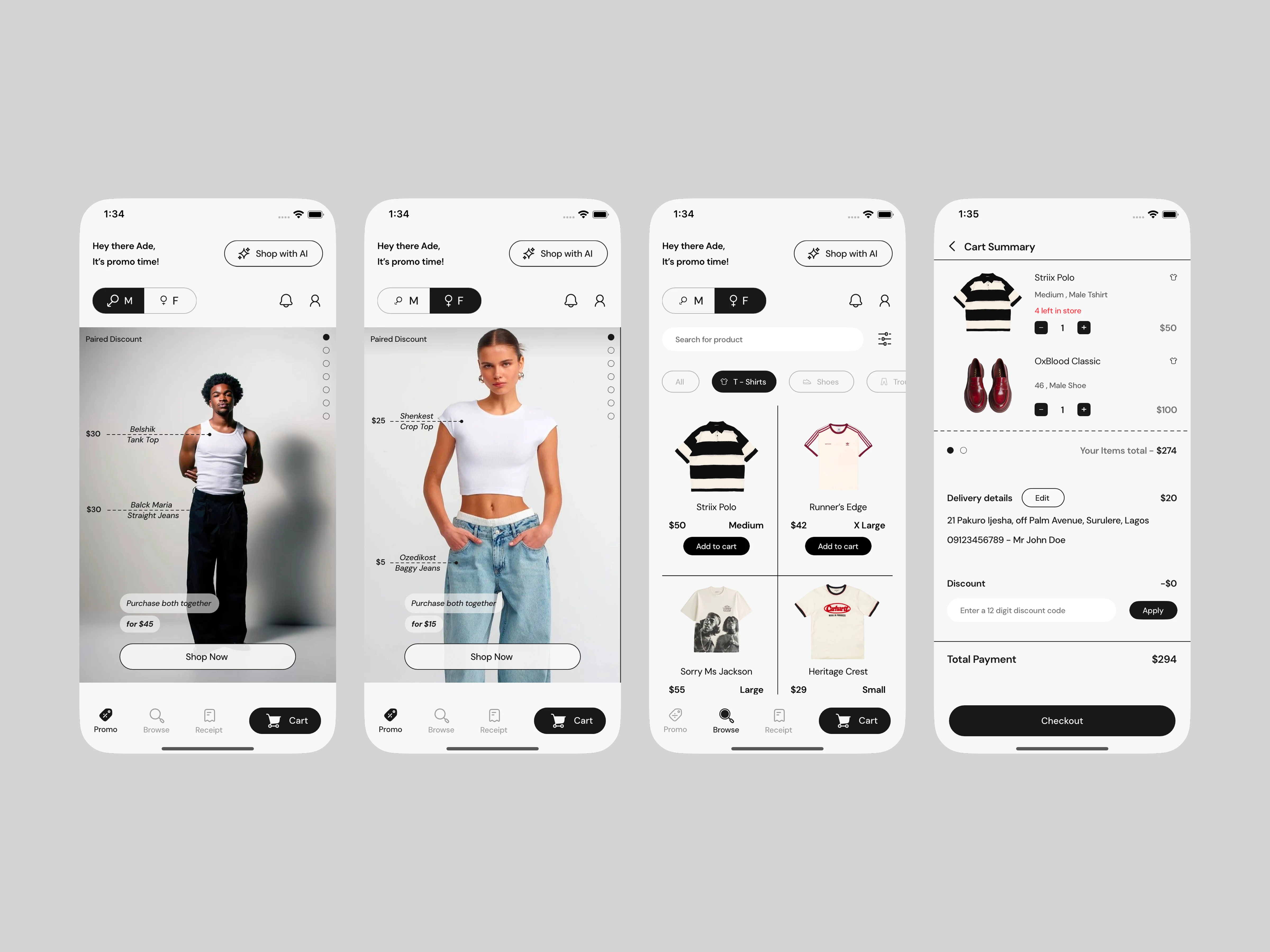
Table of Content
Intro - Haso Mobile App
Story for context
Prototype
Thought process
Haso Mobile App
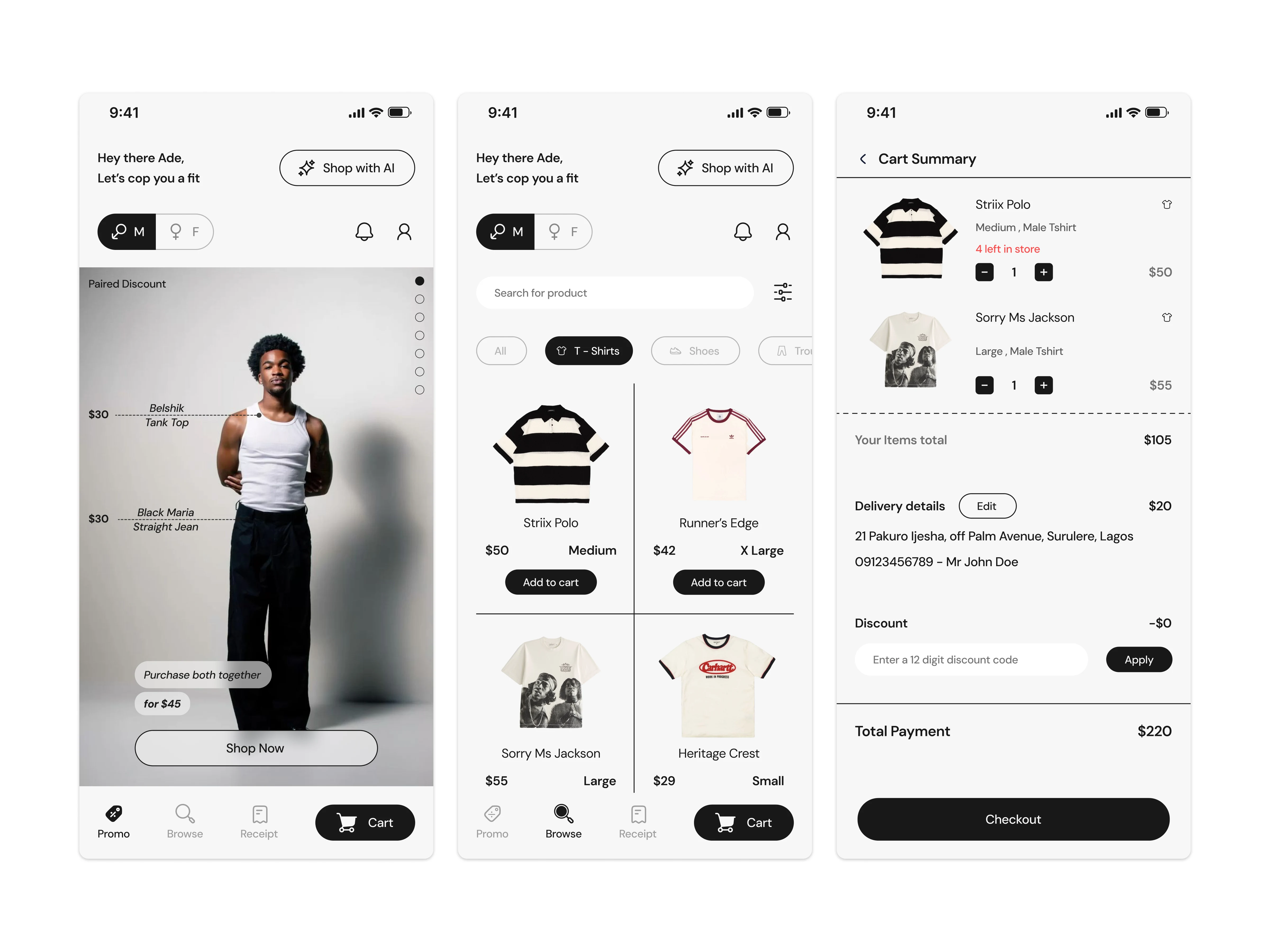
Haso is a mobile shopping app designed for an affordable fashion brand catering to both men and women. The focus of the product is speed, clarity, and familiarity — allowing users to shop promotions quickly while still having a structured way to browse full collections.
The app surfaces ongoing campaigns immediately on login, reflecting the brand’s frequent monthly promotions. Rather than hiding discounts behind navigation, Haso puts them front and center, making value instantly visible.
Story for context
Josh is a college student juggling classes, social life, and a tight budget. Like many students, he’s always on the lookout for promotions. When he opens a fashion app, his first question is simple: what’s on sale right now?
Haso is built for that moment.
On login, Josh is immediately shown active promotions through a reel-style layout that makes browsing fast and effortless. An animated toggle allows him to switch between men’s and women’s collections without breaking flow, helping him find what he wants quickly.
But Haso isn’t designed only for Josh.
For individuals who shop occasionally, the browse section offers a structured way to explore regular-priced items without promotional noise. For returning users, the receipt page provides a clear record of purchases and payment history, making it easy to track spending or revisit past orders.
By separating promotions, browsing, and receipts into clear spaces, Haso adapts to different shopping behaviors — whether a user is deal-driven, intentional, or simply checking in. The experience remains familiar, predictable, and easy to use for everyone.
Prototype
Thought Process - Design
Simplicity & Familiarity
The design approach for Haso was guided by Jakob’s Law — users spend most of their time on other shopping apps, so Haso should behave the way they already expect. Navigation patterns, layouts, and interactions follow familiar e-commerce conventions to reduce learning curves and cognitive load.
Promotion-First Experience
Because the brand runs frequent campaigns, promotions are prioritized immediately on entry. Users can shop discounted items directly from the promo feed, while regular items live in a dedicated browse section. This separation keeps intent clear and avoids overwhelming the user.
Minimal Interface
The UI adopts a minimalist visual style to keep attention on products. Spacing, typography, and hierarchy are used intentionally to guide the eye, ensuring the app feels lightweight, predictable, and easy to use.
Thought Process - Rive Animations
The animated splash screen is inspired by the act of sewing.
Sewing relies on thread to bring fabric together, so the motion of a thread became the core visual metaphor. The brand name appears as though it is being stitched into place, reinforcing Haso’s connection to clothing and craftsmanship.
Rather than treating motion as decoration, the animation reflects process, intention, and identity. This concept ultimately shaped the visual and motion direction of the Haso brand.
Like this project
Posted Jan 7, 2026
Designed a shopping app with a minimalist interface for a fashion brand.
Likes
1
Views
8