🇯🇵 Tokyo Tourism Design
An exercise in redesign
As part of my web design course, I had to redesign a tourism website, and one of my dreams has always been traveling to tokyo, so I took that opportunity!
Navbar Design
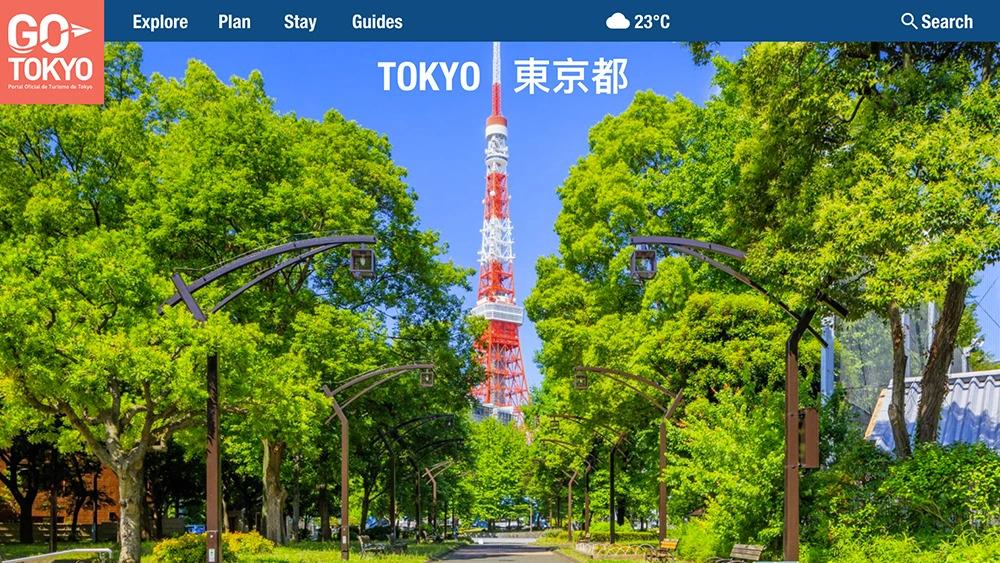
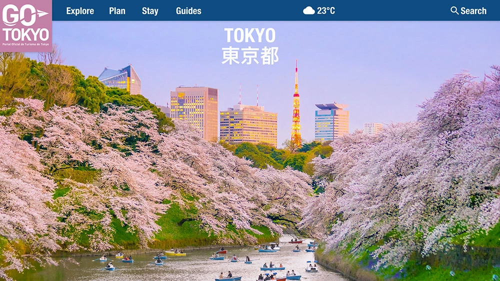
I wanted to keep the navbar simple, but useful. The Go Tokyo is an important part so it's kept bigger and colorful, while the nav bar hosts the navigation, and the weather as a nice touch.
Approach #1
Tokyo tower is a very emblematic part of Tokyo, so I figured it'd be a good approach to use it. So I found a high quality image, and added the Tokyo message in English and Japanese.
Approach #2
One of the most eventful times in Tokyo is the cherry blossoms! And it really gives the city a special look in that season, so I figured another image of Tokyo covered in cherry blossoms would be another good idea.
Like this project
Posted May 3, 2021
Likes
0
Views
43
