Shiny LOGO Ideation & Study
RJ ARIVI
(STUDY) RE-DESIGNING A LOGO FOR A BRAND CALLED SHINY
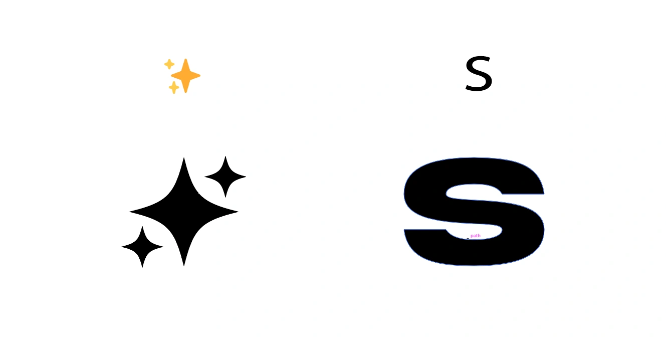
Current Logo


The main idea for the logomark is straightforward: A sparkling star ✨ and "S" symbol. Since there is no formal brief, I took my inspiration directly from a social media post introducing the Shiny brand. The post described it as a central hub for collectors, offering everything from mystery packs and real-time tools to verifiable odds and an all-on-chain platform.

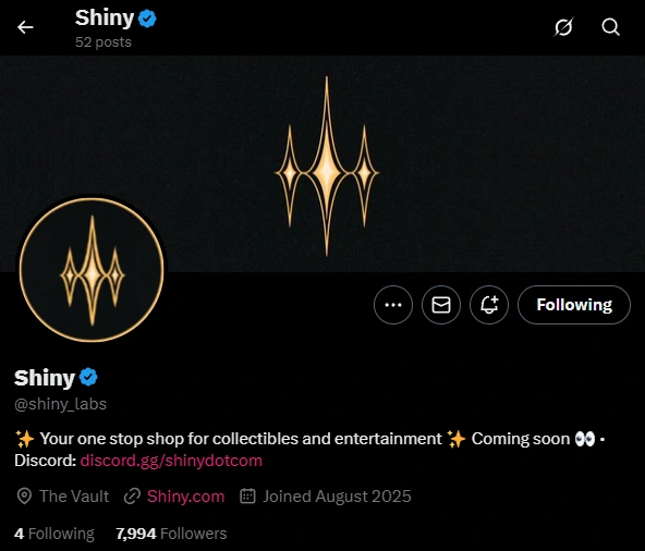
Inspired by the original logo and the common sparkling star emoji, I aimed to create a design that was both similar and yet modern. The core concept was to use three stars to subtly form an "S" in the negative space. The first step was to design the sparkling star element itself, a motif similar to what is now used by the Gemini app.
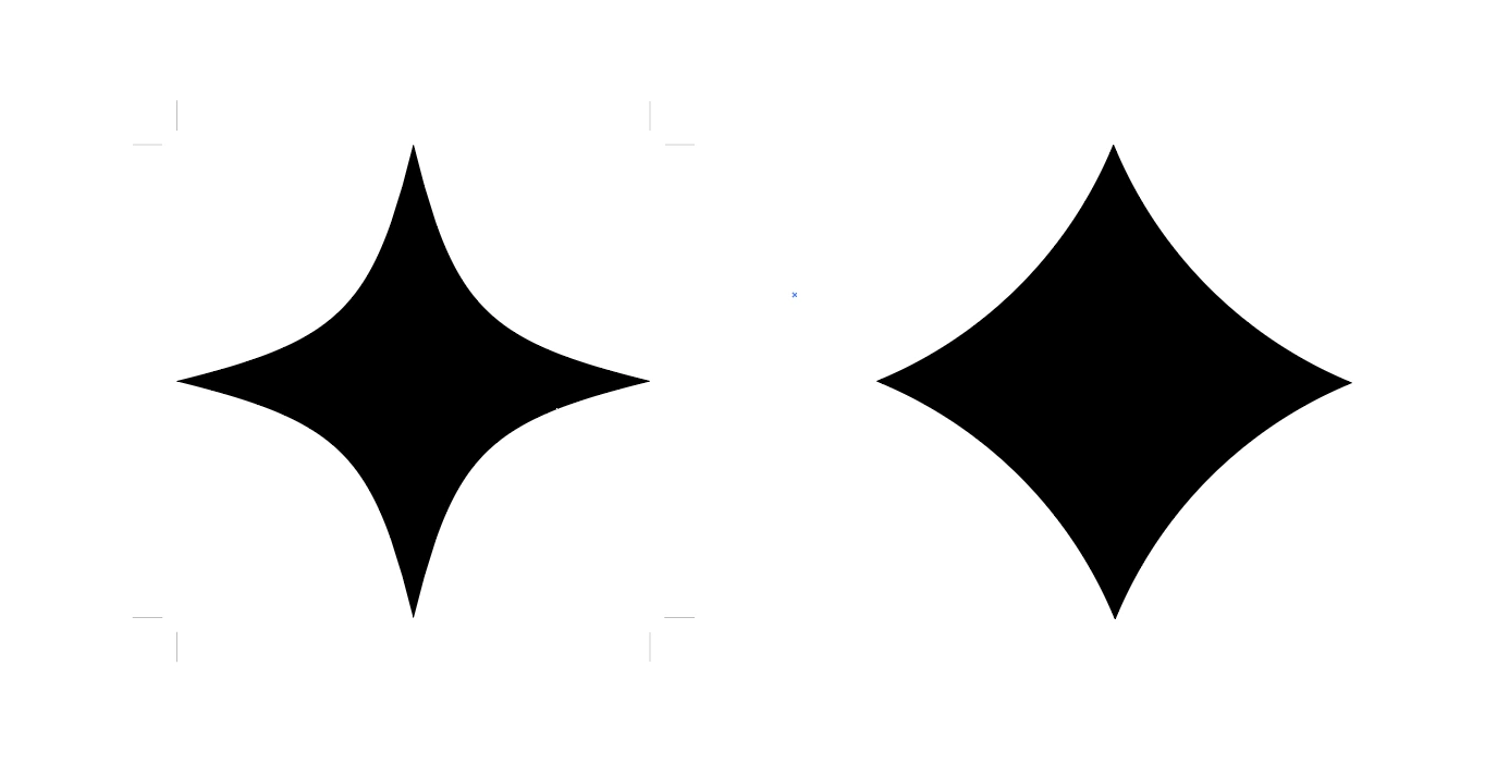
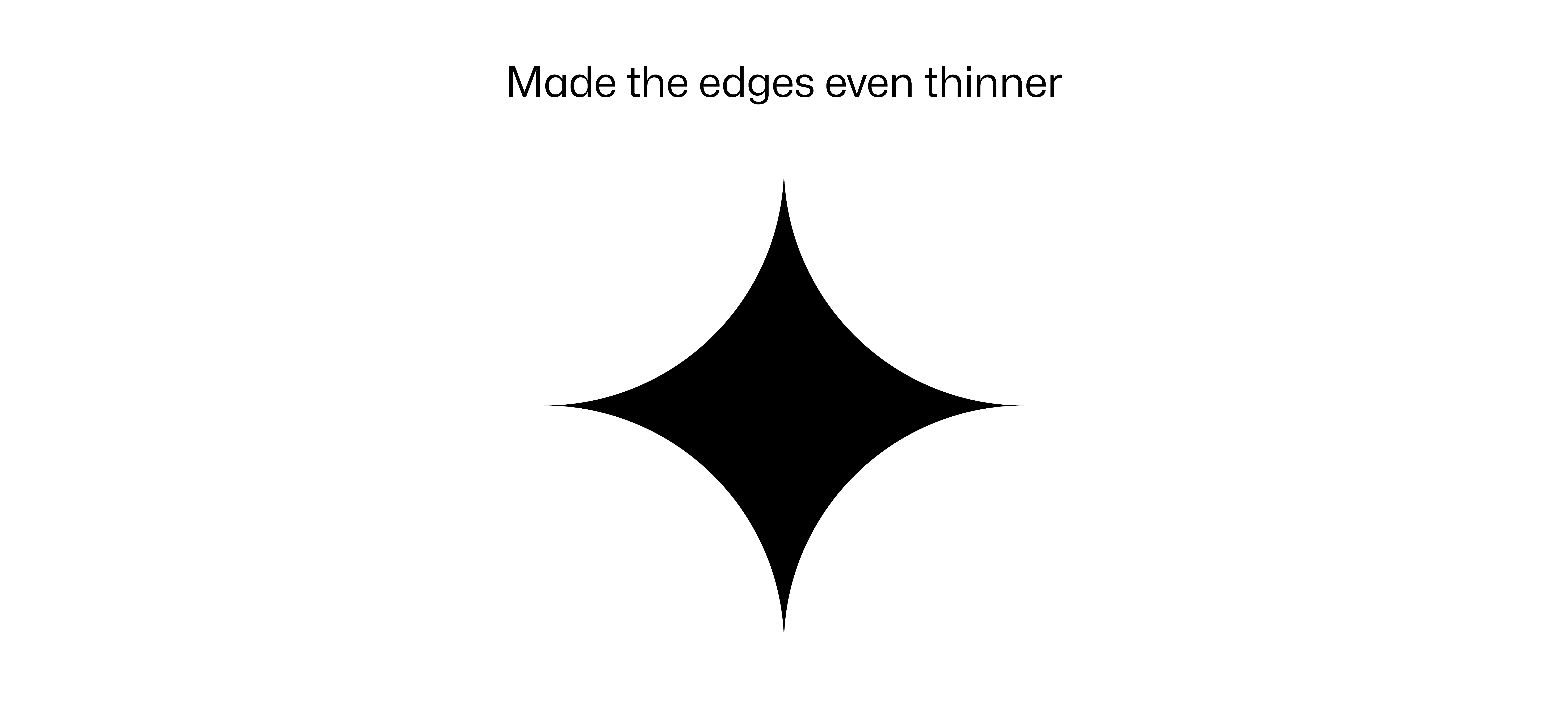
To create the star, I tried two different approaches. The first, a technique from Dansky, involved using the ellipse tool to achieve a star with fine, sharp points. I also created a second star using the built-in star symbol method, which resulted in a heavier, less refined shape. I preferred the first option for its delicate edges and later refined it further to enhance its visual effect.
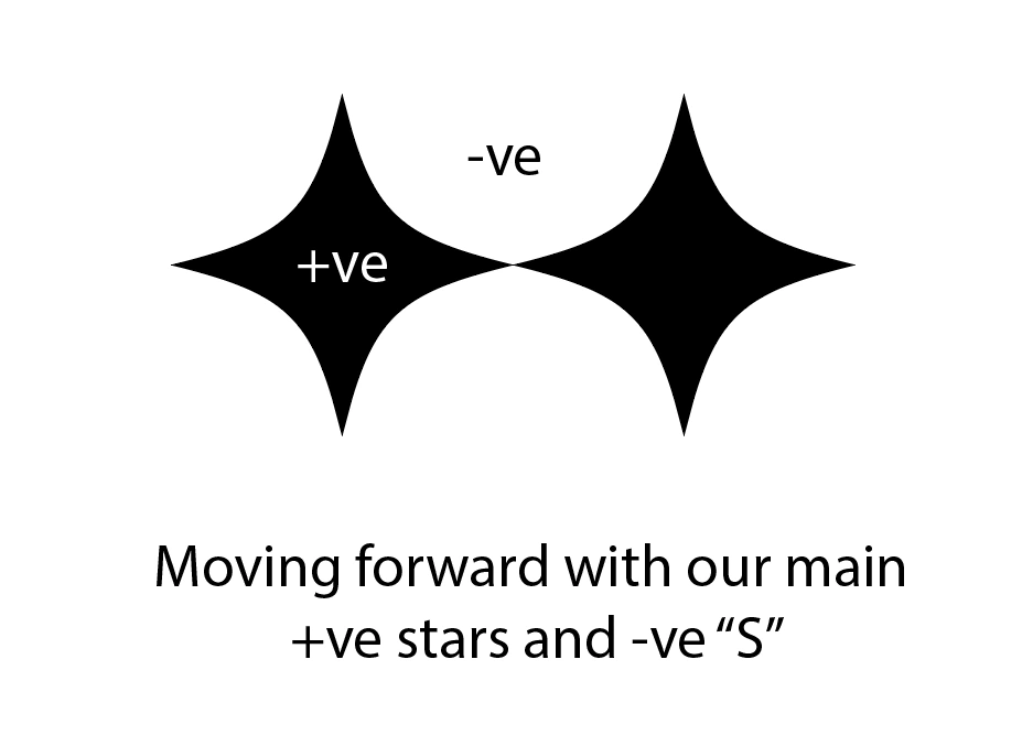
Going forward, The Sparkling stars will be mentioned as Stars
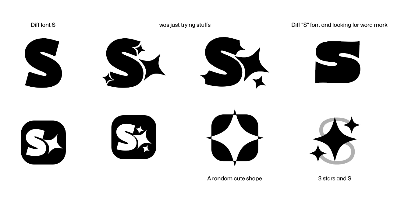
Next, I started by arranging three stars to resemble the emoji, using a bold "S" as a guide.
Just exploring and playing around with fonts and shapes
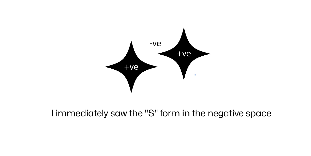
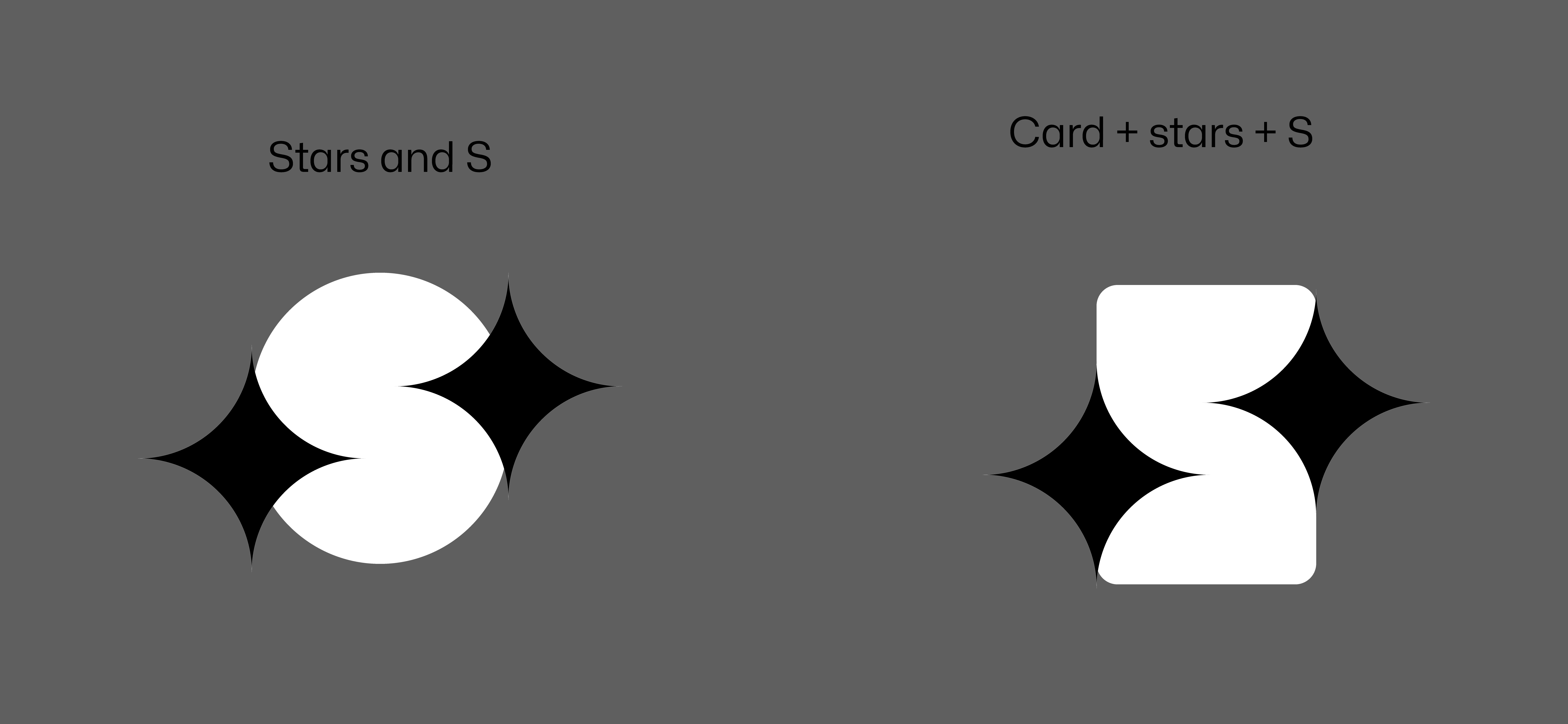
While the main idea was to use three stars to form an "S," I discovered the key to this concept by arranging just two stars side by side. I immediately saw the negative curves that would define the shape of the "S."
I immediately saw the "S" form in the negative space by arranging the stars. By placing one star slightly lower on the left and another slightly higher on the right, the subtle"S" shape emerged between them.
To further see the shape clearly I added a shape behind that
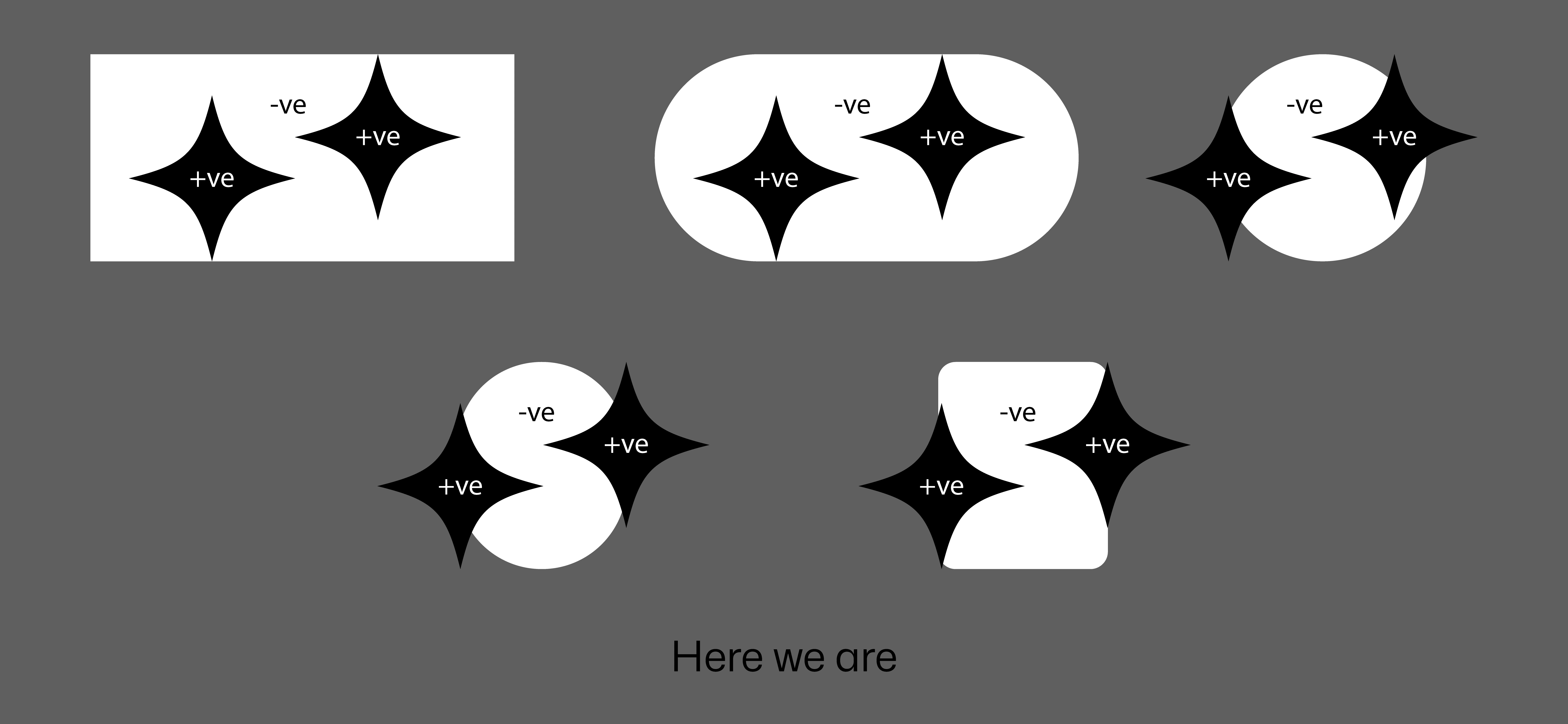
At this stage, the core logomark has been established by forming the "S" from the stars

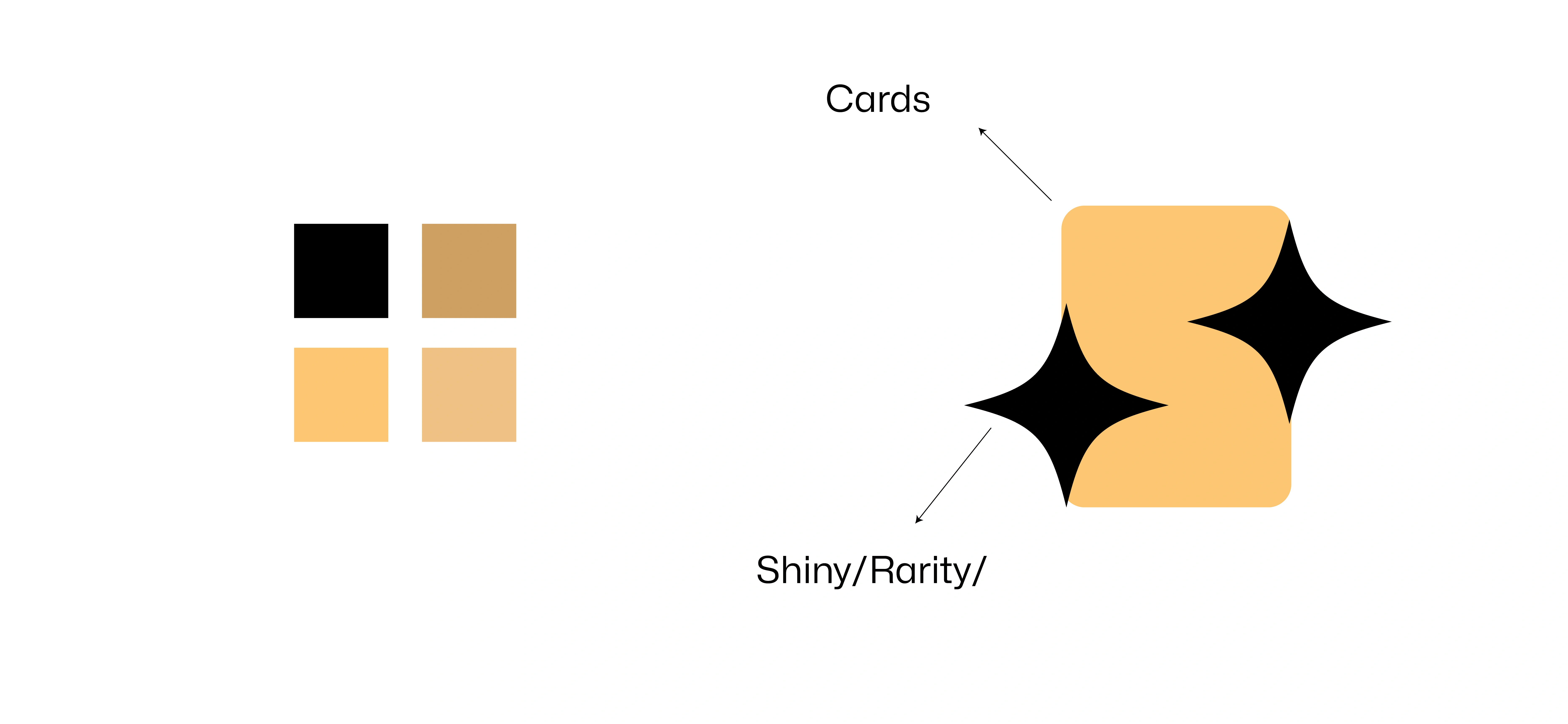
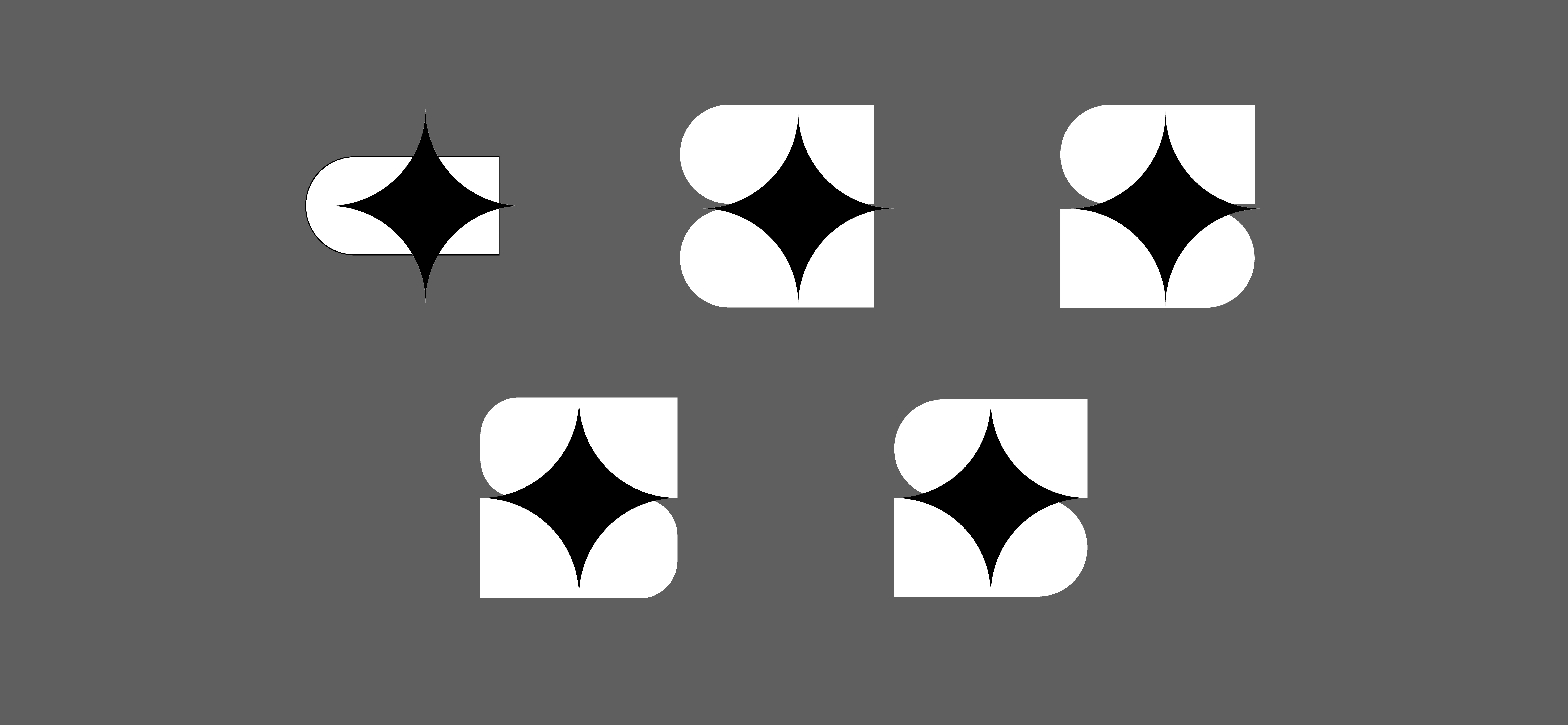
I experimented with various background shapes to see what would work best. My explorations included a circle, a simple rounded rectangle, and a more defined card-like shape.
I added a background shape behind the logomark and on the side, began exploring different fonts for the wordmark.
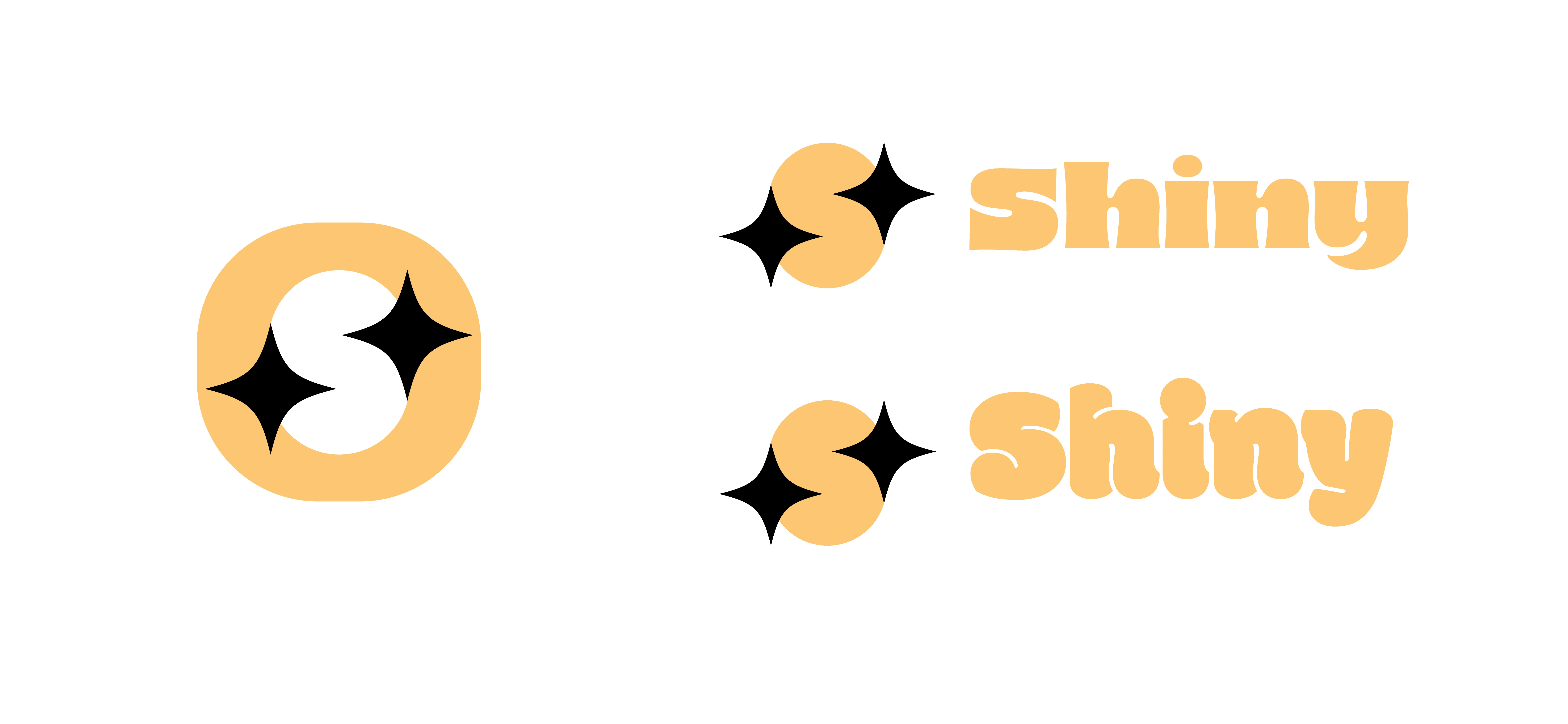
Thinner stars and shapes as logomark.
The third one is another variation I created which has the best curves retained. See below.
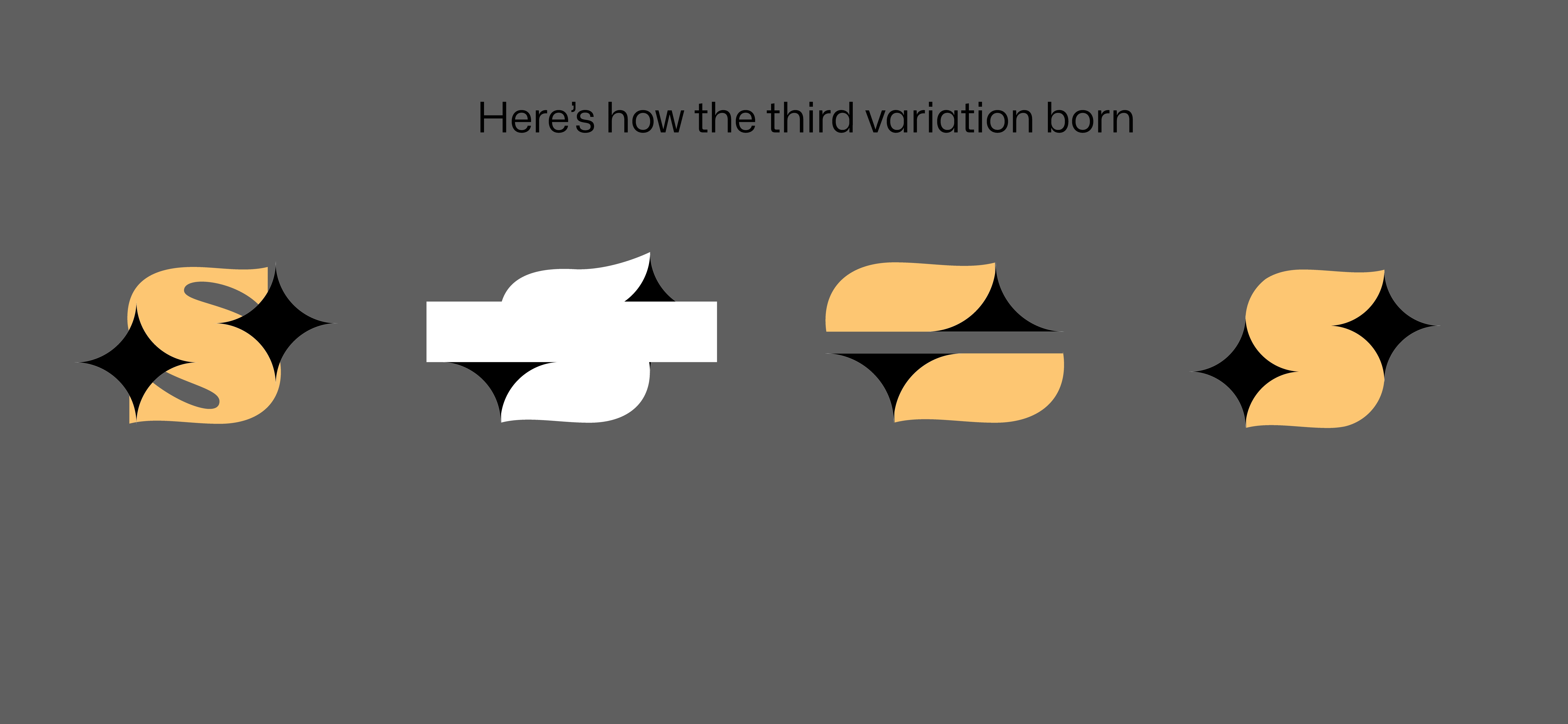
After installing the Supermoney app from Flipkart to explore some offers, I was immediately struck by its logo. It's simple, elegant, and the app's UI/UX is wonderful. The logo itself appears to be composed of rounded rectangle shapes with what looks like a card in the center. I was so inspired by this design amd I decided to create another variation of our Shiny logo.
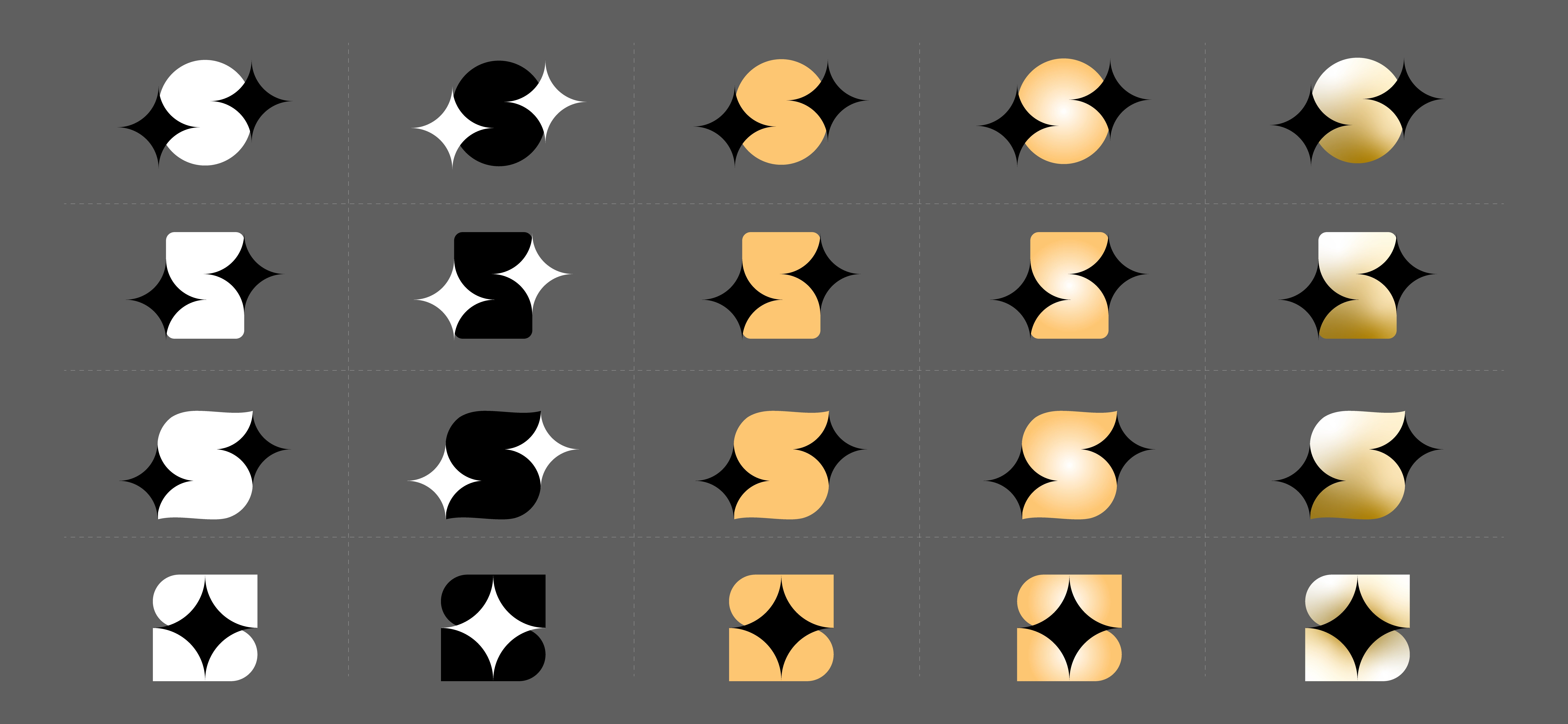
Without a formal brand brief, I'm defining the direction myself. The core brand idea from social post is, A one-stop-shop for collectors. I know it's an RWA platform focused on collectibles, and it offers key features like mystery packs, real-time collector tools, verifiable odds, and be entirely on-chain. So far I didn't add anything related to web3/on-chain to the logo mark since we are keeping it simple and straightforward. There is no final logo fixed, but I like the last one. To be hones, Each version from here can become new logo for new brand with refinement so its a win. Local logo library.
Like this project
Posted Oct 10, 2025
The core brand idea from social post is, A one-stop-shop for collectors. The Star Sparkle and "S" is the key concept
Likes
0
Views
10