Trinity Millwork Redesign
Zach Holmes
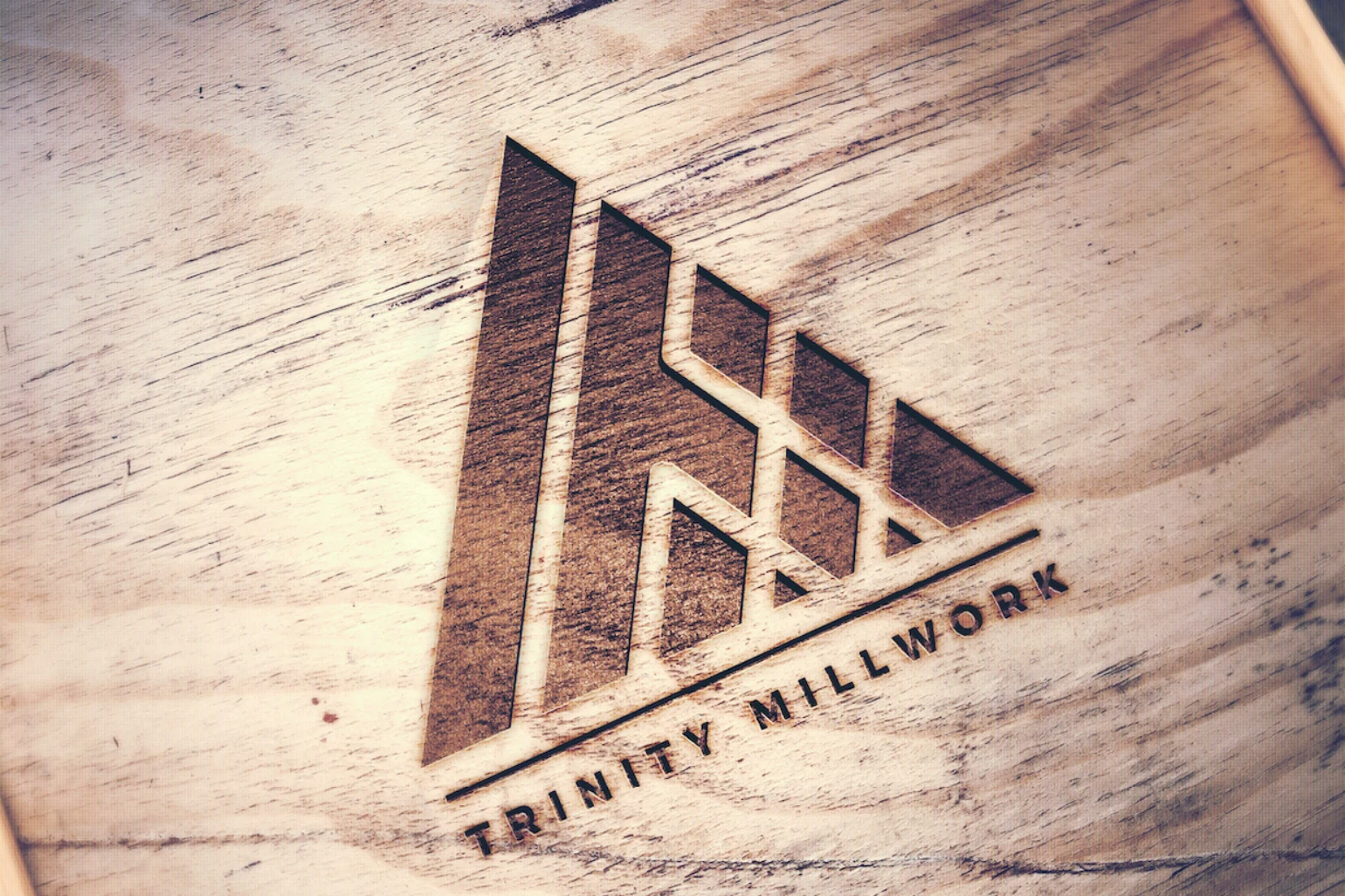
New logo for commercial building & millwork company.
Required: Upright, triangular icon, that represented their work. New, sans serif font.
Icon chosen by client (top of logo set & banner woodburning) represents a building/structure. Elements within the icon include a "T" & an "M" for potential decoupling from text in future use.
Like this project
Posted Jan 27, 2021
Likes
0
Views
16
Tags