Built with Framer
Blissgraphy Photography Portfolio Website

Tolulope Amao


THE BRIEF
Blissgraphy came to me looking for a website that reflected the elegance and emotion behind their photography brand. The goal was to create a digital experience that felt timeless, premium, and image-first, allowing every photograph to tell a story while keeping the interface clean, fast, and effortless to explore. Built entirely in Framer with zero code, the website balances visual storytelling with a refined user experience.
Timeline: 14 days (June 3 – June 17, 2026)
BLISSGRAPHY WEBSITE
Blissgraphy is a modern photography portfolio built in Framer, designed to showcase visual work through immersive galleries, thoughtful typography, and subtle motion. Every section was crafted to let the photography take center stage while reinforcing the studio’s premium identity.
View live website
https://blissgraphy.framer.website
WHAT IT DOES
A fully responsive portfolio website that presents photography in a way that feels elegant, immersive, and editorial.
The experience combines minimalist layouts, carefully paced animations, and intuitive navigation to help visitors browse collections naturally without distractions. Every interaction was designed to support the imagery rather than compete with it, creating a browsing experience that feels calm, intentional, and memorable.
HERO SECTION
The homepage was designed to immediately capture attention through large-format imagery, refined typography, and subtle entrance animations.
Rather than overwhelming visitors with excessive effects, motion was used selectively to create a premium feeling while allowing the photography to remain the focal point. The visual hierarchy guides visitors naturally into exploring the portfolio and learning more about the brand.
PORTFOLIO SHOWCASE
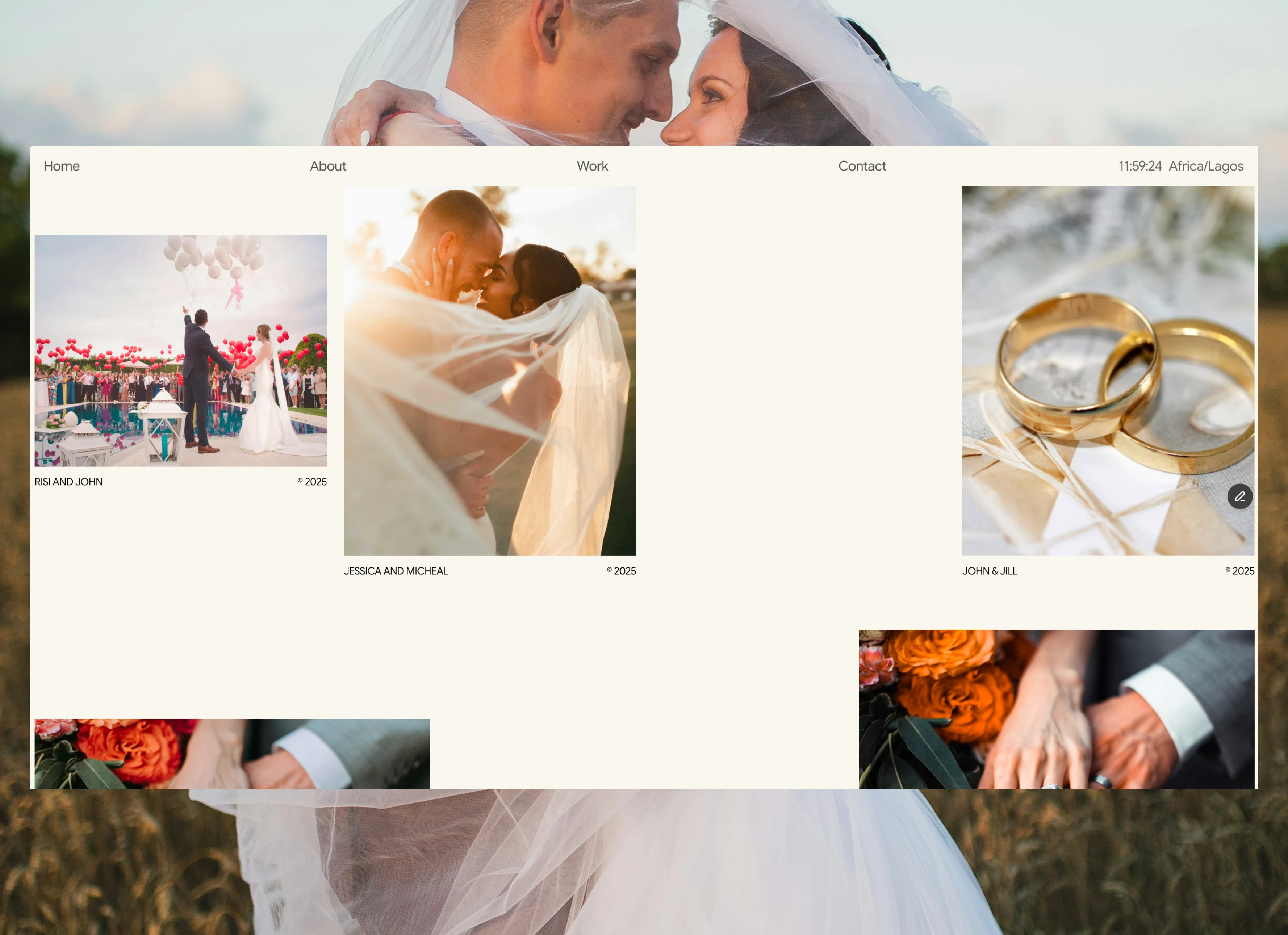
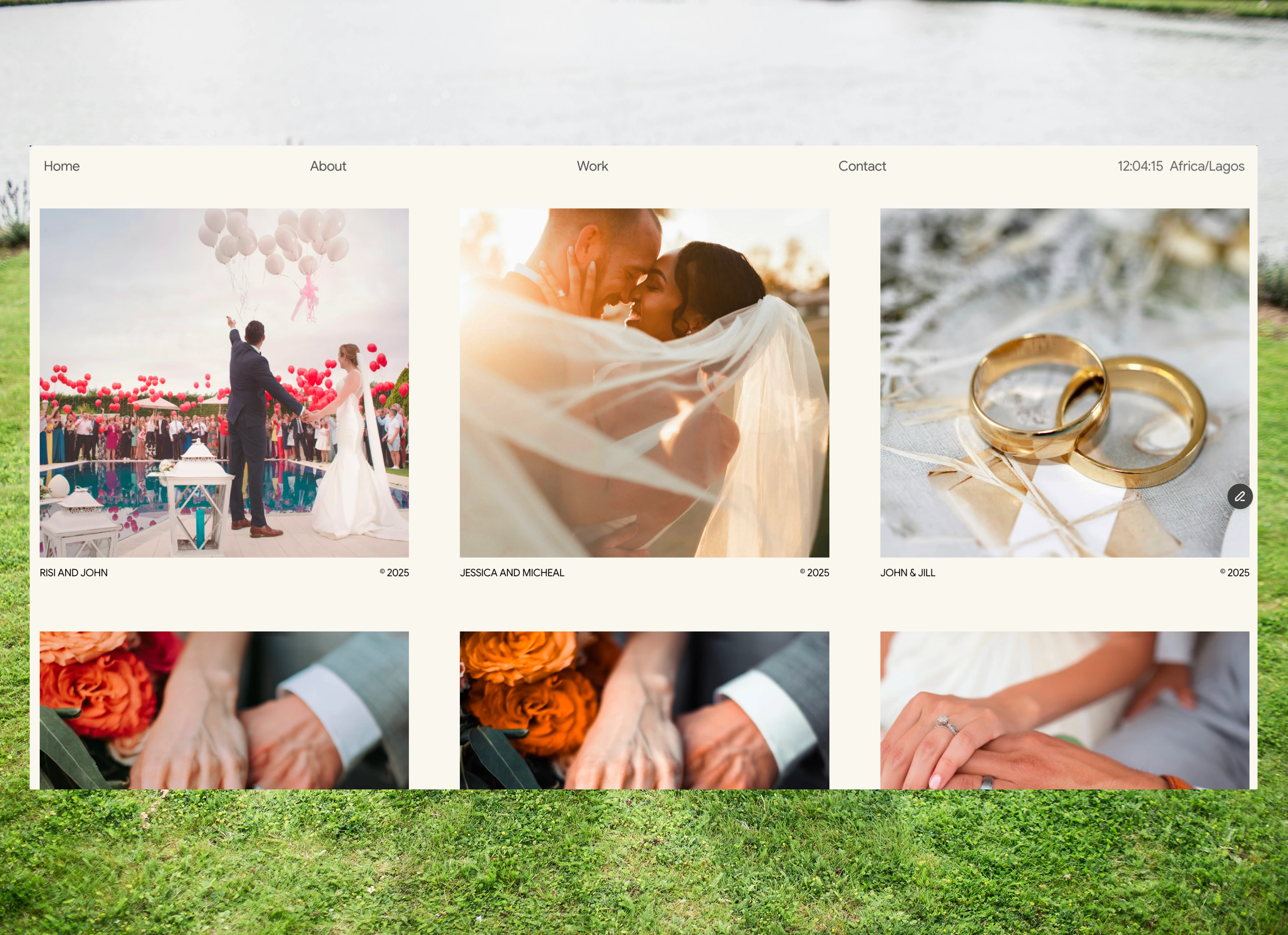
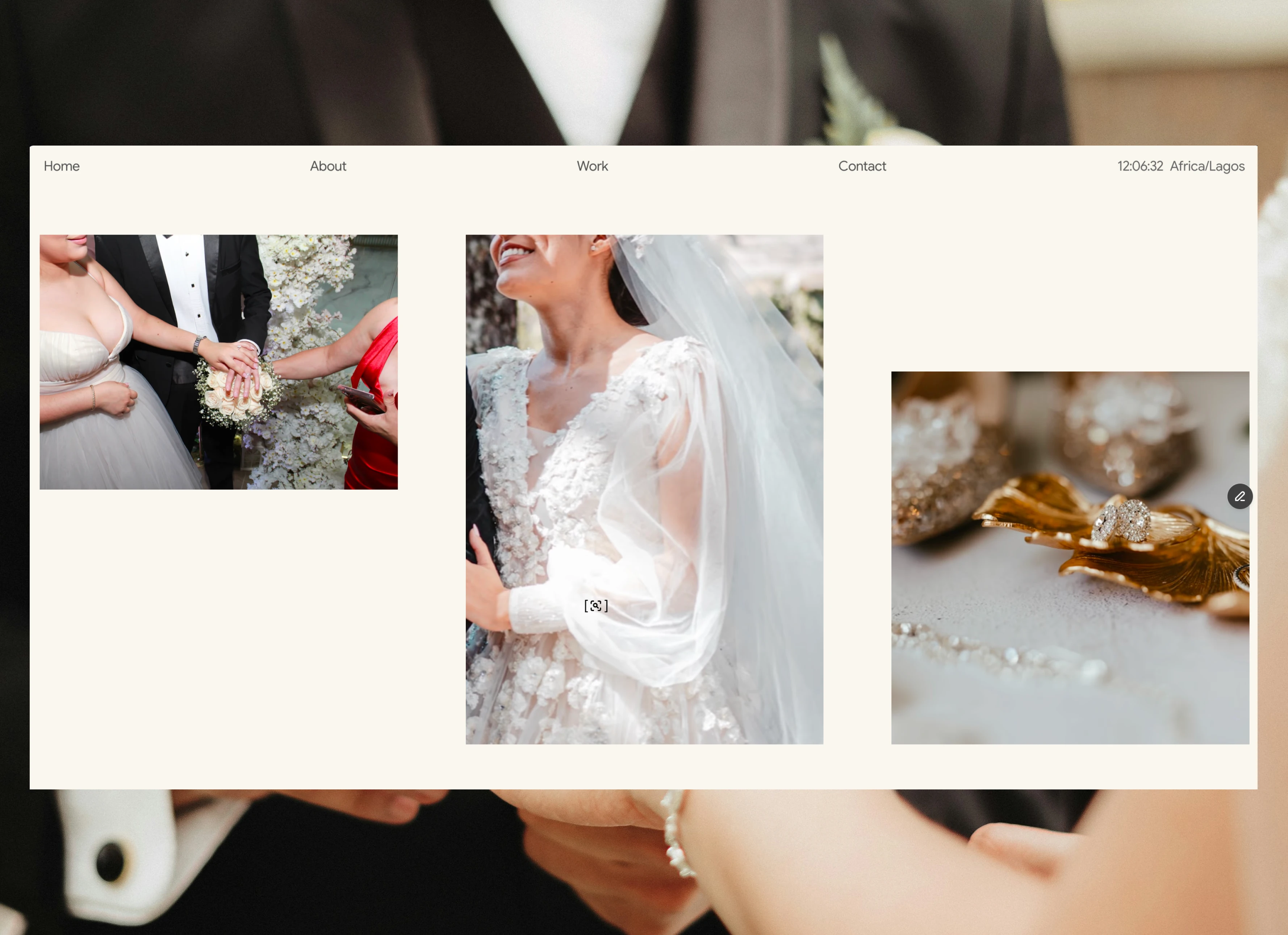
The portfolio gallery is the heart of the website, designed to highlight photography through spacious layouts and immersive presentation.
Instead of displaying images in a conventional grid alone, the layout combines varying image scales, intentional spacing, and smooth transitions to create a gallery that feels curated rather than simply organized. Every photograph receives room to breathe, making each project feel like its own visual story.
Careful attention was given to responsiveness so compositions remain balanced across desktop, tablet, and mobile devices without sacrificing image quality or layout consistency.
Why It Stands Out
Editorial presentation — every gallery feels thoughtfully curated rather than mechanically arranged.
Image-first experience — generous spacing and clean layouts allow the photography to speak for itself.
Elegant motion — subtle transitions create a premium browsing experience without distracting from the content.
Responsive design — layouts adapt beautifully across every screen size while maintaining visual balance.
Performance-focused — optimized structure ensures smooth interactions and fast loading throughout the experience.
ABOUT SECTION
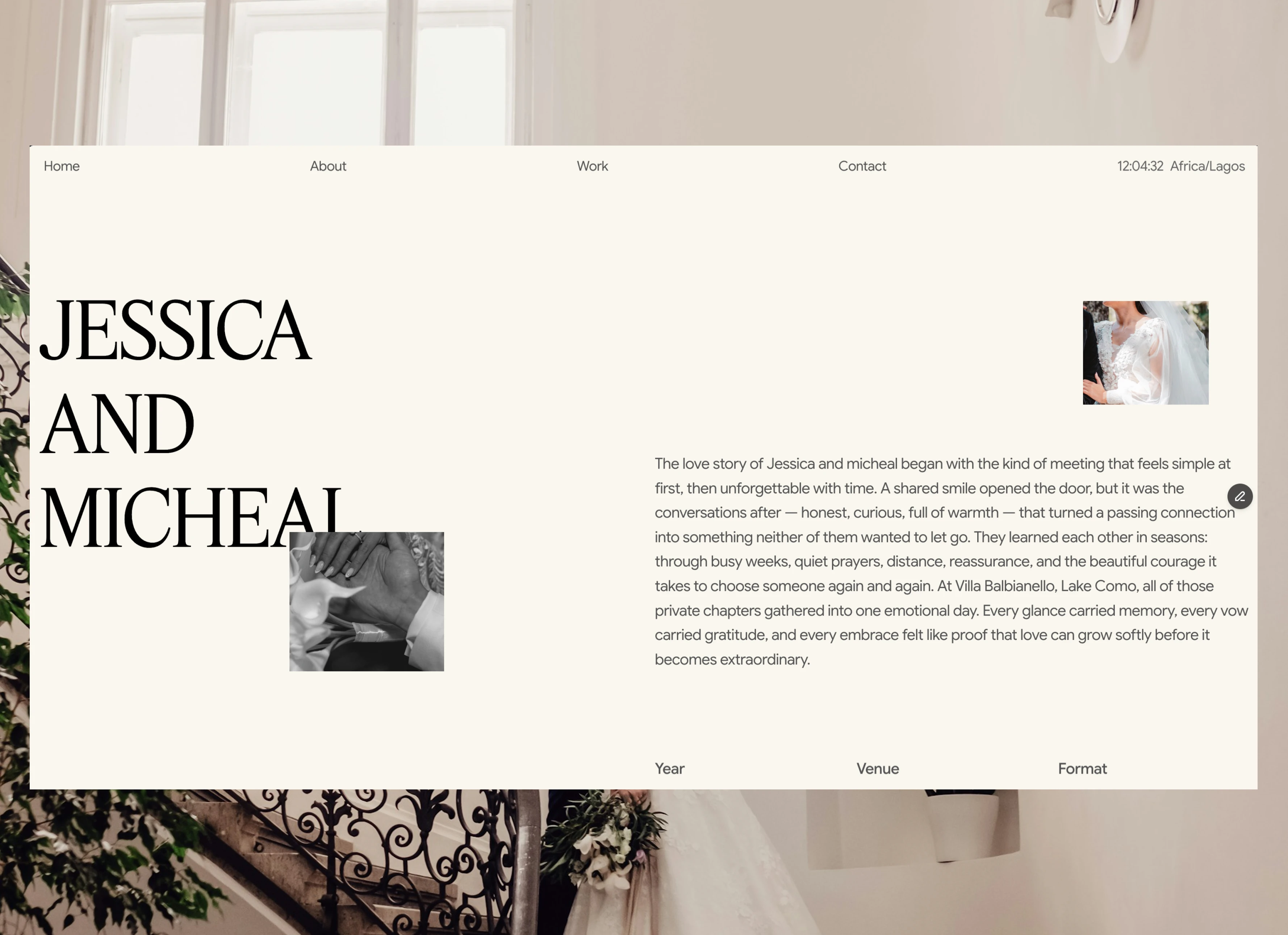
The About section introduces the photographer and creative philosophy through clean typography and balanced content hierarchy.
The layout was intentionally kept minimal, allowing personality and storytelling to complement the photography while strengthening trust with potential clients.
SERVICES & EXPERIENCE
The services section was designed to communicate offerings clearly while maintaining the same premium visual language found throughout the site.
Thoughtful spacing, subtle interactions, and consistent typography make the information easy to scan while preserving the overall aesthetic of the brand.
CALL TO ACTION & FOOTER
The closing sections were designed to leave a lasting impression while encouraging visitors to take the next step.
A simple but visually refined call-to-action invites potential clients to get in touch, while the footer provides essential navigation and social links in a clean, unobtrusive layout that complements the rest of the experience.
FEATURES
Custom Components
Photography Portfolio
Fully Responsive
Image-First Layouts
Smooth Scroll Animations
Interactive Galleries
Premium Editorial Design
Built in Framer with Zero Code
Like this project
Posted Jul 27, 2026
A premium photography portfolio built in Framer with zero code, designed to let every image breathe through editorial layouts, elegant motion, and immersive galleries that turn visitors into clients.
Likes
0
Views
0