Kasper-Design
Ahmed Abdelsamie
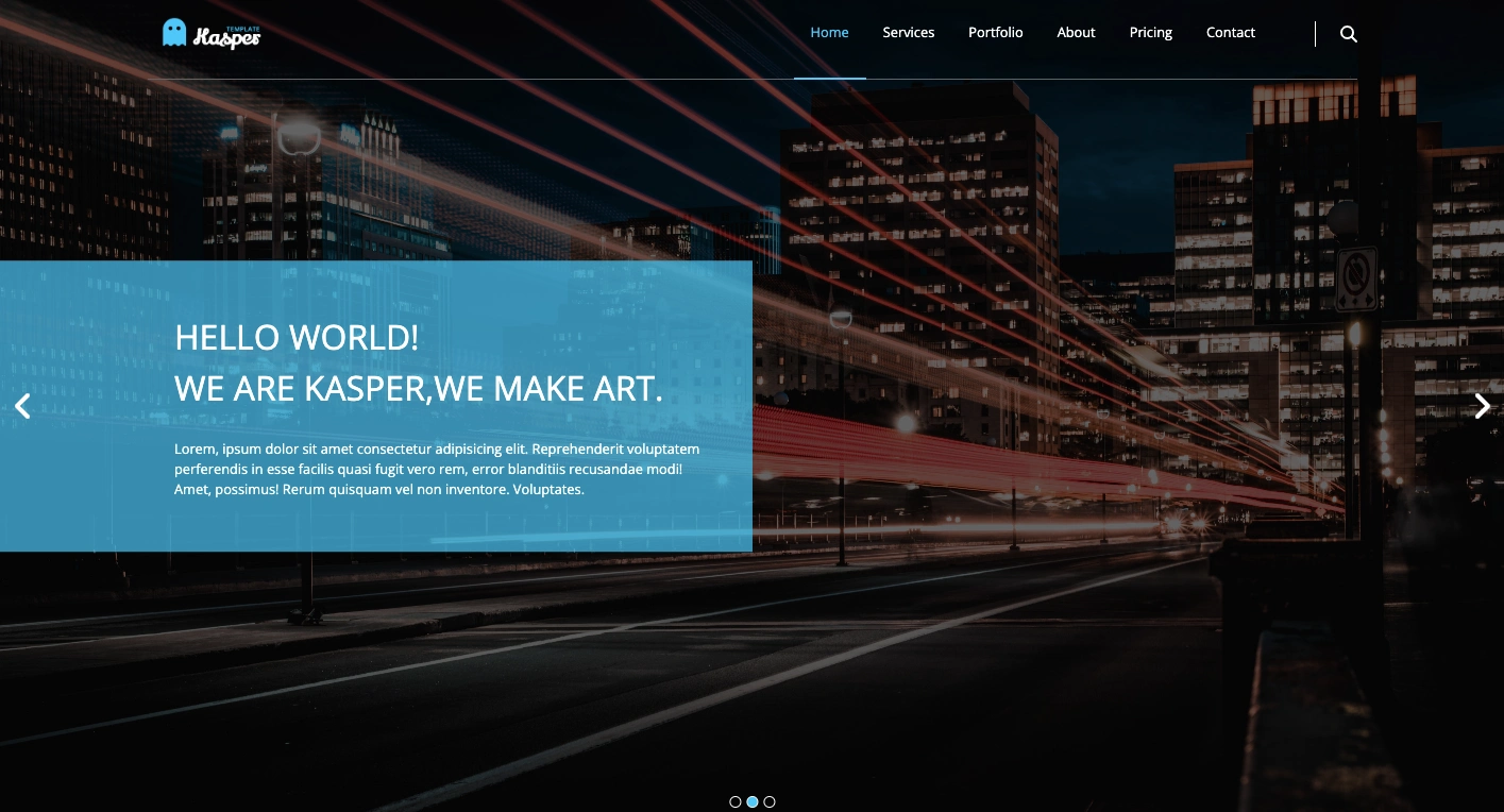
Kasper design
Table of contents
Overview
Description
The incentive of creating this project to demonstrate the uses of flex system combined with grid system, and to show the ability of doing that.
Using media quires to reach the maximum level of responding to various screen on different devices.
One of the problem I faced that how to manage using grid and flex system parallel to each other, whether vertically or horizontally so I used everyone of them depending on their auto flow.
Screenshot
Links
Live Site URL: Kasper - Design
My process
Built with
Semantic HTML5 markup
CSS custom properties
Flexbox
CSS Grid
jQuery - JS library
Setup
To run this project, install it locally using git clone or download it as a ZIP:
Like this project
Posted May 23, 2023
The incentive for creating this project is to demonstrate the uses of flex systems combined with grid systems and to show the ability to do that.
Likes
0
Views
13