Bloomly Landing Page Design

Devowise Studios


Petal Perfection — Crafting an Elegant Landing Page for a Modern Floral Brand
Overview
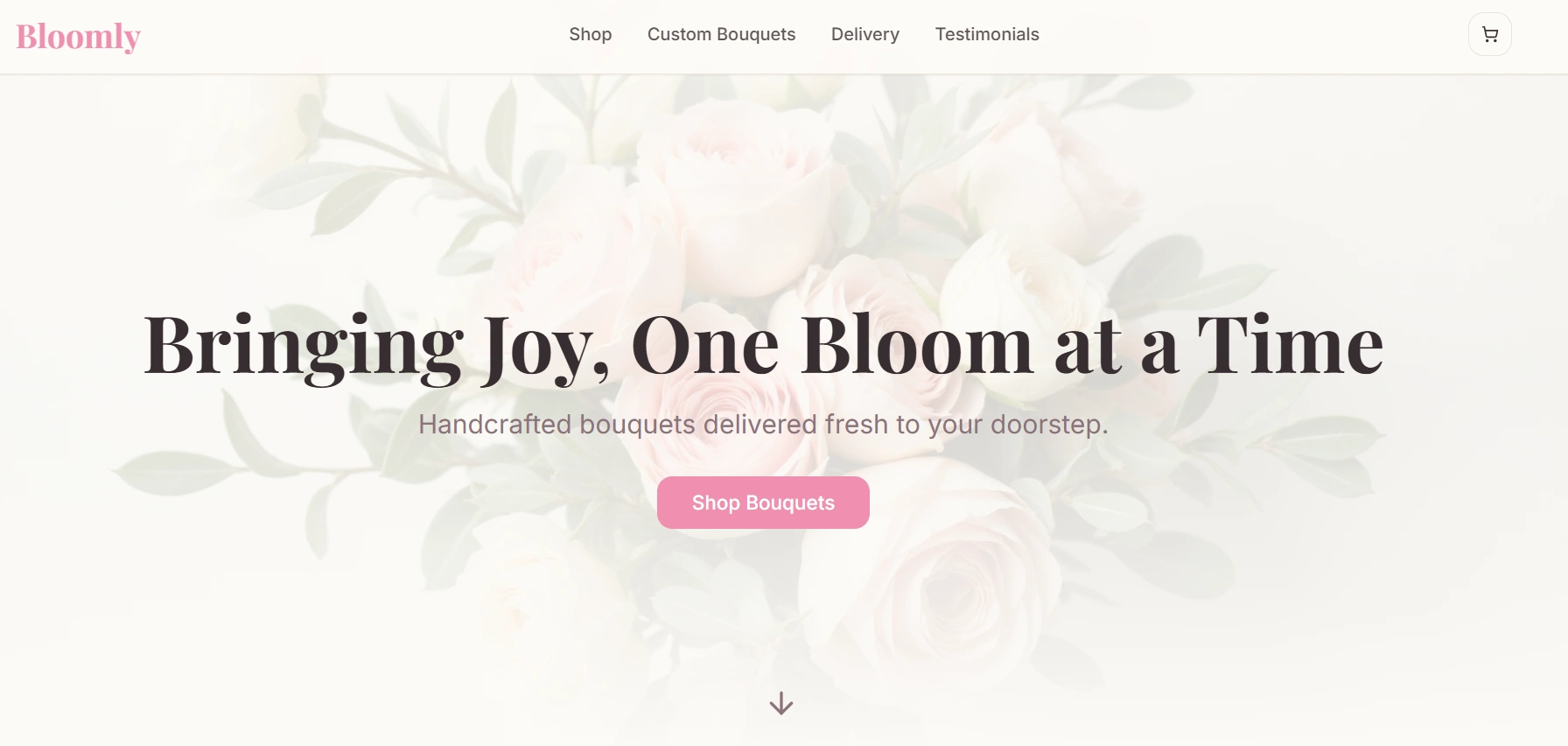
At Devowise Studios, we designed and developed Petal Perfection, a minimalist landing page concept created to capture the elegance, warmth, and freshness of a modern floral brand.
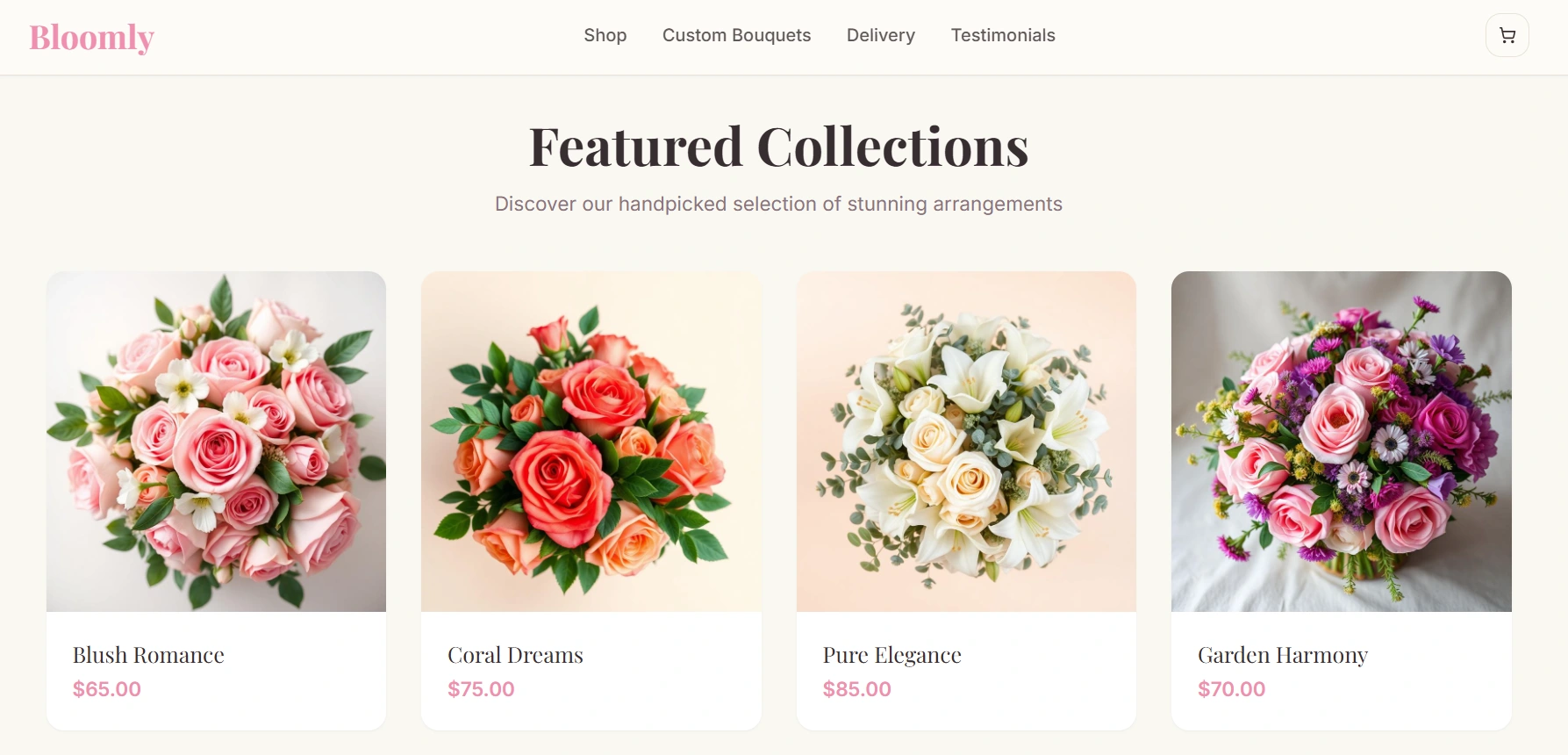
Our objective was to create a visually calming, conversion-focused experience that communicates quality and trust from the first interaction. Through thoughtful typography, soft color palettes, generous whitespace, and responsive layouts, we crafted a digital experience that allows the brand's products and story to take center stage.
The project emphasizes simplicity, visual storytelling, and performance—creating a landing page that feels both premium and approachable while encouraging user engagement.
The Challenge
Lifestyle and floral brands rely heavily on visual presentation to create emotional connections with their audience. The challenge was to design a website that felt elegant without becoming overly decorative, while maintaining clear messaging and strong conversion opportunities.
We set out to create a landing page that would:
Establish a memorable and trustworthy brand presence.
Showcase products and brand values through clean visual storytelling.
Guide visitors naturally toward key calls-to-action.
Deliver a seamless experience across desktop, tablet, and mobile devices.
Build a scalable foundation for future content and marketing campaigns.
Project Objectives
To achieve these goals, we focused on:
Creating a refined and modern visual identity.
Designing a clean information hierarchy for effortless navigation.
Improving engagement through thoughtful layout and user flow.
Developing responsive layouts optimized for every screen size.
Building reusable components for efficient content management.
Optimizing performance to ensure fast loading and smooth interactions.
Our Role
Our team managed the project from concept through development, including:
UX Strategy
Information Architecture
Landing Page Design
UI Design
Responsive Development
Component-Based Development
Performance Optimization
Accessibility Improvements
Quality Assurance
Deployment Preparation
Our Process
1. Discovery & Design Strategy
We began by defining the visual direction of the brand, focusing on elegance, simplicity, and approachability. Research into modern lifestyle and floral brands helped shape a design language centered around soft colors, balanced layouts, and clean typography.
The experience was structured around a simple user journey:
Discover → Explore → Build Trust → Take Action
2. Information Architecture
A clear content hierarchy was established to help visitors quickly understand the brand while naturally progressing through the landing page.
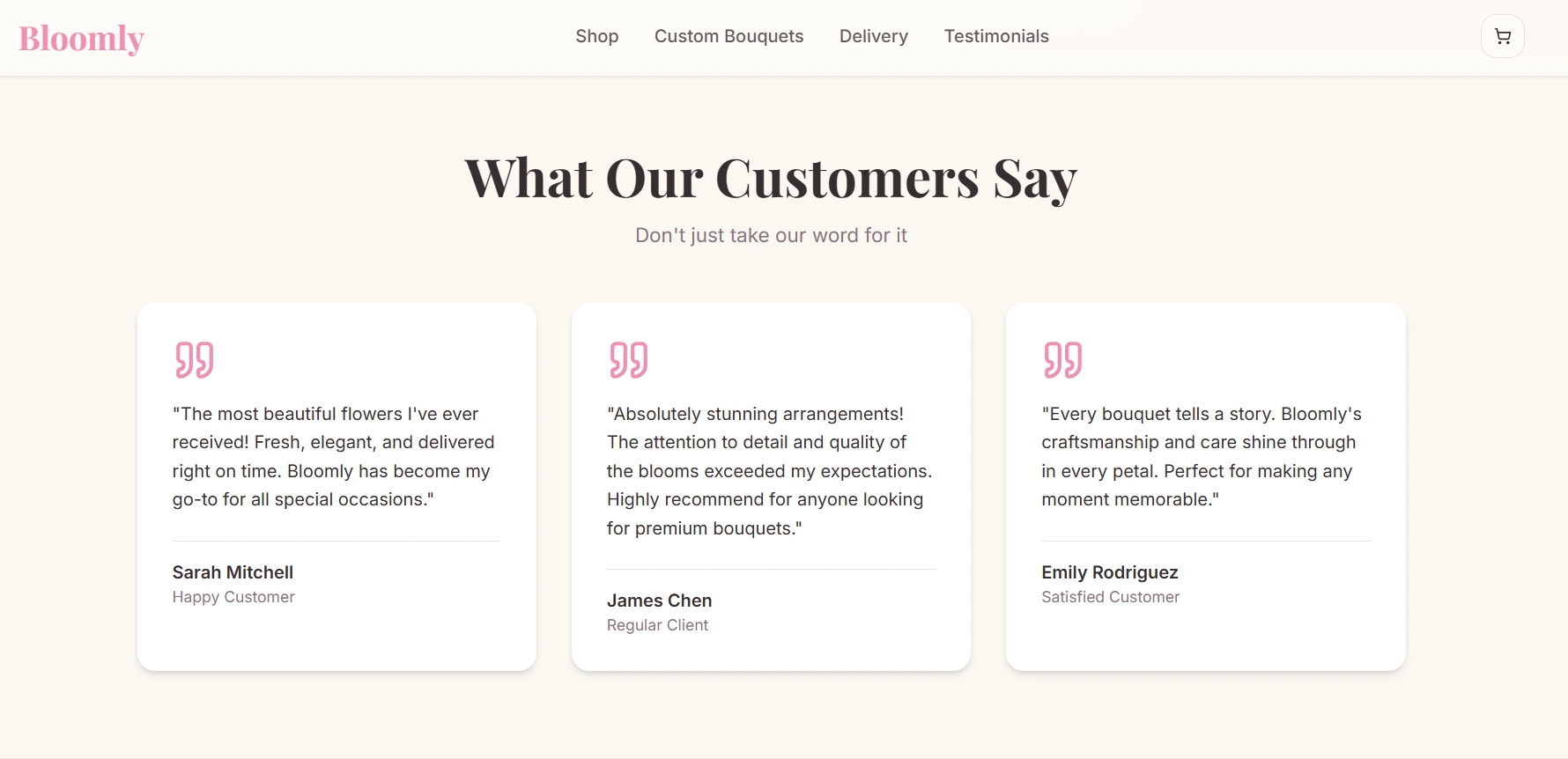
Content was organized into focused sections—including the hero, brand highlights, customer testimonials, and conversion-focused calls-to-action—to create a seamless browsing experience without overwhelming users.
3. UI Design & Development
The interface was intentionally minimal, allowing the brand's visual identity and messaging to remain the primary focus.
Key design decisions included:
Soft pastel color palettes that reinforce freshness and elegance.
Clean typography hierarchy for effortless readability.
Spacious layouts with generous whitespace.
Reusable UI components for consistency and scalability.
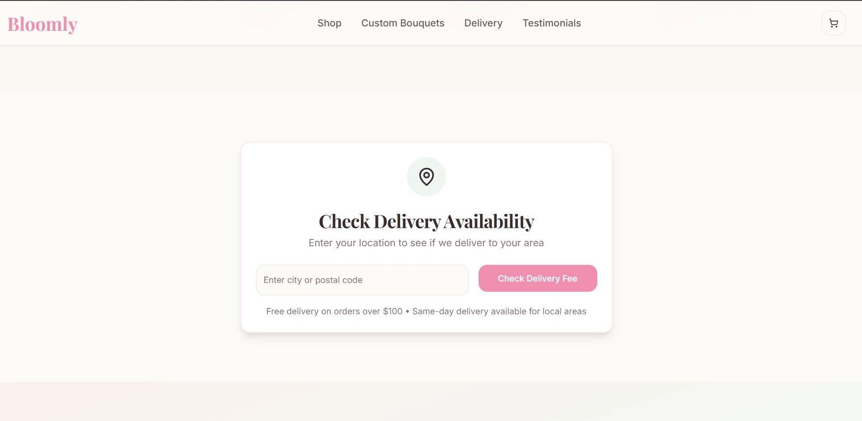
Strategic placement of calls-to-action to encourage engagement.
Responsive grid layouts that adapt seamlessly across devices.
Development was completed using Lovable.dev's component-based workflow, enabling rapid iteration while maintaining clean, scalable project architecture.
4. Performance & Responsive Experience
Performance and accessibility were prioritized throughout development.
Optimized images, lightweight assets, and responsive layouts ensure fast loading times and a consistent user experience across desktop, tablet, and mobile devices. Final testing focused on responsiveness, interaction quality, and visual consistency across multiple screen sizes.
Key Features
The completed landing page includes:
Elegant hero section with a clear value proposition.
Conversion-focused content structure.
Customer testimonials and trust-building sections.
Responsive layouts optimized for all devices.
Component-based architecture for scalability.
Optimized media assets for improved performance.
Smooth transitions and polished micro-interactions.
Accessible and maintainable code structure.
Flexible foundation for future marketing campaigns and content updates.
Technology Stack
Platform
Frontend
HTML
CSS
JavaScript
Design & Architecture
Component-Based Layout
Responsive Grid System
Global Styling System
Outcome
The final landing page delivers a refined digital experience that reflects the elegance of the brand while effectively guiding visitors toward meaningful actions.
Key outcomes include:
A polished visual identity that strengthens brand perception.
A streamlined user journey designed to improve engagement and conversions.
Faster development through reusable component-based architecture.
Responsive performance optimized across desktop, tablet, and mobile devices.
A scalable foundation that simplifies future content updates and marketing initiatives.
Key Takeaways
Petal Perfection demonstrates how thoughtful design, modern development workflows, and performance-focused implementation can transform a simple landing page into a compelling brand experience.
By combining minimalist aesthetics, responsive development, and a scalable component-based architecture, we created a landing page that balances visual elegance with usability—helping the brand connect with its audience while supporting long-term growth.

Like this project
Posted Nov 13, 2025
Designed a clean, elegant landing page for Bloomly on Lovable.dev, focusing on soft visuals, responsiveness, and a seamless modular experience.
Likes
1
Views
11