
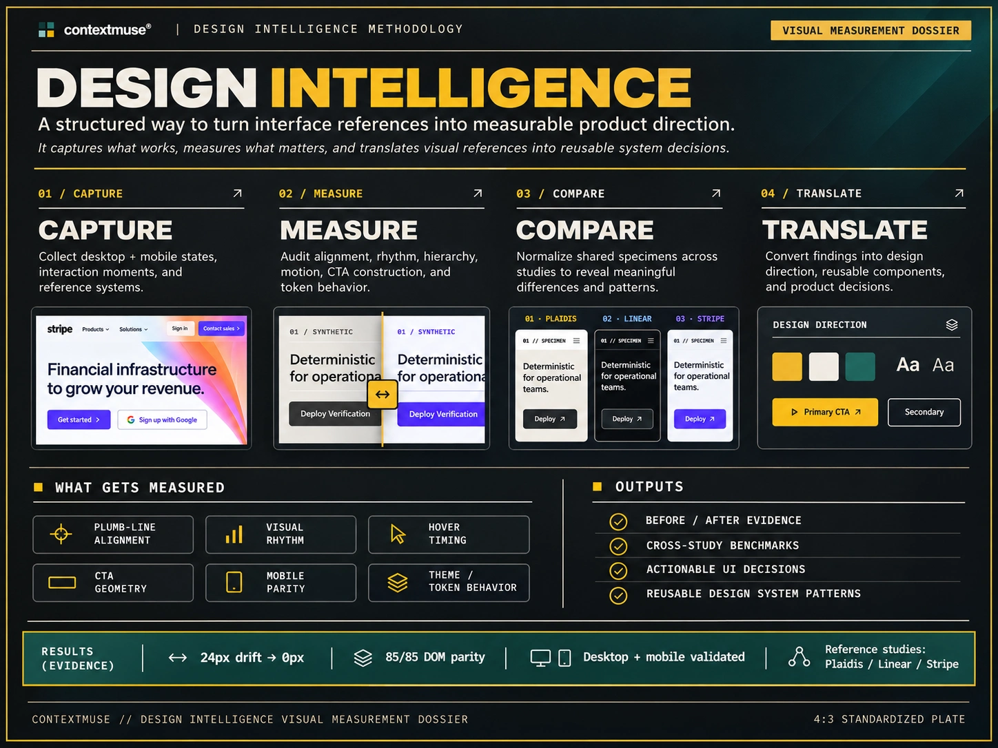
Design Intelligence
From Visual Reference to Measurable Design Decisions
Context & Muse | Design Research · Design Engineering · UI/UX · Front-End Architecture
Overview
Design is not a collection of preferences. It is a system of relationships.
Rather than treating established products as collections of visual inspiration, I developed a controlled comparative framework to investigate the mechanics behind three distinct design philosophies: Plaidis / Locomotive, Linear, and Stripe.
The objective was to move beyond subjective visual imitation and establish a repeatable process for extracting, testing, evaluating, and selectively implementing design principles.
The resulting research became both an interactive design laboratory and a production-facing design system improvement for Context & Muse.
Design Intelligence is an applied design research project examining how visual systems communicate through structure, motion, typography, surface treatment, spacing, and interaction.
The Challenge
Visual references are easy to collect. Understanding why they work is considerably harder.
A design can appear polished while relying on entirely different underlying mechanics: structural alignment, typographic hierarchy, surface contrast, spatial density, motion timing, or component relationships.
Copying the visible result without understanding those relationships often produces inconsistent interfaces and superficial design decisions.
I wanted to investigate a more rigorous question:
Can visual design principles be extracted from existing systems, tested against an identical interface, and evaluated before being introduced into a separate product's design language?
Research Methodology
I developed a five-stage research pipeline:
Reference Selection: Identify three systems with distinct and recognizable design philosophies.
CSSOM & DOM Extraction: Examine structural relationships, rendered styles, typography, spacing, surfaces, and interaction characteristics.
Controlled Specimen Testing: Apply extracted design mechanics to the same 85-node interface specimen.
Selective Production Transfer: Identify which principles improve Context & Muse and which should remain specific to their original systems.
Technical Verification: Validate structural consistency, contrast, responsive behavior, and implementation integrity.
This created a distinction between observing a design and understanding its underlying system.
Three Systems, Three Philosophies
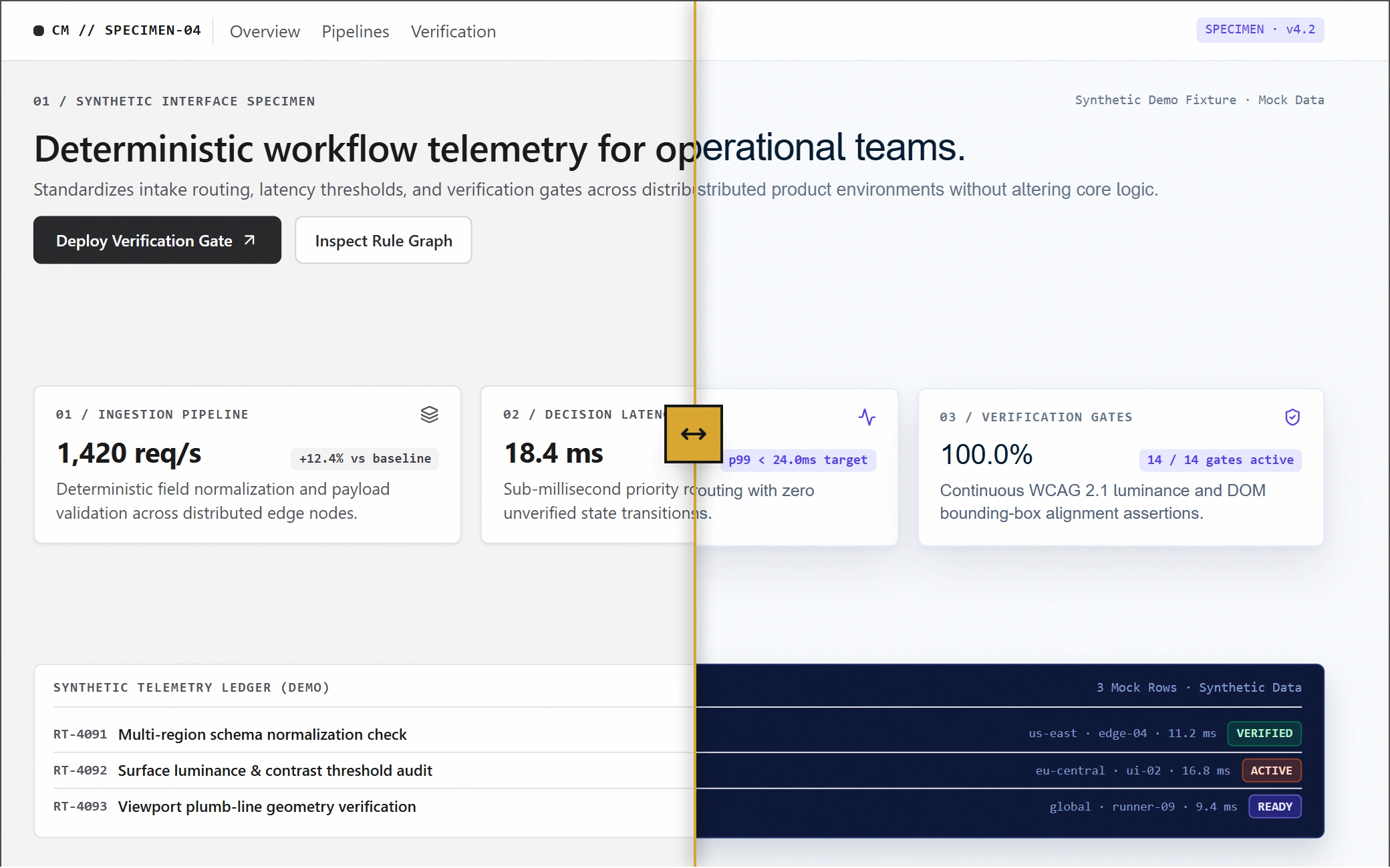
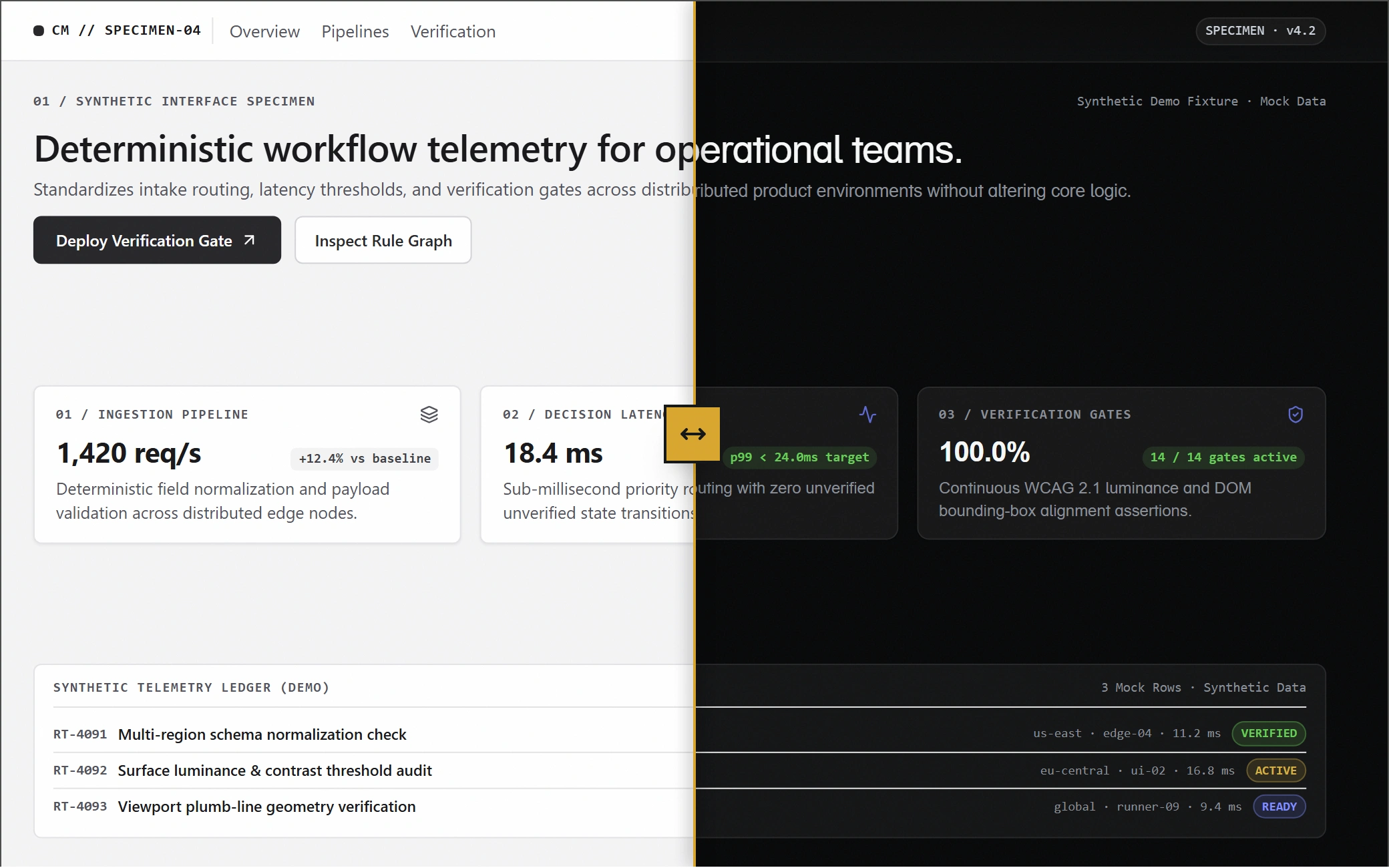
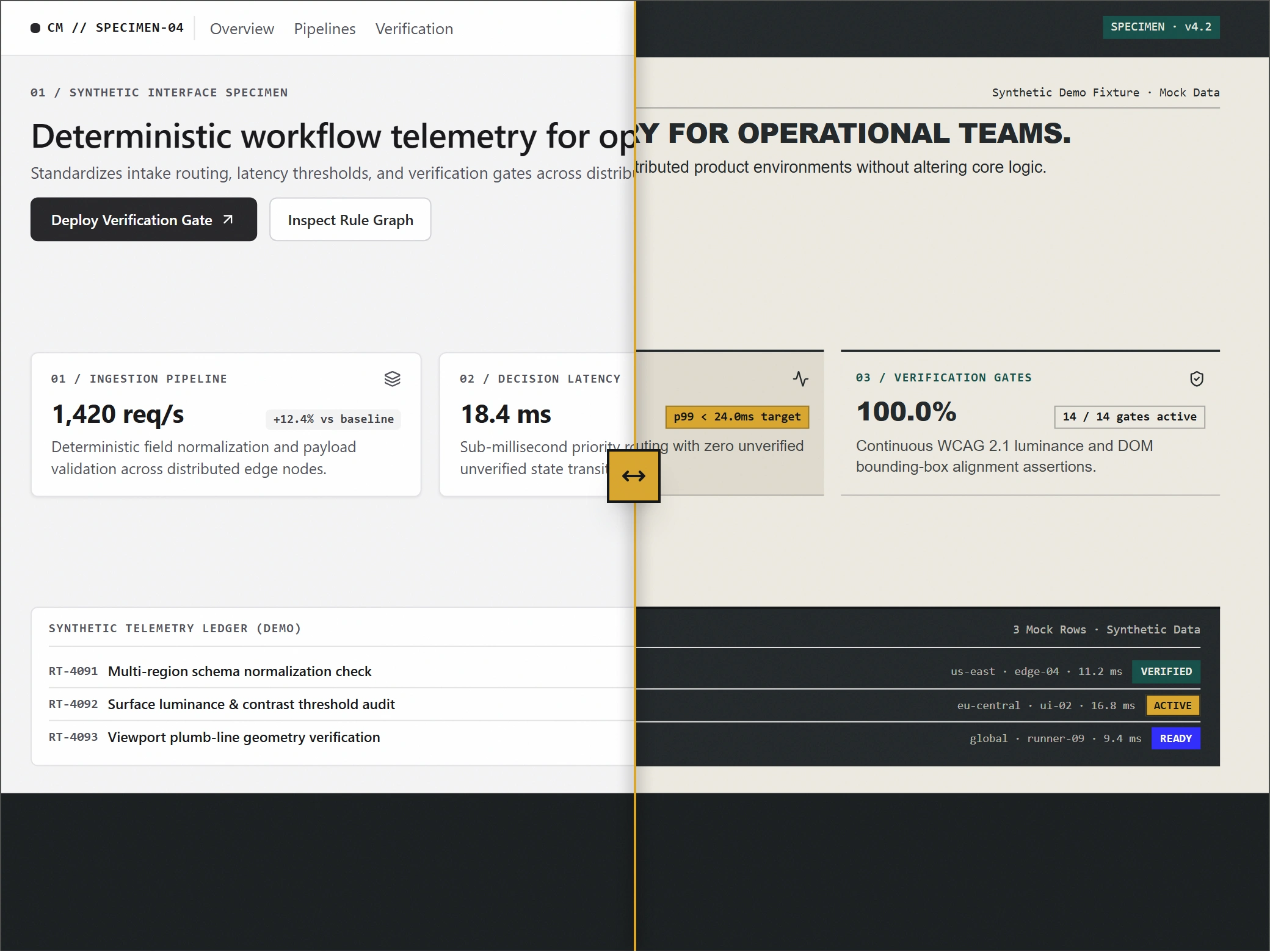
I examined three reference systems, each contributing a different architectural perspective.
01. Plaidis / Locomotive | Structure & Motion
Investigated exposed grid relationships, structural alignment, zero-radius geometry, asymmetric spacing, and differentiated entrance and exit motion.
Key observations included:
1px structural grid rules.
40px desktop and 20px mobile plumb insets.
0px corner radius.
450ms entrance and 200ms exit motion.
02. Linear | Density & Surfaces
Examined how layered dark surfaces, subtle luminance differences, typography weights, and restrained borders establish hierarchy without excessive visual separation.
Key observations included:
Stepped surface luminance from #08090A through #0F1011 to #141516.
Variable font weights of 510 and 590.
Subtle 1px borders using 6% white opacity.
03. Stripe | Light & Hierarchy
Investigated high-key surfaces, lighter display typography, spatial breathing room, and layered elevation.
Key observations included:
White and #F6F9FC surface treatments.
56px display typography at 300 weight.
-0.03em letter spacing.
Layered navy-tinted ambient and key shadows.
The objective was not to reproduce three brands. It was to understand three different approaches to organizing visual information.
The Controlled Experiment
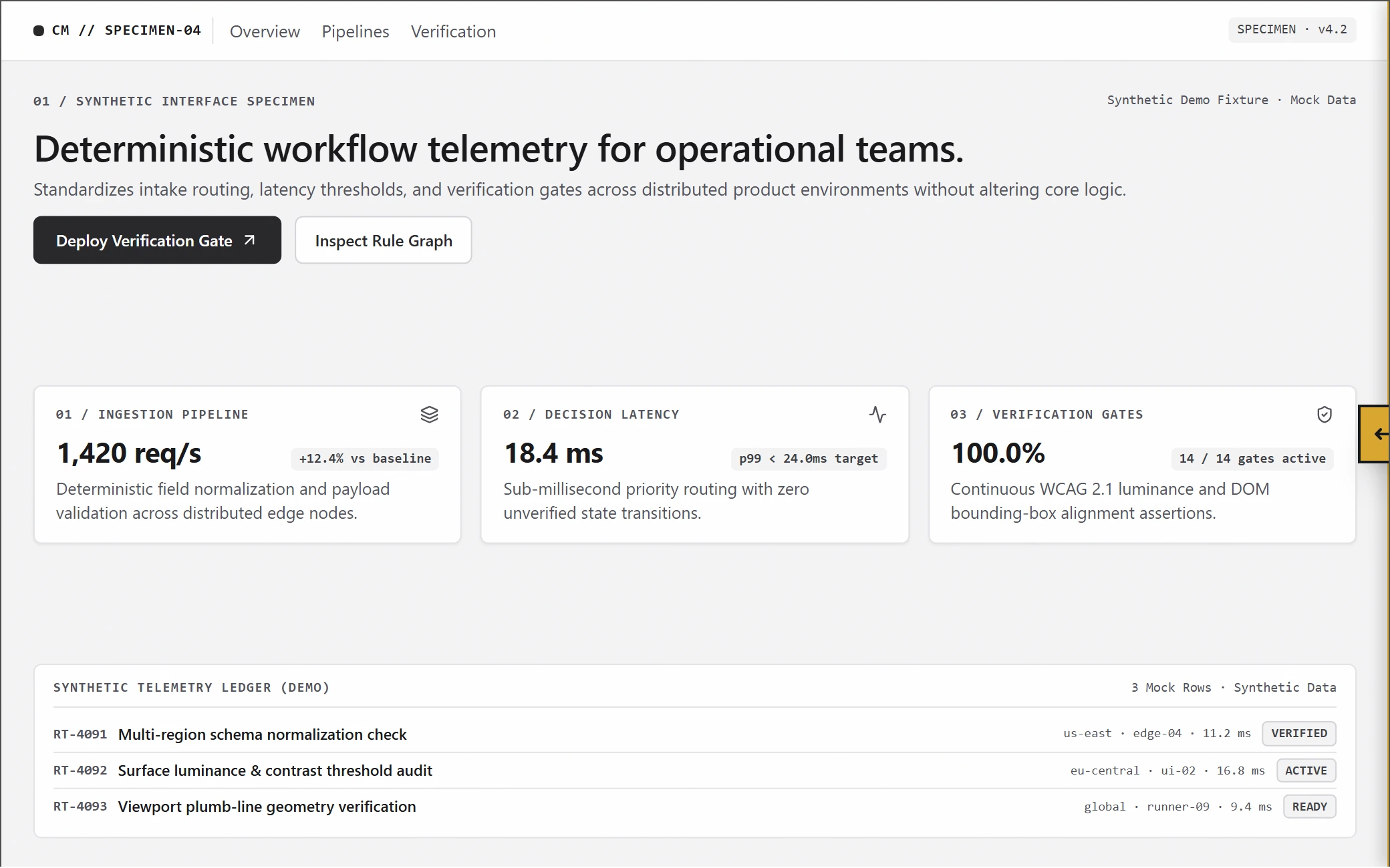
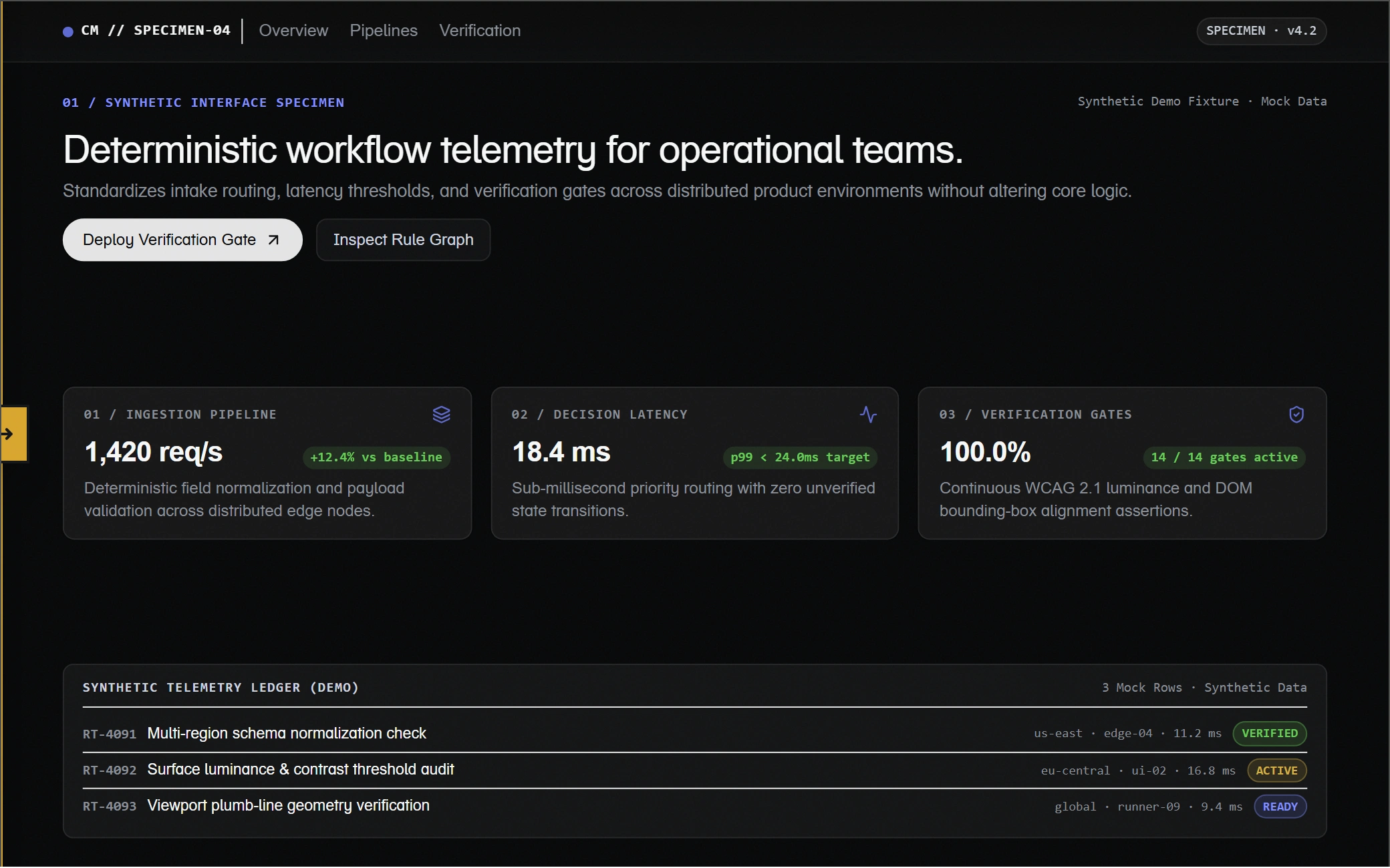
To make the comparisons meaningful, I developed a shared interactive specimen containing 85 identical DOM nodes.
Each reference system was applied to the same underlying interface, allowing the visual and structural differences to be examined without changing the content or component structure.
The research environment included:
Original, Split, and Transformed comparison modes.
A draggable 50% comparison slider with WAI-ARIA support.
Desktop and mobile specimen configurations (1440 × 900 and 390 × 844).
A contextual entrance-surface variation for the first study.
A full-screen Detail Inspector for examining implementation decisions.
This made it possible to distinguish changes in presentation from changes in underlying structure.
Instead of comparing three unrelated screenshots, I could evaluate how different design principles behaved when applied to the same interface.
Findings & Design Translation
The research produced a comparative design matrix, a four-pillar measured-effects analysis, and a provenance classification system spanning four categories (Class A–D).
I also incorporated live WCAG 2.1 contrast calculations, allowing proposed foreground and background combinations to be evaluated against measurable accessibility thresholds.
The production translation followed an important distinction:
Adopt the mechanics. Preserve the identity.
Context & Muse retained its established brand architecture:
Charcoal: #23282A
Warm neutral: #EDE9E0
Gold: #D9A62E
Deep green: #17504A
Structural principles, hierarchy, spacing, surface relationships, and other useful mechanics could be selectively adopted without importing the reference brands' visual identities.
This prevented the research from becoming an exercise in making one product look like another.
Technical Verification
The completed implementation was evaluated across seven viewport widths:
320px, 375px, 390px, 430px, 768px, 1440px, and 1920px.
Verification results:
85/85 identical DOM nodes across the controlled comparisons.
18/18 WCAG 2.1 contrast swatches passed.
11/11 implementation smoke gates passed.
0px horizontal overflow across all seven tested viewport widths.
02 controlled specimen viewport configurations.
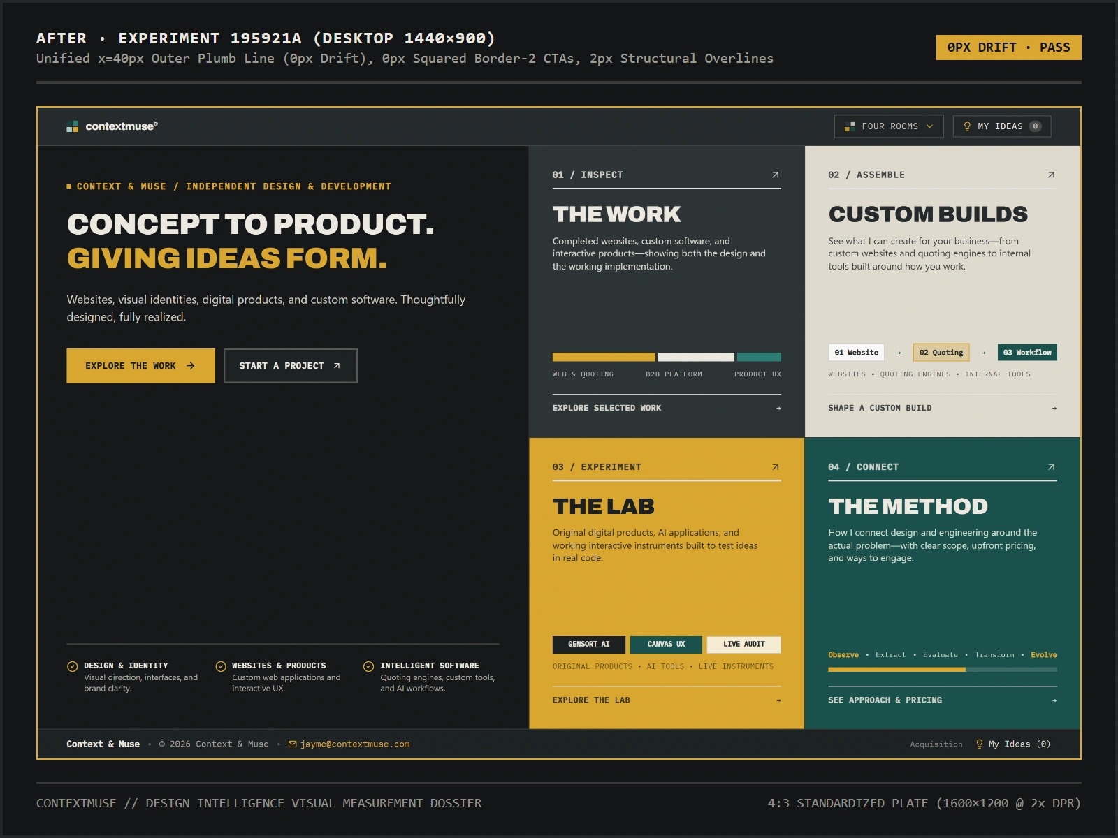
Production changes were documented with before-and-after implementation references, including commits
52e179d and 195921a.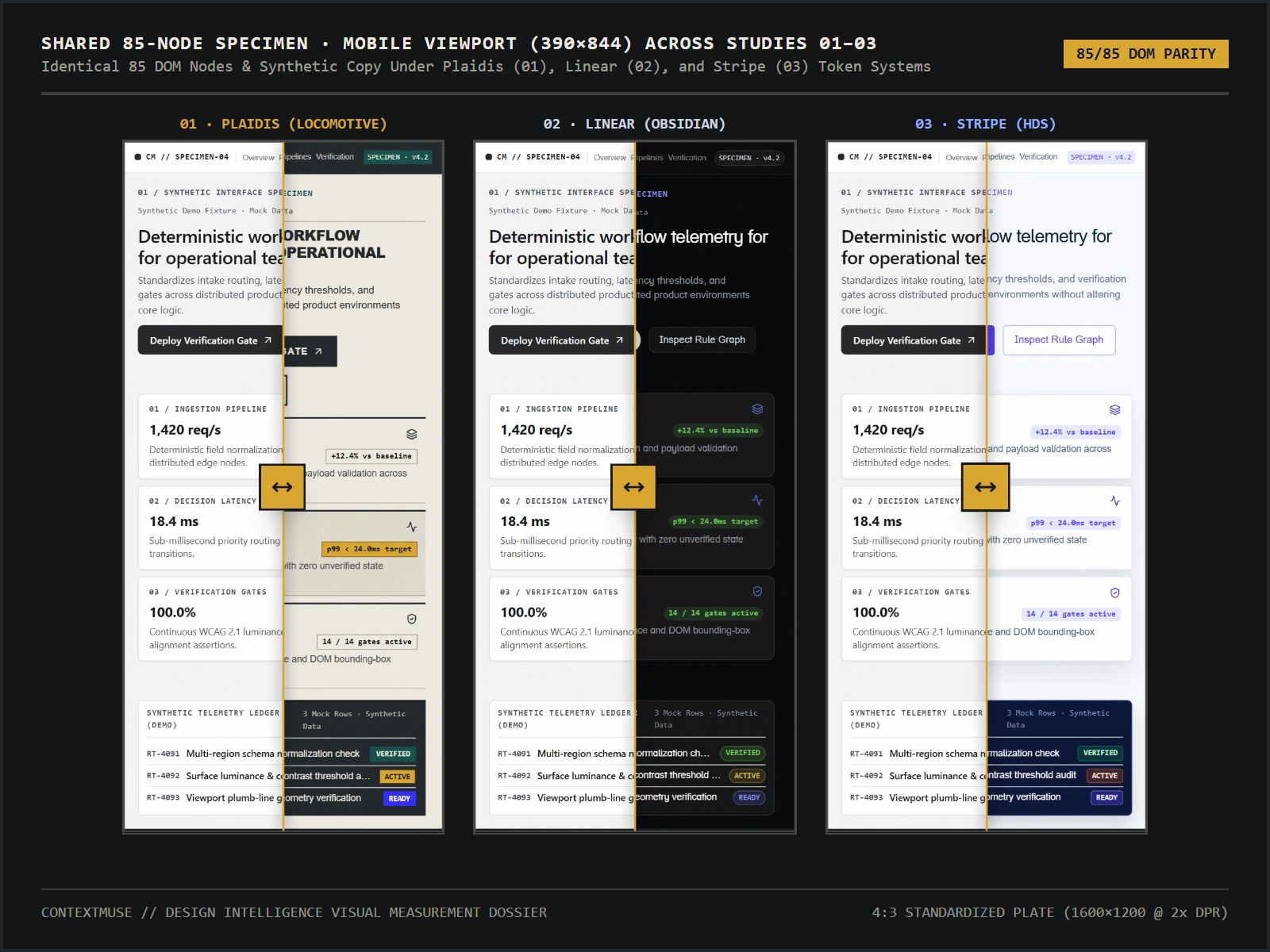
Outcome
The project transformed design research into a repeatable engineering process.
It produced an interactive comparative research environment, an inspectable design specimen, a measured design-token analysis, and a documented production implementation.
More importantly, it established a practical distinction between visual imitation and structural understanding.
The resulting methodology is applicable beyond this particular project: design engineering, product design, UI/UX architecture, design systems research, and front-end development can all benefit from treating visual decisions as relationships that can be investigated rather than preferences that must simply be defended.
Design is not about reproducing what works somewhere else. It is about understanding why it works, determining whether those principles belong somewhere new, and proving that the translation holds together.
0 likes · 3 views · Nov 15, 2026
An applied design research project that tests visual principles from reference systems against a shared interface


