HomeScape; Home - Rental Website

Tevin Wright
Web Designer
UX Designer
Figma
Google Docs
Google Slides
Project Overview
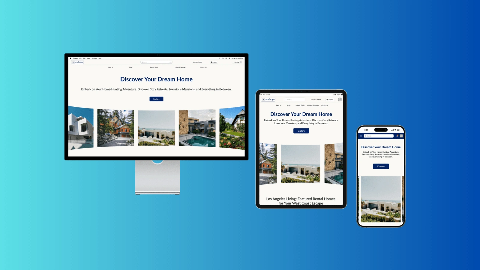
HomeScape is a modern and user-centric rental-home website. HomeScape caters to a diverse range of users, including young professionals, families, and retirees, who are in search of rental homes that align with their unique needs and preferences.
My Role
Product Designer
Project Duration
March 2023 to May 2023
The problem
Available home-rental websites have outdated designs, inefficient systems for browsing through products, and confusing main user flow.
Research Origins: Unveiling Insights
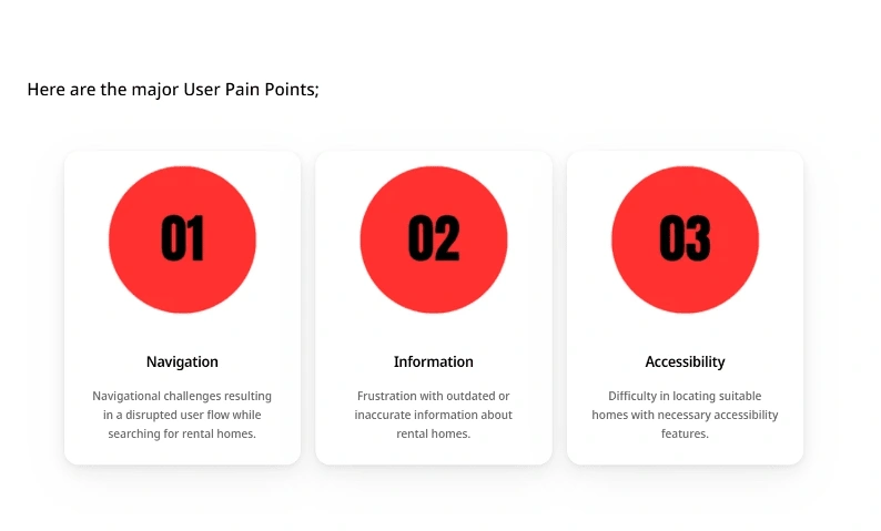
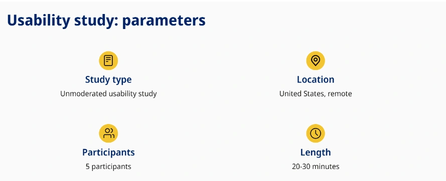
User interviews were conducted with a diverse individuals seeking rental homes , with analyzing their responses. Assumptions were made regarding user behaviors, pain points, and preferences prior to the research. However, through the interview process, these assumptions evolved as valuable insights were gained.
User Personas: Understanding the Needs and Goals
Understanding users is key to delivering an exceptional web experience. Through insightful interviews, I crafted user personas to embody the needs, desires, and behaviors of the target audience. This persona has a fictional character who represents a composite of real users, ensuring that the design decisions align closely with their goals and expectations.

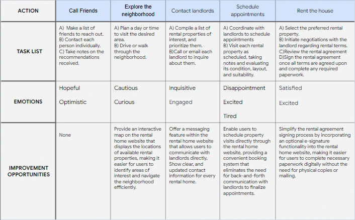
User Journey: Mapping the Pathways of User Experience
I created a user journey map which is a series of experiences a user has as they achieve a specific goal, to help identify improvement opportunities .

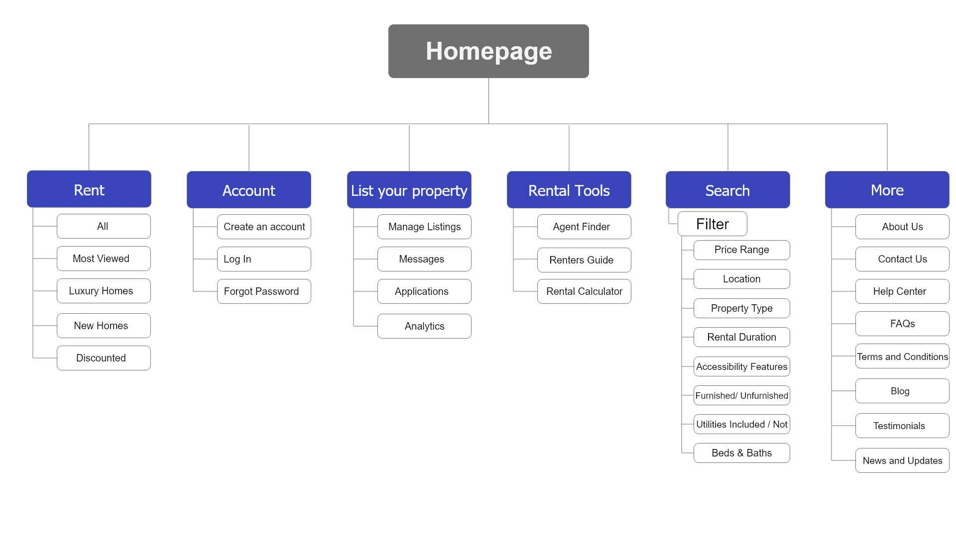
IA and Sitemap: Structuring the Website for User-Friendly Navigation
IA (Information Architecture) and sitemap section details how to organize the content and structure of our website to ensure intuitive navigation for users.

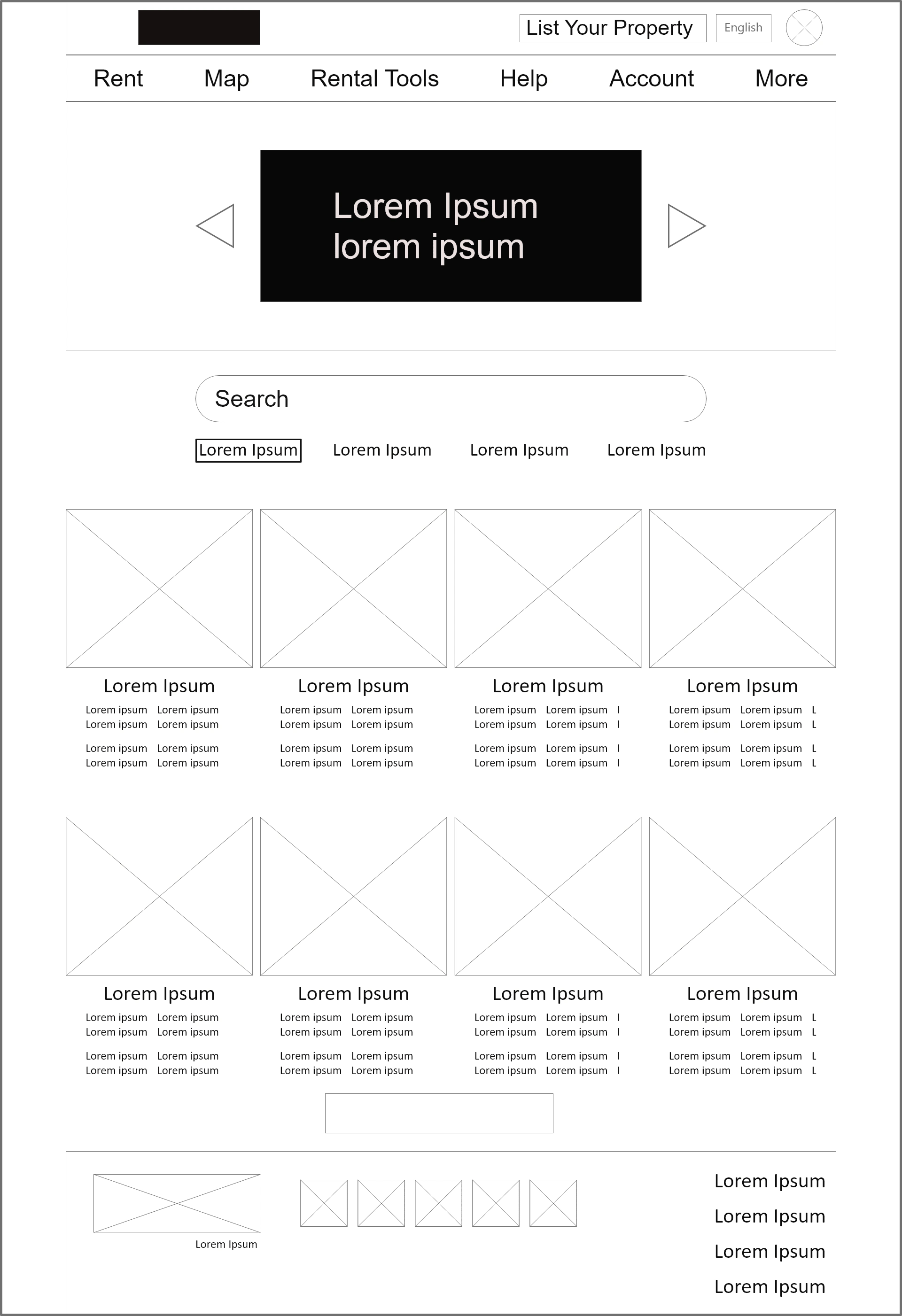
Digital Wireframes: Transitioning from Paper to Pixels
In digital low-fidelity wireframes, I sketch out the basic blueprint for our website's user interface, focusing on content placement, navigation elements, and overall flow. By keeping the design simple, so it can be quickly iterated and gather feedback on the usability and functionality before diving into more detailed design work.
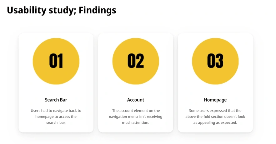

Lo-Fi Wireframe
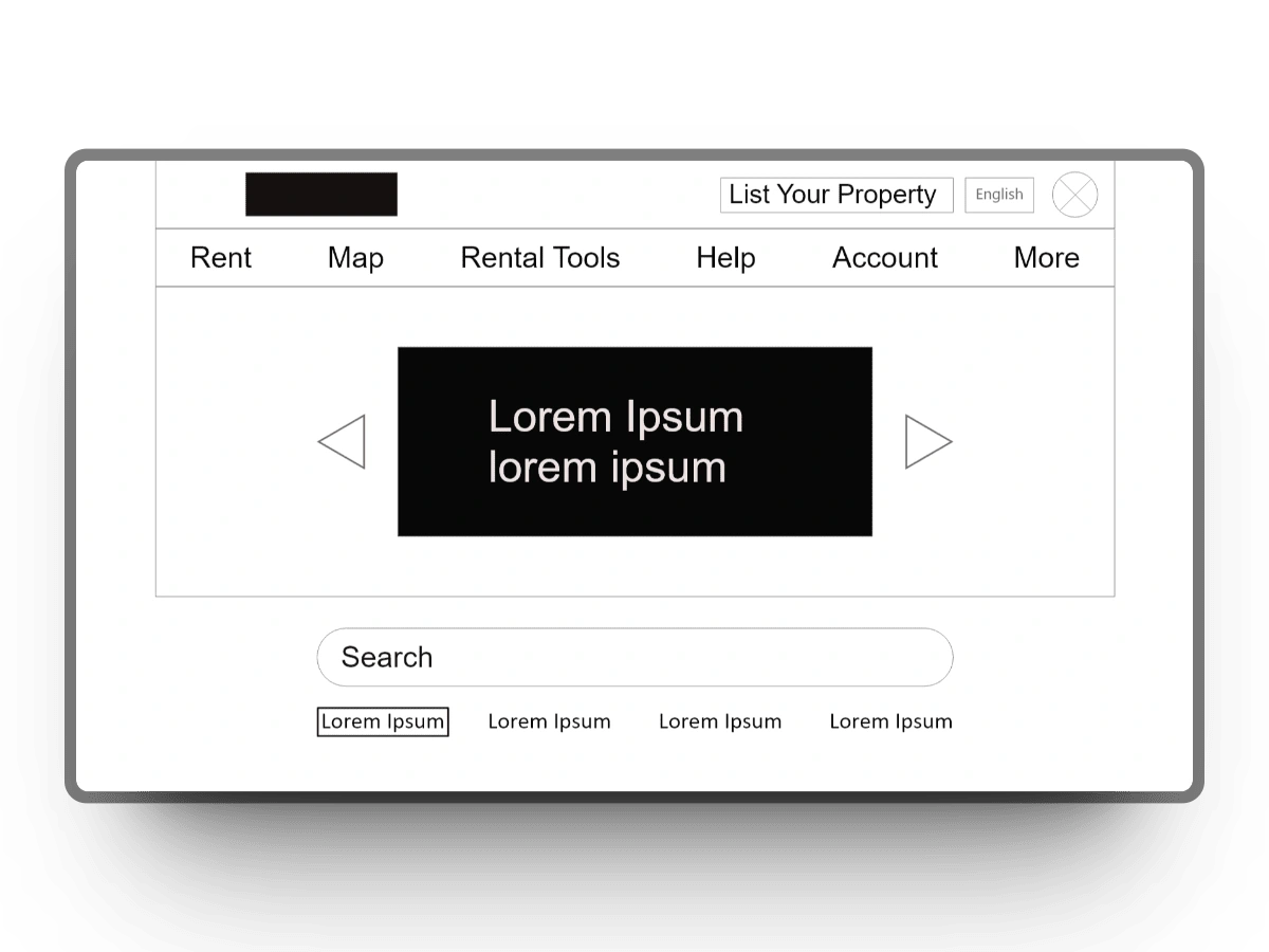
Hi-Fi Mockup
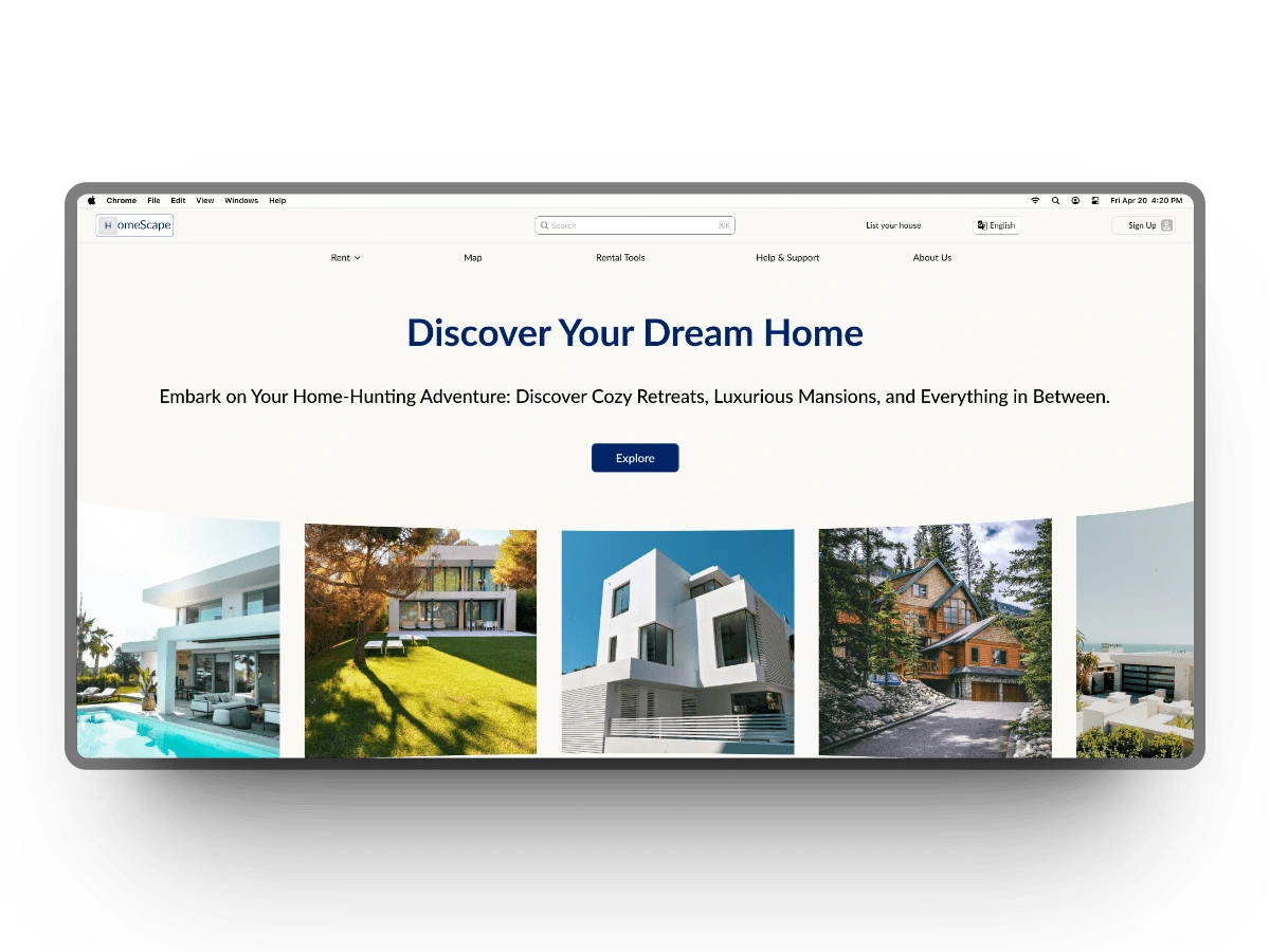
Final Design Showcase
Desktop Version
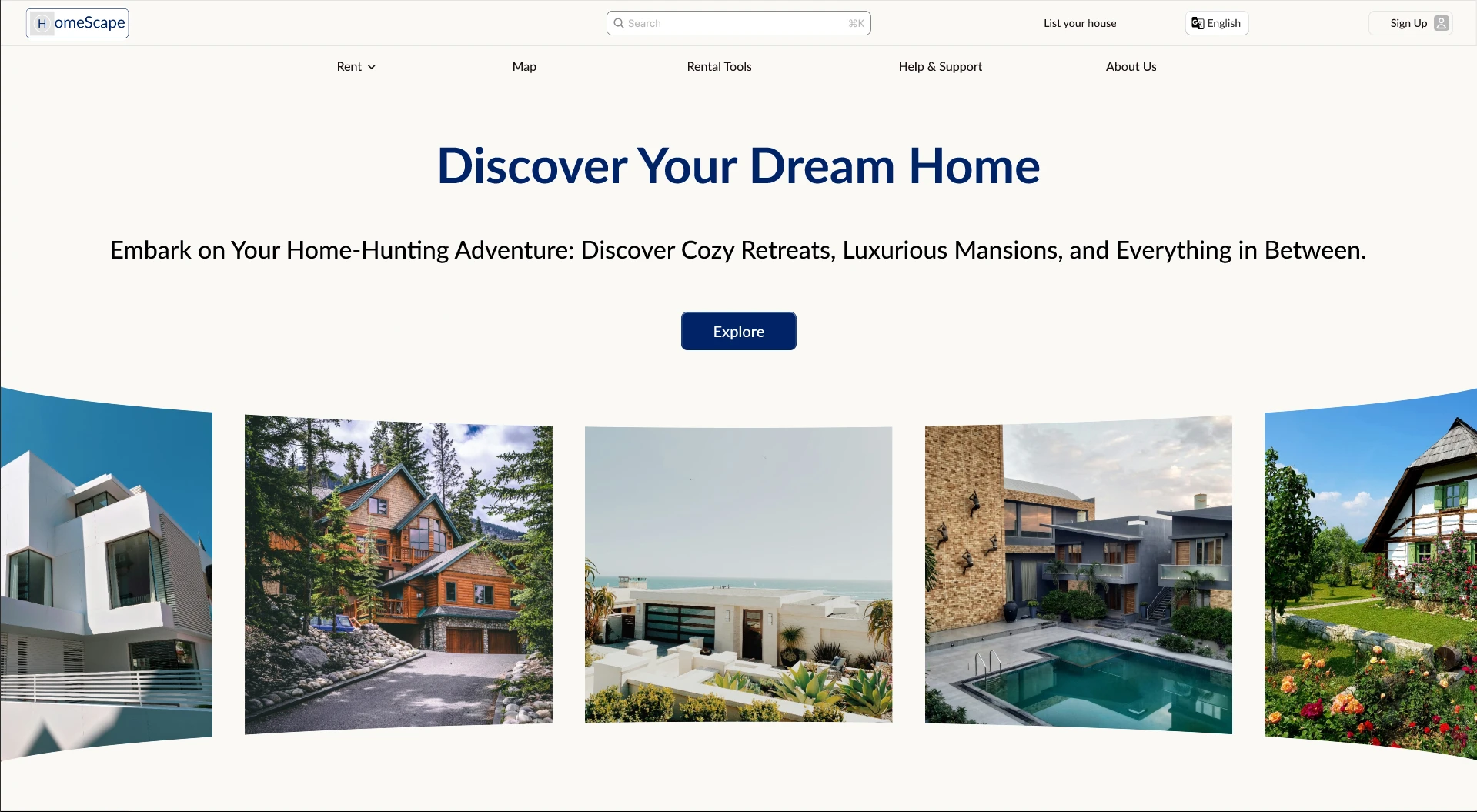
Above the Fold
Footer

Blog Posts

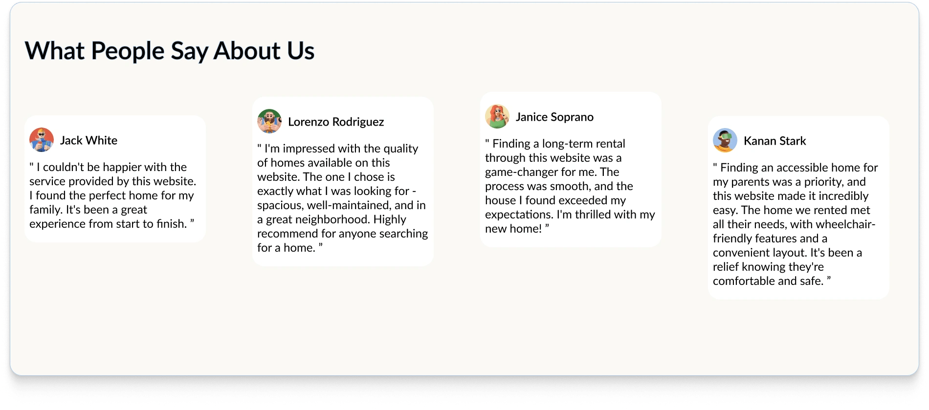
Reviews
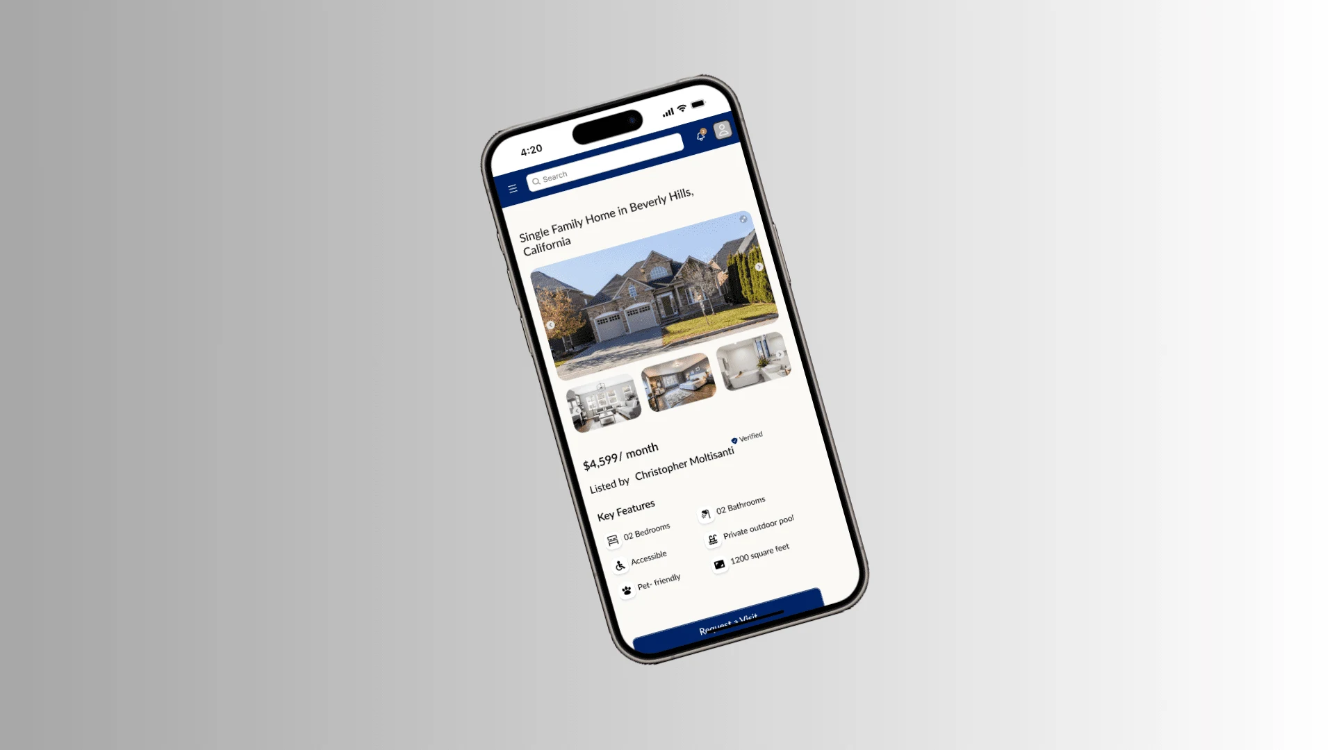
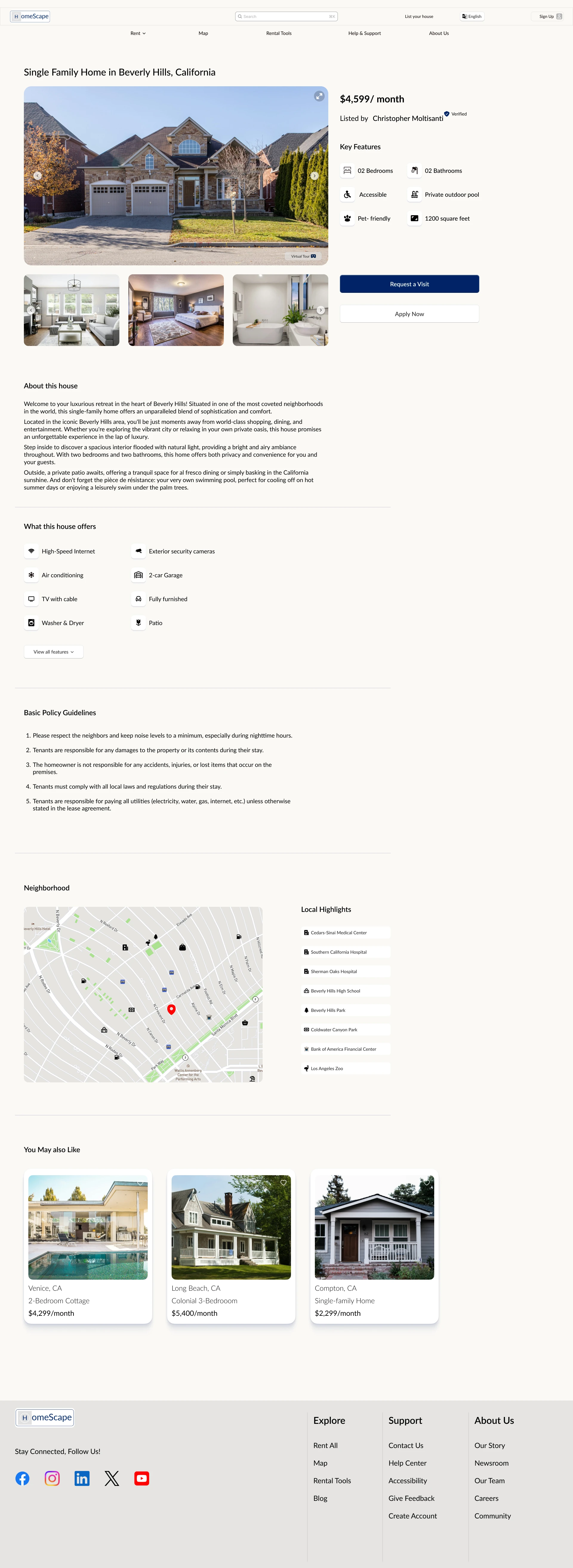
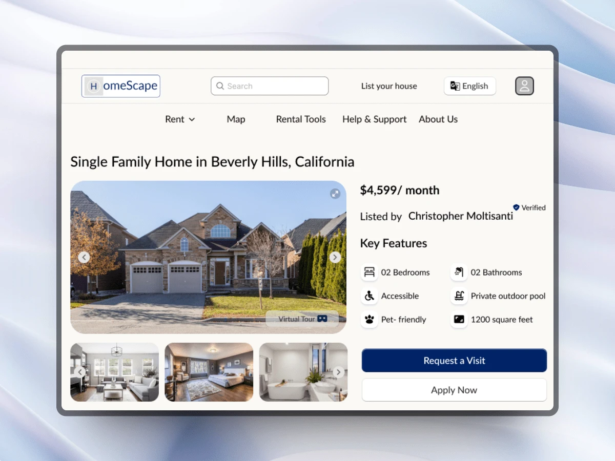
Selected House Page
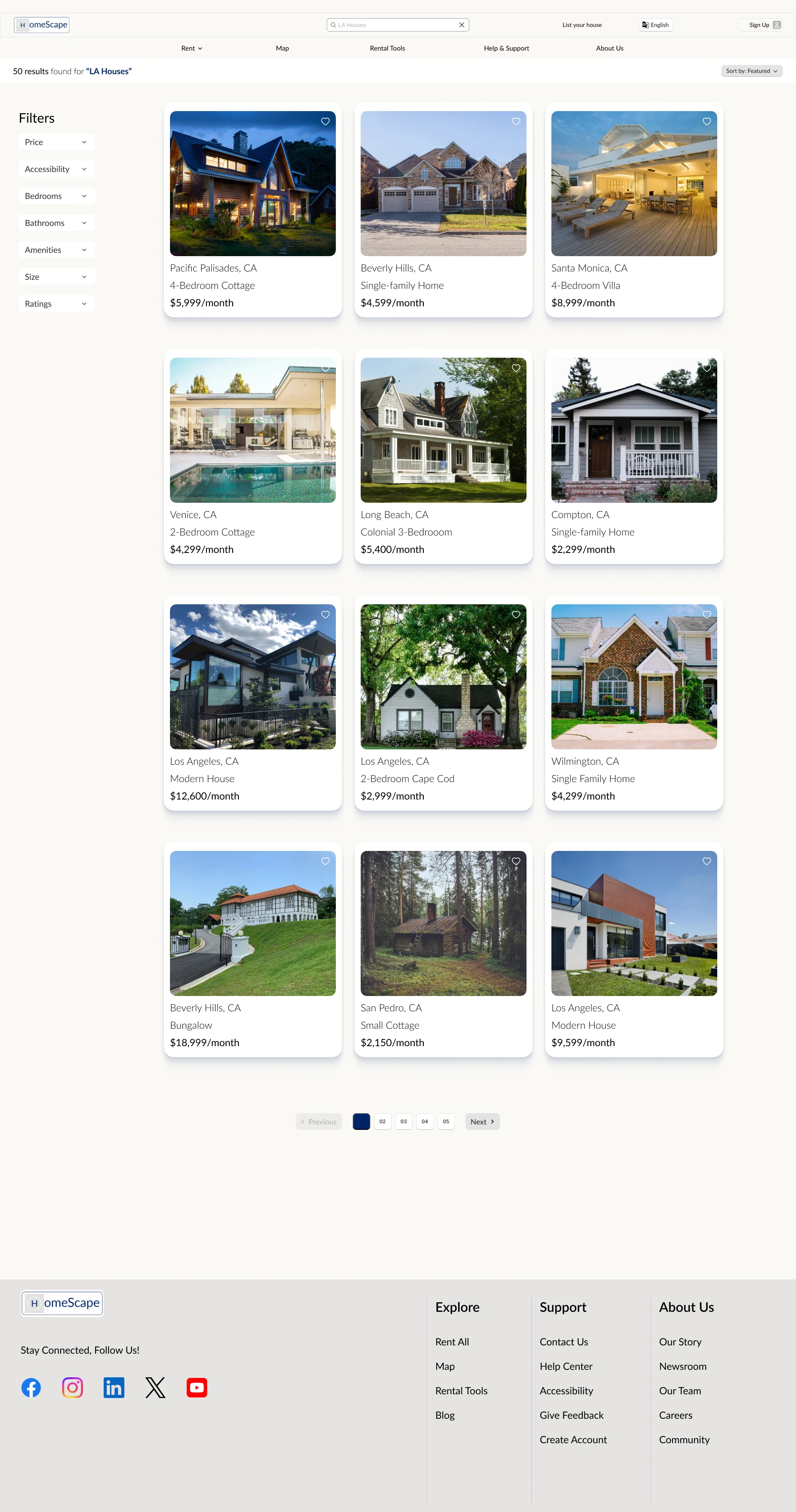
Search Results
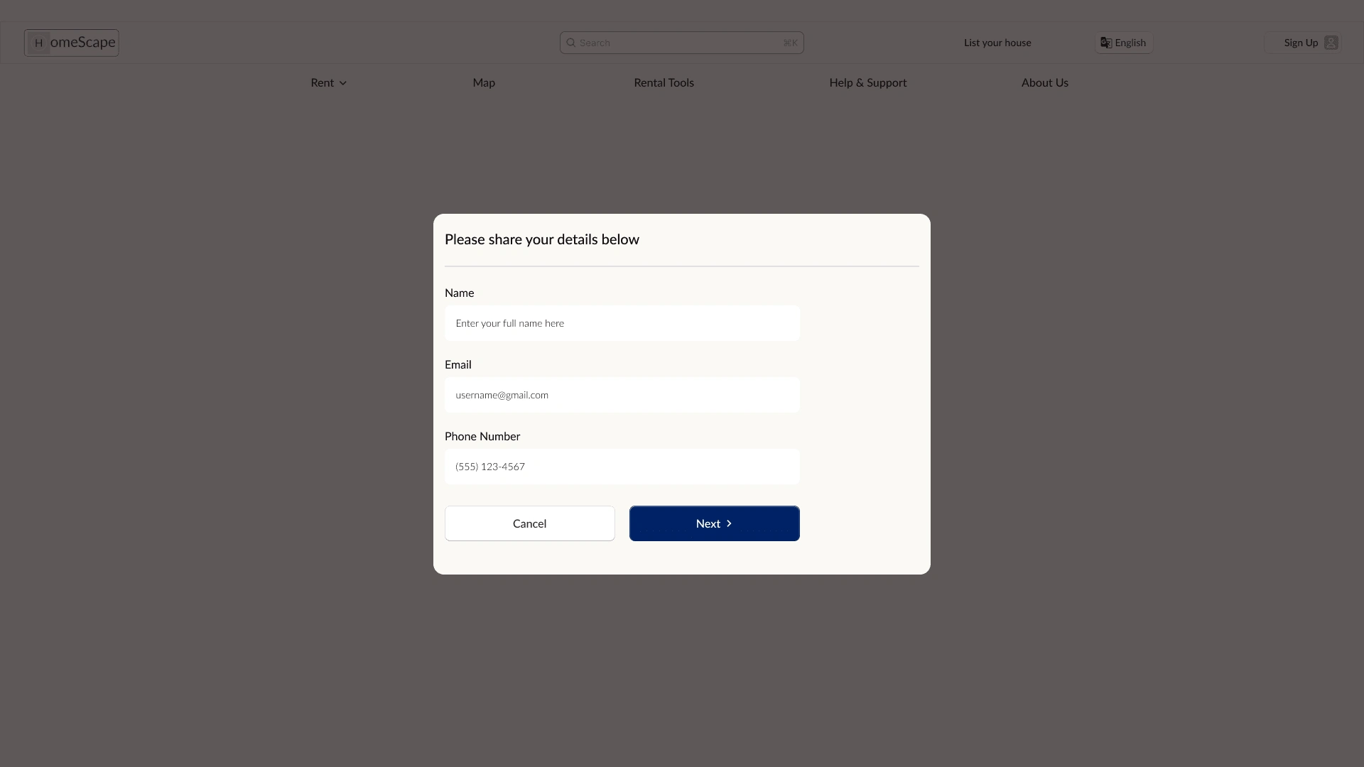
Application
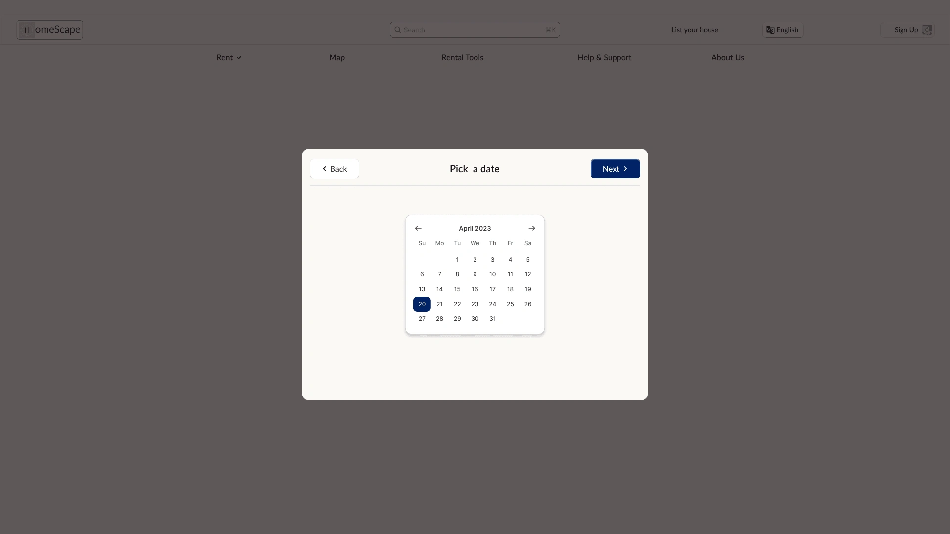
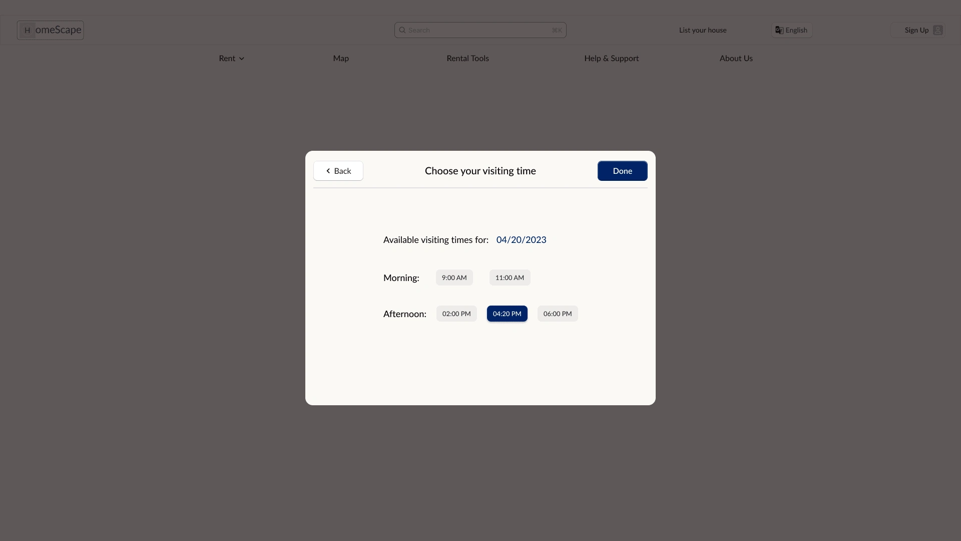
Tablet & Mobile Variations
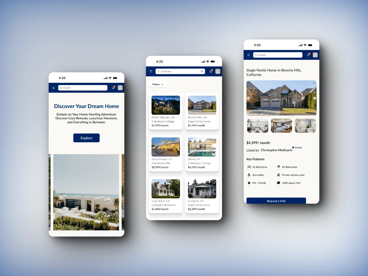
Outro
Users shared that the design was intuitive to navigate through, more engaging with the images, and demonstrated a clear visual hierarchy. I learned that even a small design change can have a huge impact on the user experience. The most important takeaway for me is to always focus on the real needs of the user when coming up with design ideas and solutions.


