Built with Framer

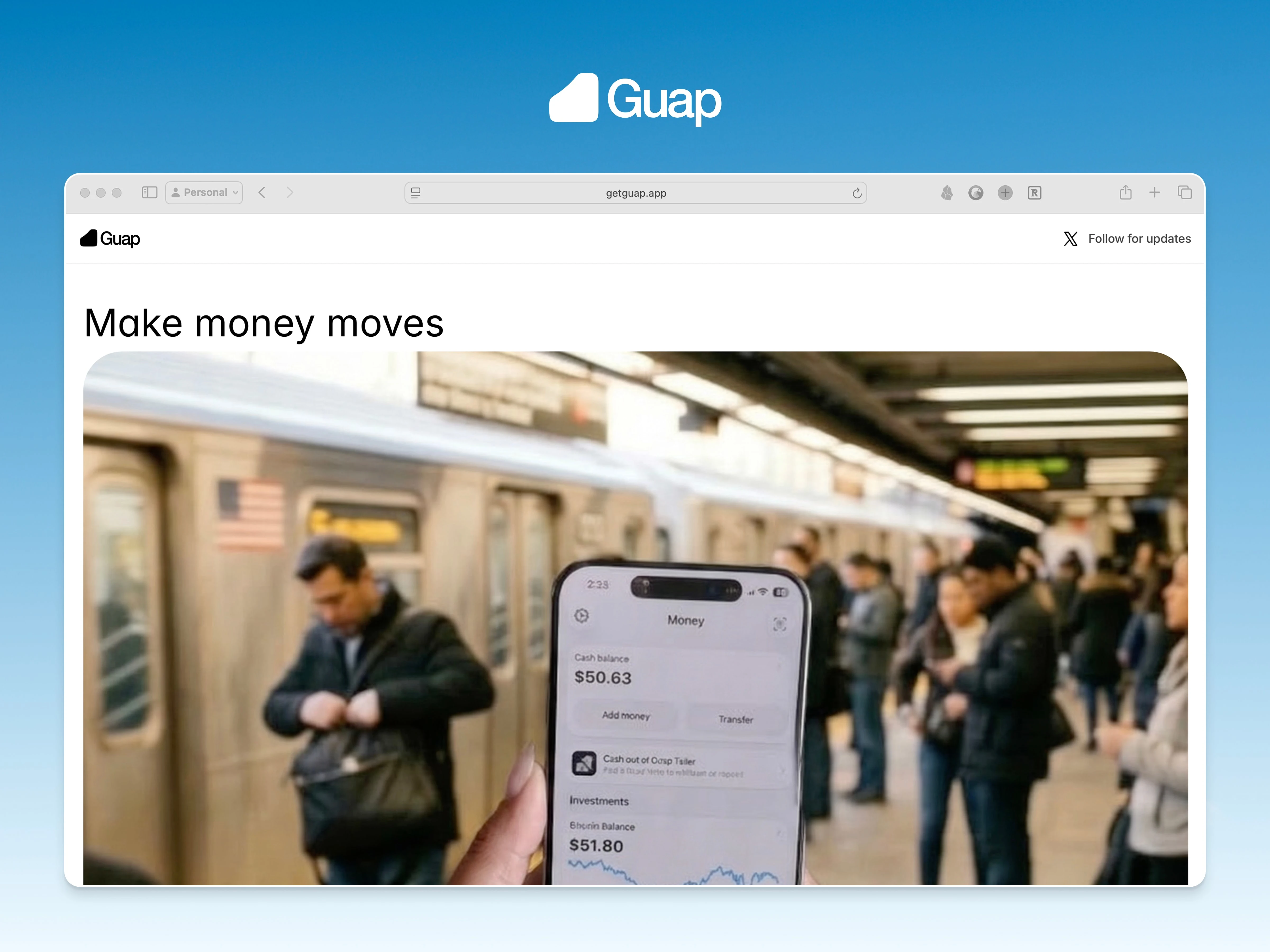
Guap
Framer site for a fintech startup – designed, built, and launched in two days.
The brief
Guap came in pre-launch with no site and no content. They knew what they liked – Cash App's clean, modular layout – and needed to move fast. The goal was a site that communicated the product clearly and felt polished enough for early investors and users.
Groundwork
I decided on Framer early. For a client still shaping their product, building and iterating in the same tool is a real advantage. There's no handoff between design and build, so feedback loops stayed tight and changes landed the same day. I could adjust a section in the morning and have it live by afternoon.
I laid out a basic wireframe first to test content placement and structure before committing to the visual direction. I did this in Figma. Once the layout felt right, I moved straight into Framer to build.
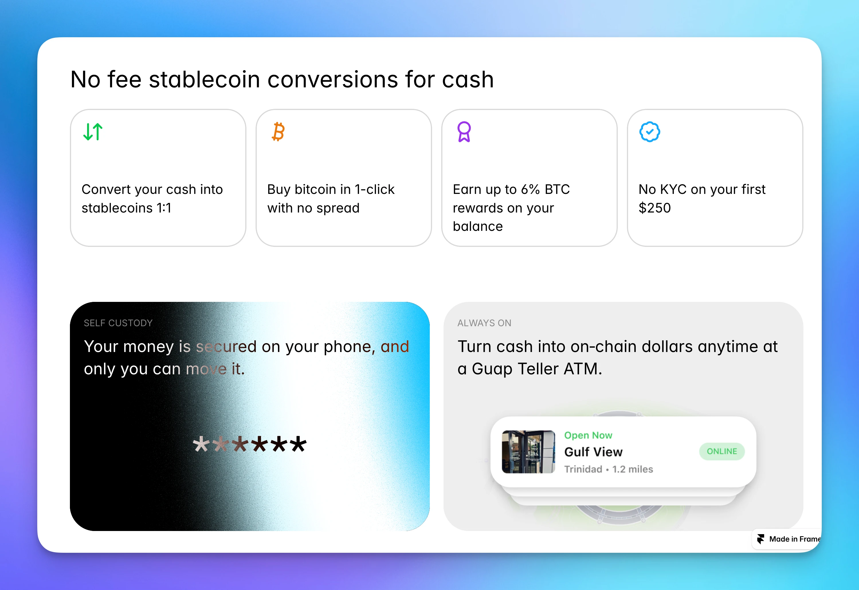
I chose card components as the organizing system. Each card holds one idea and one visual – self-contained, easy to rearrange as messaging evolves. For a startup still figuring out how to talk about their product, that flexibility matters. The layout works now and scales with the company.
Motion
Rather than a purely static site, I added light touches throughout: hover states, subtle transitions, small moments of feedback. The brief called for something that felt alive – not a brochure, but not a distraction either. The interactions signal craft without getting in the way.
Delivery
Designed and built in two days. Tweaks and light iterations over the following week as the client reviewed and refined the messaging. They were happy with the result given the timeline – a polished, functional site from nothing in under ten days.
1 like · 25 views · Apr 15, 2026
Framer site for a pre-launch fintech startup. No existing content, no system. Designed and live in two days.

