Contacts+ Pricing Page redesign
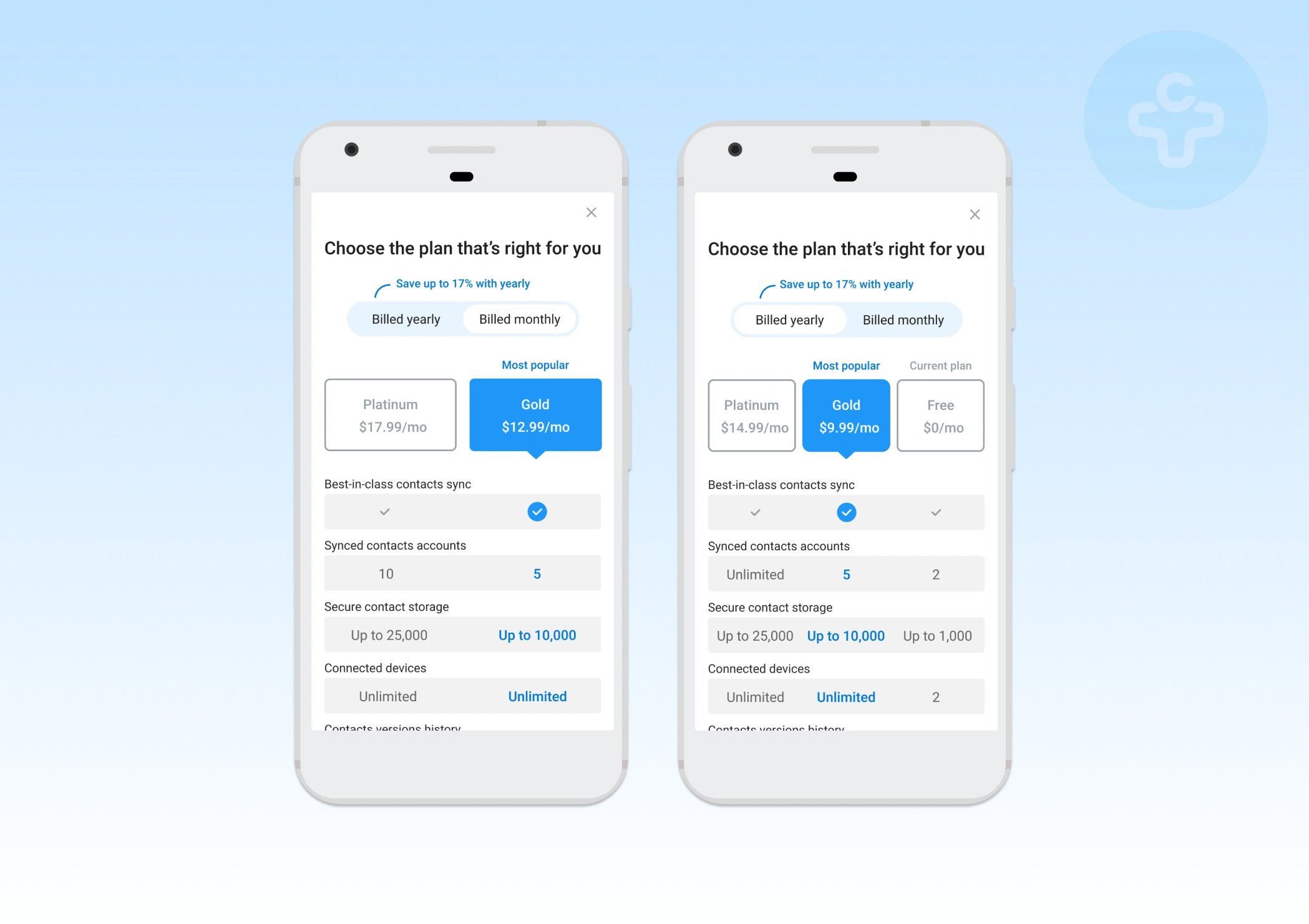
Was going through my folders and found some of the onboarding redesign i did whilst at Contacts+. My biggest focus was mobile experience and here you can see designs for the Android app. You can two ideas - one where free plan is shown and one without.
What would I do differently? 🤔 Definitely there should be a pinned upgrade button once the plan is selected and also Free plan should be on the left IMO.
Like this project
Posted Jan 27, 2021
Likes
0
Views
61
Tags

