Lisbon is prettier with design!
Rita Guerreiro
"The art of looking sideways", a project to revive a city.
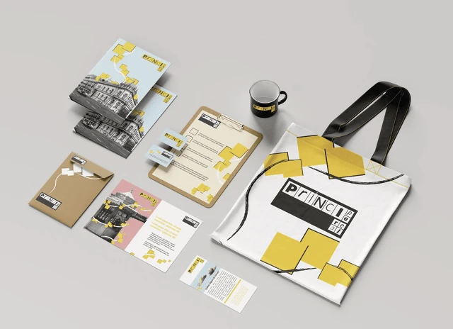
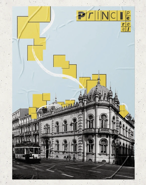
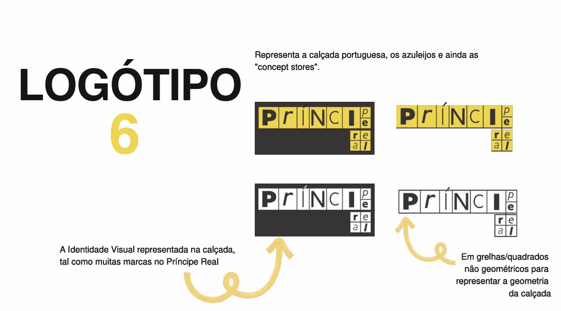
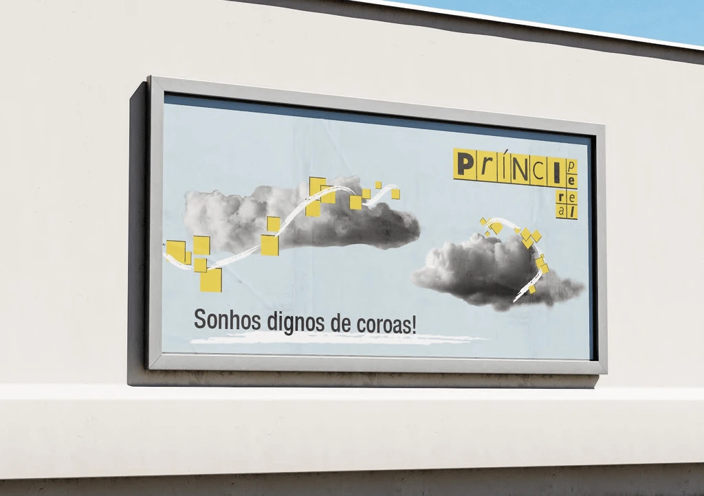
In this project, I started by analyzing the characteristics of the neighborhood and focused on its modernity and history. The concept of alternating is the foundation for the use of typography in various styles, much like the alternative stores in Príncipe Real. The Portuguese pavement and tiles are symbolized by the division between the squares in the pattern and the letters in the logo. To create contrast, I used pastel colors. In the illustrations, yellow serves as a metaphor for the neighborhood's color, joy, and artistic expression. The spread of this passion throughout the city is precisely depicted in the illustration.
Like this project
Posted Sep 24, 2024
An initiative to breathe fresh life into an already stunning city!