Kalavibhinna - Interior designers & Architects

Amarnath Rao


Contents
Discovery call
Educating the client
Understanding the client
Mood boarding
Designing the wireframes
Website design
Helping with the copy
Improving their logo
Developing the website
Discovery call & understanding the client
Main points from the discovery call with the client:
They did interior designs and took up projects that were in a specific price range
They specialize in authentic designs or we could say a mixture of old and modern look.
This was their first time getting a website done and were unaware of the process.
They had a logo and have shared their Instagram page where they have posted some of their works.
Educating the client
Since this was the client’s first time getting a website done, I had to educate them on the process and also suggested few things which would helped them in their business.
Key points:
I had to make them understand what is USP(Unique Selling Point) and why is it important for a website.
I had to help them figure out their USP by giving an example of my website.
I briefed them on the web development process and showed them our process which is:
Mood boarding
Designing the wireframes which is basically the layout of the website
Final design of the website
Developing the website
Understanding the client
After the discovery call and educating the client on the process, I collected the following information that would help me get started on the project.
Key points:
Purpose of website: Portfolio and getting clients
Website style: simple & minimal
Colors: Neutral colors - black, white and gray
Preferred font: Century Gothic in headlines
Website structure
Landing page - Introductory page
Project page - Project showcase page - blog page
About us page - Explaining about your firm
Contact page - To contact you
Career page - Career options & HR activities
FAQ page
References shared
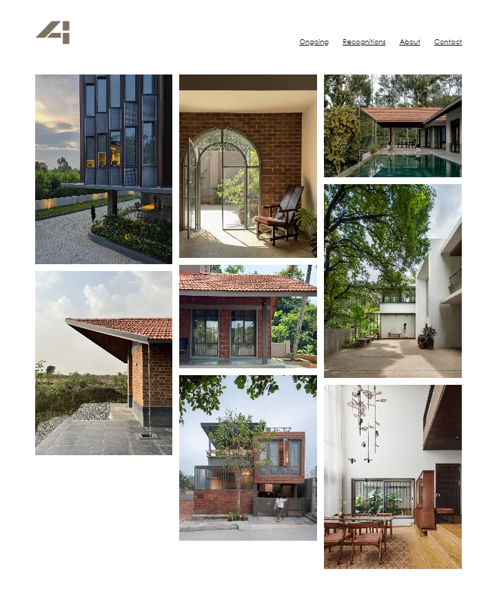
https://www.studio4a.net/pages/ - They liked this website, they loved how the projects were showcased in the landing page. Liked how minimal the website was.
https://mindspacearchitects.com/index.html - They liked the minimal design in this website as well.
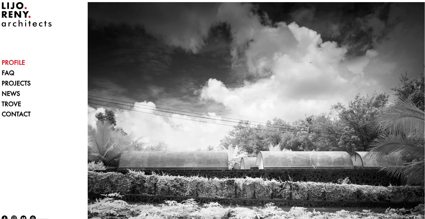
https://lijorenyarchitects.com/ - They liked how the red accent color was used in this website.
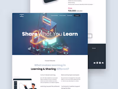
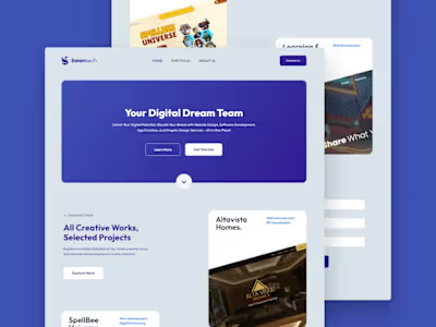
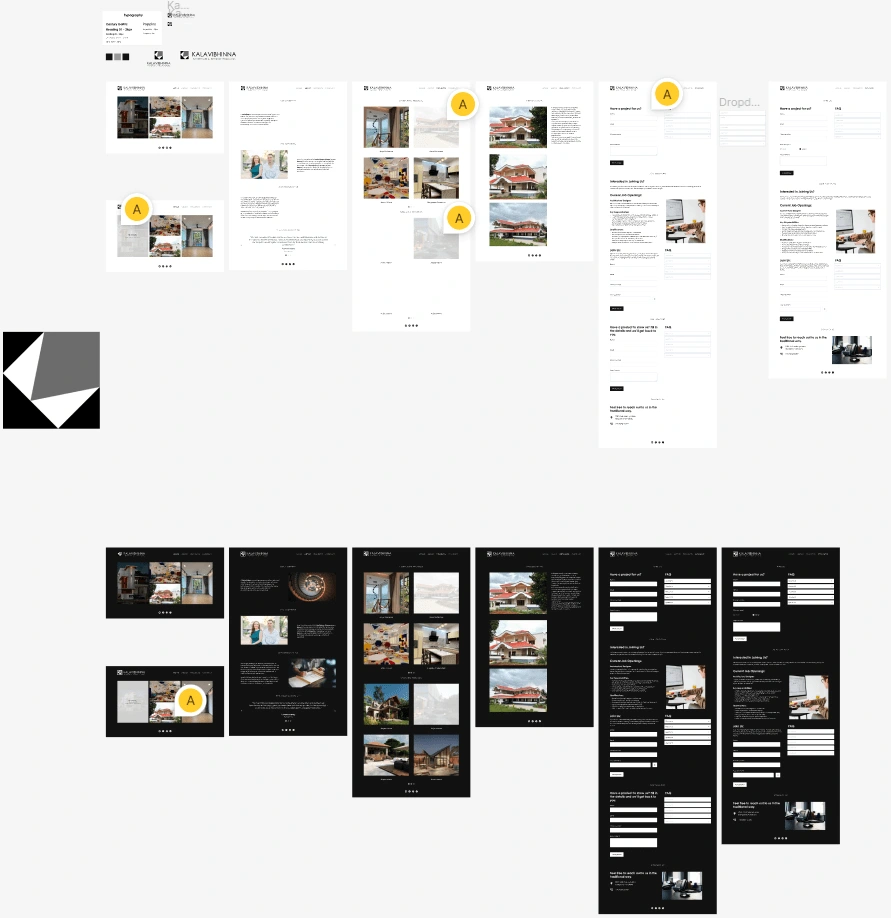
Mood boarding
This is where we research and find inspirations related to the information shared by the client.
This process is done to make sure that we have understood the client’s requirements very well and also helps the client to confirm that we both are on the same page.
After showing the mood board to the client they were confused what they were supposed to do because it was all new to them.
I told them what I had done and explained the importance of this step and they understood what to do and reverted back on what they liked.
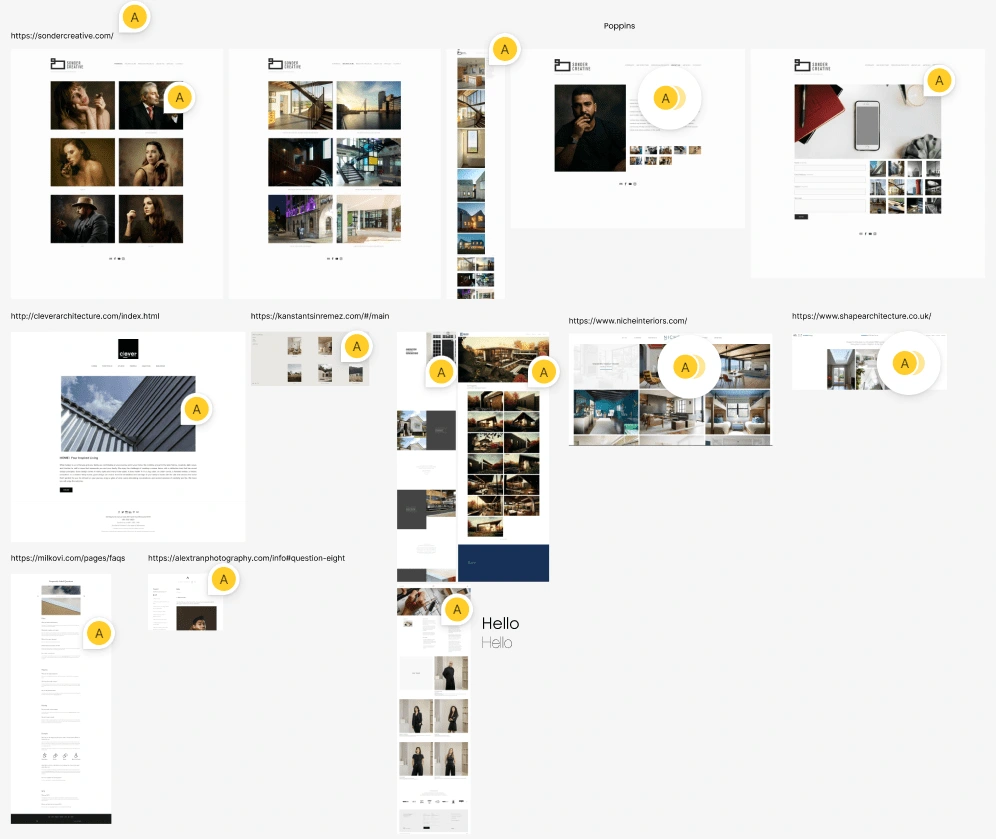
I felt like this website really resonated the look and feel of what the client wanted. Its simple, minimal looking and clean.
The client did not like the symmetric layout. They preferred this layout.
Thumbnail hover animation - Simple and minimal they liked the half white hover color
They mentioned that they’ll have less description and more imagery in the projects page so they liked this layout.
The About us page would be a normal text - image sections
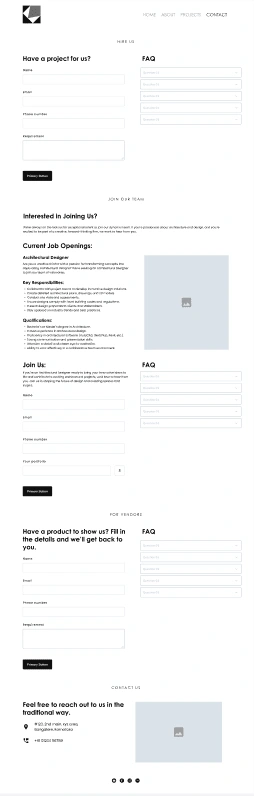
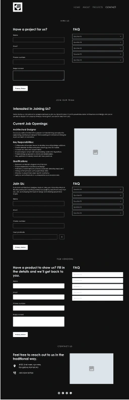
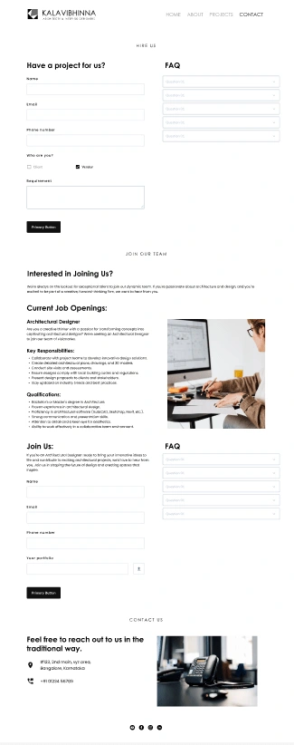
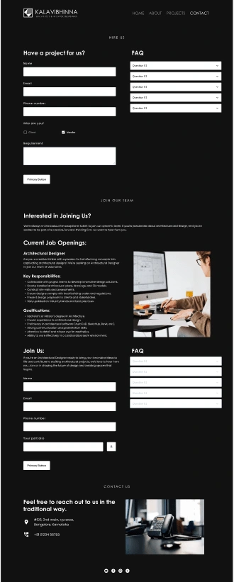
Contact page would have 3 sections:
Hire us - for venders/clients
Join our team - to recruit employees
Contact us - for any other enquiries
Since they wanted to have FAQ page which would be associated with questions related to these sections in the contact page, I thought it would be better to have them in the contact page itself instead of having it in a separate page.
Since the primary objective of the website was to act as a portfolio website the footer only has links to their social media accounts which the client liked.
Coming to the fonts, just like they had suggested we went with Century Gothic for the headline and I chose Poppins for the paragraph.
As for the colors, kept it minimal and used neutral colors.
Designing the wireframes
This is where we structure the layout of the website.
This gives an idea of how the website would take its shape, we will get a rough understanding of how the website would look like.
In this step we are only concerned about the layout and type. We do not worry about what kind of images will be placed or what colors would be used. Only accent colors would be shown.
After creating the mood board I had a clear idea about the look and feel of their website and I started to work on the wireframes for the website.
I also helped the client with a bit of copywriting, suggested them how they could come up with a copy for their pages(more on this later).
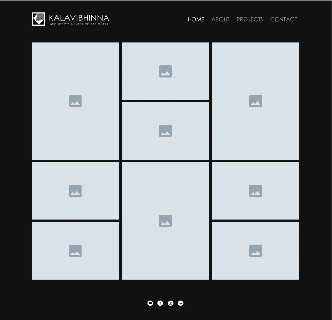
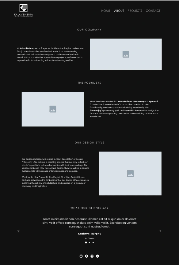
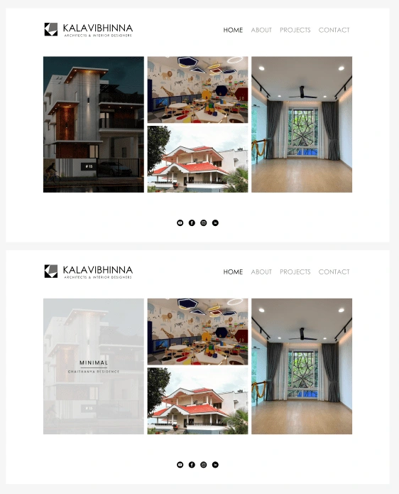
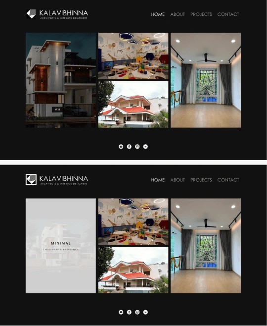
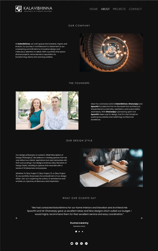
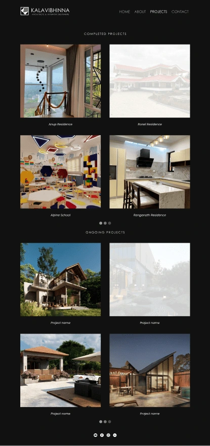
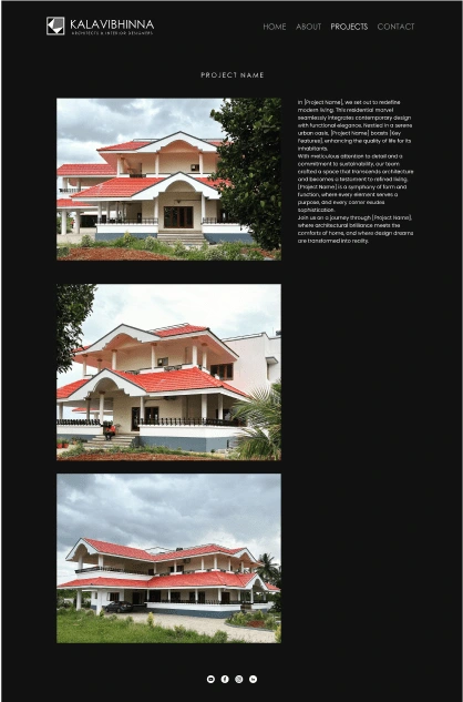
I designed the website on white background and then had to do another version with black background. They liked the black version.
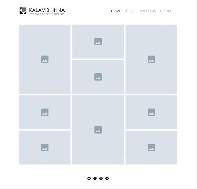
Home page - A simple layout to showcase their projects in thumbnail
The navbar is also minimal with simple hover animations.
Current page is highlighted in black
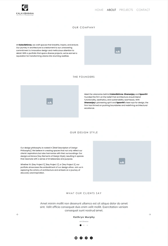
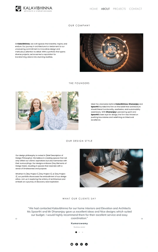
About us page - A simple text - image layout that provides information about the company, founders and their design style along with a testimonial section which adds credibility and trust.
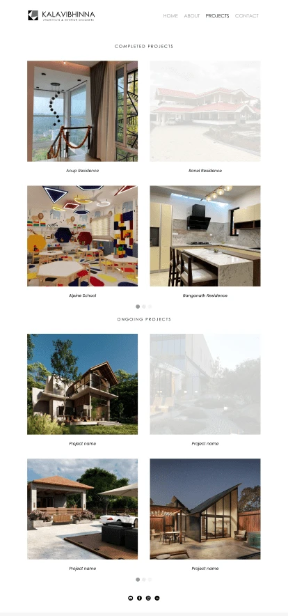
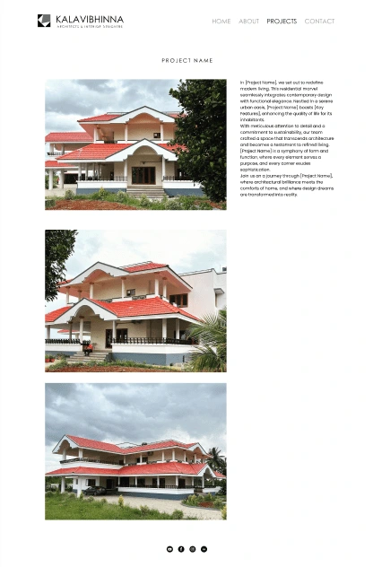
Project page - They needed two sections here to showcase their ongoing and completed projects which would take to the project description page.
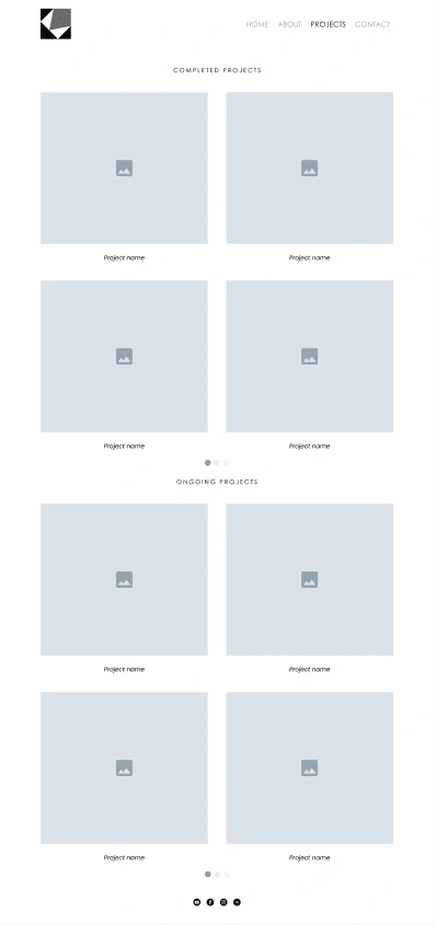
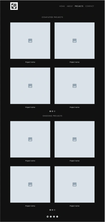
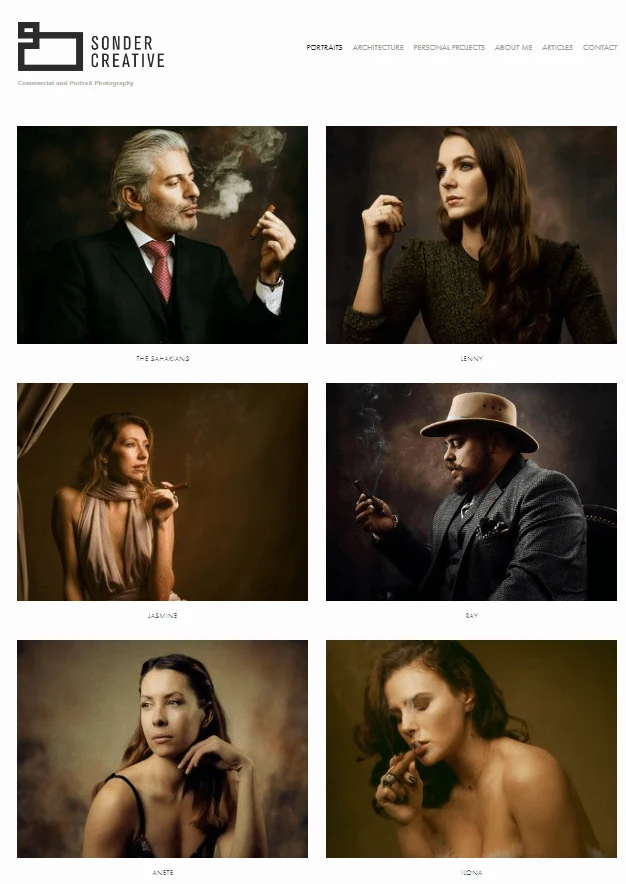
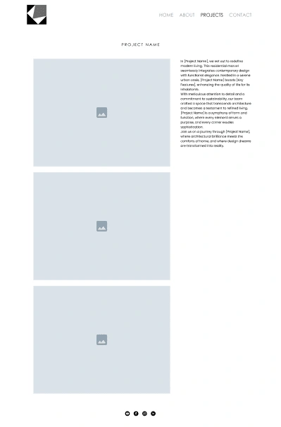
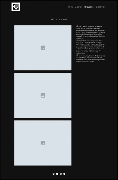
Project description page - A simple layout where the image has been given more prominence since the text is less.
Contact Us page - Showcases all the three sections along with its respective FAQ.
Footer - A simple footer with social media icons lined to their social media accounts


Website Design
This is where we completely design the website, adding colors, images, animation look, etc.
This gives an idea of how the website would look like when the user visits their website.
We also discuss about how they want the interactions and animations to be.
After designing the wireframes and getting it approved I started placing the project images given by the client. I have used image placeholders in places where they’ve not provided images so that they can get an idea on the kind of images they can use.
I have also provided them with a placeholder copy to give them an idea on what kind of copy they will need to come up with.
Home page
About us page
Projects page
Project description page
Contact us page
Helping with the copy
The client had no clue on what the copy should be in their website, I helped them on how to think on coming up with copy.
I gave them myself as an example, I also teach video editing so I told them my USP(why should someone learn video editing from me), my USP it to share what you learn and my teaching style is that I teach in simple ways giving various analogy so that all age groups can understand easily.
So I suggested them to ask these questions and the answer would give them their USP:
When a user sees your company’s name what should come to his mind?
Why should a person come to you to for interiors design works?
Do you have any specific style which is unique from other designers?
I generated some basic copy with the help of Chat GPT and some inspiration from other websites which I have used as placeholders.
Improving their logo
Once the website was done I figured out that there was something not right with the logo, something was feeling off.
This was the original logo given to me while designing the website.
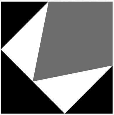
They had shared me a reference of a logo animation on their Instagram page from which I tried to come up with two variations of their logo.
The former logo did not look well on the website’s navbar so we decided to go with the latter.
Developing the website
Only after getting the design approved fully we proceed to develop the website.
This is done because it will be hard to make any changes once the website is developed, so we try to make sure all the changes are pointed out and cleared in the design stages itself. Especially in the mood board and wireframing stage.
I developed the website on Webflow to showcase how the website animations, interactions and its responsiveness.
Like this project
Posted Oct 17, 2024
A simple & minimal looking portfolio website designed for an Interior Design company called Kalavibhinna.
Likes
0
Views
7