Adventales - Website Redesign
Kris Lee
Adventales Redesign
Overview
Adventales is a small indie game studio located in Oslo Norway. While the team focused on developing their upcoming game as well as market and look for financial backers, the website felt like an afterthought.
The team needed a clean website that could showcase the company and the various projects they were working on.
Process and solution
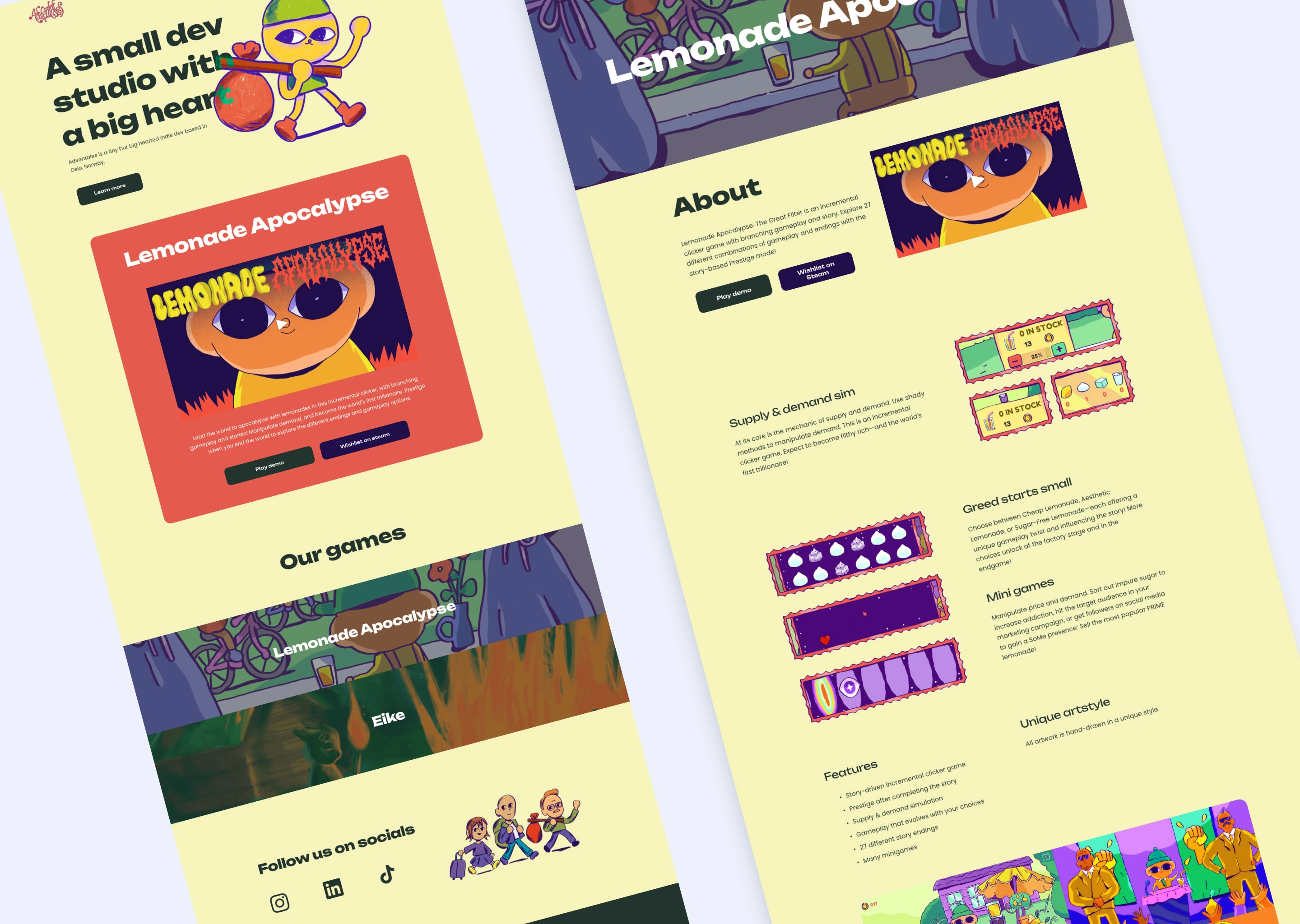
The previous website struggled with eye-straining colors and visual hierarchy. Through a bit of back and forth with the main founder, Geir, we were able to come up with a design that emphasized bold shapes and a typeface that made the design fun and characteristic.
Although the website is light on content, we were able to use a lot of art assets made by their in-house illustrator, Ida.
Results
The current website is a starting point for what the company has achieved so far. As they grow, so will the website.
See the live site here: https://www.adventales.games/
Like this project
Posted Aug 27, 2025
Redesigned Adventales' website to better showcase the company and its projects.
Likes
0
Views
13