This project focused on improving

Jackson Leschinsky


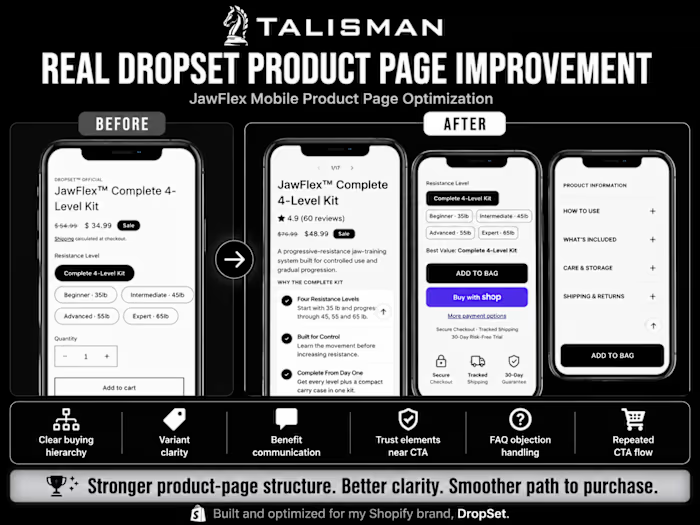
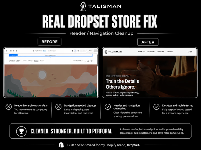
This project focused on improving the responsive behavior of the DropSet Shopify storefront across mobile, tablet, and desktop.
The problem
Several storefront elements required better behavior across screen sizes, including spacing, alignment, overflow, sizing, and overall layout consistency.
What I improved
• Mobile spacing and alignment
• Responsive section behavior
• Horizontal overflow issues
• Element sizing and positioning
• Desktop-to-mobile consistency
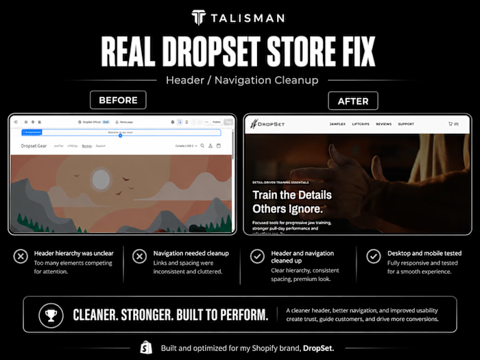
• Header and content spacing
• Layout behavior across multiple viewport sizes
Process
I inspected the affected sections across different screen sizes, identified the relevant theme and CSS behavior, implemented targeted fixes, and retested each change across mobile and desktop.
Result
A cleaner, more consistent responsive storefront that maintains the intended design across major screen sizes.
Completed for DropSet, my independently operated Shopify e-commerce brand.
Like this project
Posted Aug 14, 2026
This project focused on improving the responsive behavior of the DropSet Shopify storefront across mobile, tablet, and desktop. The problem Several storefron...
Likes
0
Views
1