Commonwealth Bank: UX & UI Mobile Tablet App Design

Chris Halaska
UX Designer
Motion Designer
UI Designer
iOS


ProtoPie

Sketch

Commonwealth Bank of Australia Tablet App
Created and launched the first CBA Tablet App from scratch in a lean squad, following a lean startup methodology
UX Design
UX Research
Motion Design
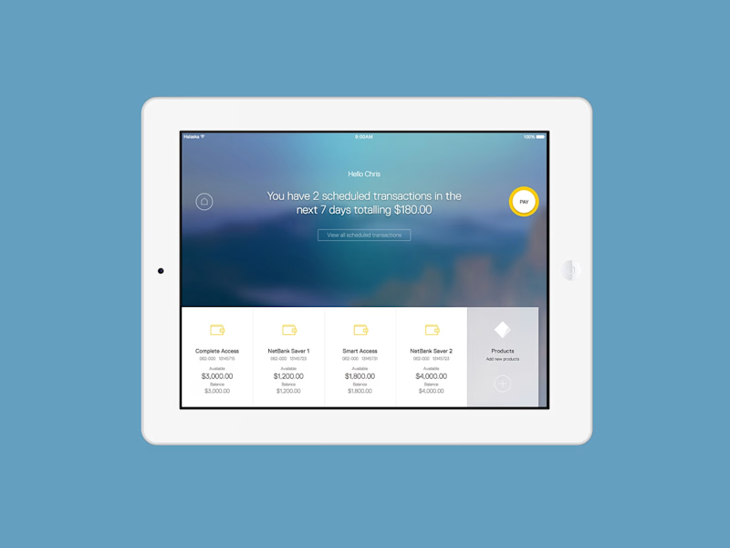
A world class banking app for Apple and Android tablets, the first of it's kind from CBA
The Commonwealth Bank app for tablet is a new product which was recently launched to provide users with a world-class banking experience for both iOS and android devices. The app allows you to complete your day-to-day banking tasks such as transferring between accounts, checking your balance/transaction history, as well as giving you a better view of your finances with features like a running balance and the savings tracker. The portfolio view gives a snapshot of your finances by combining all your assets and liabilities into one dashboard so you can get a sense of your overall financial position.
The Process
Working as part of a product team I was focused on not only visual design, but contributed in the fields of Interaction Design, Motion Design, Copy, Brand Identity, Development, Conceptualisation and User Experience.
Working through sprints on specific features I would work with a UX designer to sketch, prototype, test and iterate on the UX flow.
Alongside the UX process, I was working closely with two other visual designers, Tony Bolcina and Johnny Le to create the design principles and visual language of the app. Together we worked on countless variations until we came up with a language we were happy with and that best represented the brand and experience.
The language we came up with is called Dimension. This is used throughout the app to give a sense of scale and spatial awareness as the user carries out their banking tasks. Dimension uses shadows, blurring and animation to bring the app to life and help the user carry out their tasks.
As the features were taking shape and the UX was standing up to the fortnightly user testing sessions I would work on the visual design of these screens. The design of the app was truly a collaborative effort as we would hold daily review sessions in which we would share what we had done in that day and get important feedback from our peers. These sessions were vital for insuring consistency across the app and to quickly get feedback.
Specifically, I worked on the payment features, settings and support pages while collaborating with the other designers to develop the overall design direction of the app.
Production
As the designs were getting worked on and signed off we would move the assets into a program called PaintCode. This program acts as a global component library, allowing the designers to set the colours, shadows, icons, graphical assets, and animations of the app. These assets are then easily exported into Objective-C for the developers to ingest ingest into their builds.
The benefit of this program was that it gave us control over these elements and allowed us to update as we felt necessary even once these assets had been referenced in the build. This would mean if there was a icon change for example, all we would have to do is update it in paintcode and re-export it, which would then automatically get updated in the build. This saved lots of development time and allowed us to block the build.
Motion
One of my main responsibilities on this project was to take charge of the animations and interactions, prototyping them to set the style and timing and working closely with the developers to bring them to life. Throughout the project I experimented with different animation prototyping tools depending on what stage of development we were working on.
Earlier on I would start off with post-it notes cut out into shapes of the interface elements and move them around on my desk to find the best movement and layering of them. As the designs progressed I would move into Flash and animate on the timeline, starting off with plain boxes and eventually adding more detail to represent the designs as they were developed.
For the smaller interface animations I would work in paintcode to create them using their code based animation controls, these were then exported to Objective-C for the build.
The more complex animations were worked on directly with developers, with a reference animation that I would create in flash as a guide to communicate the intent and timing.


