
The brief: a flyer and an insert for a D2C lighting brand that sells a product people usually think needs an electrician. The design had to prove in one glance that it is easy, and still feel warm and playful.
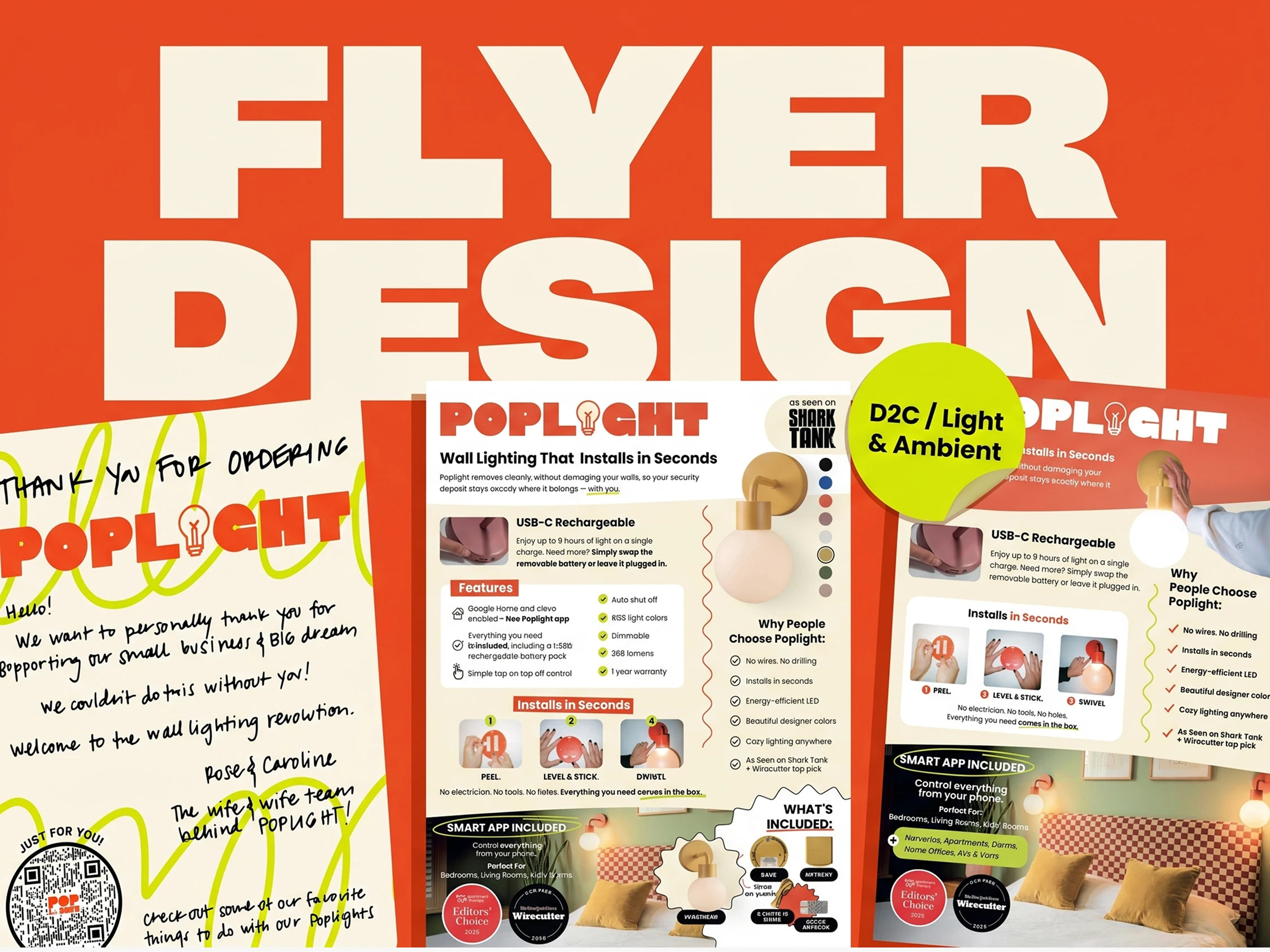
Poplight makes wall lights that stick on in seconds, with no wiring and no drilling. They needed print pieces that explain the product fast and make the unboxing feel personal.
I designed two flyer concepts and a handwritten style thank you card in the brand's bold orange, lime and cream look.
The challenge
A lot of info had to fit on one page: features, install steps, what's in the box, colors, press badges. It also had to stay easy to scan and feel like the brand, not like a spec sheet.
What I did
Built two flyer directions: a light, clean one and a bold one with a full orange header and a hero photo
Turned the install process into a simple 3 step visual: Peel, Level and Stick, Swivel
Grouped features, benefits and "What's included" into clear blocks so a customer gets it in a few seconds
Placed trust signals (Shark Tank, Wirecutter, Apartment Therapy) where they get noticed
Designed a handwritten style thank you card with a "Just for You" QR sticker that leads to ideas for using the lights
Deliverables: 2 flyer concepts, 1 thank you card
Industry: D2C, lighting, home decor
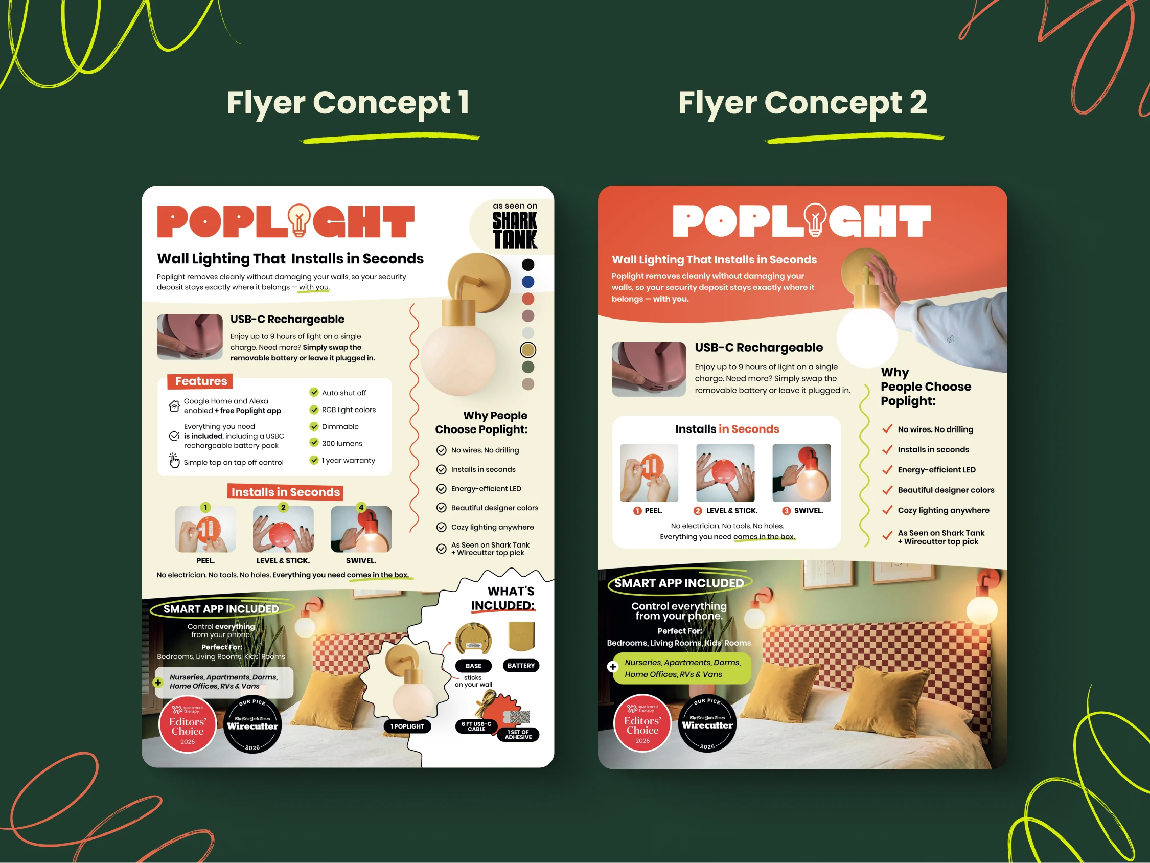
The challenge: fit features, install steps, colors, what's in the box and press badges on one page without it feeling crowded. I made two directions. Concept 1 is light and airy with a product-first layout. Concept 2 is louder, with a bold orange header and a hand in the photo to show how fast it installs. The client can pick based on where the flyer is used.
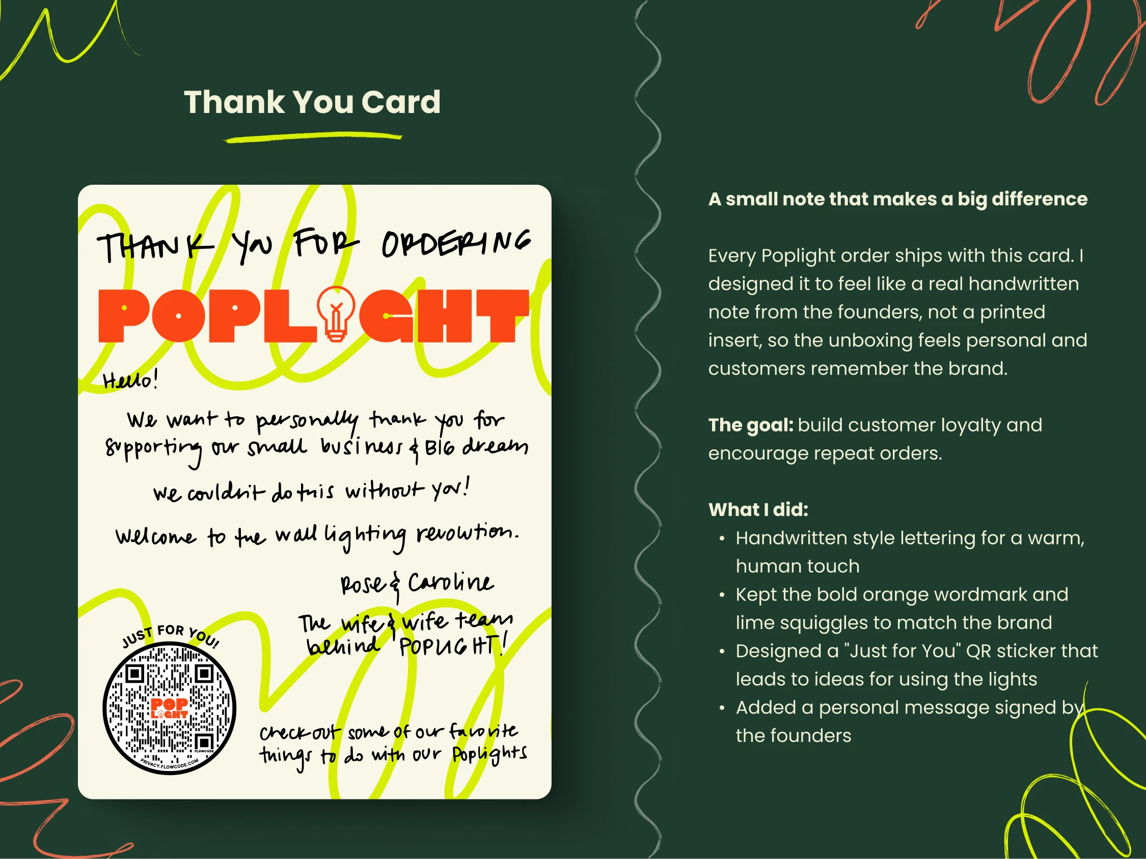
The challenge: make the unboxing feel personal, not like a printed insert. I used handwritten lettering, signed it from the founders, and added a "Just for You" QR sticker. The goal is customer loyalty and repeat orders.
0 likes · 0 views · Nov 15, 2026
Flyer concepts and a handwritten thank you card for Poplight, a D2C wall lighting brand with lights that stick on in seconds.


