Radacini – Long charmat Packaging |

Anta Petrenco


Radacini – Long charmat
Packaging | Label Design | Visual Identity
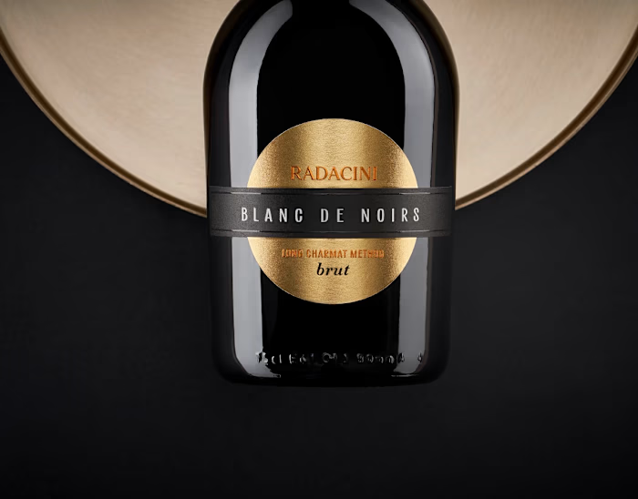
The design builds around the bottle’s shape — rounded, grounded, with a low center of gravity. It sets the tone for a visual language that’s minimal, structured, and quietly confident. Nothing here distracts from the form — instead, the elements work with it, highlighting proportions and keeping the overall composition clean and balanced.
The key visual accent is the gold foil — used both on the neck and echoed in the circular label. Set against a dark background, the metallic finish brings a sense of warmth and understated luxury without overwhelming the design.
Like this project
Posted Sep 1, 2026
Radacini – Long charmat Packaging | Label Design | Visual Identity The design builds around the bottle’s shape — rounded, grounded, with a low center of gra...
Likes
0
Views
2
Timeline
Oct 5, 2024 - Dec 10, 2024
Clients
Radacini