
In this first week of development, we focused on the core pillars of the brand’s visual identity: logo, color palette, and conceptual moodboard.
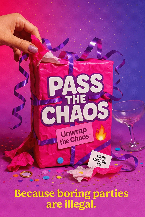
The goal was to visually explore the Pass The Chaos™ universe and propose graphic directions that capture the game’s irreverent, bold, and collective spirit.
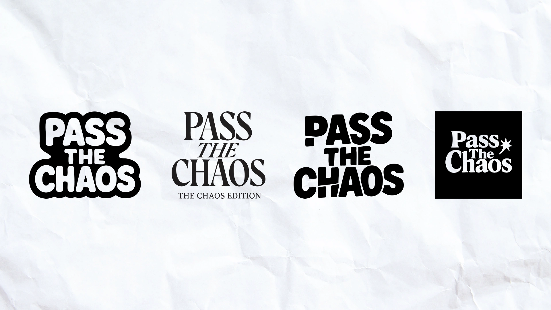
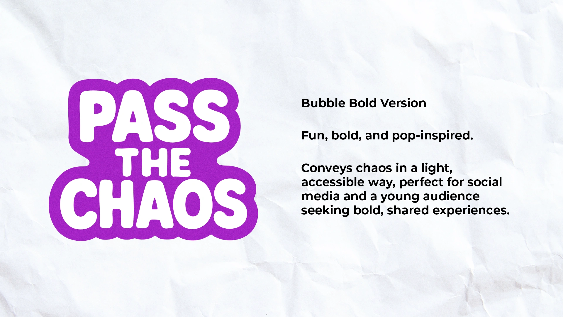
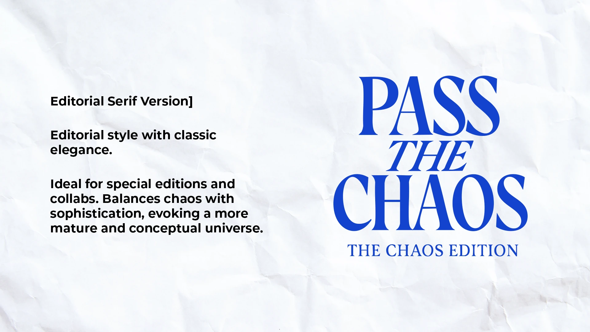
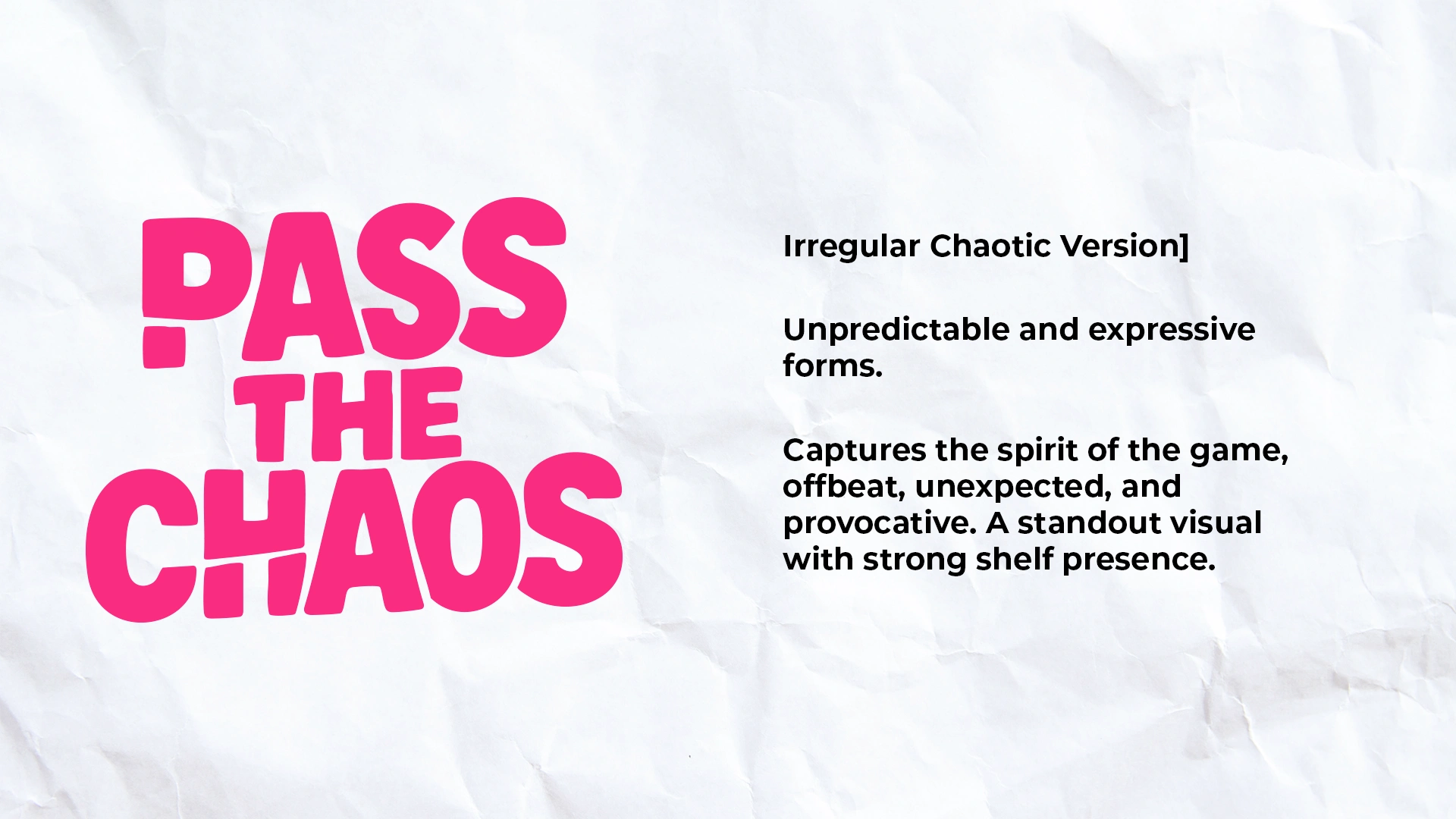
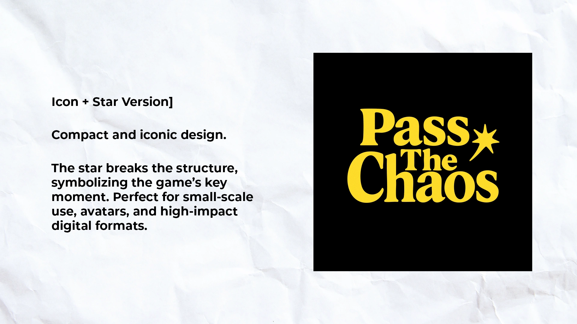
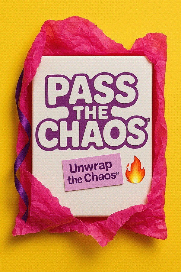
We presented four distinct logo variations, each with a unique approach, from sophisticated editorial style to a chaotic and playful visual.
The intention is to offer options that represent different facets of the brand: accessible pop energy, provocative sophistication, controlled chaos, and versatility for multiple formats and platforms.
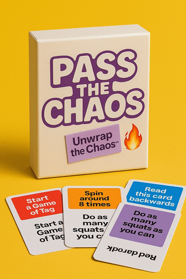
All versions were designed to work seamlessly across print, digital, and product applications.
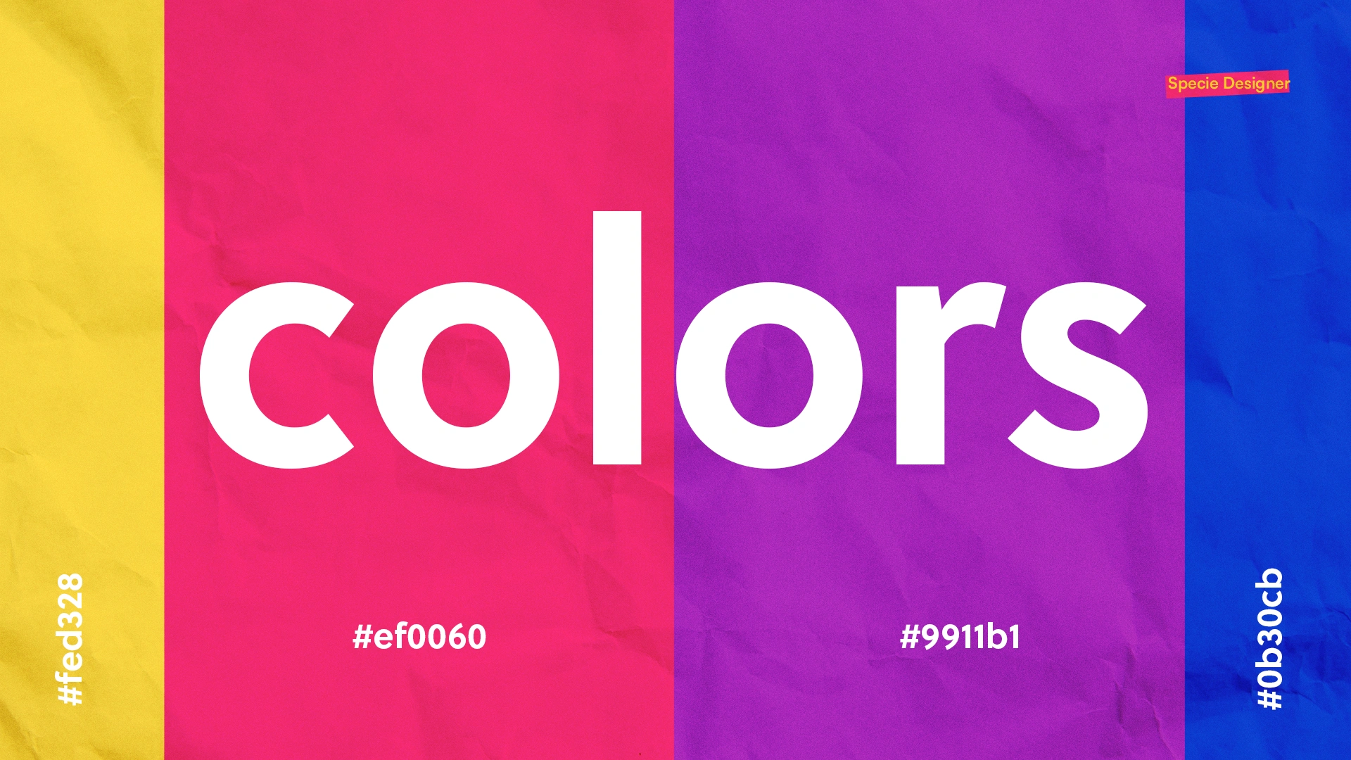
The selected palette balances visual impact and adaptability, featuring vibrant, contrasting colors that convey the game’s energy and work well both digitally and for home printing.
This combination ensures instant recognition and consistency across different editions
of the product.
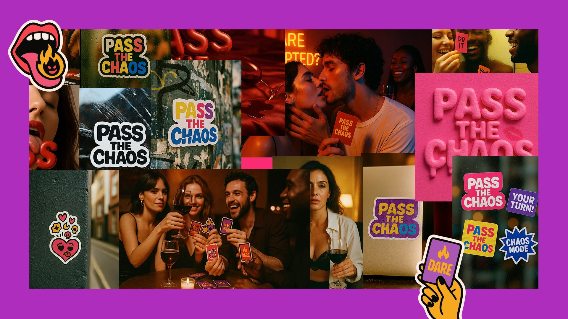
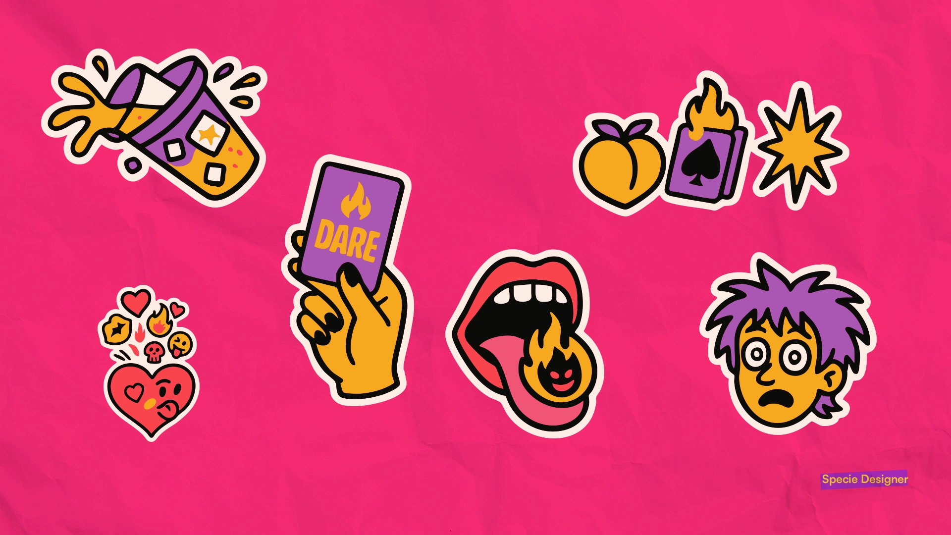
We created a visual panel with references that guide the brand’s universe: personas, adult card deck aesthetics, pop culture, social interactions, and the unpredictable energy of parties.
These images act as a creative compass, shaping the visual narrative and ensuring coherence in the next stages of the project.
This initial delivery lays a strong foundation for building a memorable, provocative, and visually striking brand.

0 likes · 0 views · Nov 4, 2026