
Sylvania and the Challenge
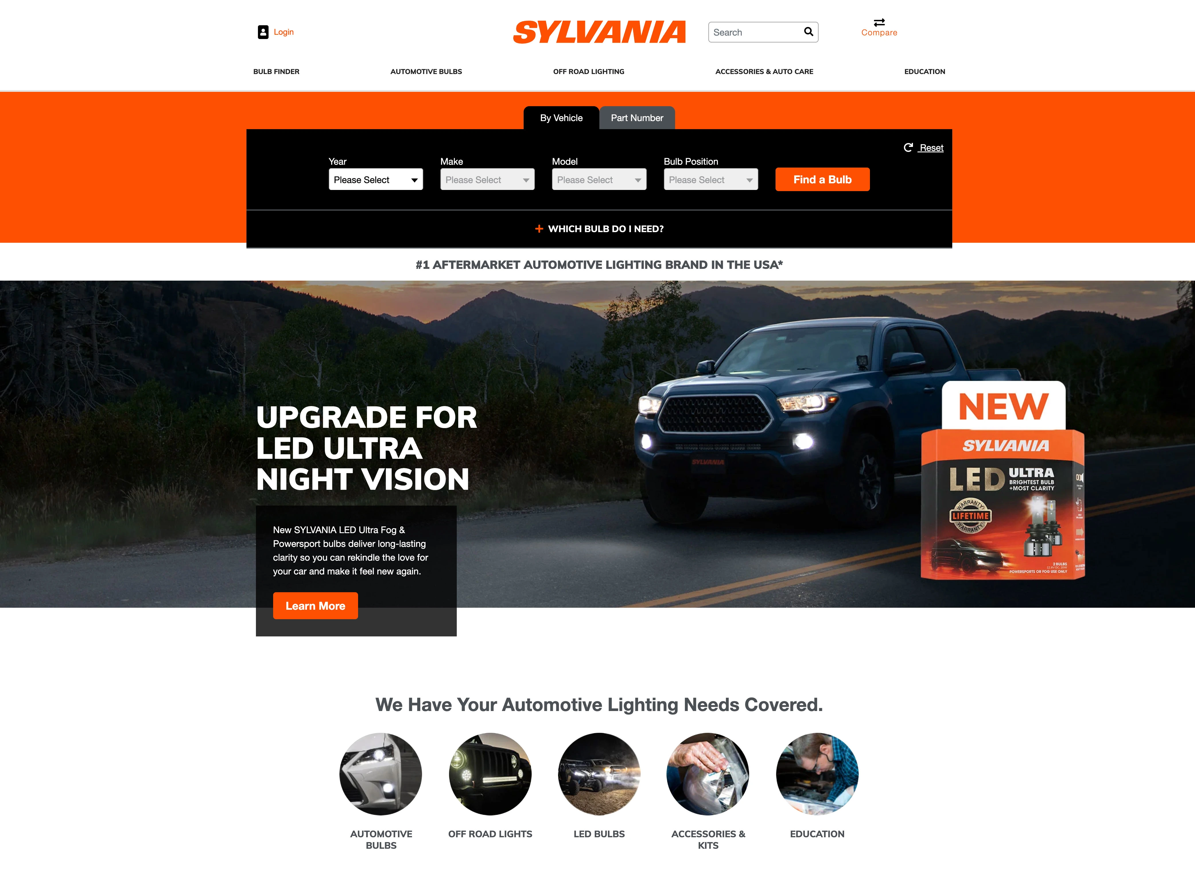
Sylvania is an aftermarket automotive lighting brand that offers its products both in retail stores and direct from their online store which was facing a decline in online sales.
Sylvania had a tool that allowed users to input information about their automobile and the site would direct them to a product listing page of the compatible products for their model and bulb type. This was functioning successfully, but user behavior began to change following the COVID-19 pandemic which resulted in a decline in sales on their online store.
My team was tasked with identifying the experience gaps and explore solutions for improving the rate of sales from their online store.
The Approach
To identify the user pain points and the opportunities for improvement, my team selected several activities that would shed light on these items.
Heuristic Evaluation
Utilizing the 10 usability heuristics, we reviewed a series of key pages to identify violations that could cause gaps in the user experience.
Heatmap Analysis
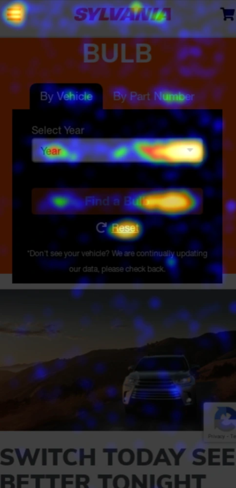
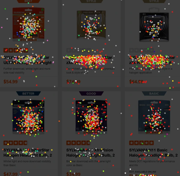
To evaluate consumer behaviors on specific pages, we utilized heatmaps to establish if the proper elements were capturing consumer attention or if there were elements causing distractions from consumer and business goals.
User Testing Reports
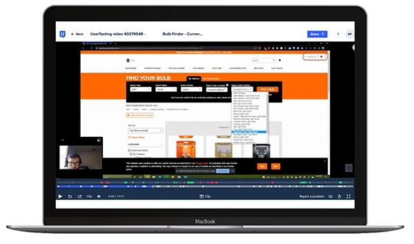
For direct user feedback, we utilized UserTesting.com to run unmoderated tests. We created a series of tasks and wrote questions for the test takers to talk through during their session.
Test Results
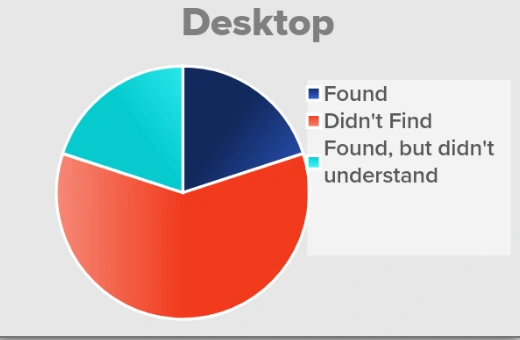
The testing activities revealed several key elements that would greatly enhance and simplify the experience if all were addressed in concert.
The Bulb Finder
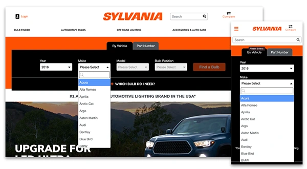
We found that users were slowed down and confused by the way the dropdowns in the Bulb Finder functioned causing users to abandon assuming it was broken or not worth the effort.
The Product Listing Pages
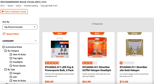
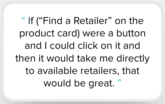
Inconsistencies between the product listing pages and the Bulb Finder lead to confusion in navigating the post-Bulb Finder experience. Additionally, it was difficult to compare products that were compatible with the same light.
Product Details Pages
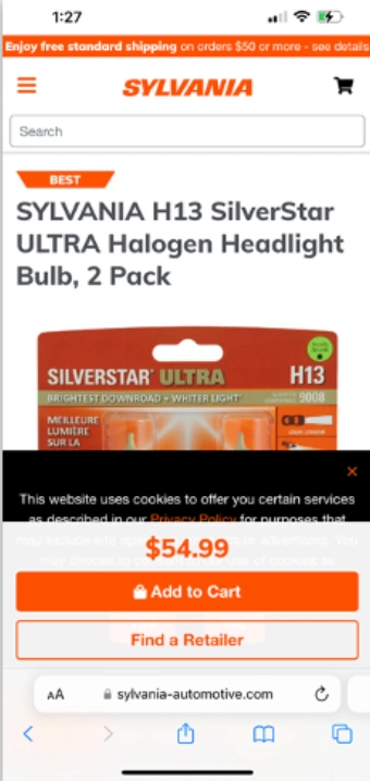
The product details pages had gaps information, competing elements, and were lacking in context, so it was easy for users to become disoriented when navigating from a details page to other products.

Crafting a New Experience
With our research to guide us, the team created designs to solve for the issues in the old experience within the previous design to minimize the development lift needed to achieve these goals.
The Bulb Finder
We updated each dropdown to be inactive until a value was selected in the previous dropdown and including a search box within the dropdown. This was a significant improvement in error prevention and ease of finding the proper value in a long list.
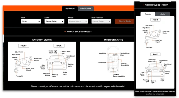
Additionally, we made the graphics for identifying the proper bulbs more accessible by adding them in a drawer immediately below the Bulb Finder.
The Product Listing Pages
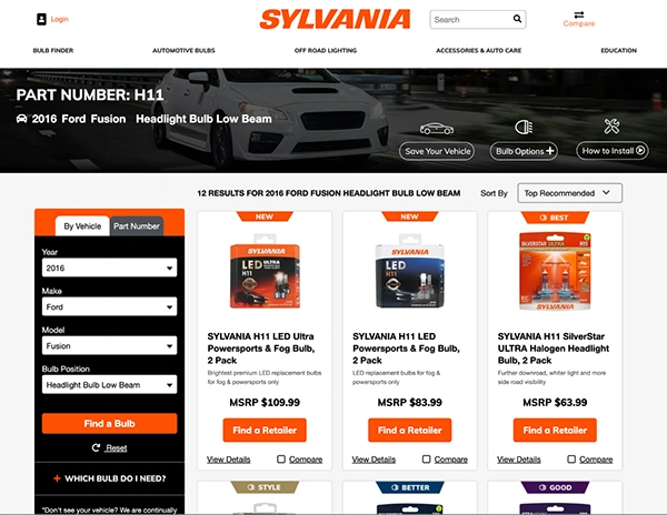
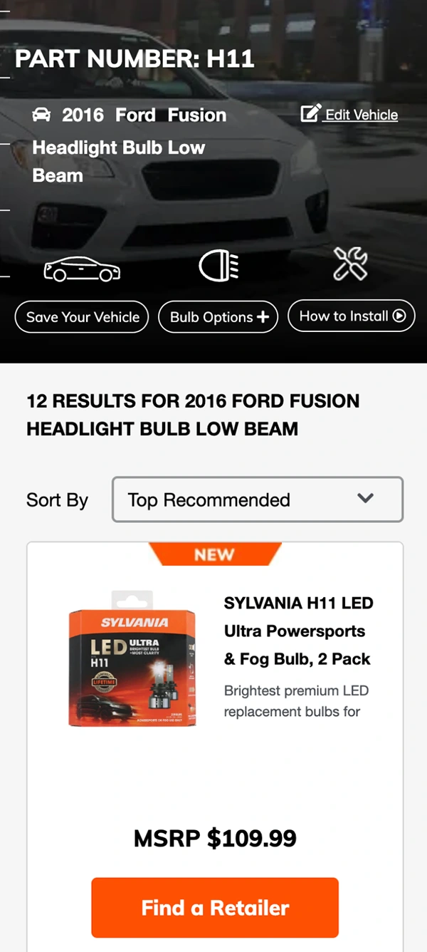
The first update we applied to the product listing pages was to clearly display the product that they entered into the Bulb Finder and provide relevant actions in the header for ease of access.
We also updated the badge designs for easier recognition of the tagged attribute.
Lastly, we added a comparison feature allowing consumers to directly compare up to 4 products side-by-side to streamline the product selection process.
Product Details Pages
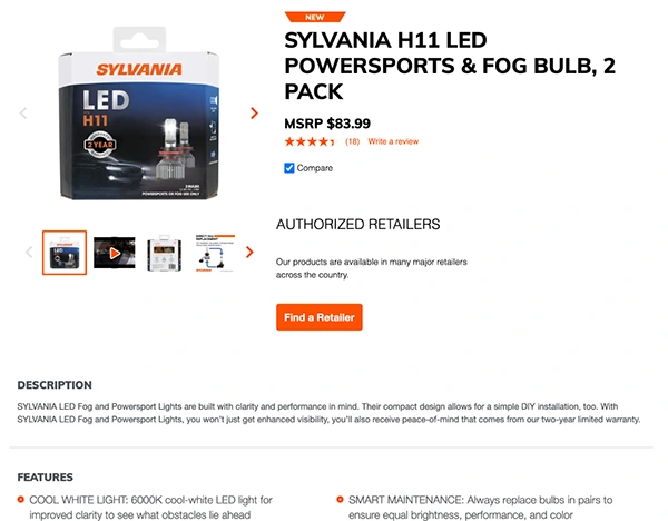
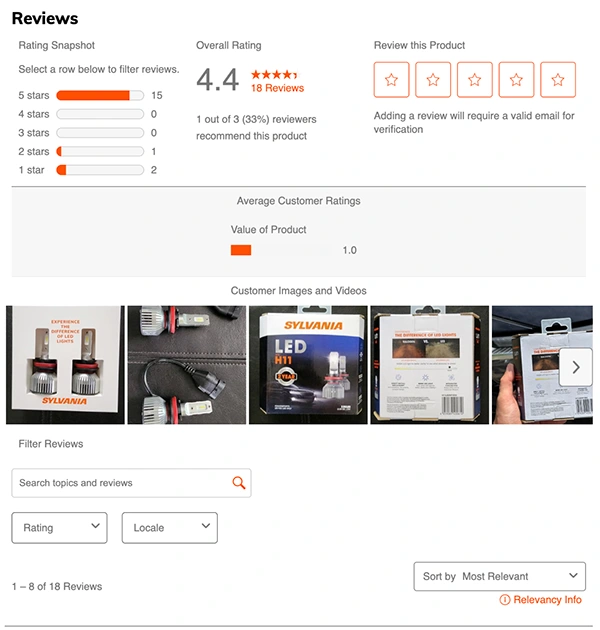
We streamlined the product description pages by dynamically populating only the elements and information relevant to that specific product and championed the reviews immediately below the product description.
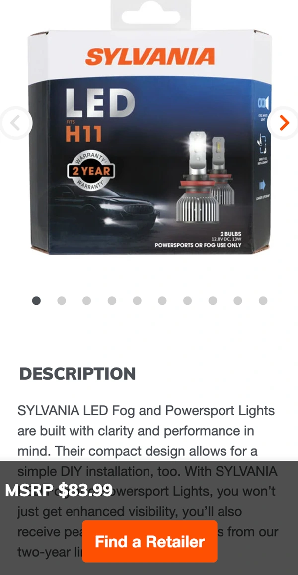
The mobile view was also enhanced by making the relevant CTA(s) sticky at the bottom of the screen while ensuring that they didn’t consume any excessive, high-value screen real estate.
Summary
The outcome of this process was a revitalized e-commerce experience that drove an increase in conversion rates and sales. The Sylvania team was not able to provide us with exact metrics on how the site performed after the updates, the team was adamant about how successful the outcome was. The results and relationships we built with the Sylvania team lead to a long-term relationship with additional projects that followed.
Thank you for taking the time to review this case study. I would be happy to review this and additional work in more detail. There is a downloadable PDF version of this case study if you would like to have it for your records.
John Begley

0 likes · 0 views · Oct 27, 2026
Revamped Sylvania's online store for increased sales through UX improvements.

