Built with Framer
I redesigned Bunny’s website. Redesigned this
Saif Uddin
I redesigned Bunny’s website.
Redesigned this website to make it feel more premium, clearer, and conversion focused.
Before:
Bad typography, Outdated color palette, A hero that did not explain the product, Weak layout, An AI-slop background, No clear message about what Bunny actually does
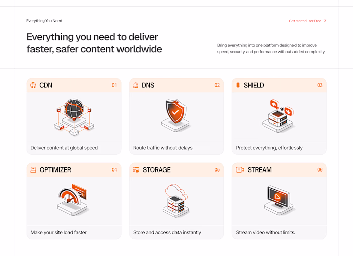
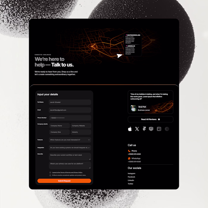
After:
A cleaner navbar and stronger layout
Better typography with a premium font pairing
A CTA that actually stands out
Modern illustrations with more personality
Social proof that builds trust
Cleaner effects and a design that feels more unique than competitors
Built in
@framer
.
What’s your take on this?
Like this project
Posted Apr 9, 2026
I redesigned Bunny’s website. Redesigned this website to make it feel more premium, clearer, and conversion focused. Before: Bad typography, Outdated color p...
Likes
0
Views
3