
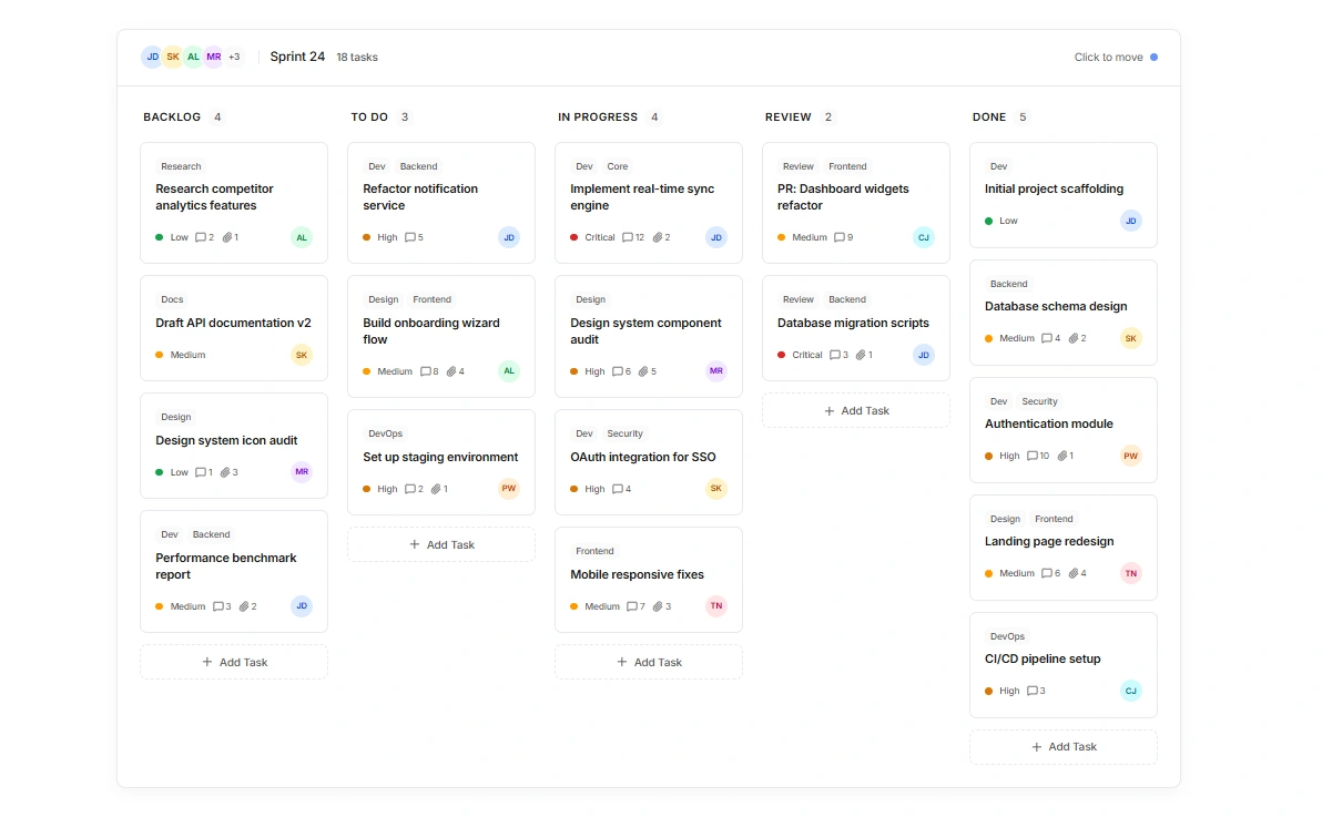
While working on a Kanban-style project management dashboard recently, I noticed something interesting.
At first glance, most people pay attention to the layout, cards, colors, and overall design. But the more I refined the interface, the more I realized that typography was doing much of the heavy lifting.
Users need to quickly distinguish between task titles, labels, priorities, statuses, assignees, and metadata. If the typography isn't structured properly, even a clean-looking board can feel overwhelming and difficult to scan.
In this project, typography helped create:
✅ Clear hierarchy between task titles and supporting information
✅ Faster scanning across multiple columns and dozens of tasks
✅ Better readability without adding visual clutter
✅ Improved focus on high-priority and critical tasks
✅ A more professional and trustworthy user experience
Good UI isn't only about making things look beautiful. It's about helping users process information quickly and make decisions with less effort.
The best typography often goes unnoticed because users don't consciously see it—they simply understand the interface instantly.
Working on this project reminded me that typography isn't just a design detail. It's one of the most important tools for creating intuitive and user-friendly products.
What's a UI detail you think is often overlooked but has a huge impact on user experience?
#UIDesign #UXDesign #Typography #ProductDesign #WebDesign #FrontendDevelopment #DesignSystems #UserExperience #SaaS #KanbanBoard
0 likes · 1 view · Jul 13, 2026
While working on a Kanban-style project management dashboard recently, I noticed something interesting. At first glance, most people pay attention to the lay...

