
Brand Identity Concept: Honey & Hues - Baby Clothes
Client Brief: A premium but soft baby clothing brand needing to feel safe, organic, and gender-neutral. Had to appeal to modern mothers who value both aesthetics and baby safety.
My Solution:
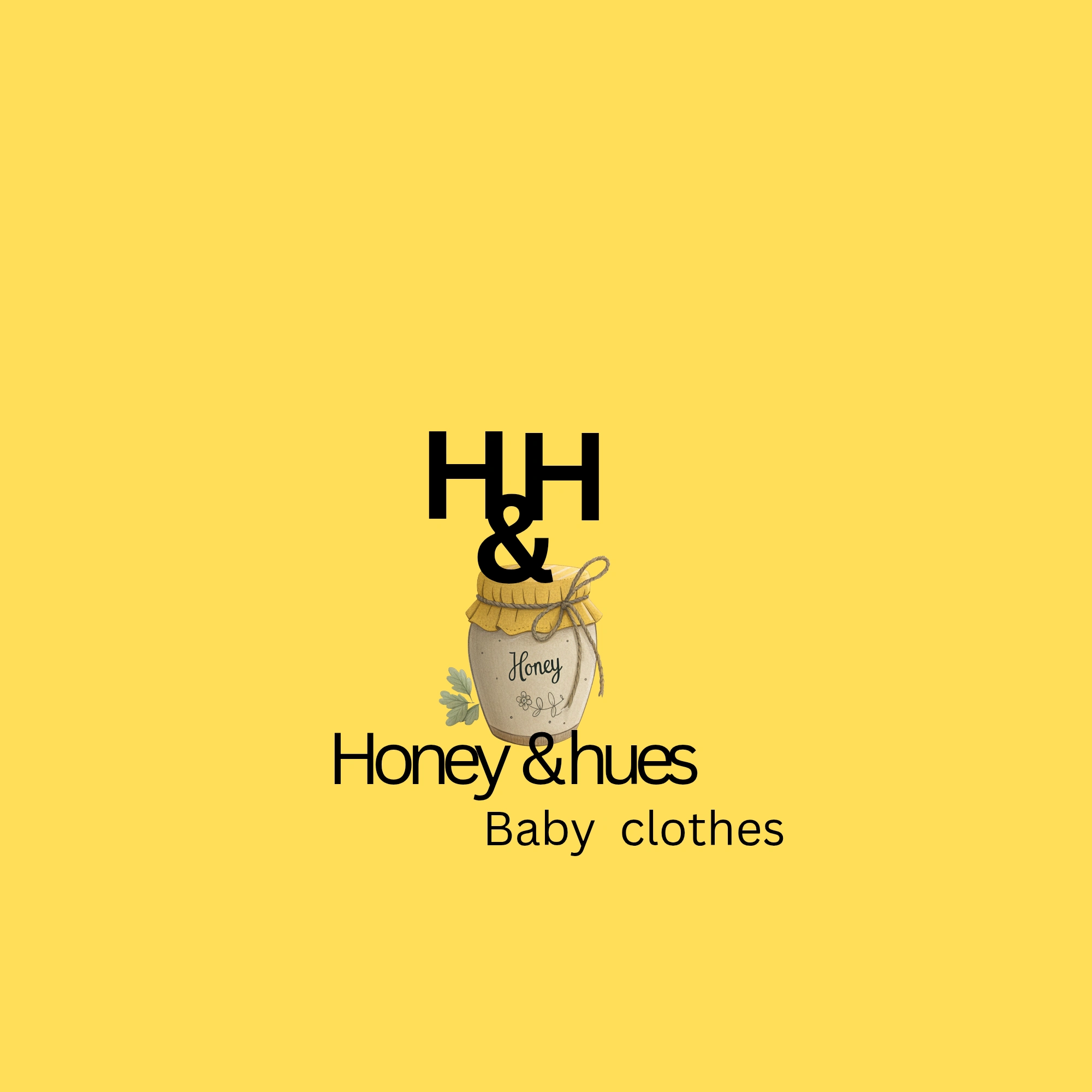
Monogram + Icon: Bold 'HH' monogram for instant brand recall and trust. Paired with a hand-drawn honey jar icon to communicate 'sweetness, warmth, and handmade care'. The twine and leaf details add an organic, chemical-free feel.
Color Psychology: Honey yellow background evokes happiness, warmth, and childhood. It’s gender-neutral and stands out on Instagram feeds against typical pink/blue baby brands.
Typography: Playful script for 'Honey' + clean sans-serif for '& hues' and 'Baby clothes'. This balances the emotional, sweet side with the modern, premium quality parents expect.
Scalability: The square 'HH' monogram works perfectly as a clothing tag, Instagram DP, and website favicon. The honey jar can be used alone for packaging stamps.
Result: A brand identity that feels 'store-bought premium' but 'mom-made safe'. Perfect for a brand launching on Instagram or in boutiques.
Deliverables: Primary logo, icon, color palette, font system. Ready for tags, labels, and social media.
0 likes · 0 views · Apr 29, 2026
Brand Identity Concept: Honey & Hues - Baby Clothes Client Brief: A premium but soft baby clothing brand needing to feel safe, organic, and gender-neutral. H...
