Web Design | AI-Powered Education Tool Development
numi design
AI-Powered Education Tool
For Taylo AI, our aim was to transcend the conventional approach to teaching and learning. Taylo AI's goal is to disrupt the education space, rivalling traditional methods of education, offering a modern take on online learning assistants. We developed an AI experience that is not only modern and sleek, but also speaks to students of all ages not only in terms of appearance, but also experience. We have completed the first two phases of production and are ready to bring the product to a next level.
Our Focus
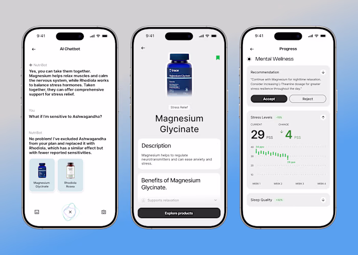
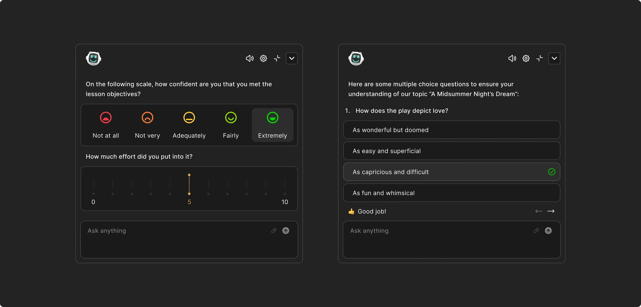
A core consideration with this app was the avoidance of information overload, as well as accessibility that caters to students of all levels. Students with neurodiverse needs or attention difficulties can easily feel overwhelmed by dense information or busy UI.
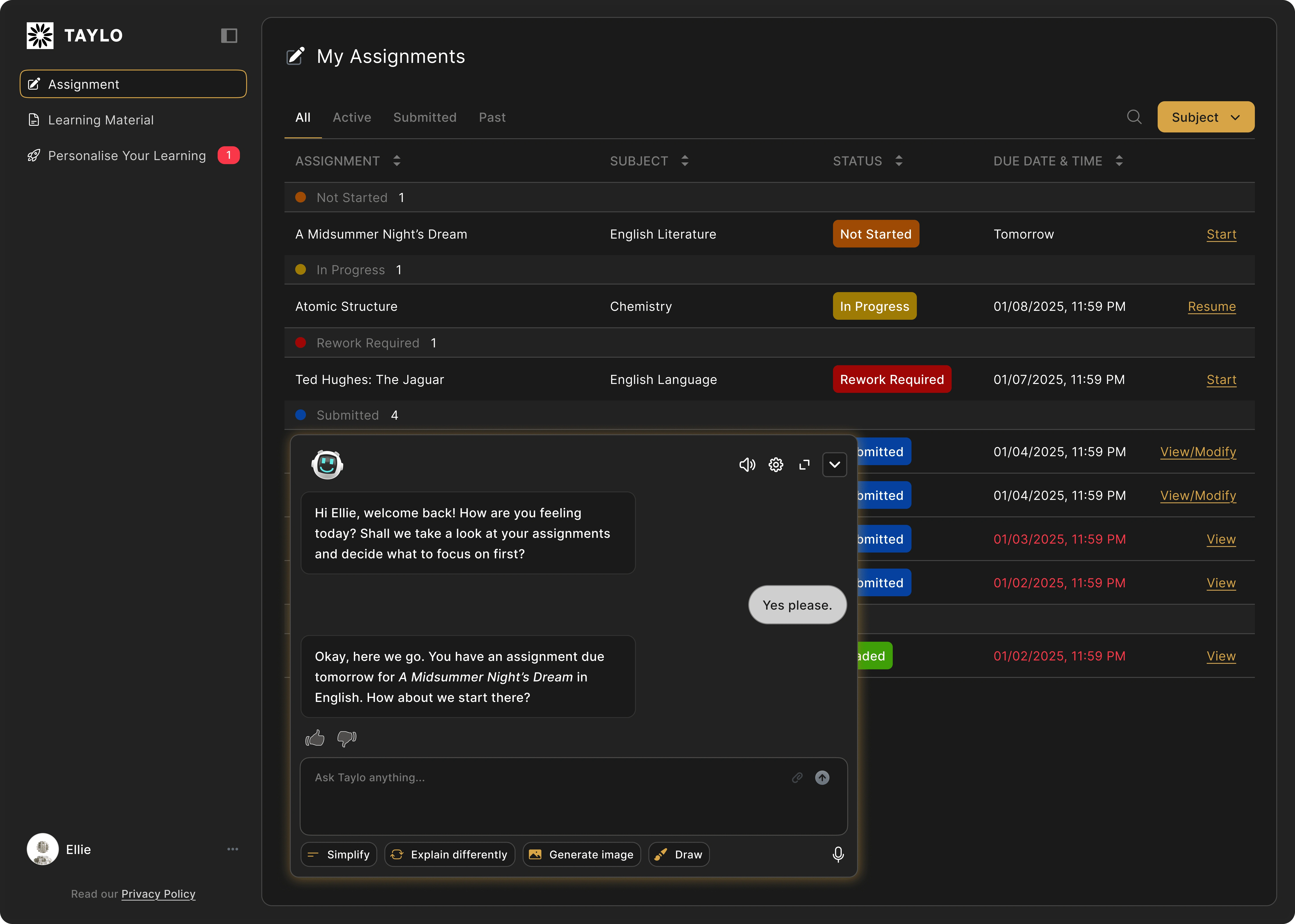
Our central strategy revolved around using a clean, dark-themed interface with high contrast, ample spacing, and simplified controls, as well as cleverly dividing dense information framework into multiple user steps that are more easily understood, both structure wise and function wise. Important UI elements like assignment status and action buttons are color-coded (e.g., Not Started in orange, Rework Required in red), supporting quick decision-making. Clear, digestible chunks of information help students stay focused without needing to process too much at once. This approach not only counterbalances the potential for user overwhelm, but also takes consideration towards students with different learning behaviors.
Designing for Emotional Safety and Learning Confidence
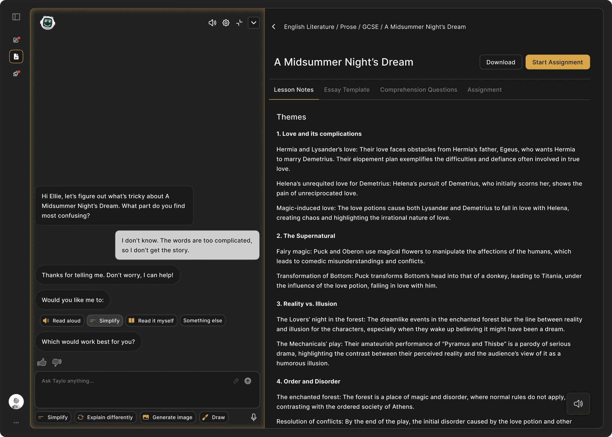
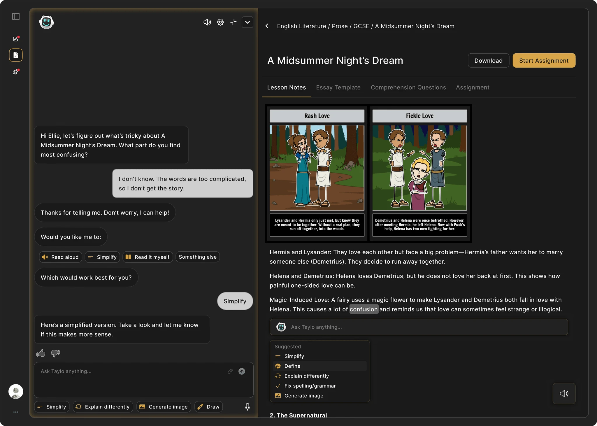
Many students, especially those with learning difficulties or lower confidence, are hesitant to admit when they’re confused. Thus, we created a friendly, conversational AI assistant that opens with empathetic language like “Thanks for telling me” and “Don’t worry, I can help.” This reduces stigma around not understanding and sets a supportive tone. Giving students agency over how they receive help via buttons like Simplify, Read aloud, or Explain differently can help empower them to choose support that fits their learning style.
Real-Time Feedback That Doesn’t Interrupt Flow
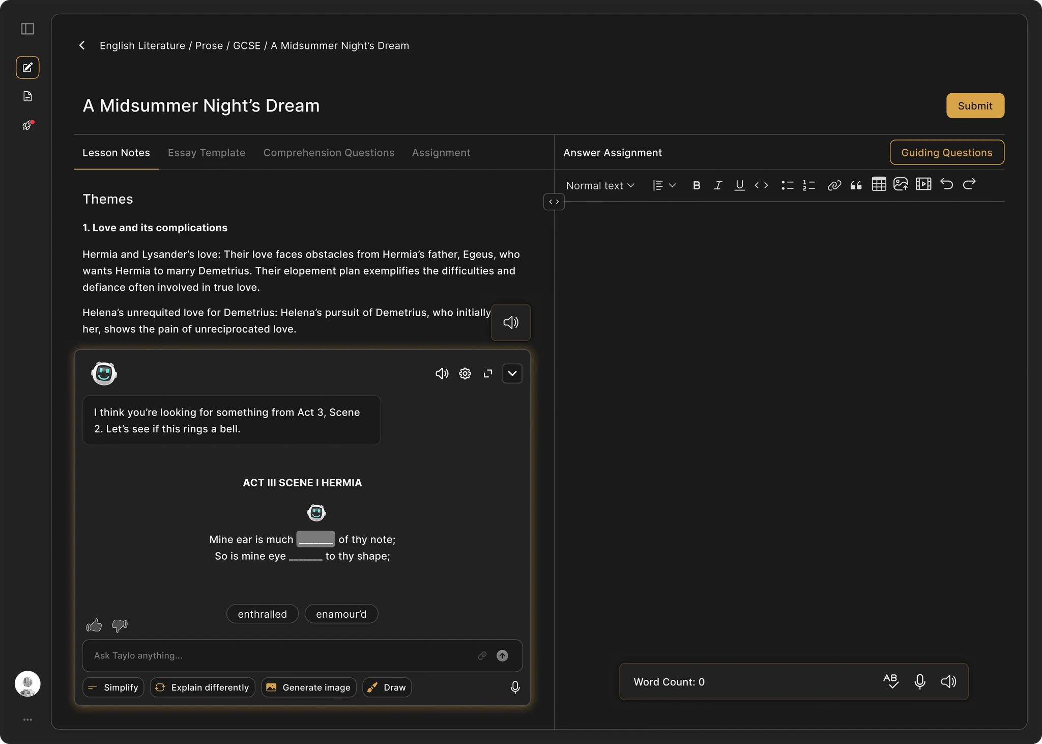
Learning moments often happen while a student is working, not before or after, so support needs to feel instant and non-disruptive. While students are writing or reading content, the assistant stays docked in the UI, offering contextual help ("simplify," "define," "draw"). This encourages help-seeking behavior without breaking focus or forcing a tab switch. When a student clicks a word like "confusion," a suggested tooltip appears instantly, reinforcing meaning without interrupting flow.
Like this project
Posted Apr 17, 2025
Partnered with Taylo AI to enhance educational tools through AI, ensuring accessibility for students of all ages, learning behaviors and work styles.
Likes
0
Views
7