UX Case Study
DESCRIPTION
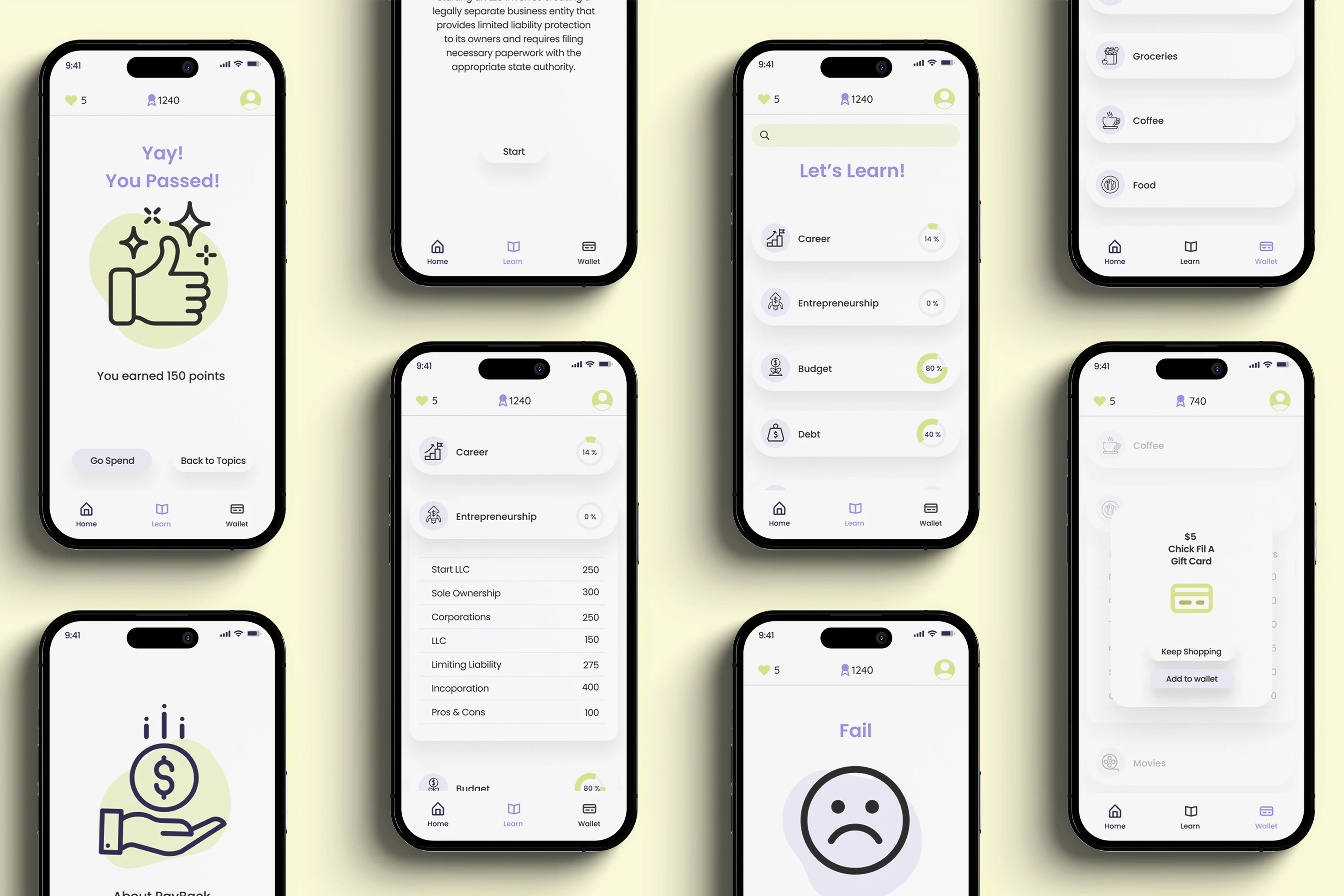
Pay Back is a gamification app that aims to help individuals who are financially illiterate learn about finance in an engaging and interactive way. This project is designed to make the learning process both fun and rewarding by allowing users to earn money while they learn.
Challenge
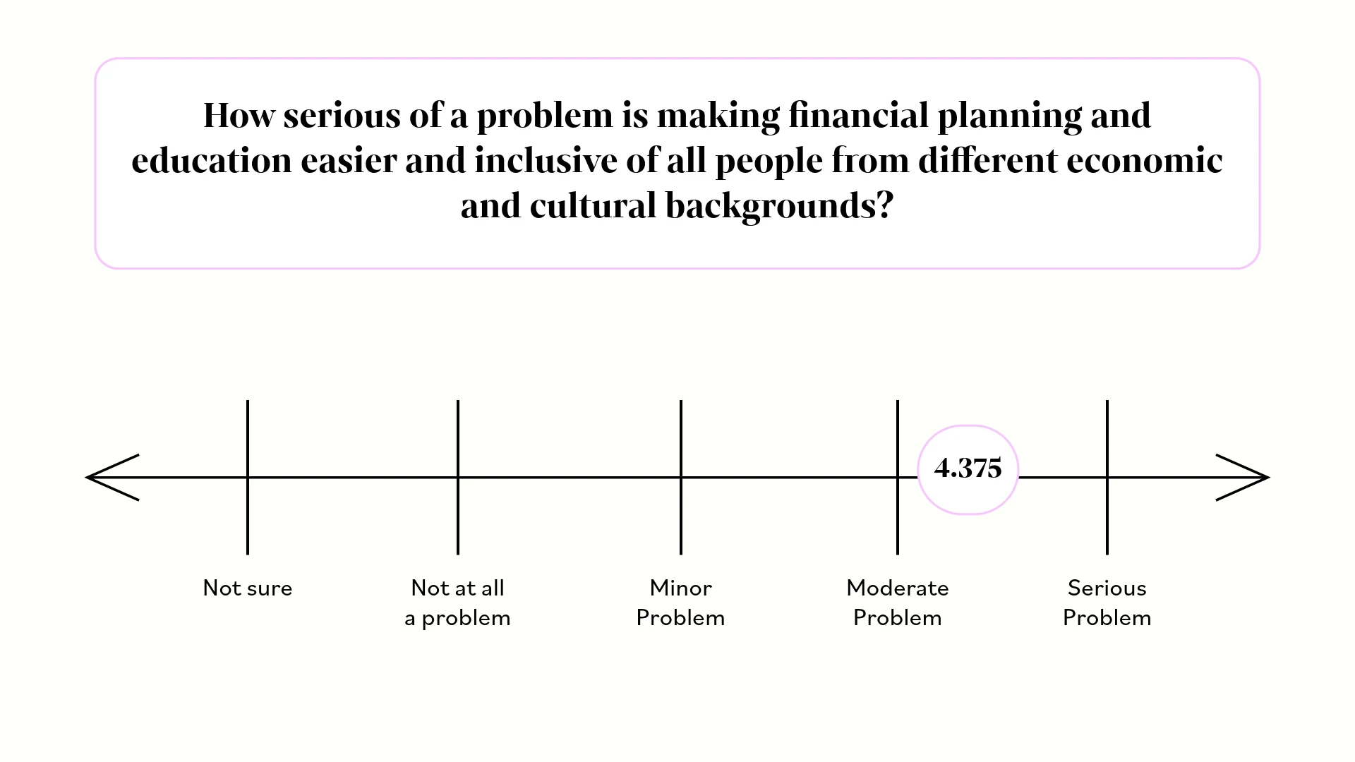
How might we make financial planning and education easier and inclusive of all people from different ecomnomic and cultural backgrounds?
Research
User Interviews
Objective:
The primary objective of the user research was to gain deep insights into who the target audience is, their behaviors, needs, and pain points to inform the design process effectively.
Methodology
Conducted in-depth interviews with 12 participants(conducted with the help of 2 other ux designers) to understand their goals, challenges, and preferences related to their thoughts about education in financial literacy.
Insights
After gathering all the data from the 12 interviews the following was found:
- Most want to start investing but don't know enough about it to actually start
- Some wish they would have learned more about financial literacy earlier in there life
- Most don't know where to find the proper resources to start learning or don't know where to start
- Most to all participants agree that there was/is cultural misinformation
-Minorities are learning how to create generational wealth
- There are not trustworthy resources
Competitive Analysis
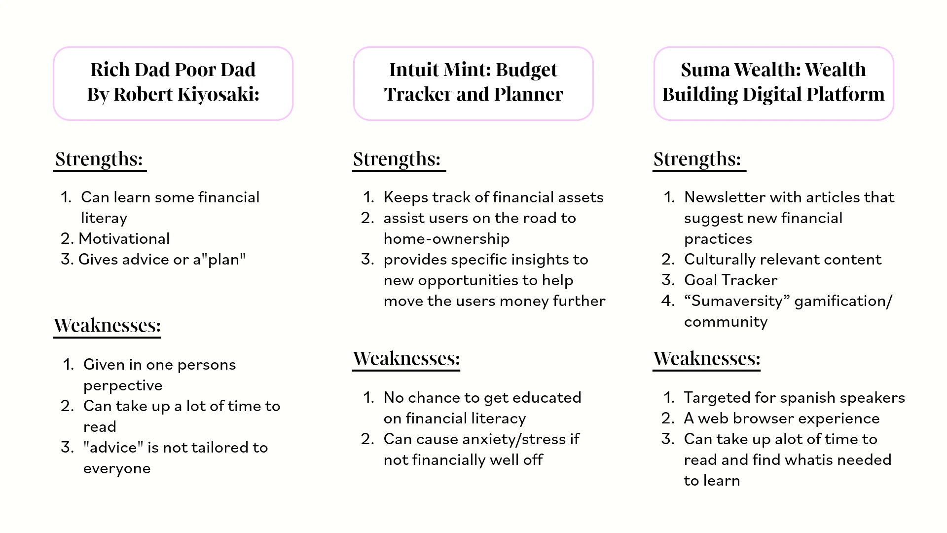
Rich Dad poor dad by Robert Kiyosaki (book)
Rich Dad Poor Dad gives two different socio-economic perspectives about advice in financial literacy. The author advises on and gives personal examples about financial literacy to progress further and become financially successful.
Intuit Mint: Budget Tracker and Planner (app)
Mint is a mobile app that tracks the main aspects of daily finances and helps optimize users spending and budgeting. It delivers personal insights on ways to save, pay down debts and bill management.
Suma Wealth: Wealth Building digital Platform (website)
Suma is a free digital financial platform that focuses on improving the wealth gap and increase generational wealth specifically among youngerLatinx communities. Suma focuses on using culturally relevant content with a goal of helping their users to a more financially prosperous future.
Insights
After analyzing what is out in the market for user the following was found:
- There is nothing that can be accessible for "on the go"
- Users are having to jump from resource to resource to get answers
- There is no type of incentive for learners
- To get help from "professionals" the user/learner has to pay them
User Persona
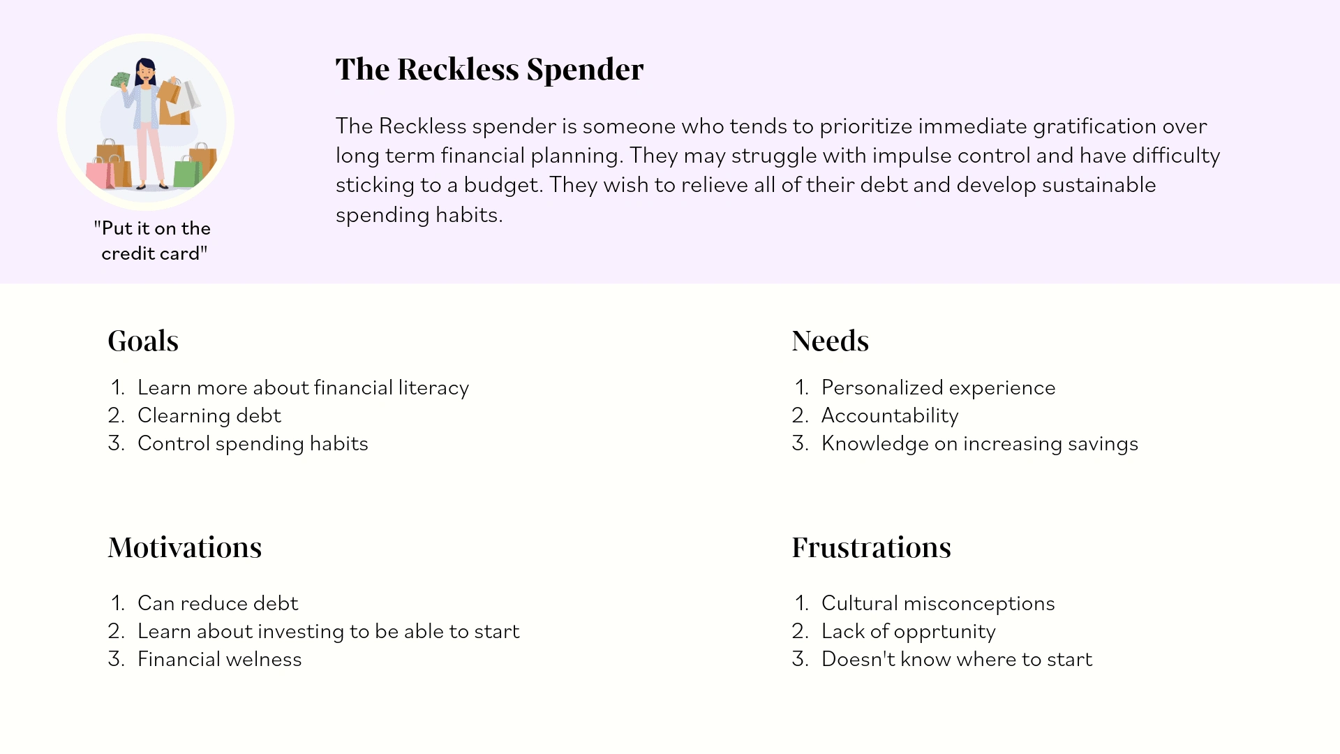
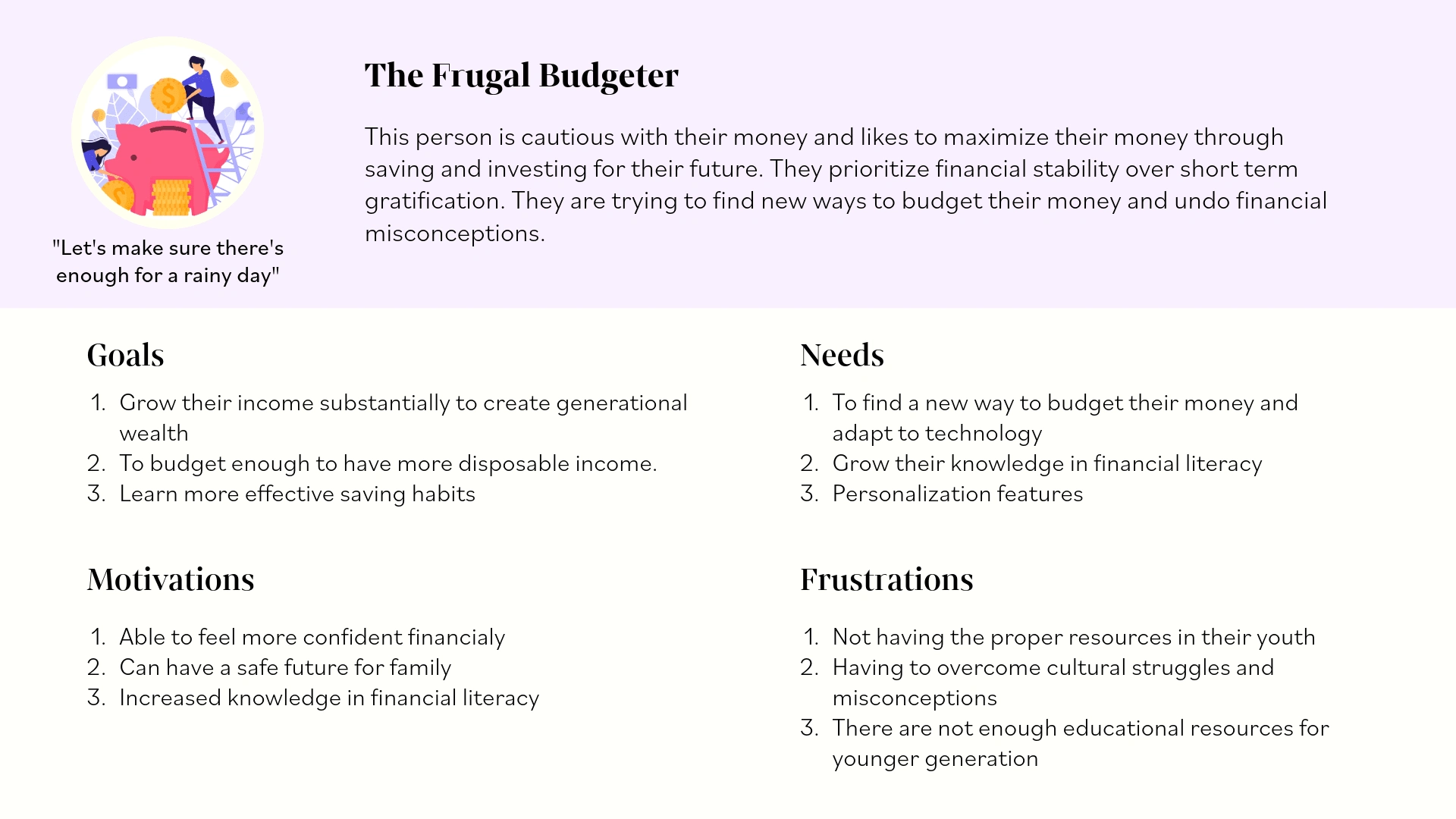
After learning a lot about the audience and what they want, I use user personas to represent different groups of people. These personas enable me to concentrate on addressing the most critical issues by focusing on the primary needs of our key user groups. While always keeping in mind their goals and frustrations so that I can create an easier experience for them.
Feature Priortization
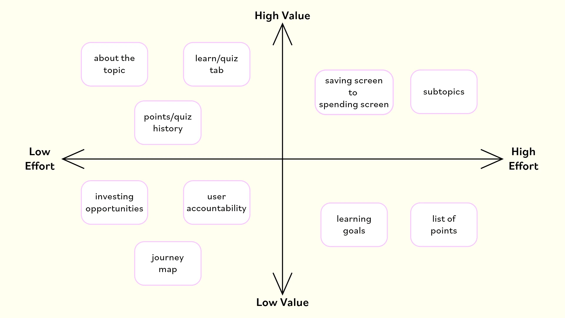
I took the initiative to brainstorm and generate ideas for the actual features of the app. Considering the context of using the app on the go, my focus was on creating an interface that is effortless to navigate. This includes incorporating a streamlined onboarding process and ensuring quick access to the main feature. By leveraging the insights gained from the research phase, I was able to distinguish between features that would offer low versus high value to the user.
User Flows
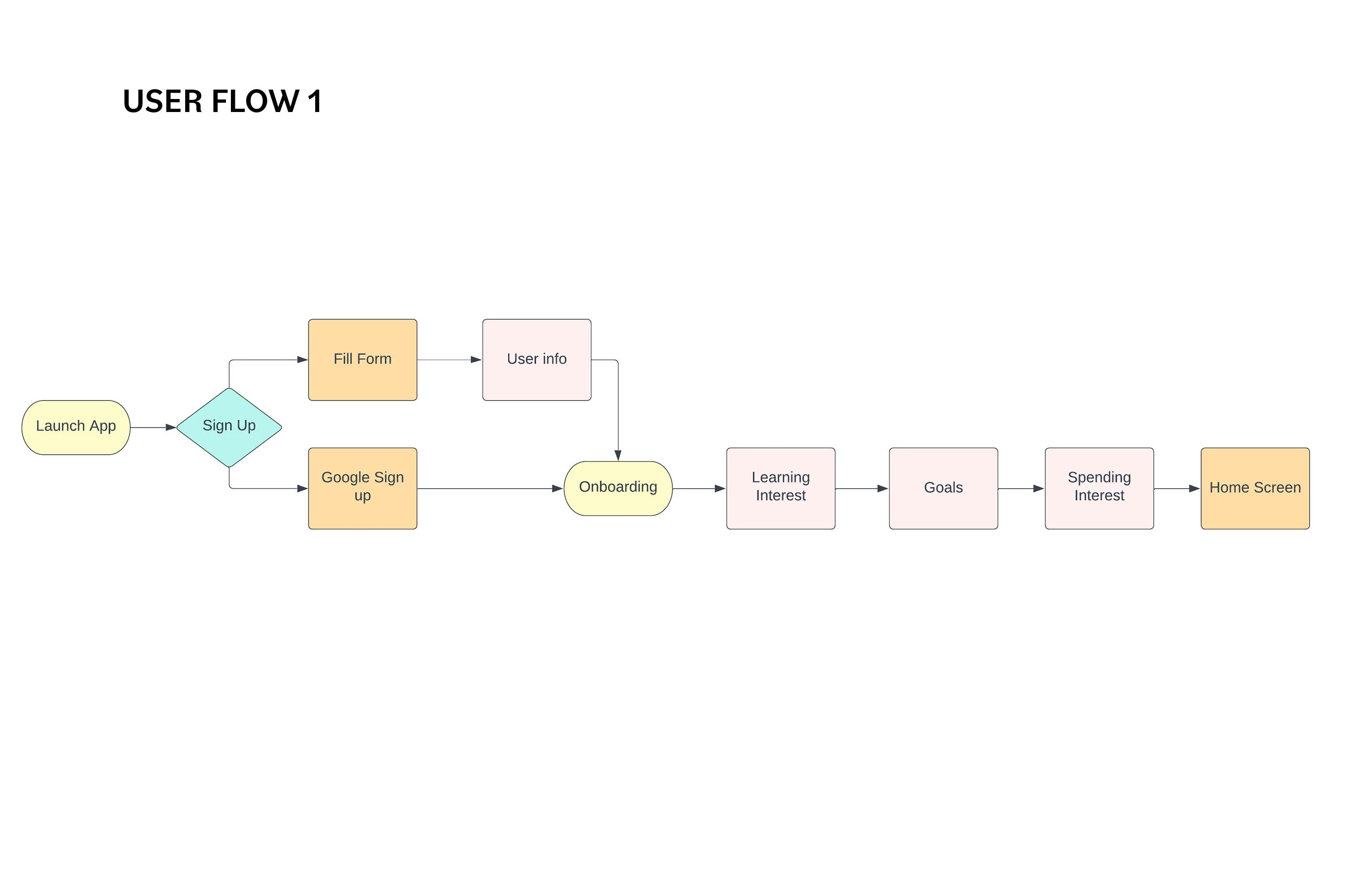
USER FLOW 1 (LAUNCH APP)
Launch the app to start learning more about financial literacy. This user flow assumes the user is using the app for the first time
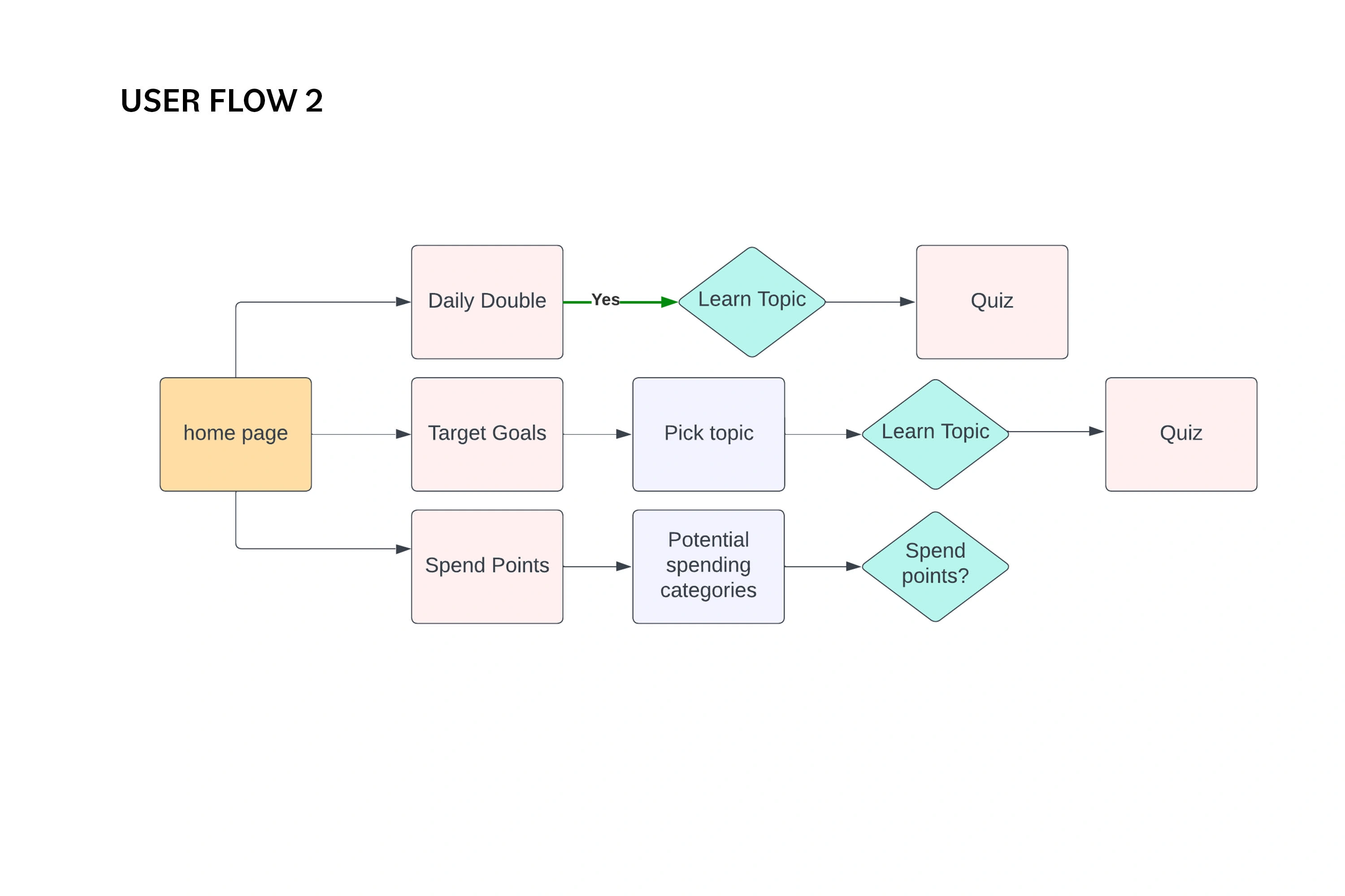
USER FLOW 2 (HOME PAGE)
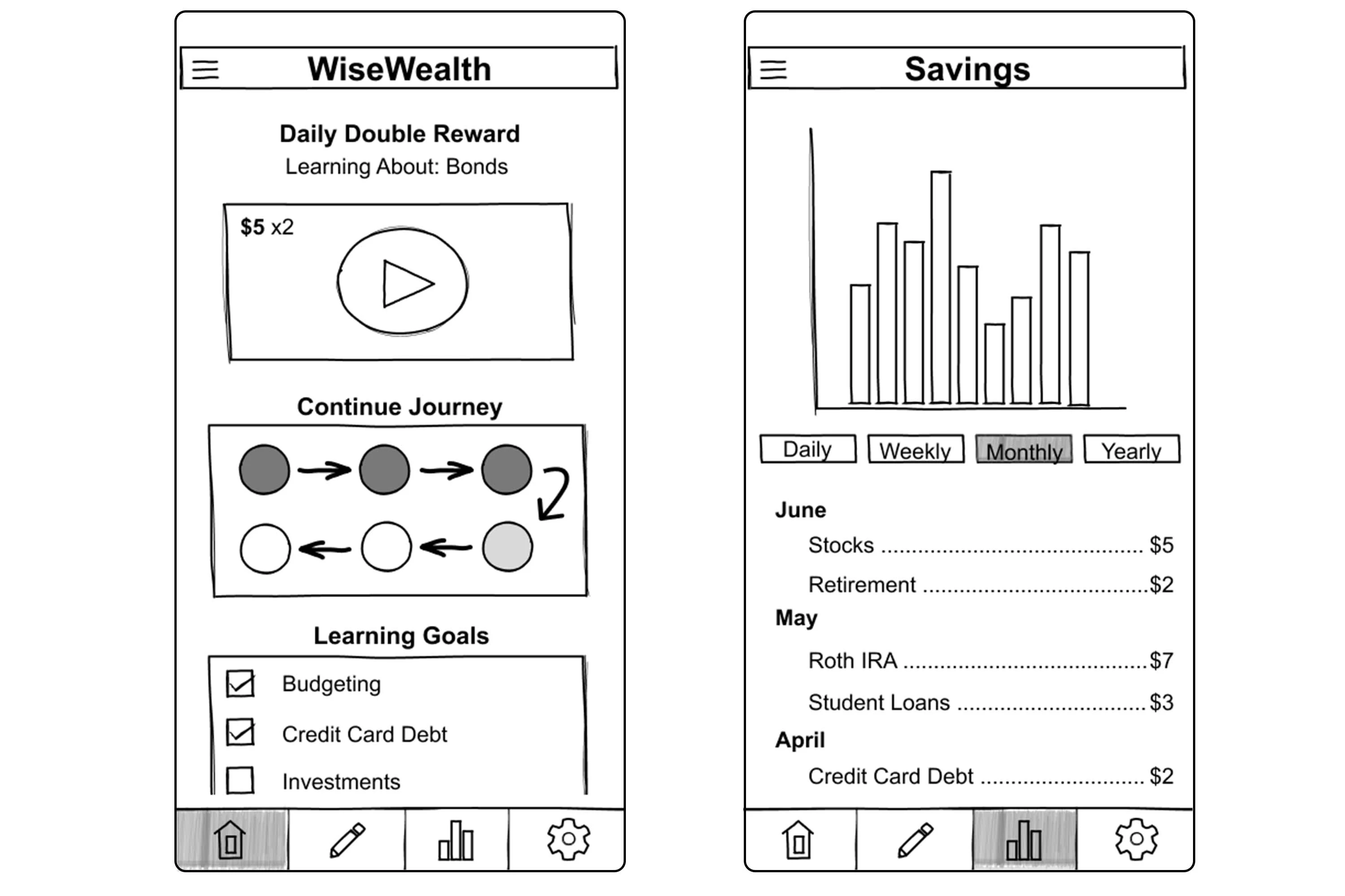
User is able to see a chance for a double point opportunity. Able to see goals that need to be met along with their perspective learning lesson.
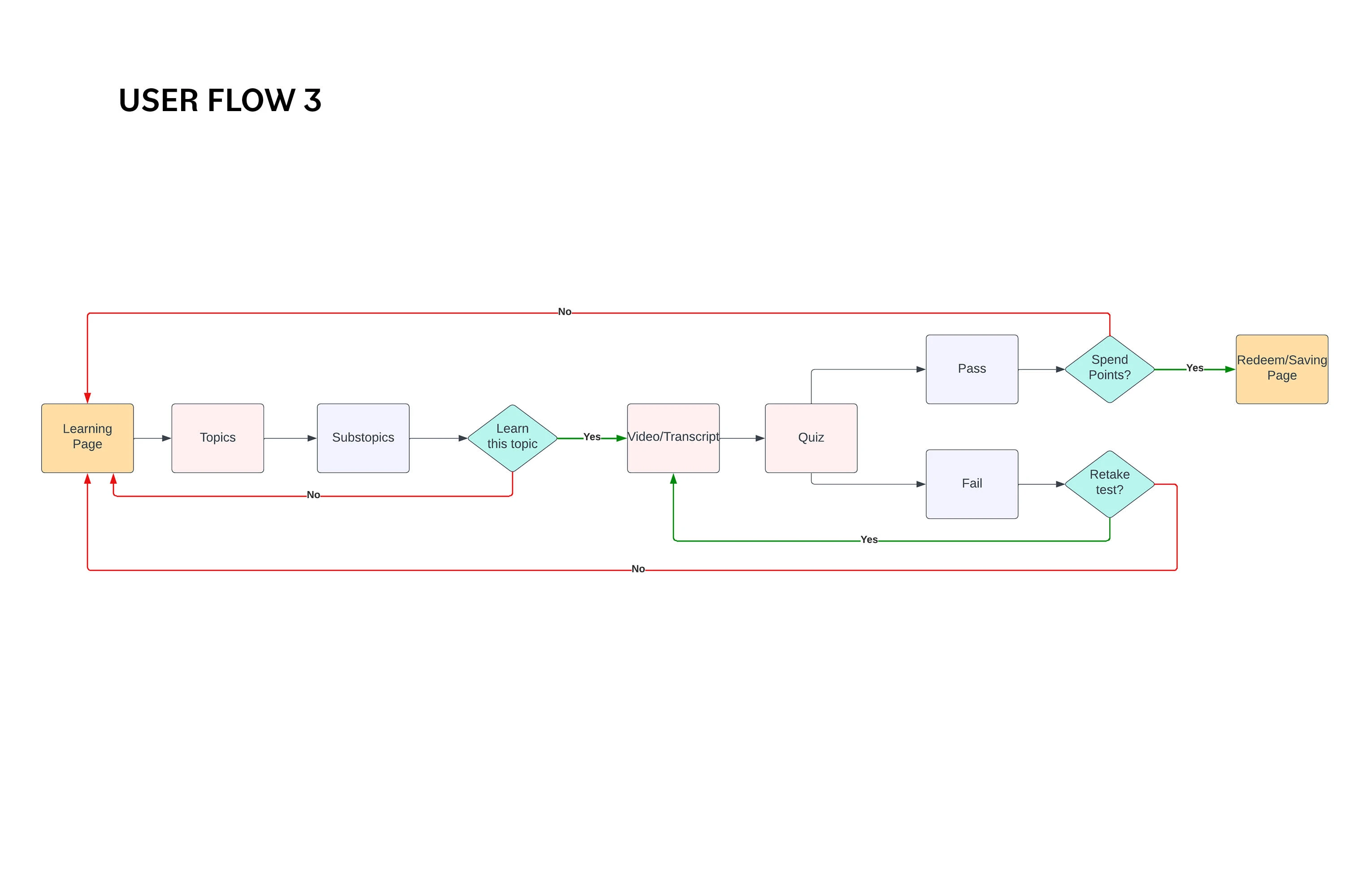
USER FLOW 3 (LEARNING PAGE)
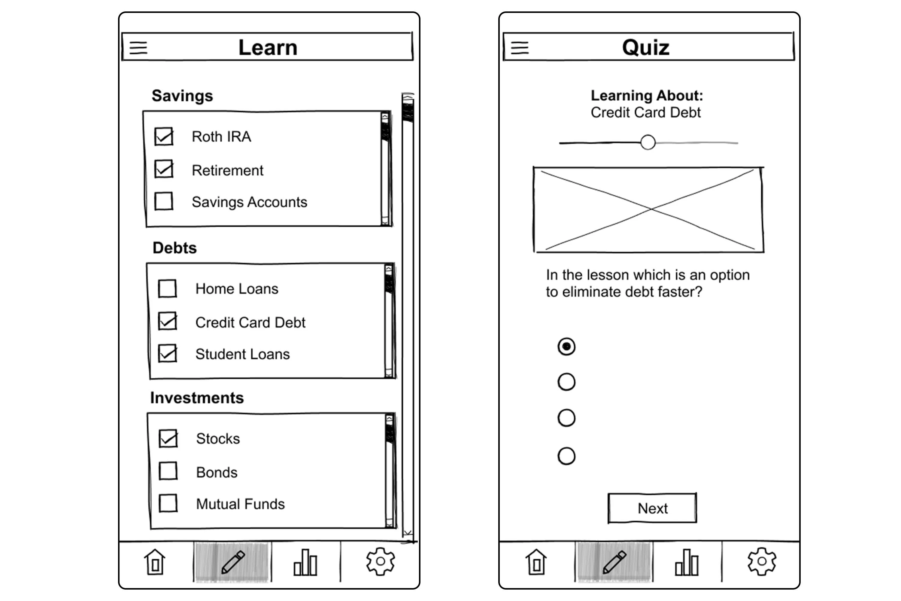
Learning tab the user views categories along with their subcategories. Once a topic is chosen they with see video/transcript, once finished they take a quiz. If passed, they are awarded points and given the option to redeem points. If failed, they can retake quiz/lesson or head back to the learning page with the categories list.
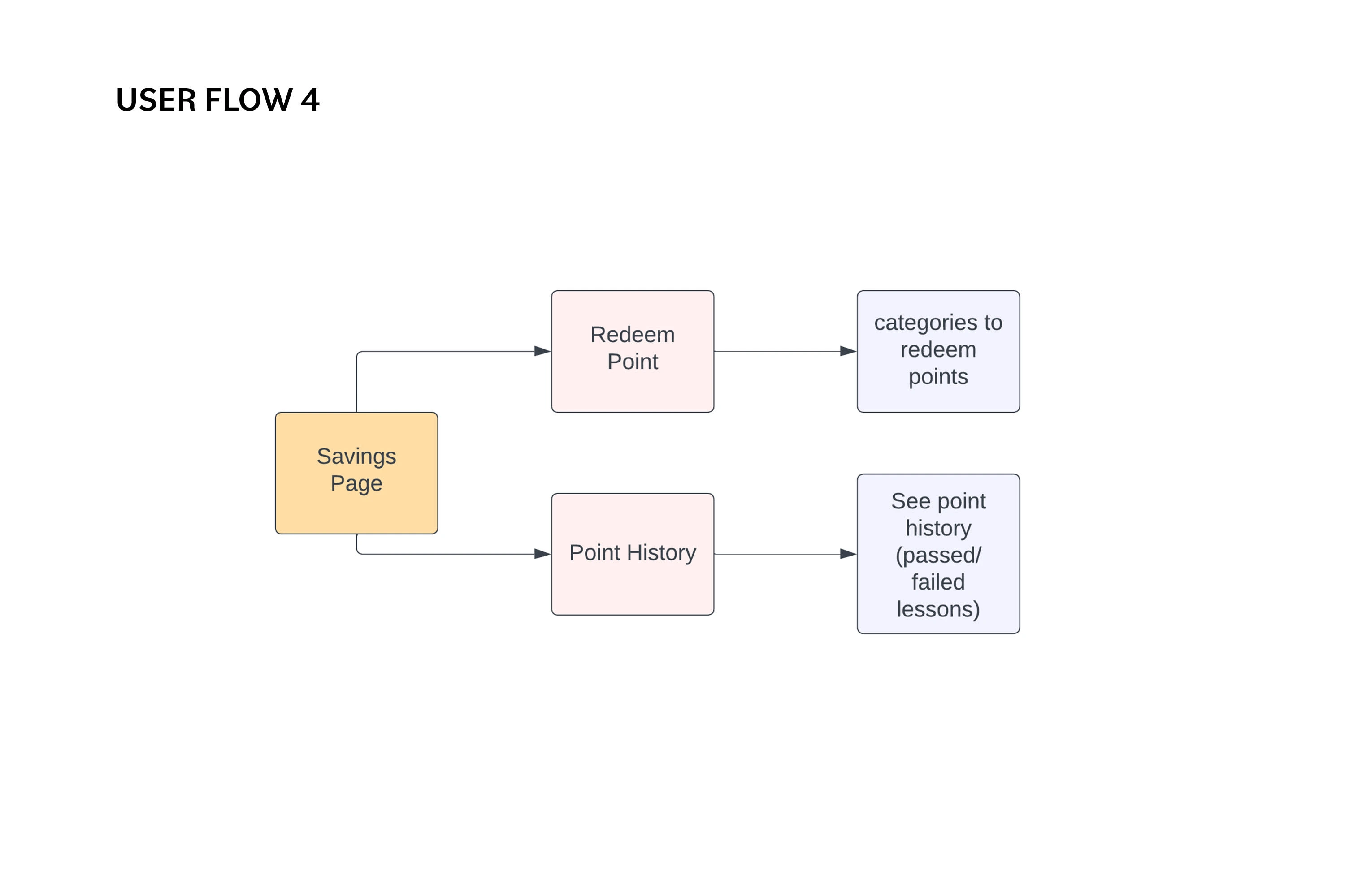
USER FLOW 4 (SAVINGS PAGE)
Savings tab the user can view total amount of points, as well as categories to redeem the points. They are also able to see the point history that includes passed and failed lessons.
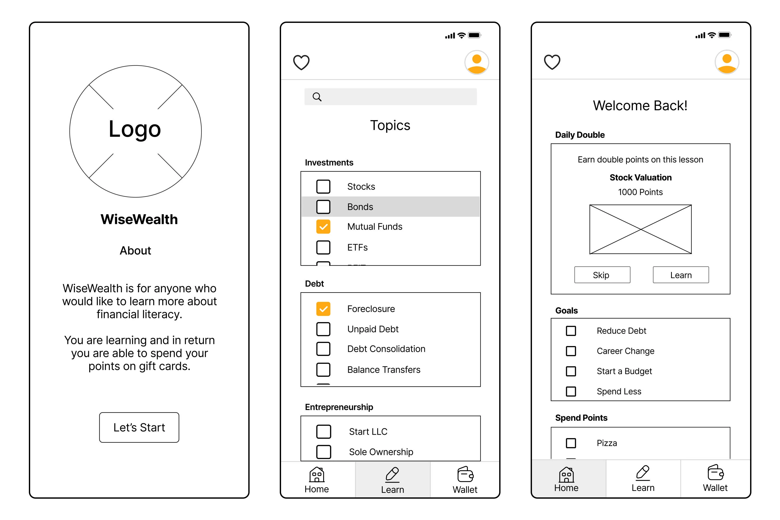
Lo-fi Wireframes
The first simple wireframes helped me test usability early on and pinpoint essential changes. This reduced the need for many revisions in later versions, as the main focus shifted to creating the polished high-fidelity interface. The updated version includes tweaks to information structure and microcopy.
- Get rid of the journey map
- Savings Page should be more of a Spending page
Prototype
CONCLUSION
With the final prototype created, I believe I have met the challenge that were outlined in the beginning of the design process. I designed a mobile named Pay Back that provides gamification centering on learning financial literacy. I believe a created an application that has an easy to use interface where the user wont get overwhelmed, making the learning process more easier.
For the future I hope to incorporate more accessibly features to be able to help a wider range of users.
Like this project
Posted Aug 23, 2024
Pay Back is a gamification app that aims to help individuals who are financially illiterate learn about finance in an engaging and interactive way.

