Built with Framer
CForce Dashboard
Yaroslav Tsyhanenko
Client Force Dashboard
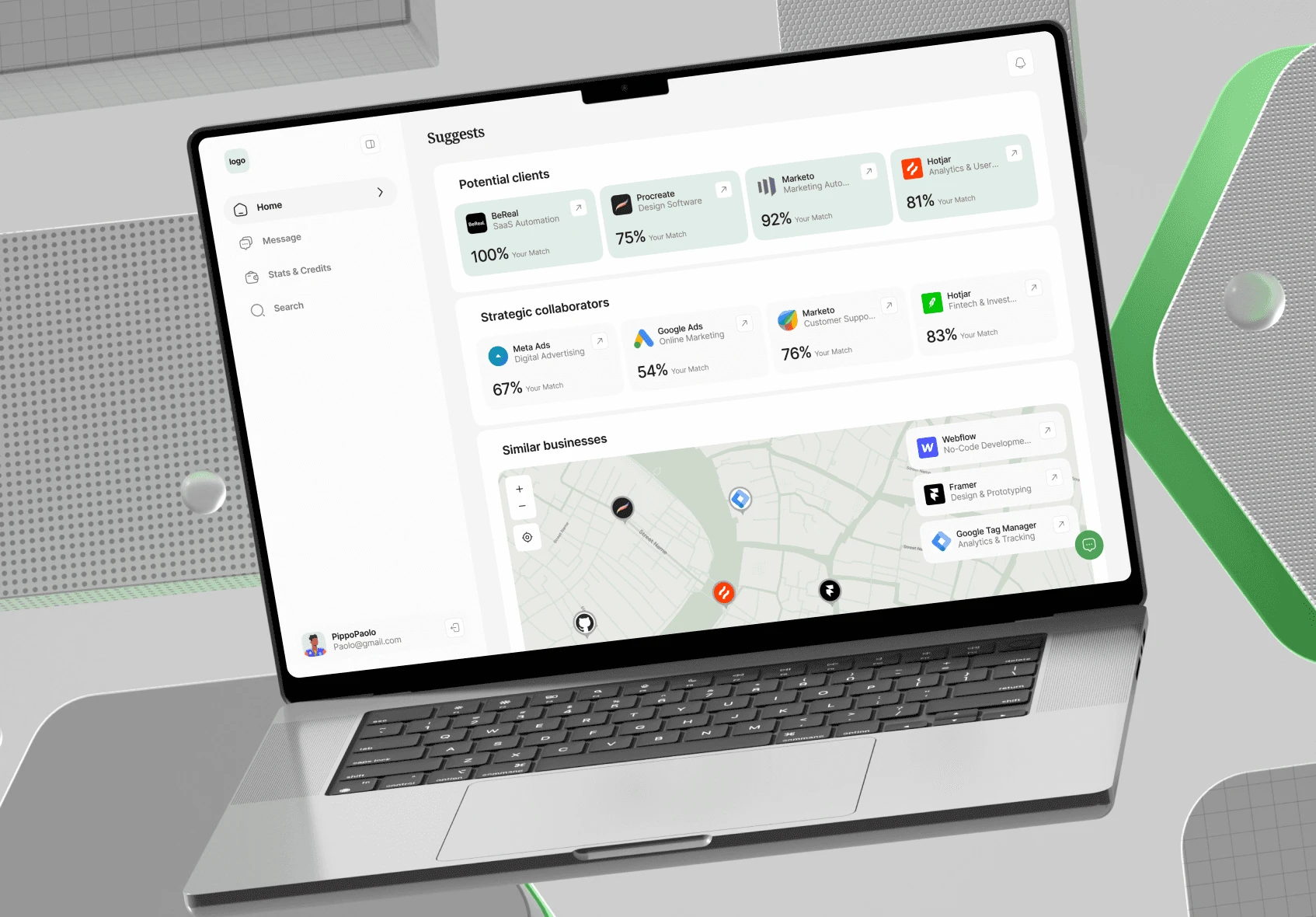
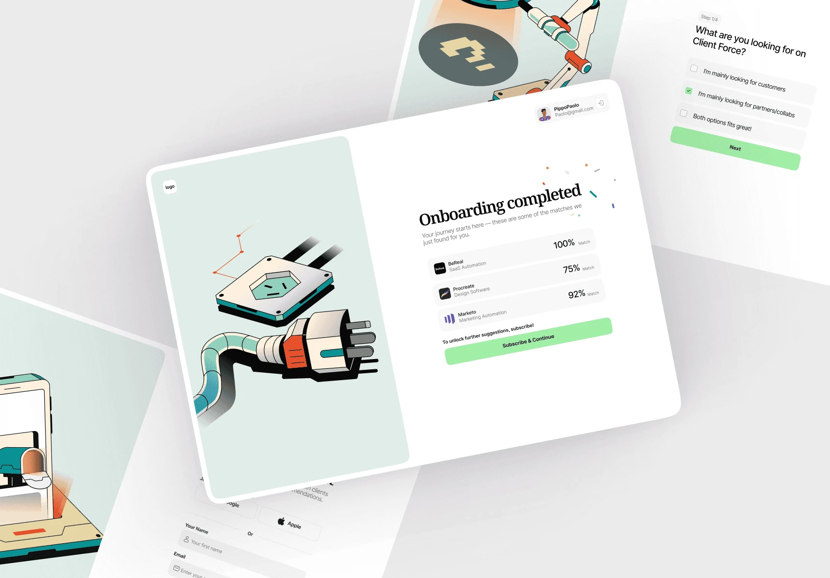
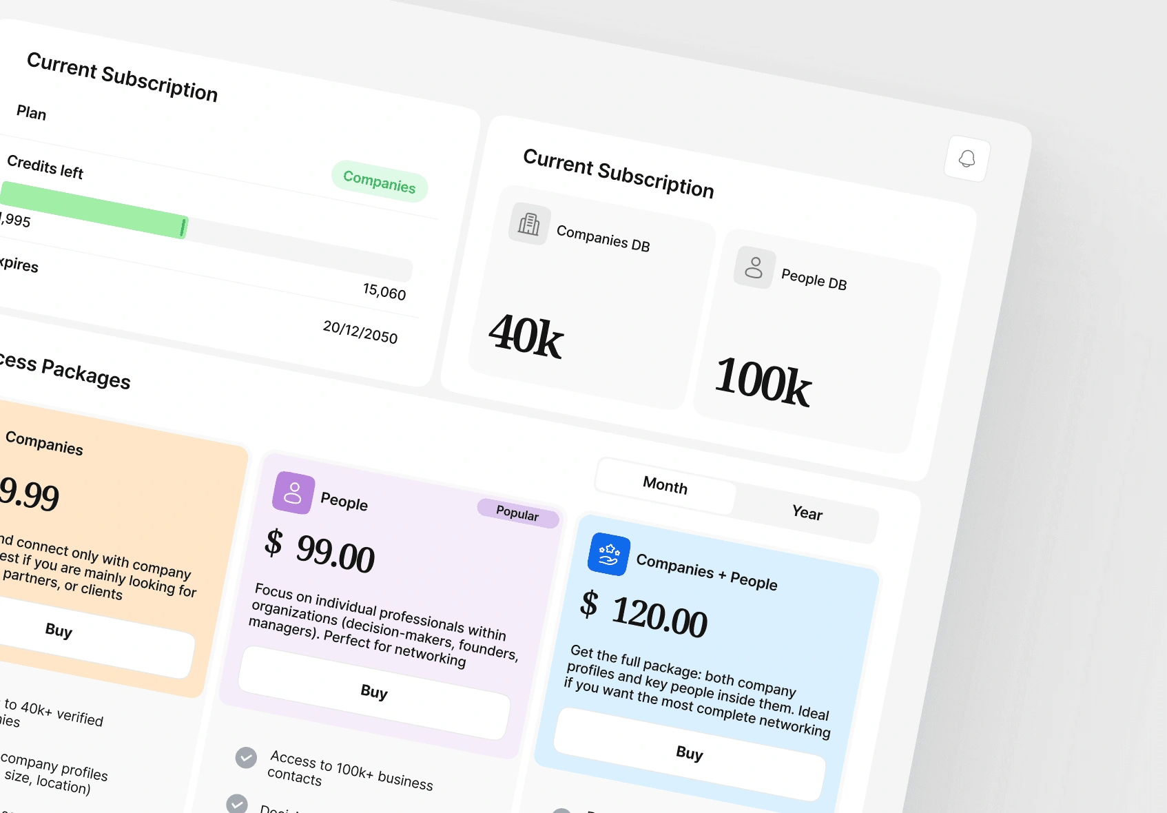
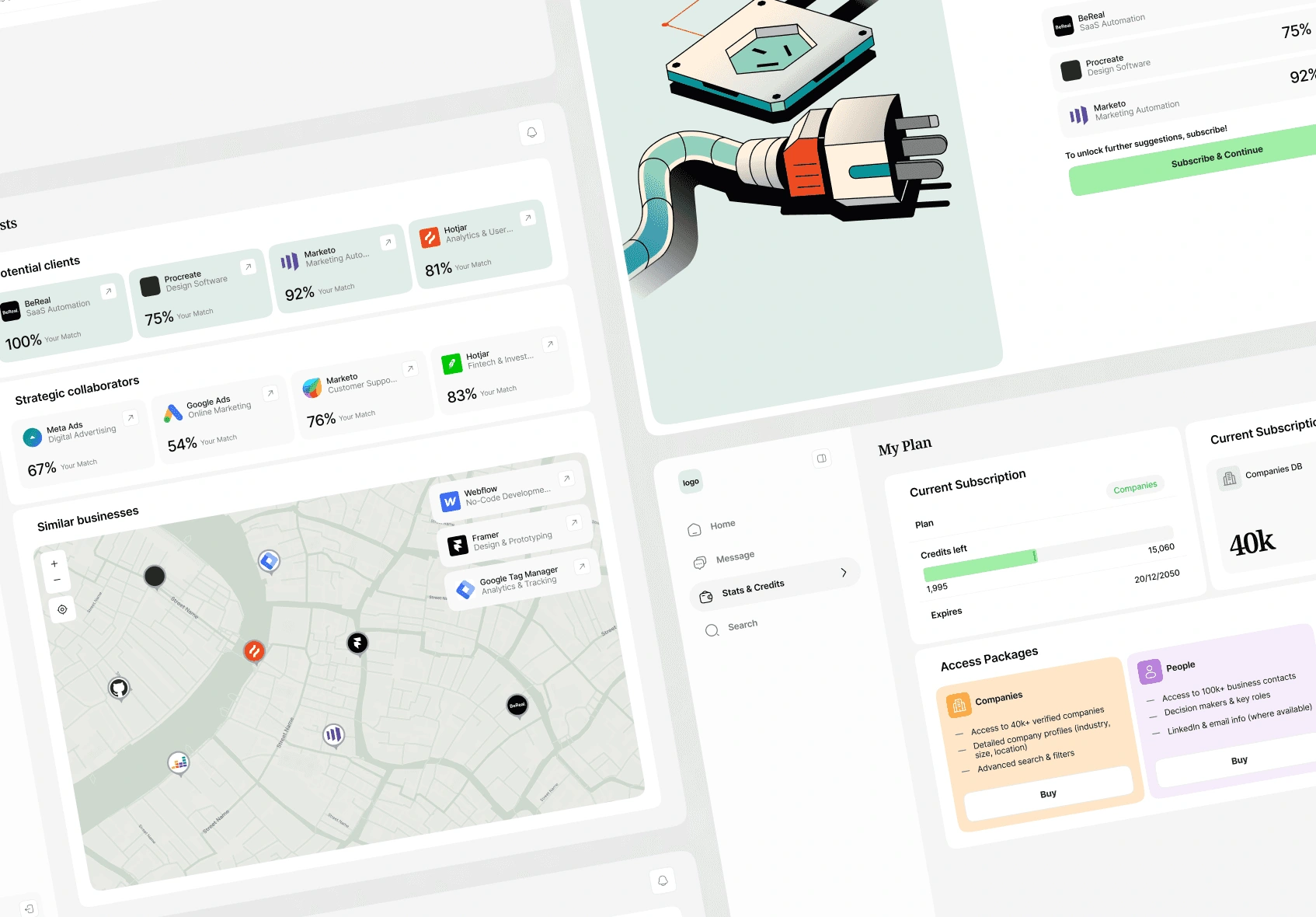
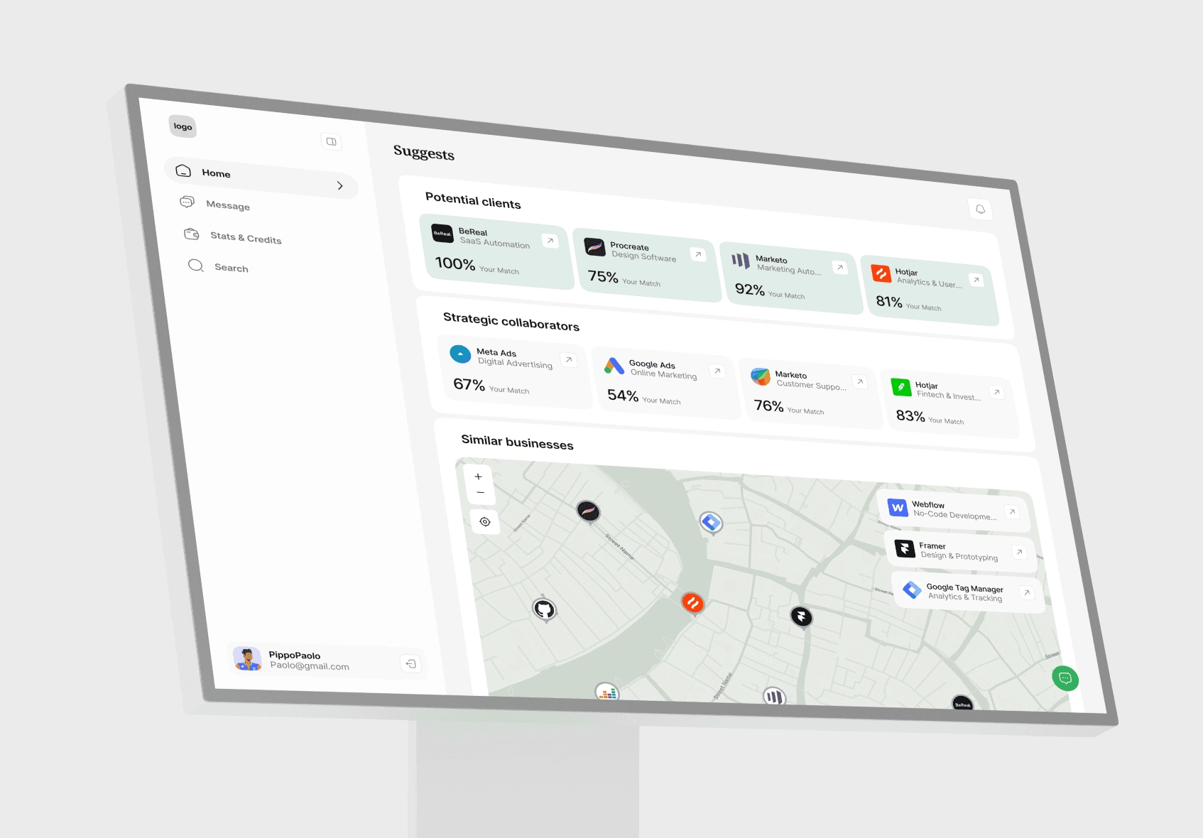
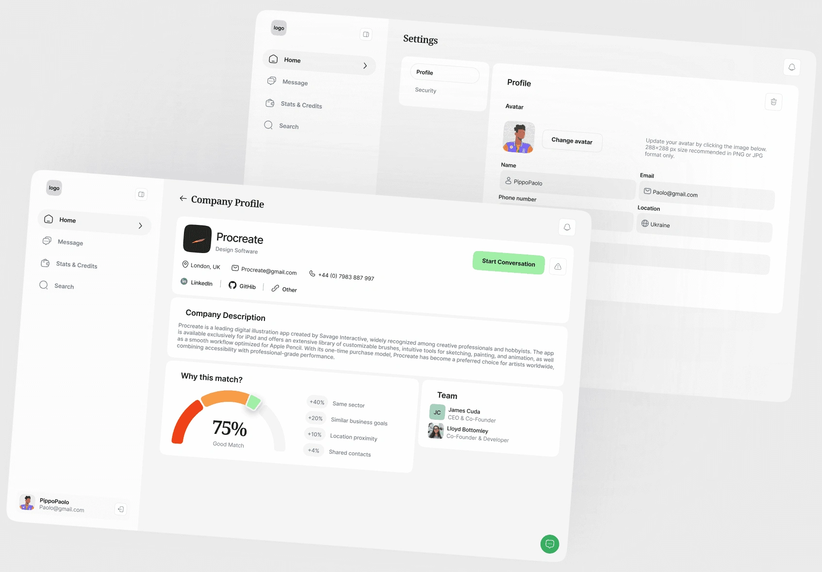
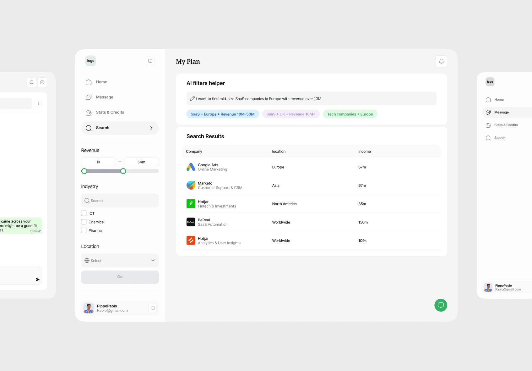
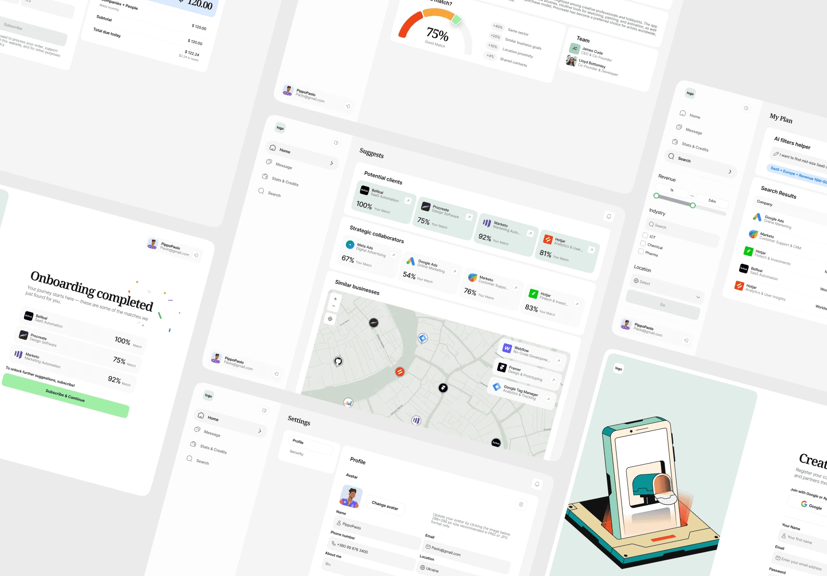
CForce is a web platform that helps teams and managers monitor projects, track performance, and optimize workload distribution in real time. With clear data visualization and intuitive navigation, CForce turns complex operations into actionable insights — empowering teams to stay aligned and productive.
Challange
Designing a dashboard that makes large amounts of data simple and actionable. The main challenge was to present complex performance metrics in a way that feels professional, trustworthy, and easy to scan — without overwhelming users. We also needed to ensure the interface worked seamlessly across devices for managers on the go.
Goal
To create a modern, scalable design system that transforms raw data into meaningful visuals. The goal was to make project health, resource allocation, and performance tracking instantly clear, while keeping the experience efficient and engaging for busy teams and decision-makers.
Solution
We designed CForce with a clean, structured layout, using a balanced color system, strong typographic hierarchy, and interactive charts to highlight key insights. Clear status indicators, filterable views, and personalized dashboards help users focus on priorities without losing the bigger picture. The result is a dashboard that combines professionalism with usability — making data-driven decision making faster, easier, and more transparent.
Like this project
Posted May 16, 2026
Web platform dashboard design for client CForce, focusing on data visualization and usability.
Likes
1
Views
2