HELP VZLA/AYUDA VZLA 🇻🇪
Client: The People
Scope: UI/UX Design, Frontend Development
Category: Education, Humanitarian
Description: Humanitarian project that serves to help Americans and Venezuelans find ways how to help, serve, and give aid to the crisis in Venezuela under the re-election of the dictator, Nicolas Maduro, who stole the election from Edmundo.
THE CHALLENGE: FINDING HOW TO HELP FROM THE USA
After researching and asking around, I learned that with the Venezuelan dictatorship suppressing truthful media, it’s crucial to share the content from independent sources in Venezuela on social media to reveal the reality of the situation. My challenge was to create a platform that compacted this information in a clear and engaging way, while also making it visually appealing and accessible on any device, all while ensuring great performance.
THE CATALYST:
IT ALL STARTED WITH AN INTERNAL SERVER ERROR
The website's design was inspired by a simple "Internal Server Error" message I encountered on Google Chrome. The stark contrast of the black background, white text, and monospace font struck me as both simple and powerful. Initially, I had been working on a design using the colors of Venezuela, aiming for a modern tech look with a single vertical column. However, this approach felt more complex than the error message that ultimately inspired the site. Embracing the simplicity and urgency of the error screen, I refocused the design to reflect a sense of alertness and urgency, symbolizing a callout for those who have been silenced in Venezuela. This became the foundation of the website's design. This became, Ayudavzla.com
THE ERROR
OUR PLAN
-> UI/UX Design & Prototyping
-> Website Development
-> Visual Identity & Web Design
-> Domain, SEO, & Launch
UI/UX DESIGN
The UI/UX design of ayudavzla.com was inspired by three things: the censorship of independent news in Venezuela, which reminded me of the dark web; During the process I got a Google Chrome “Internal Server Error” page, which influenced the use of monospace and minimalism; and lastly the concept of truth, represented in black, white, and grey tones to encourage unbiased interpretation.
*below is the pre-visual process of the website, this is a "North-Star" to lead the design*
VISION: The dream for this website is to help fellow Venezuelans, and Americans learn how to help the people of Venezuela spread the truth, and give aid during political chaos.
MISSION: The way to achieve the dream, is by creating a unique website that amplifies the voices and resources to help Venezuelans who are on a chokehold from the dictator, Nicolas Maduro, and his followers, Chavistas, that can be accessed anywhere with the highest of speeds, and have close to zero lag since the internet speeds in Venezuela can be very slow, lastly it has to be in both english and spanish. Meaning the code has to be efficient, the design has to be unique and simple, and the language has to be perfectly translated.
PURPOSE: A website that offers ways for people in the USA to support Venezuela.
RESEARCH: I researched tools, resources, and methods to provide effective assistance. I also conducted extensive UX and Frontend Dev research to identify user-friendly components that would support a minimal, fast, and efficient website. Additionally, I explored the suitability of a perpetual “dark mode” design and confirmed that it was a well-received and appropriate choice for the target audience of 18-40.
Light to Dark Mode
PROTOTYPING & CHALLENGES
WIREFRAMES: I have a lot of experience in simultaneous design and development due to hackathons, AGILE, SCRUM, & In general sprinting while creating top level products. So I skipped wireframing due to time constraints and went straight to high-fidelity development. This approach allowed for faster iteration and continuous inspiration. I designed as I developed, finding inspiration along the way. Starting with the first page, I refined my understanding of the design and development process, which accelerated the creation of additional pages. It became a productive cycle.
DESIGN CHALLENGES: The biggest challenge was keeping the design simple yet effective, ensuring that it was both visually appealing and easy to navigate, despite never having done anything like this before.
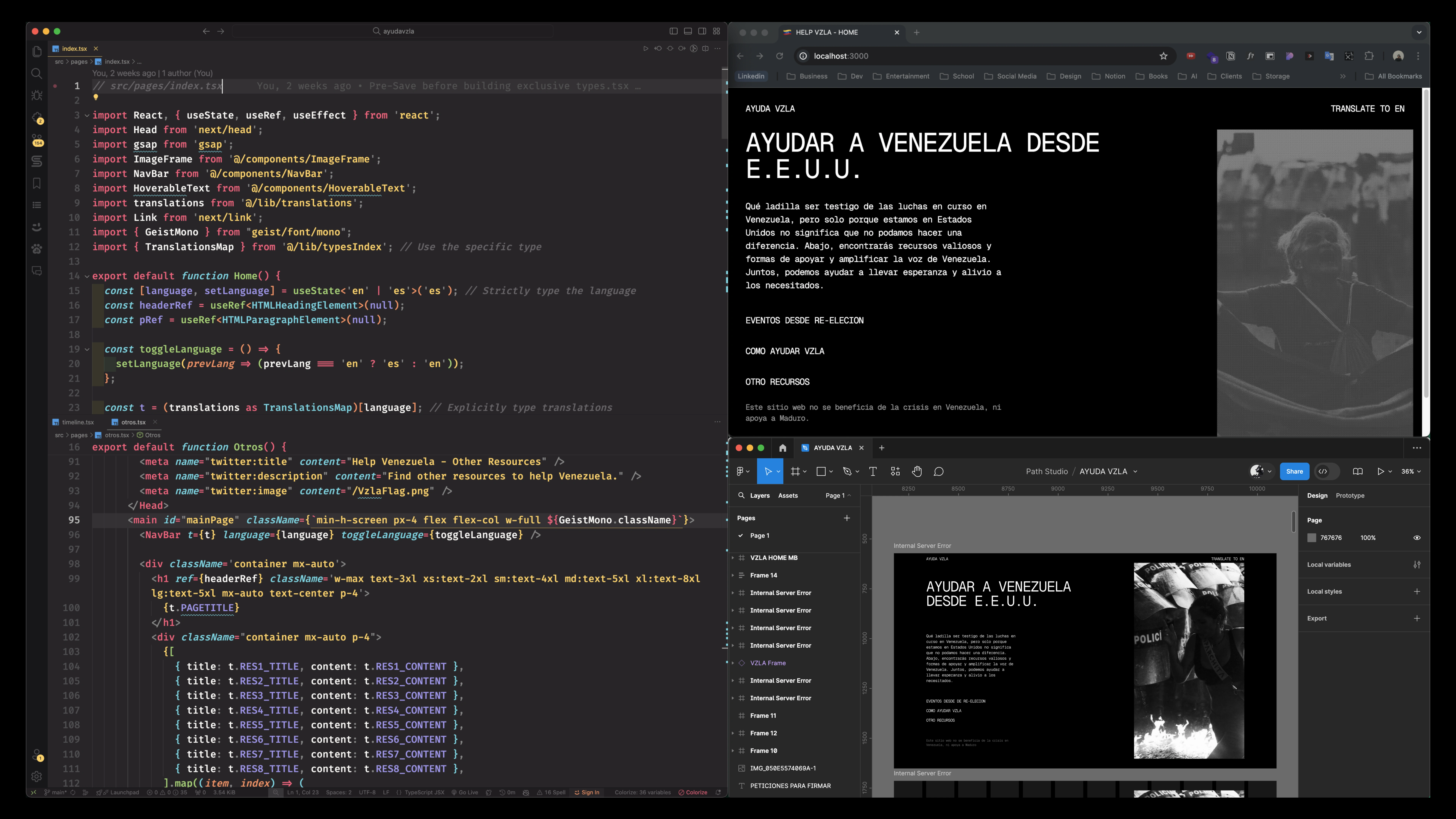
Image of me developing while designing
WEBSITE <DEVELOPMENT/>
Leading the frontend development of this project, I wanted a tech stack that was effective for static site generation, SEO, Images, and of course easy domain and server connection. With these conditions I chose NEXT.JS, TypeScript, GSAP animation Library, and Tailwind CSS.

Tech stack visual
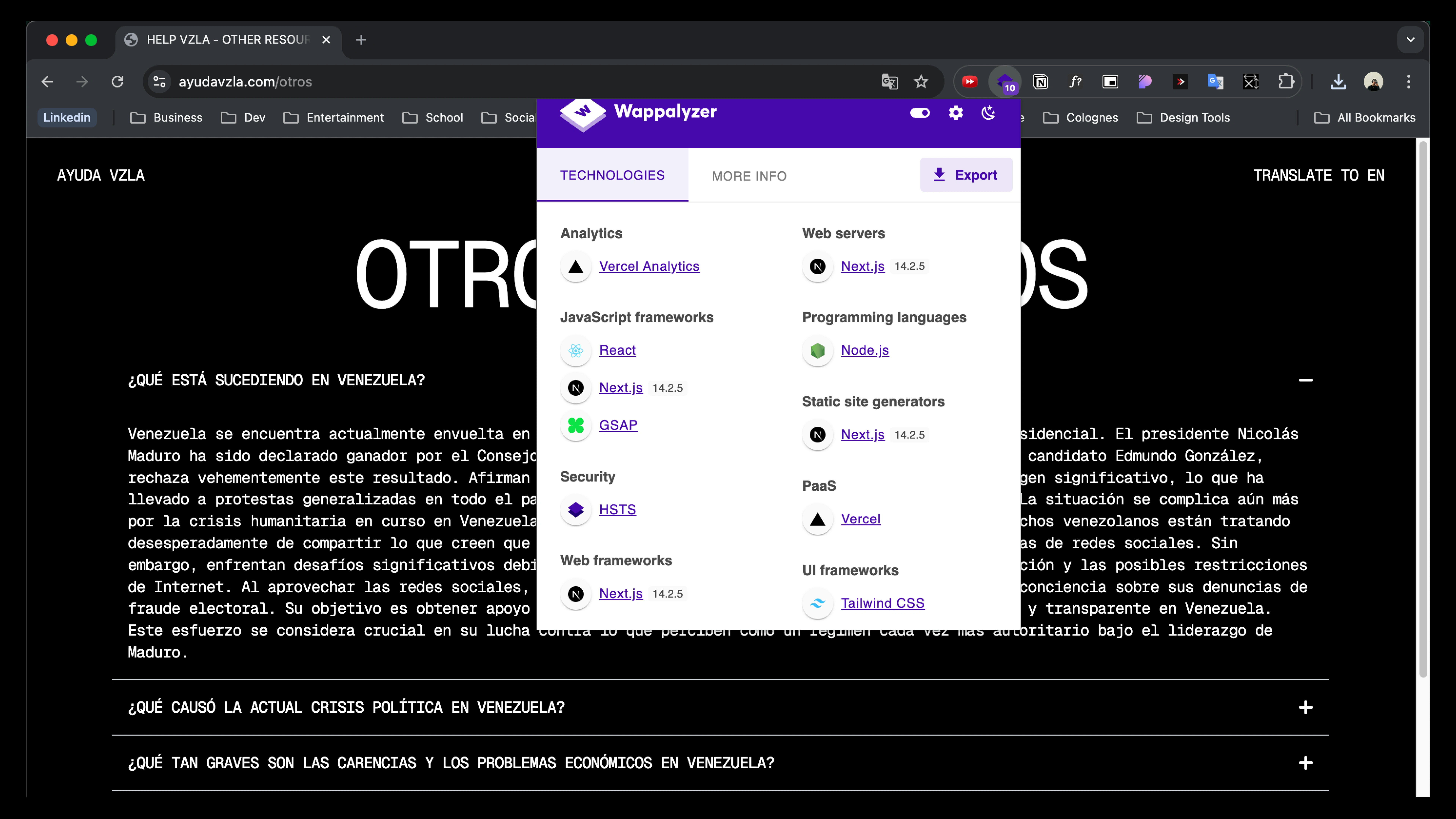
Screenshot of tech stack
RESPONSIVE DESIGN: My approach to responsive design is utilizing how my brain works. With my photography background, I have always found that I can create inspiration for myself by going landscape then portrait. Translating this into responsive design, I designed for Desktop first, then Mobile. This way I can have a lot of detail in the desktop and then find the essential and design from there for Mobile. So using Flex, Flex-Columns, and Flex-Rows for responsiveness between screen widths really helped, and fortunately I was still able to keep all the cool animations, and layout of typography, & imagery.
TESTING/PERFORMANCE: With the use of NEXT.JS I was able to utilize their native ‘NPM RUN BUILD’ command in the terminal to test the product and find errors. I found many errors through out, some dumb and simple, and others frustratingly complicated that had me gaslighting myself (I had a bug that after refreshing my computer it gave me the green check). For performance, I used fast logic, NEXT Image, NEXT Link, and NEXT Analytics/Speed to improve performance and to find ways to better the website.
VISUAL IDENTITY
COLOR SCHEME: Consistently used a black background with white text. Forming strong and uniform visual identity to reinforce the minimalistic, somber tone that aligns with the serious subject matter of the site. On highlight text, the text gets a yellow background and black text to be similar to caution tape, and highlighting info on newspapers. Lastly, when interacting with any buttons or links the onHover state turns the text to red to address that this is important.
TYPOGRAPHY: The typography is consistent across all pages, with the use of a monospaced font that reinforces the minimalist and neutral design approach. This choice supports the theme of unbiased and clear information dissemination, which is crucial for the website’s purpose.
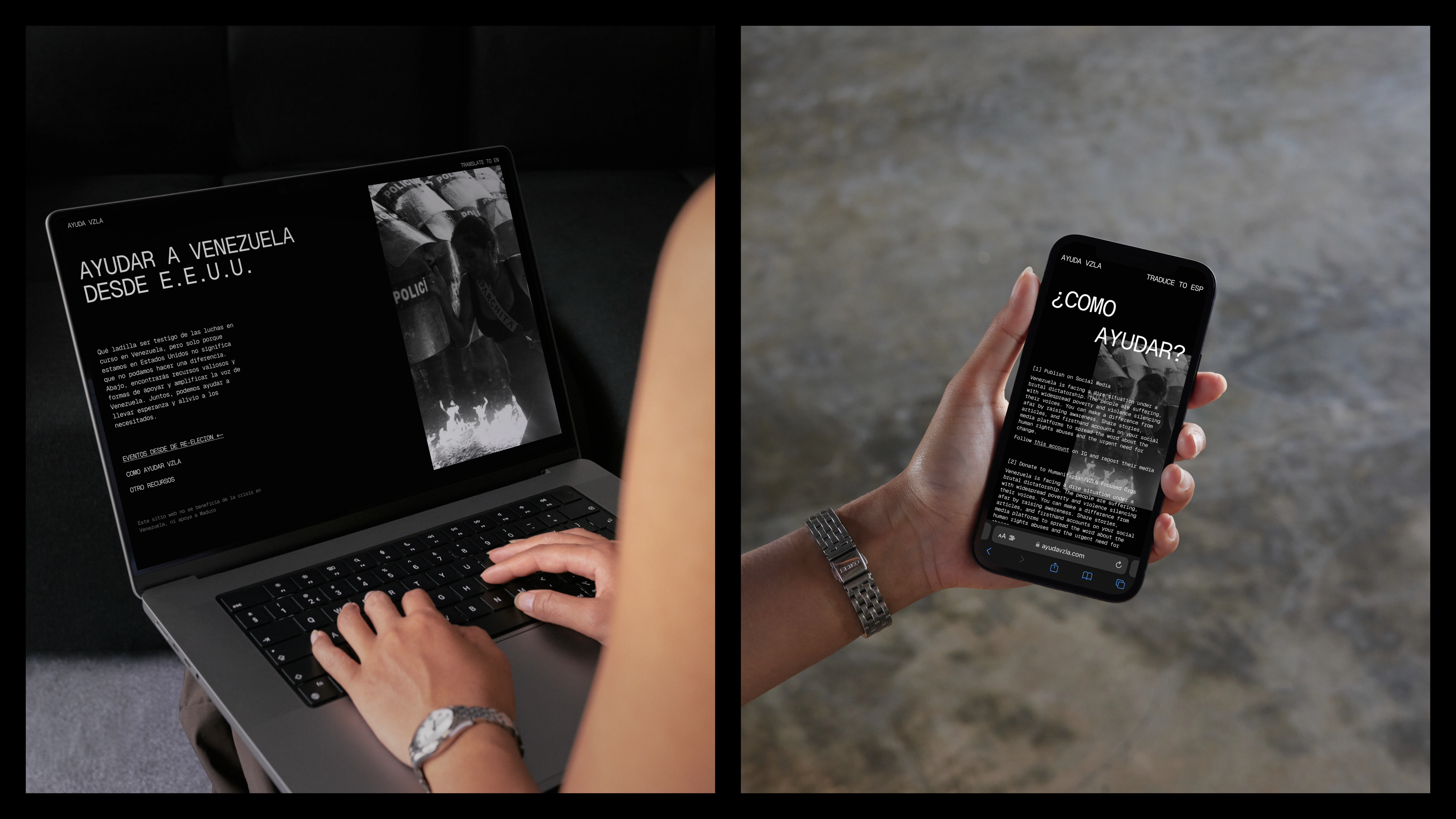
LAYOUT & STRUCTURE: The layout follows a structured format with left-aligned text and consistent padding/margins, which helps in maintaining visual order. The use of large, bold headers (e.g., "OTROS RECURSOS," "¿CÓMO AYUDAR?") provides clear section breaks and guides the user through the content.
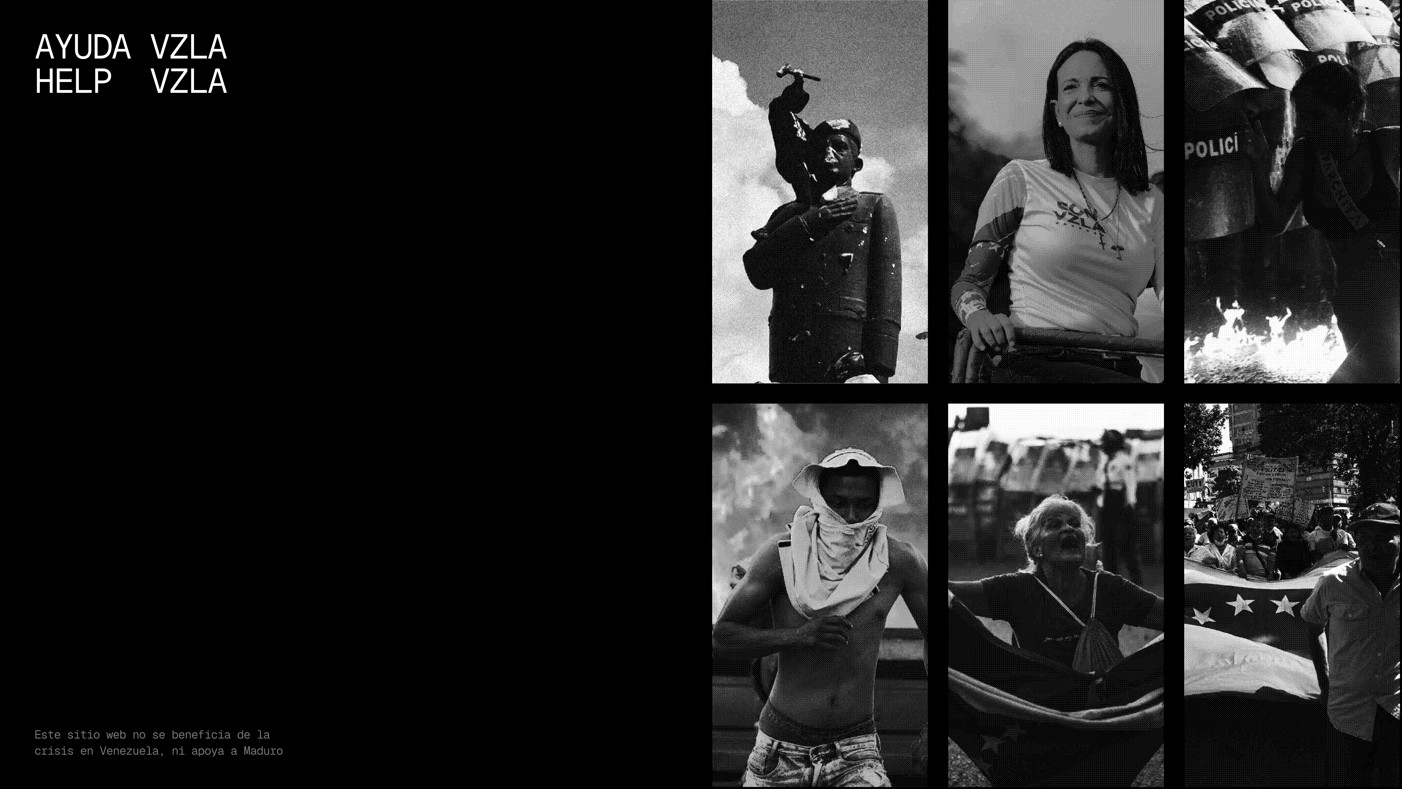
IMAGERY: Using black and white imagery with a bit-map filter on it to complement the overall color scheme and consistent tone throughout the website. The imagery used adds emotional weight to the topics discussed.
INTERACTIVE ELEMENTS: Links and buttons are consistenly styled on default, hover, and pressed. On Hover having a white underline, and an “<-” appear. On pressed having the whole thing turn red.
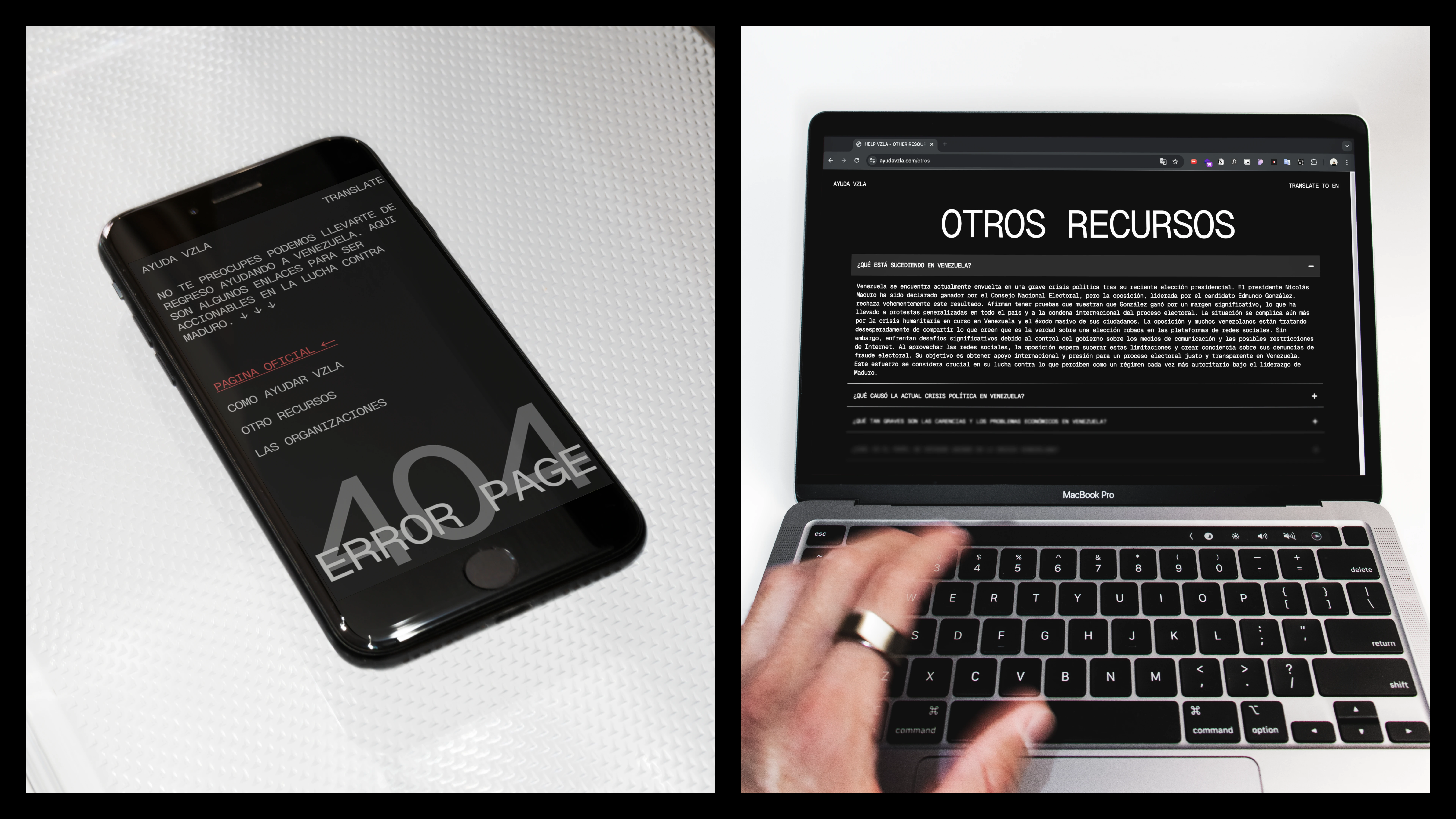
Mockups of consistency cross all of website
DOMAIN, SEO, && LAUNCH
This last and final part of the process is something that happens at the beginning and simultaneously at the end. It's paradoxical, but it works. Lets start.
DOMAIN: The domain name was in search from the start, since it could benefit the visual identity and also the SEO (beginning & end). Jumped from ayudamemano, manoayudame, manoayuda, manoayudavzla, to the name it is now ayudavzla. This domain name, having a shortened version of Venezuela -> to VZLA helped with the minimalism of the visual identity. In addition to the ayudavzla.com domain, I thought it would be great to get an English friendly domain: helpvzla.com they both mean the same thing just in their respective language and direct users to the same site.
SEO: The SEO performance on NEXT.JS sites are something else. Static Site Generation pre-renders pages so they are fast and that means search engines favor it. Automatic code splitting, for faster loading time. Built-in image optimization. Canonical URLS and most importantly the AMP support. AMP, improves the mobile SEO performance by delivering faster loading pages on mobile devices.
PRE/POST LAUNCH: Pre-launch strategy was to build up hype by sending people who were involved with the Venezuela crisis pictures/videos of the design. For post-launch, it was simple: Post on social media, everything including the traffic, user-feedback, adjustments, real-world usage, recordings, easy ways to repost, and even get friends to repost.

CONCLUSION & IMPACT
In 24 hours we had 480 page views, 207 visitors, and reached Venezuela. Since the project has launched and there was only 2 days of marketing on social media. In its 17 day lifespan, it has accumulated 305 visitors, 735 page views. 80% of visitors were from America, and 82% of page views were in America.
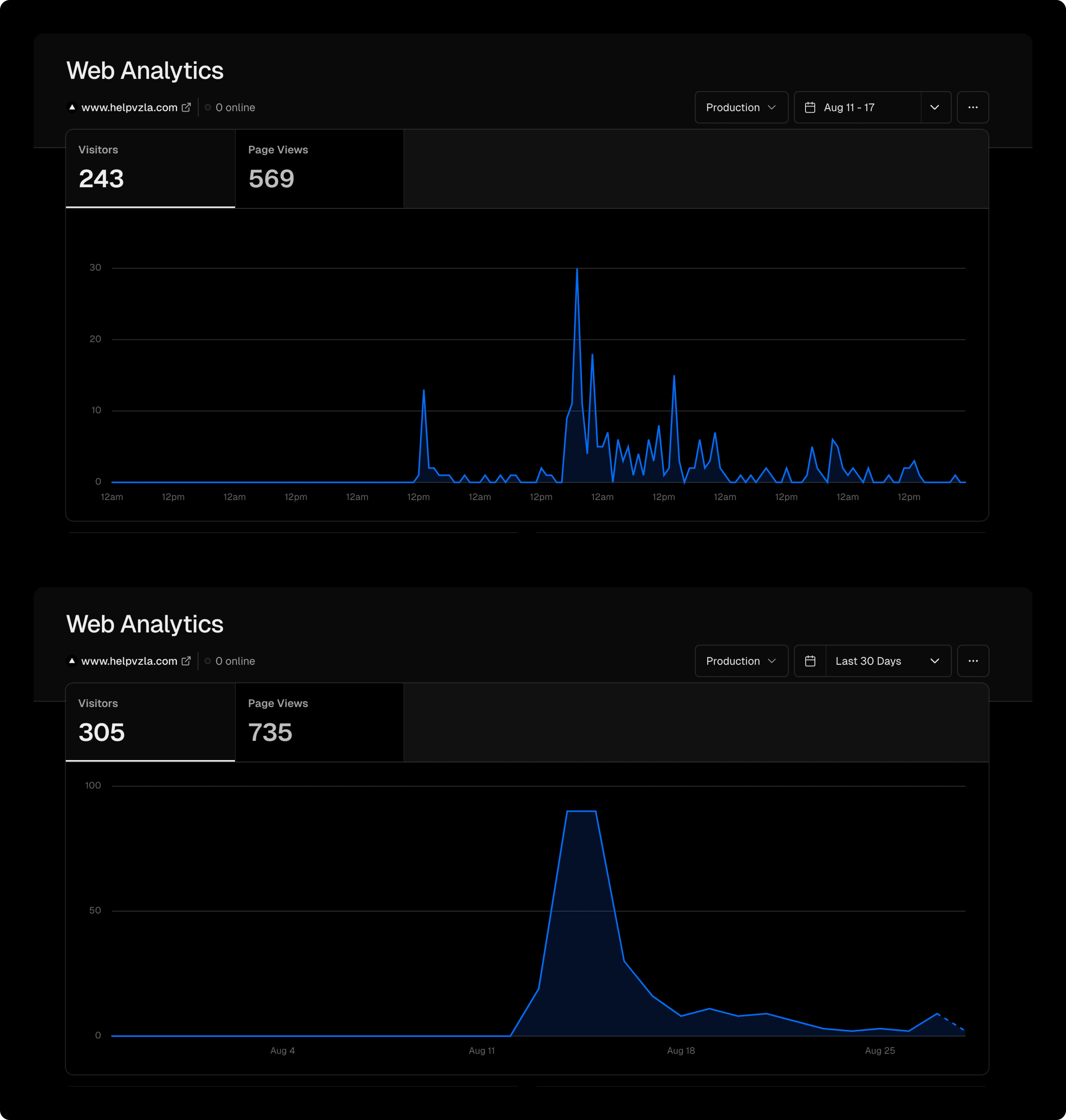
Analytics of 7, & 30 day view
We had several anecdotal points of gratitude from families, people, friends, and strangers thanking us for helping educate them on how to help. And the biggest impact, was receiving messages from Venezuelans in Venezuela sending thanks for wanting to help them. This is what it is about. Tech, Design, Strategy ⎯ tools to do one thing: Make the world a better place.
From a personal note, I had so much fun programming, and designing, since It has been a long time since I personally have programmed. Almost 6 months since I have programmed due to recent projects with clients being just design and drag-n-drop wordpress based. So I had a lot of fun going back to how I got here: Programming.
Please visit the website to help Venezuelans from their dictator:
Like this project
Posted Aug 28, 2024
Humanitarian Website and UI/UX design to help find ways to help Venezuela from the USA.
