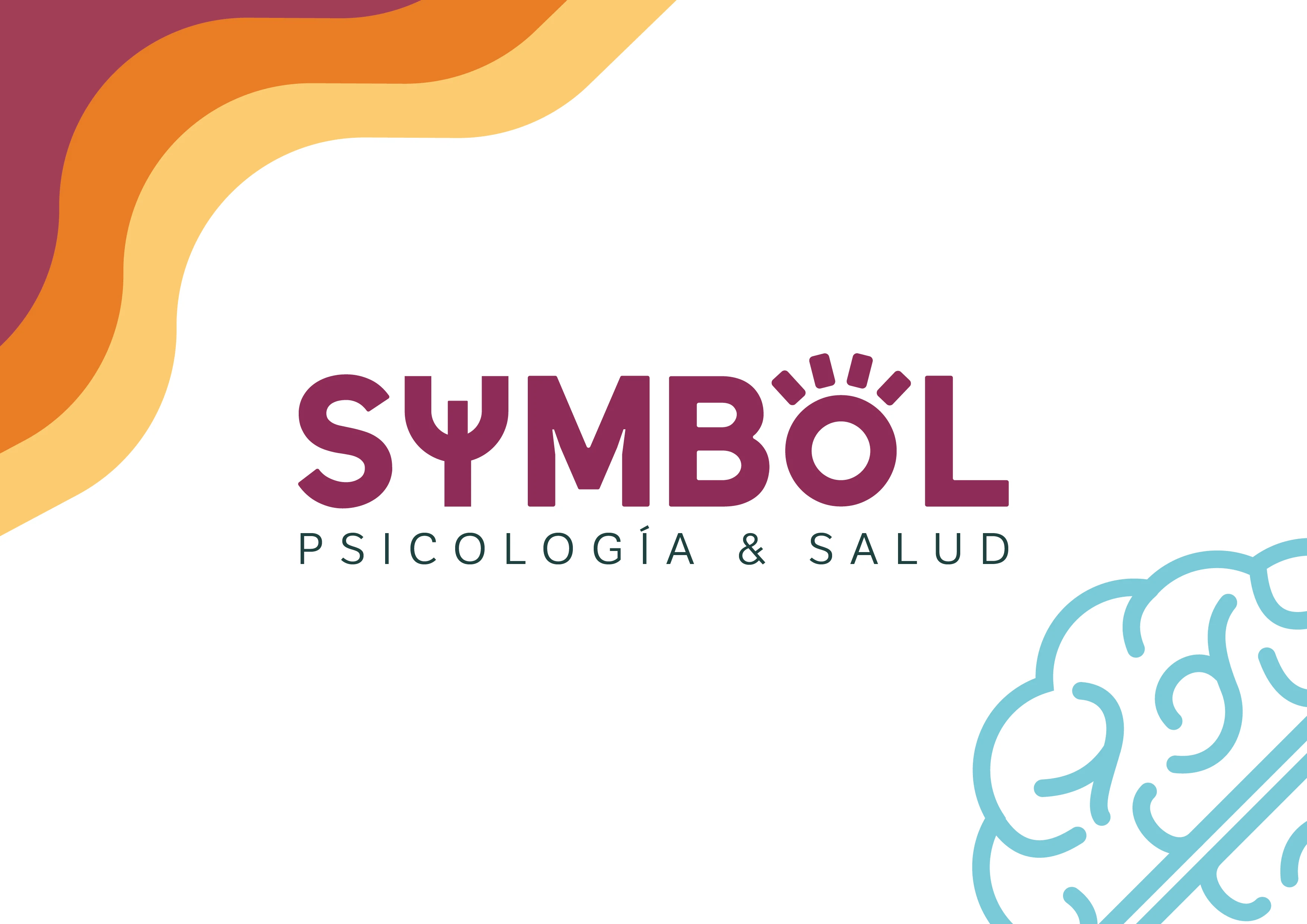
Branding for Symbol Psychology


Symbol branding project cover image
Branding · Freelance · Mental health
Symbol branding project presentation image
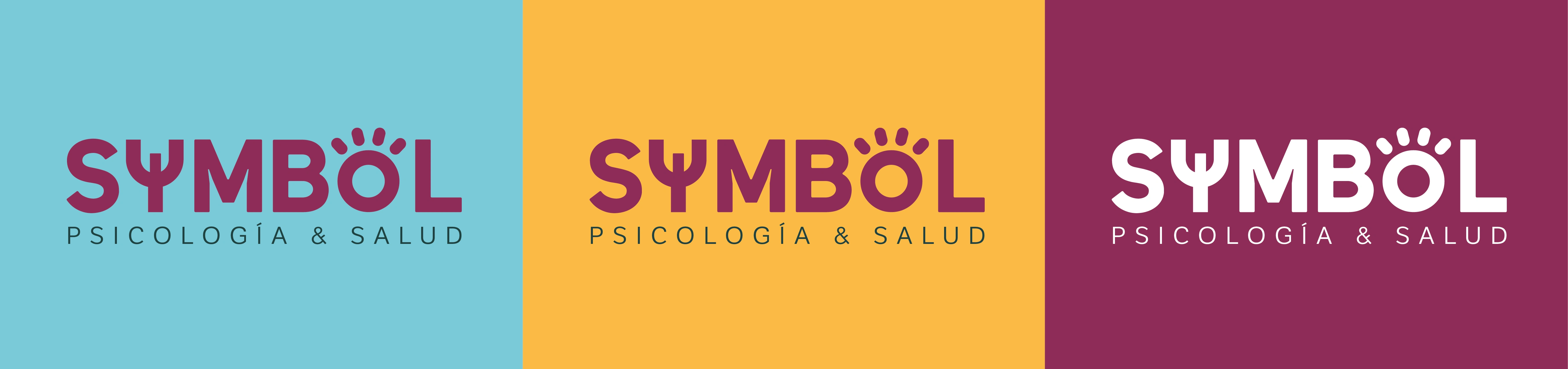
Color choice
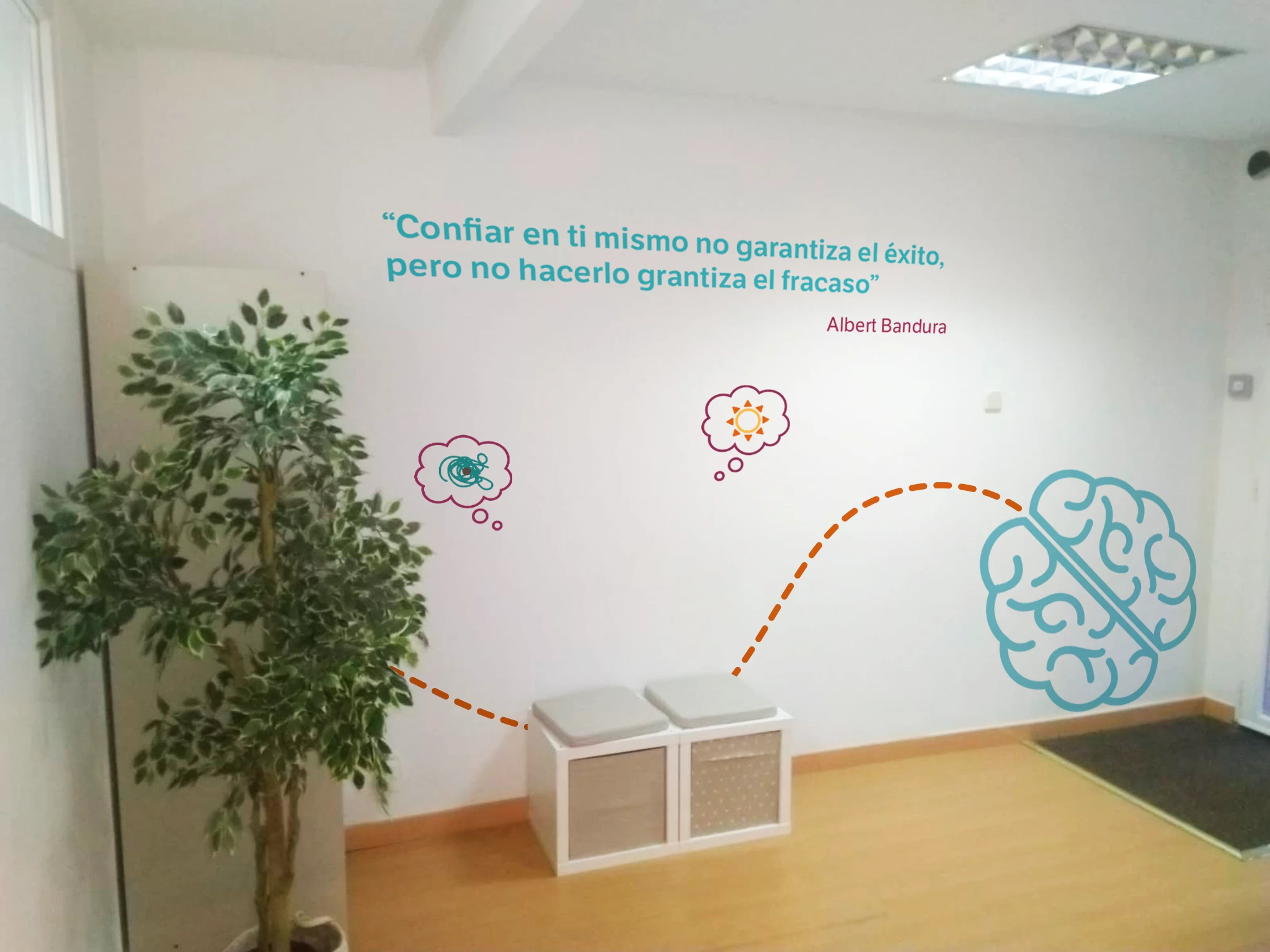
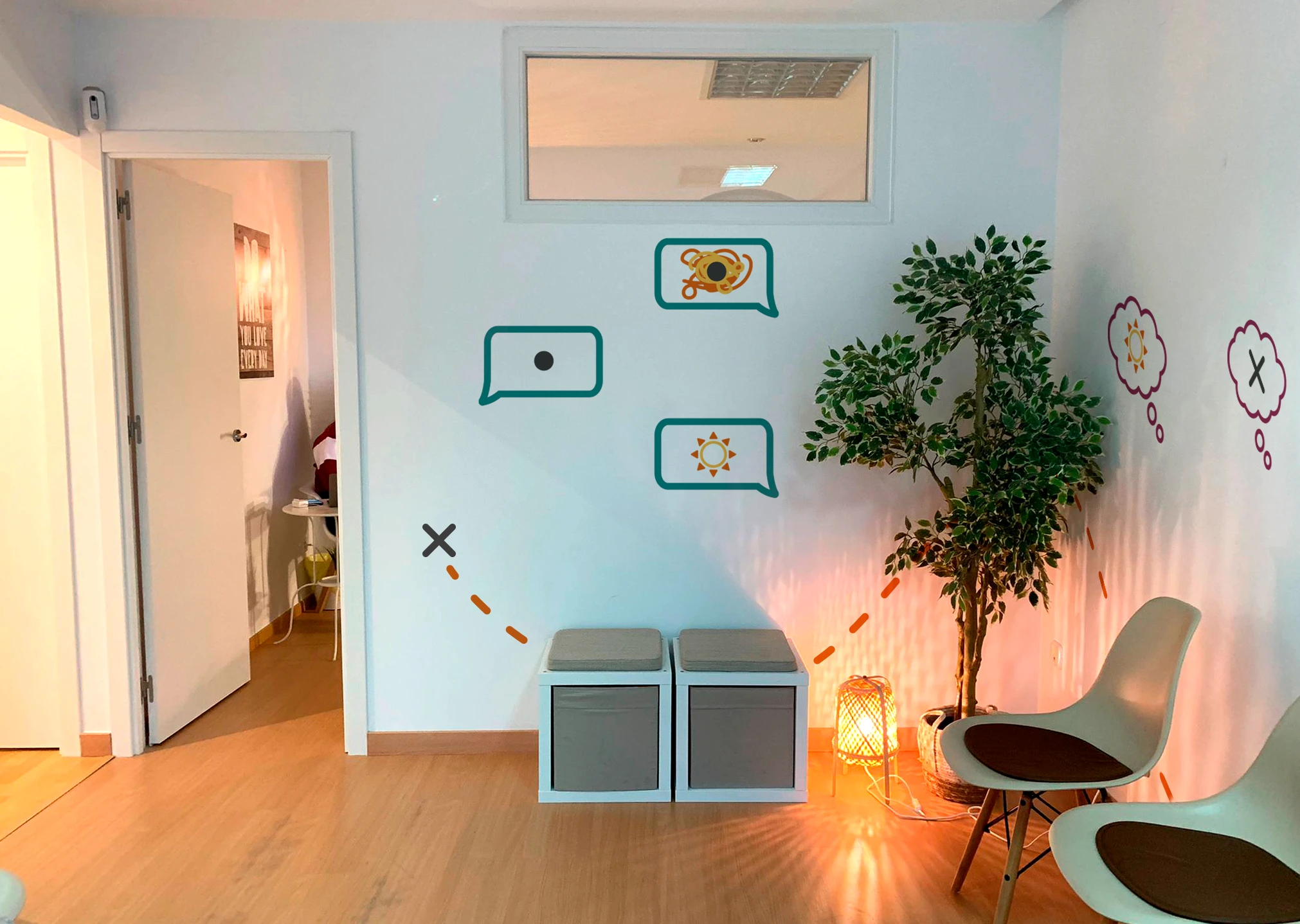
The brand's three primary colors are sky cyan, purple, and sunrise orange. The selection of these colors is influenced by their psychological connotations:
Blue is associated with serenity, stability, peace, and security.
Purple is sometimes associated with fantasy and imagination, so it is used to describe the subconscious and its mysterious aura. Purple is also associated with Easter and Jesus Christ in Spain, making it an appropriate color to represent mourning therapies instead of black.
Yellow represents energy, youth, and psychological awakening.
Pictograms design
The elements are specifically designed to be easily associated with therapy processes and to be used in conjunction with psychology posts on their social media profile:
A brain to symbolize the psyche.
A knot with a central point that represents the issues to be addressed in therapy.
A path of dots referring to "treasure hunt" maps, with the treasure being psychological well-being.
Accented lines that represent the association of ideas in therapy processes (those mental clicks).
The sun as a symbol of happiness.
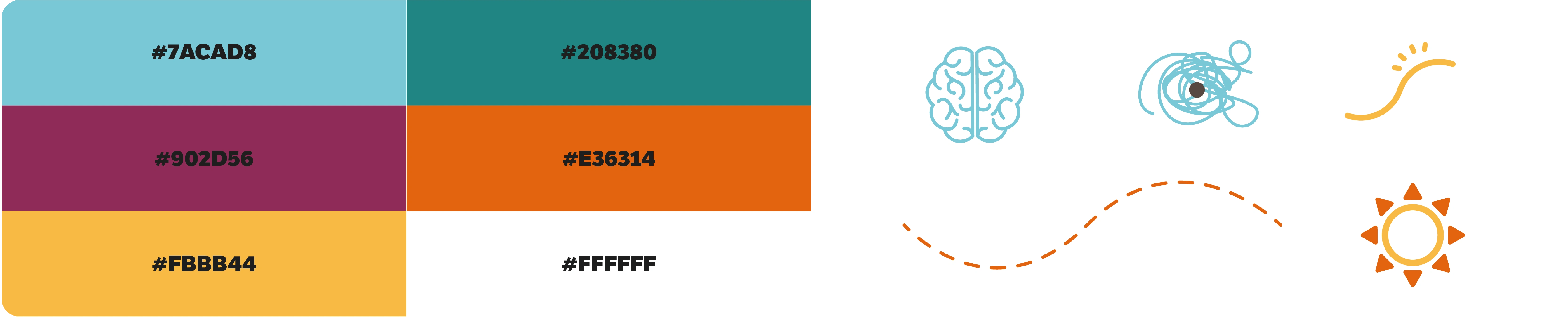
Colors and elements
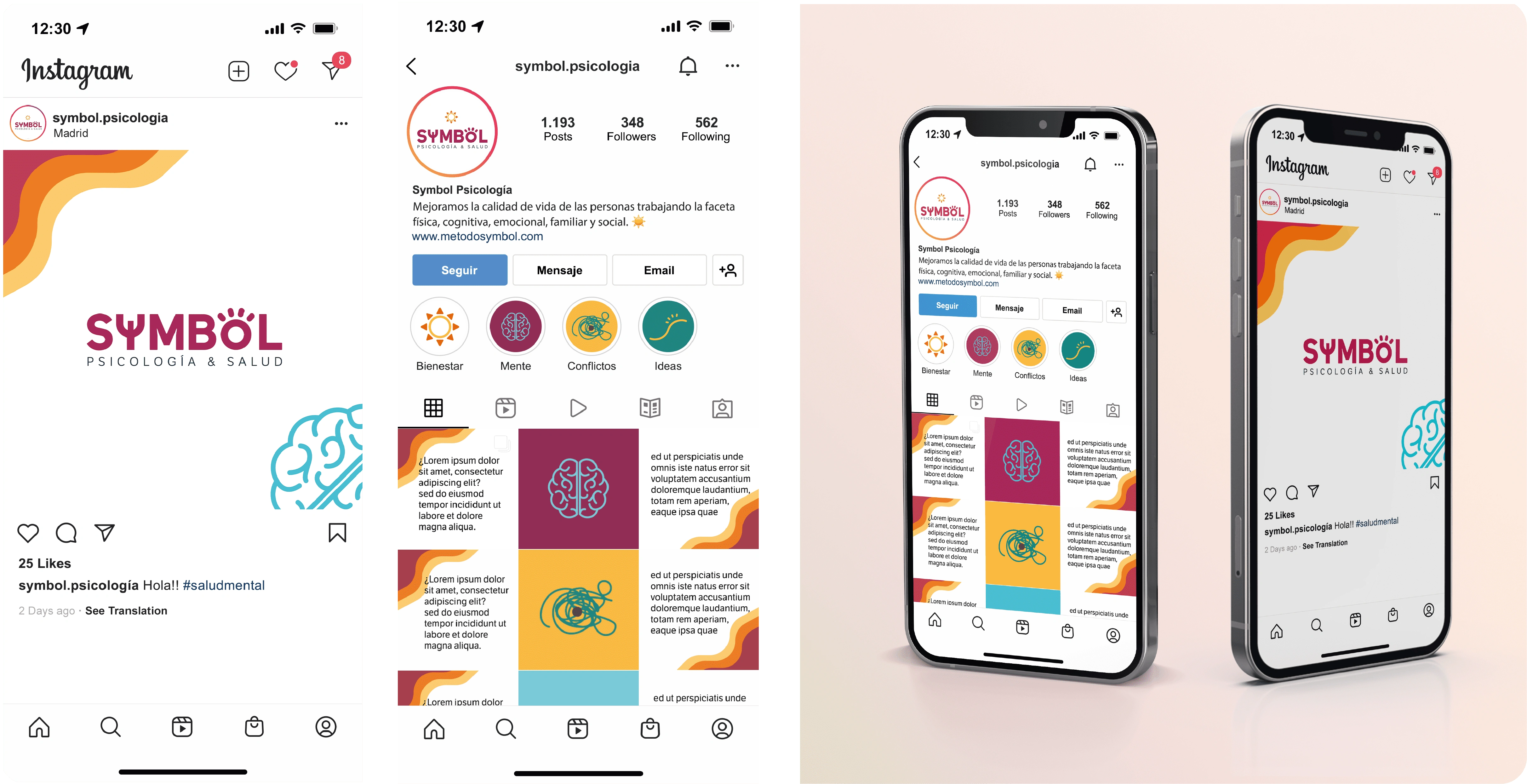
Extra! RRSS feed & Dnterior design📱
As the last part of this commission, I made the look and feel of their social networks to better guide them about the use of colors and pictograms and thus gradually create their brand identity on instragram. I also designed different vinyls for the interior decoration of the clinic.
More projects
Rove: Connecting cultures
Spotify goes Live! A sprint case study
Empowering seniors through technology
Optimizing Security Alarms through UX
Like this project
0
Posted Dec 13, 2024
Discover my work for Symbol Psychology about Branding for Symbol Psychology. Branding · Freelance · Mental health
Likes
0
Views
0


Teleasistance APP for senior users focused on Accessibility

Optimizing Security Alarms through UX

Social media app end-to-end design