Crowdsurf Landing Page Redesign

Benjamin Ludolph

Overview
When Crowdsurf.xyz came to me, they wanted a more distinctive landing page that better reflected their brand. Their goal: highlight the platform’s unique mission — investing in individuals — while providing a modern, intuitive explanation of how Crowdsurf works.
The Challenge
The existing site lacked a clear visual identity and didn’t fully communicate Crowdsurf’s value. The team wanted to move beyond generic Web3 or creator-economy aesthetics and build a landing page that felt premium, human-centered, and differentiated — while still guiding new users through the core offering.
What I Did
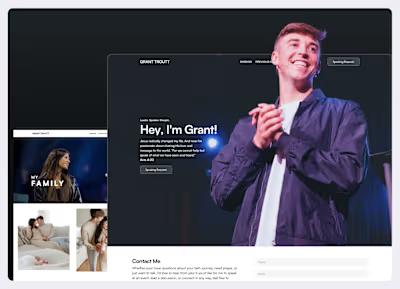
I restructured the landing page around the concept of "Invest in the Individual", using a bold hero section with an abstract portrait and subtle UI underlay effects from the actual platform. I implemented hover interactions to create depth without distracting from the core message.
The flow was redesigned to clearly explain how the platform works:
Simple “How it Works” section
Visual storytelling with modern typography and layout
The Result
The new landing page gives Crowdsurf.xyz a more distinctive, modern voice. It clearly communicates what the platform does — and why it matters — while building trust and encouraging user engagement.
If you’re looking to elevate your brand and bring clarity to your landing page experience, let’s chat! I’d love to help.
Like this project
Posted Jun 7, 2025
Redesigned the Crowdsurf.xyz landing page to simplify messaging, improve visual flow, and drive more signups across desktop and mobile.