UX issues and improvements (Usability Testing)
Claudiu Tudose
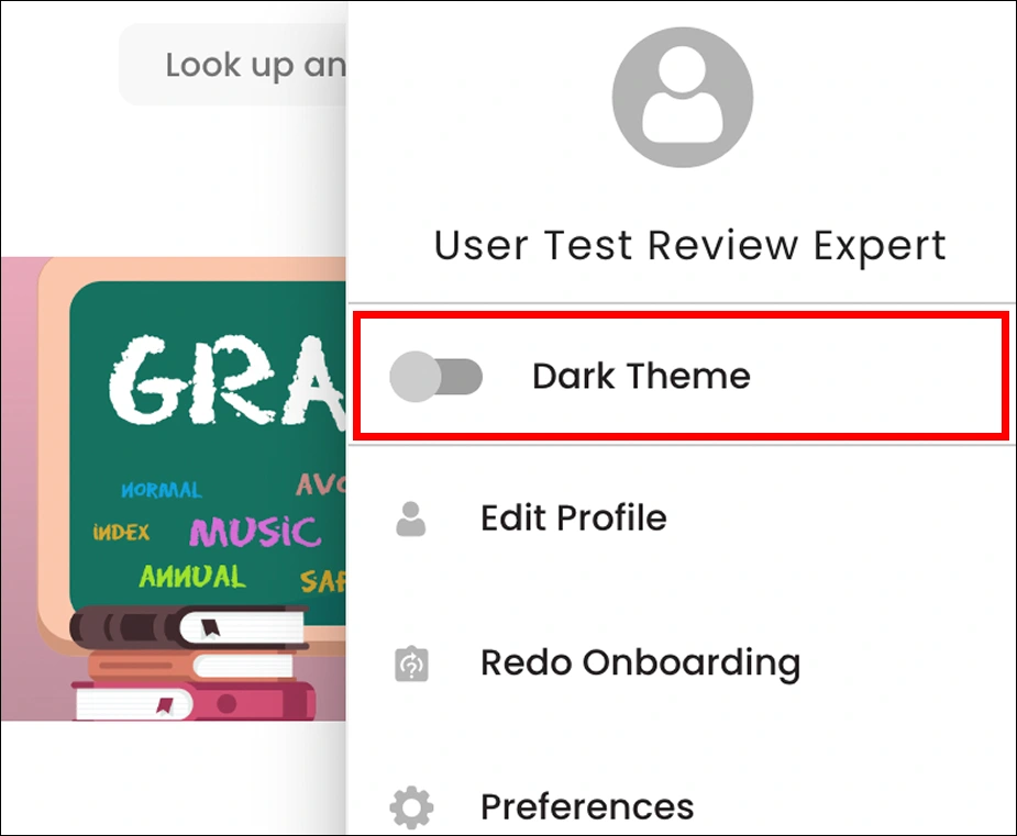
The entire section is not responsible for activating the dark theme, just the switch area component. So I suggest the entire section is responsible for activating the dark theme.

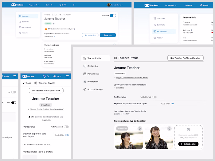
I noticed that users have to hit the back button multiple times to return to the Home screen, which can be frustrating. To improve the experience, I recommend keeping the left sidebar open and adding a top breadcrumb, as shown in the image below.

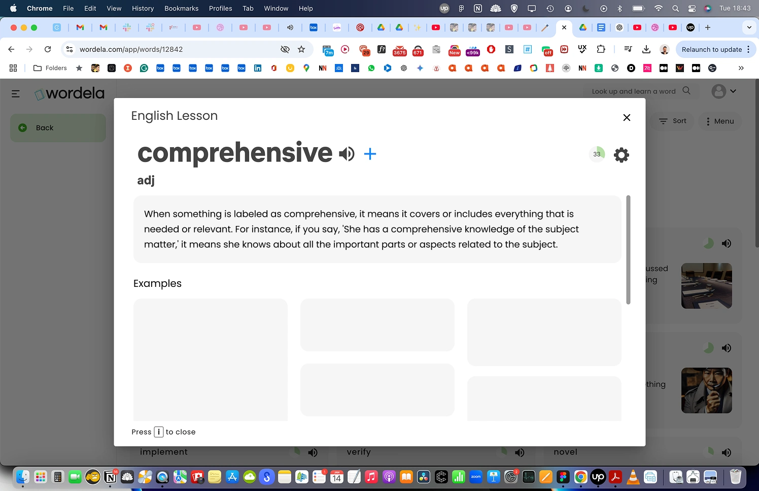
After selecting the wrong answer, this pop-up appears, so instead we will let users decide for themselves whether they want to view or not the information about the word
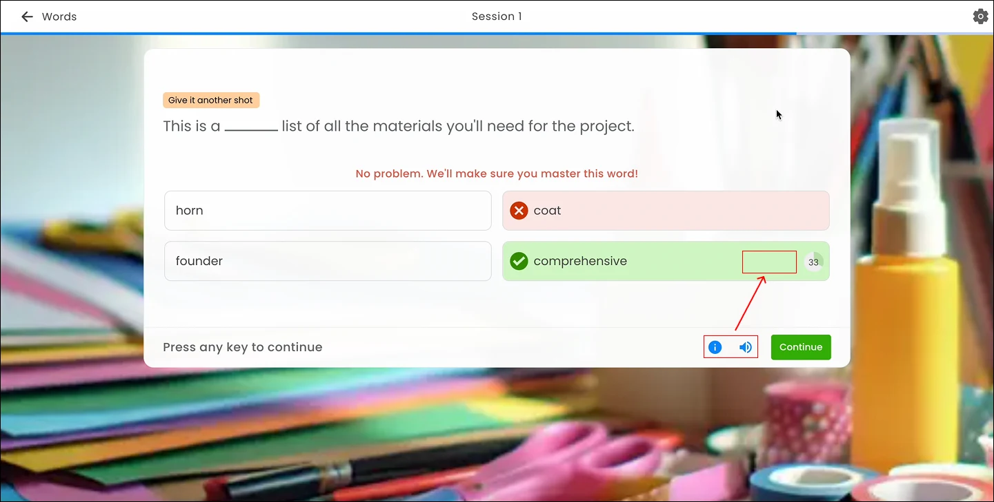
I noticed that the 'info' and 'sound' actions only appear when hovering over the correct answer. We will consider offering the same options when users hover over the incorrect answers as well.
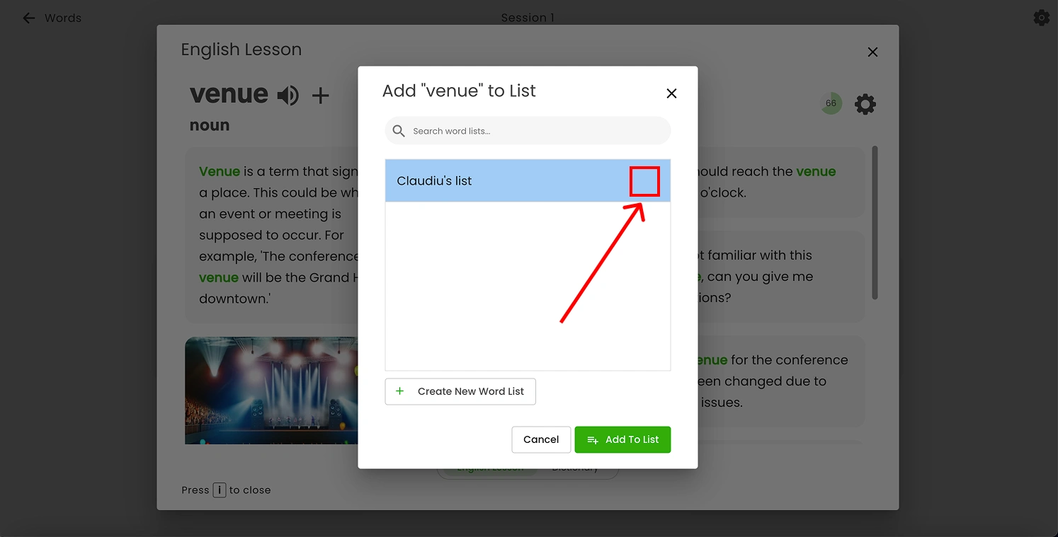
When users add a word to a list, the selected list should display a checkmark icon on the right side to indicate it has been chosen.
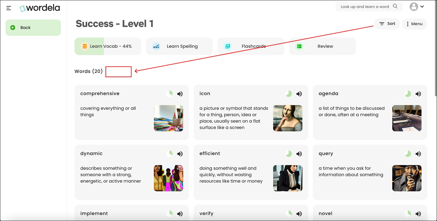
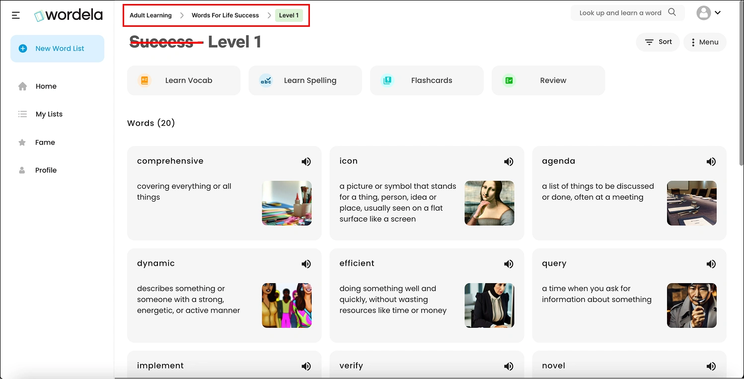
'Sort' action could be moved next to 'Words ()' since it is specifically related to the word list. In its current position, users might assume that the sort action also applies to Learn Vocab, Learn Spelling, Flashcards, and Review, which could cause confusion
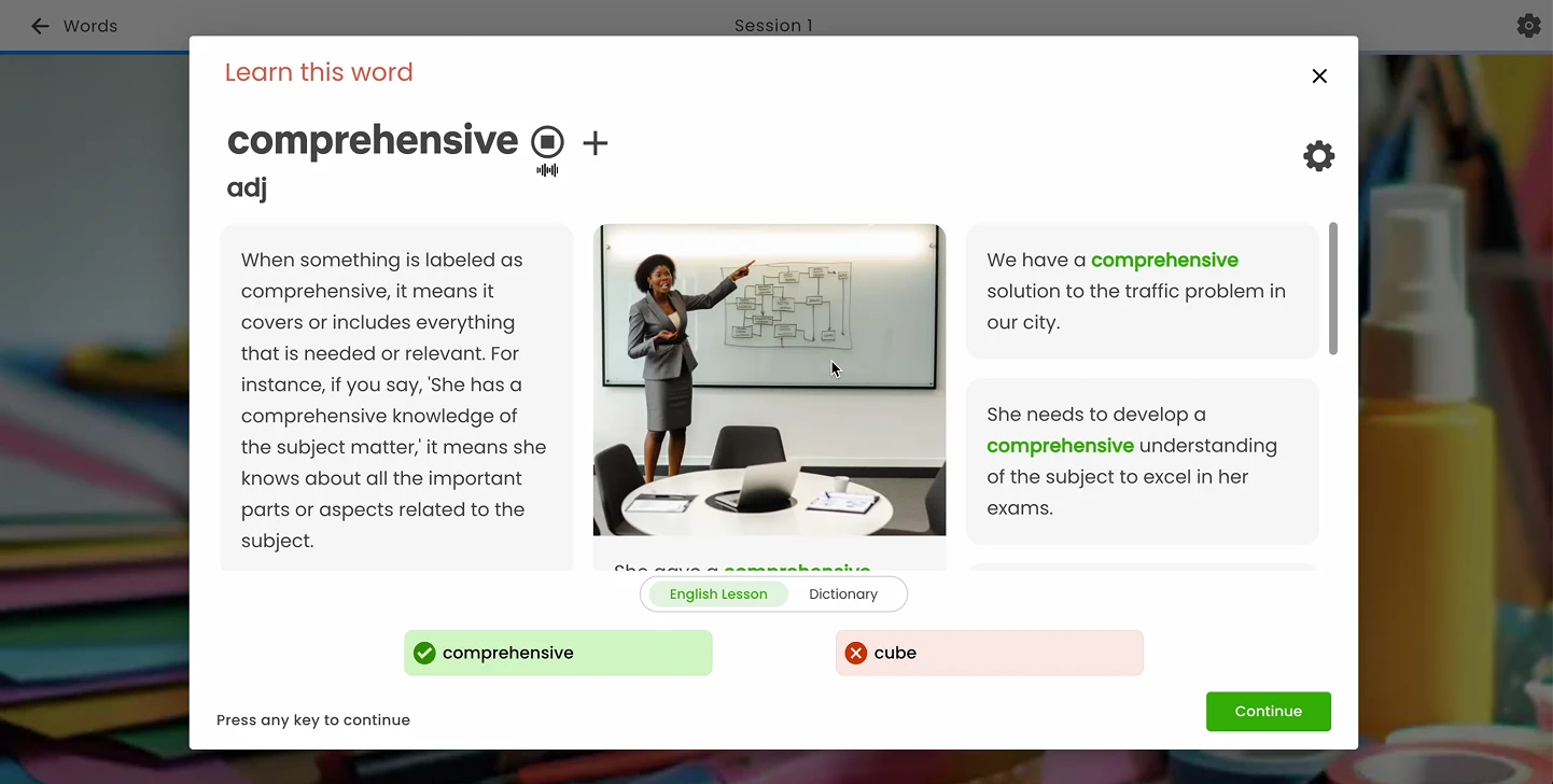
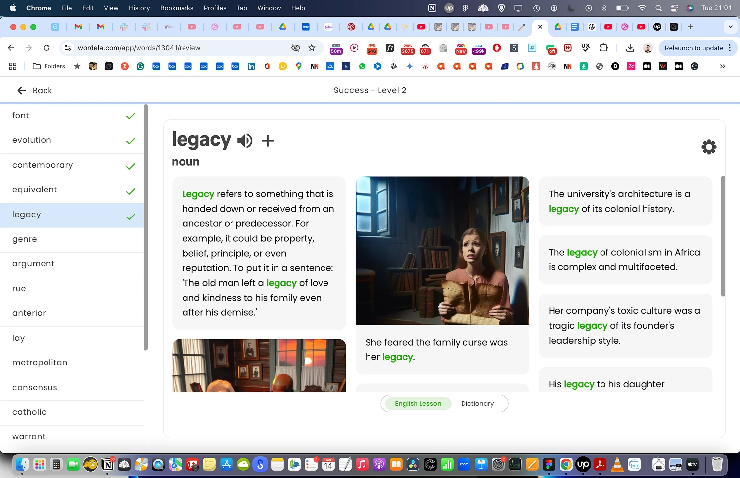
I found the way the information is displayed for each word confusing, so I made some changes as shown in the image below.
For flashcards, add an option to turn off the voice while going through each card, as the audio continues to play when moving to the next card. Some users may prefer not to hear the voice during their learning experience.
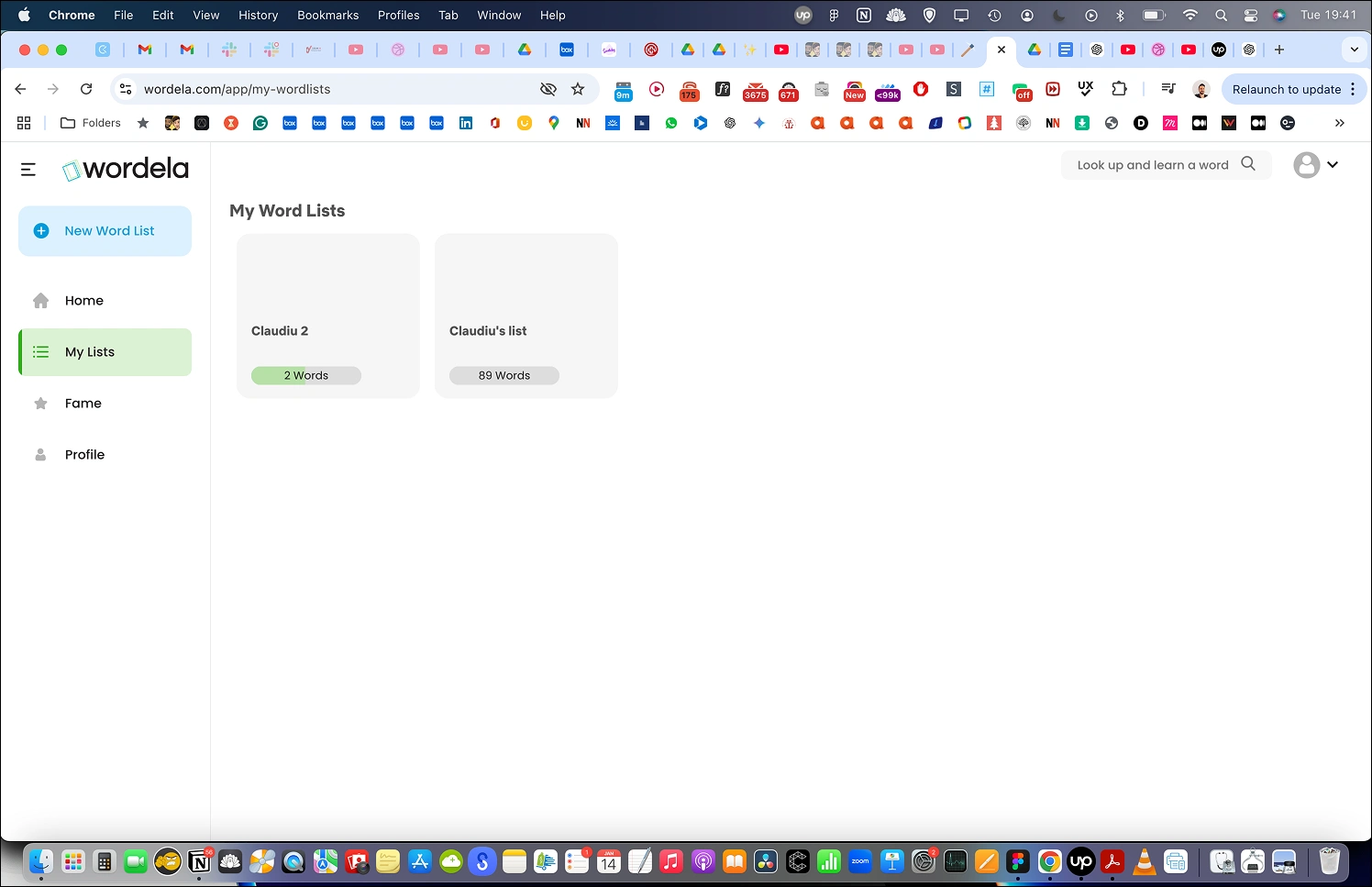
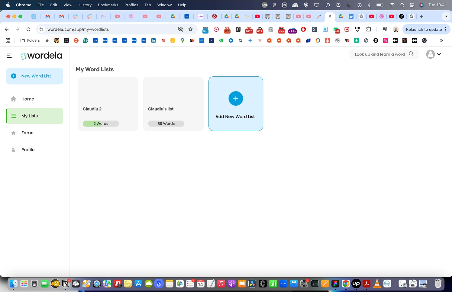
On the 'My Lists' page, add an option to create a new list as shown in the image below.
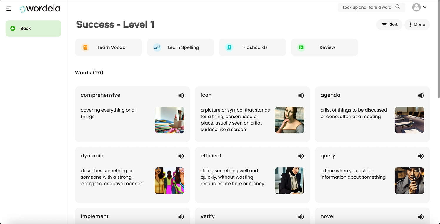
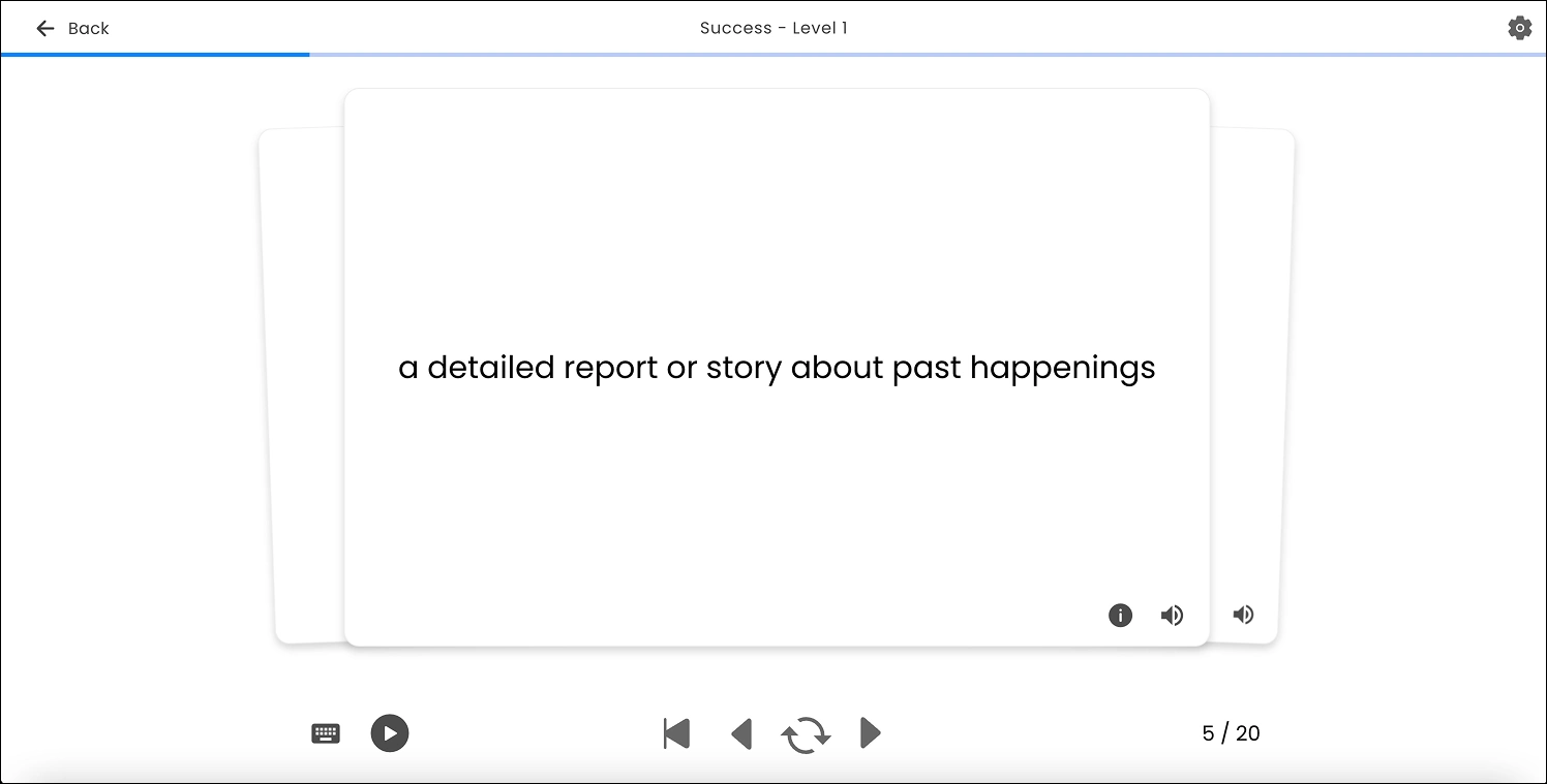
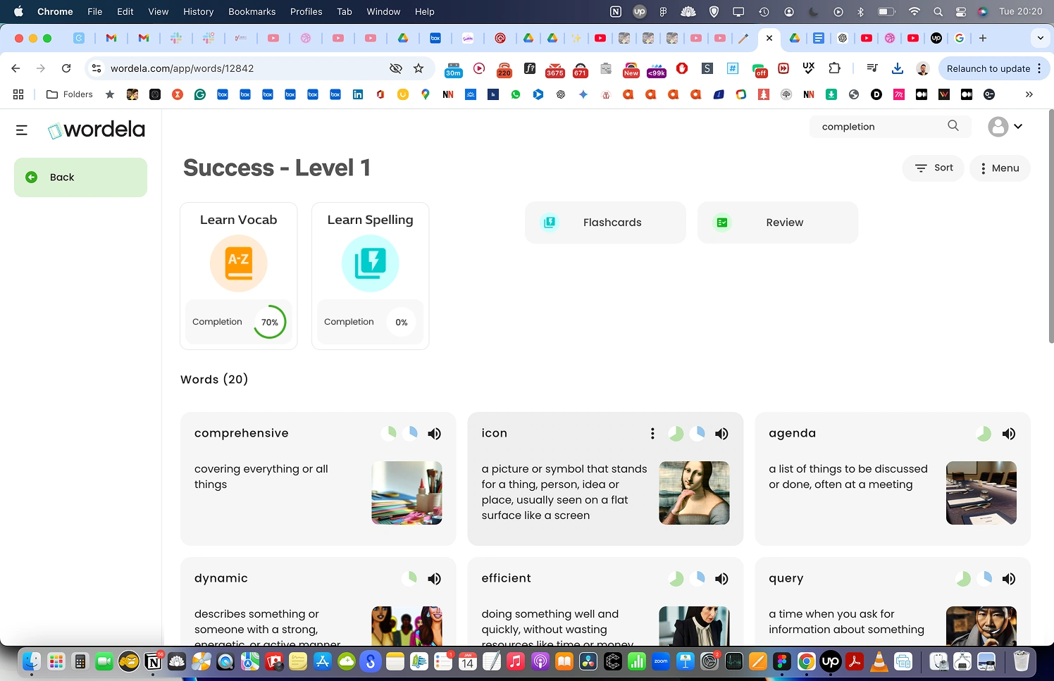
I found that the sections “Learn Vocab,” “Learn Spelling,” “Flashcards,” and “Review” increase cognitive load. To address this, I made some improvements (see image below).
I also displayed progress in a way like this (see image below).
By showing progress, users are more likely to complete “Learn Vocab” and “Learn Spelling.” This leverages the Zeigarnik Effect: https://lawsofux.com/zeigarnik-effect.
Flashcards and Review will have a similar design to Learn Vocab and Learn Spelling.
For Review, we will add a mark to all of the words users interact with, like in the image below, and the system will display this as a completion percentage on the “Review” card.
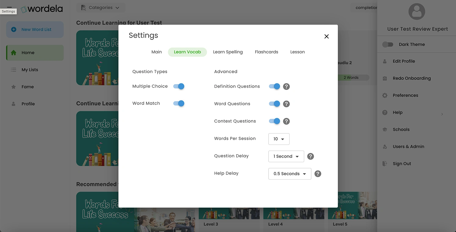
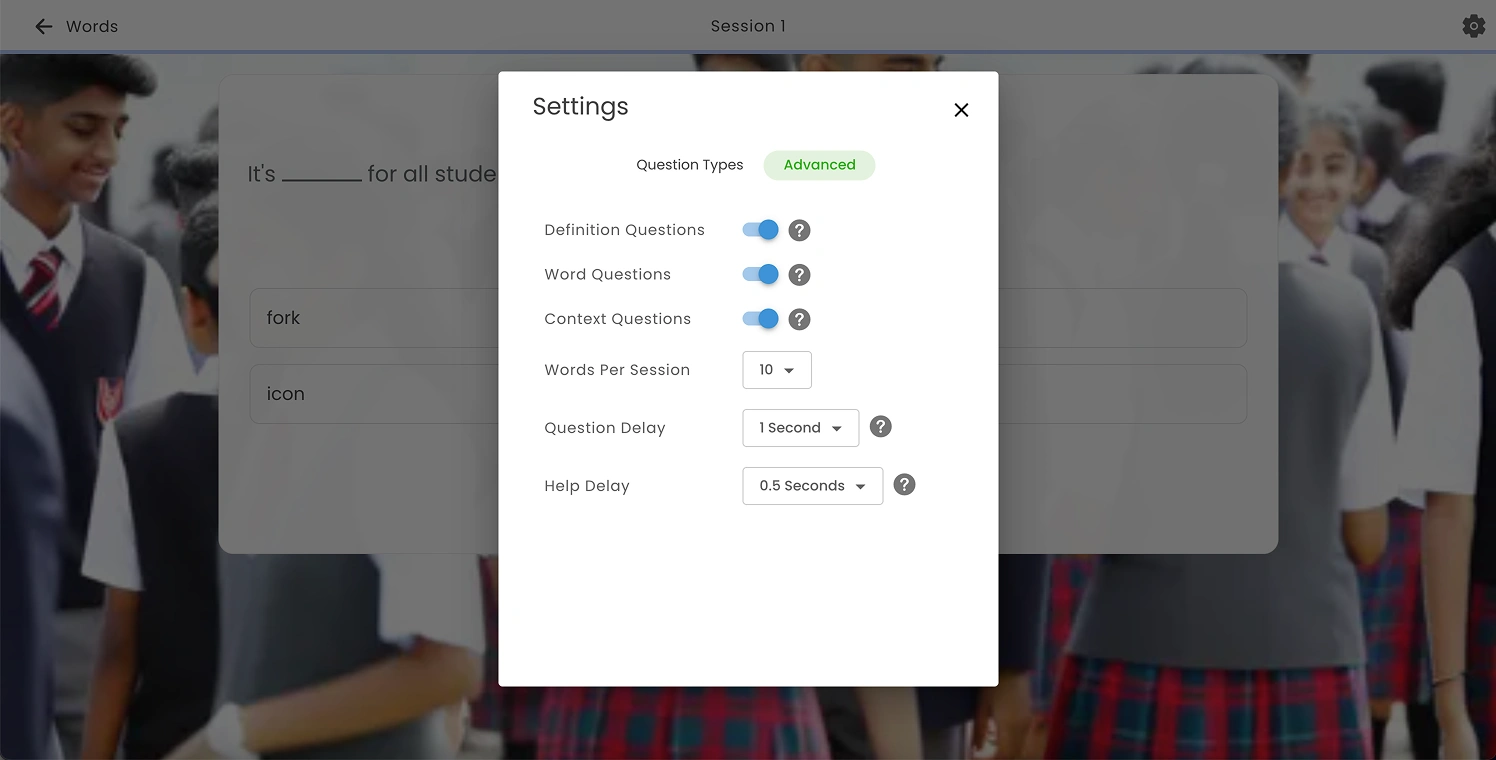
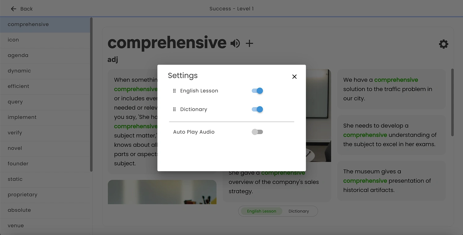
We will add a “Reset to default” action to all the Settings pop-ups. Additionally, include “Cancel” and “Save” buttons. Changes should be applied only when the user clicks “Save,” rather than automatically when closing with the “X” icon as it currently works.
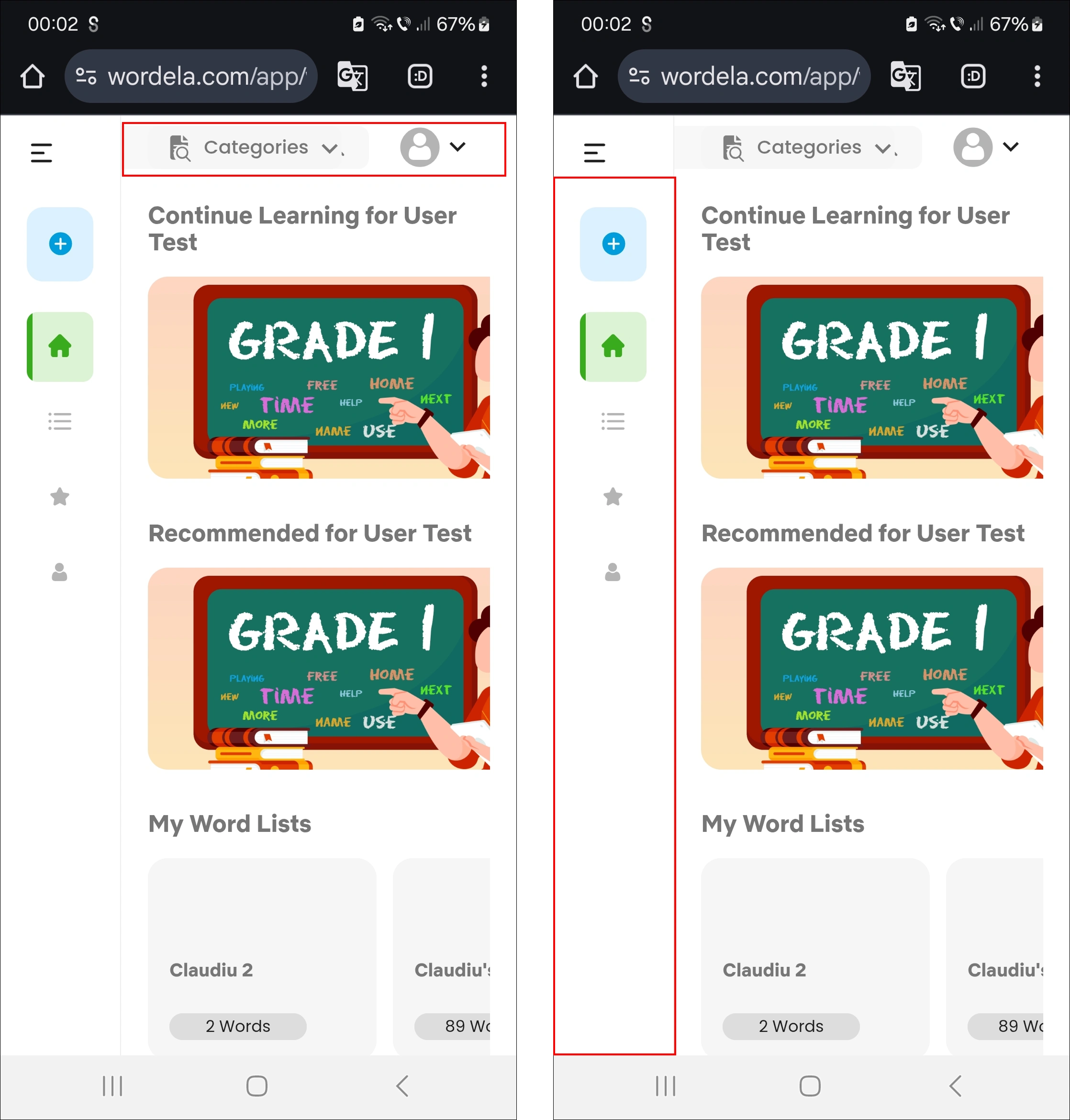
On mobile, on the left screen, the “Categories” section overlaps the search input. Move “Categories” underneath the input field. We can either keep the current layout or display the categories in a horizontally scrollable section.
In the right image, the left sidebar will be hidden by default, but the top-left menu icon will remain so users can open it when needed. Once opened, it will display the same menu items that were previously shown in the left sidebar. This approach allows the main content to be displayed full-width.
At the top, we’ll have the toggle icon on the left, followed by the search input. The category items will be displayed in a horizontally scrollable section. The Profile section will be moved into the menu and will be visible once the menu is opened.
Performance and Visual bugs
Like this project
Posted May 20, 2025
My role was to make the usability testing of the current platform, finding the UX issues and propose improvements.
Likes
0
Views
3
Timeline
Jan 14, 2025 - May 15, 2025