MacIntosh 128k
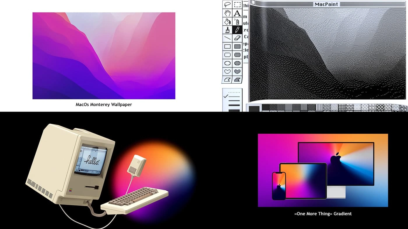
I wanted to pursue my idea of creating modern motion design stuff for vintage products.
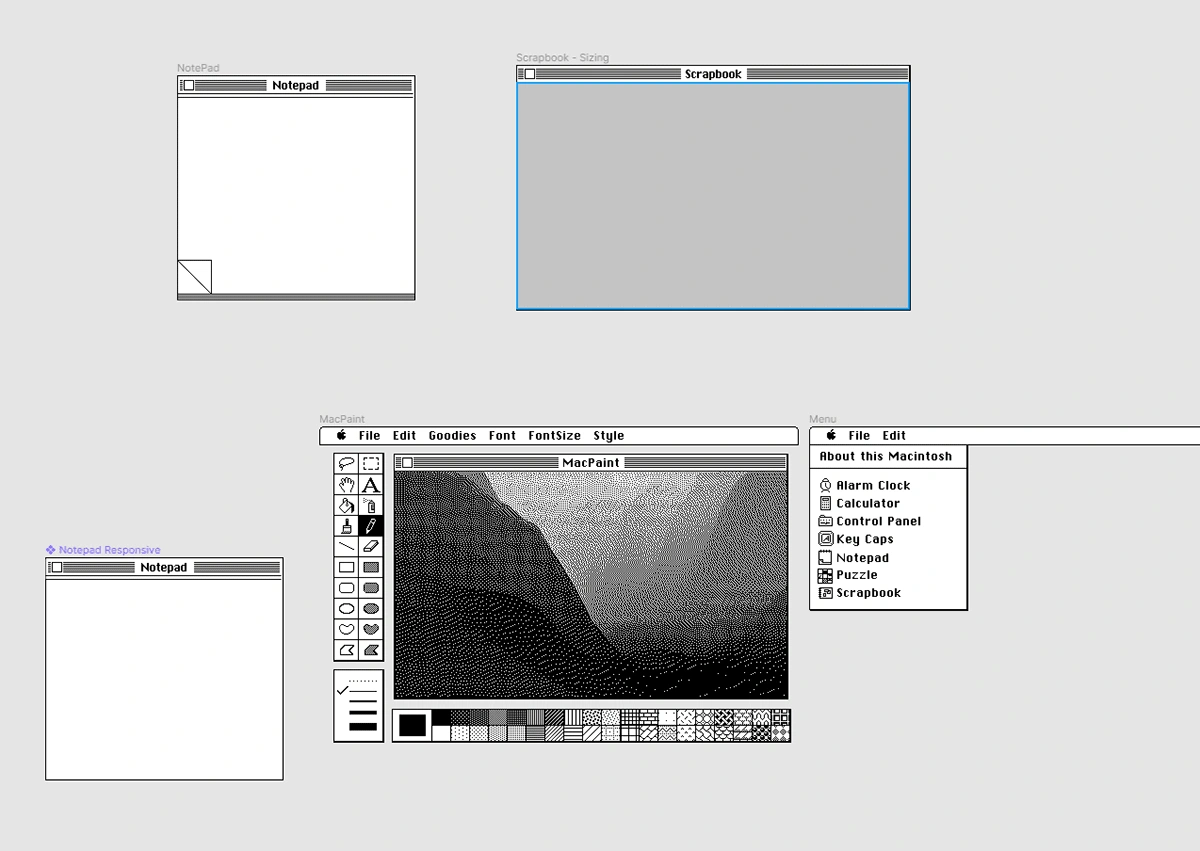
For this piece, since everything is a learning experiment, I wanted to tackle a bit of UI and "animated modeling".
The Macintosh was the perfect product for this : it was produced in 1984, and was the first large-scale product Apple designed.
When looking back at it, it is strikingly obvious how it was the founding stone of the whole Apple philosophy: design and user experience over everything.
Today, its cubic design, its cute launch icon are elements well established in the computer horizon, and I wanted to pay an hommage to that classic piece of hardware.
Process Breakdown
Music Selection
I start every single personnal project with a music idea: I have a bunch of playlists in reserve that fits some kinds of motion / era / styles. And then, I find the perfect product for that music. Yes, in that exact order.
When listening to those songs, I already have visual ideas in my little head. I really try to minimize the amount of references and try to distance myself from the stuff I saw on the interweb. So I write down everything, so that it can get out.
Some are good ideas, some are bad ones.
Music Chopping
I try to avoid lyrics, so I often cut the vocals and try to arrange the song (placing loops, and trying to fit the interesting parts in a 30 sec. edit)
Then, when I feel like the music is ready, I chop it in an editing software by placing markers, sometimes I base my chopping on the BPM, sometimes on the melody... I try to vary the beat chopping as much as possible.

Placing markers on the song can either be done by listening to the song and evaluting the placement by ear, or, by just looking at the audio spectrum and placing markers on stuff like the kick or the snare.
Making the shots
Finally the fun parts arrive: I create every single shot based on the number of frame I need to fit between two markers. This is limitating and maybe not the best way to do it, because sometimes the most interesting parts of the video are too short or are too "fillery".
Testing and re-iterating
Before rendering it, I make a quick viewport render and test the overall flow of the animation.
Is the anticipation good on the last shot? Do I need more easing on that camera? those are the kind of questions I ask myself all the time when evaluating my key-framing.
I often re-do the shot from scratch, some ideas that I wrote done earlier are simply too complicated or does not fit the vibe.
Rendering
The rendering is the last step, since the shot chopping has already being done.
I try to adjust my light setups, even my materials, depending on the camera angle.
Then I re-treat in After Effects, after a good night of rendering.
Bonus Info

I also added some easter eggs, as Im a bit of a detail geek and I always try to make people smile.

I used a Figma kit to make the UI, now I use Figma extensively on all of my projects
For the Scrapbook screen (which is like the media player in MacOS 1.0) I created a cute little scene rendered with Sketch&Toon and using the cel shader to get that 1-bit look.
Like this project
Posted Dec 17, 2024
A modern & fresh view on a classic vintage product.
