Gohighlevel Consulting Website Design

Ademola Oladunjoye


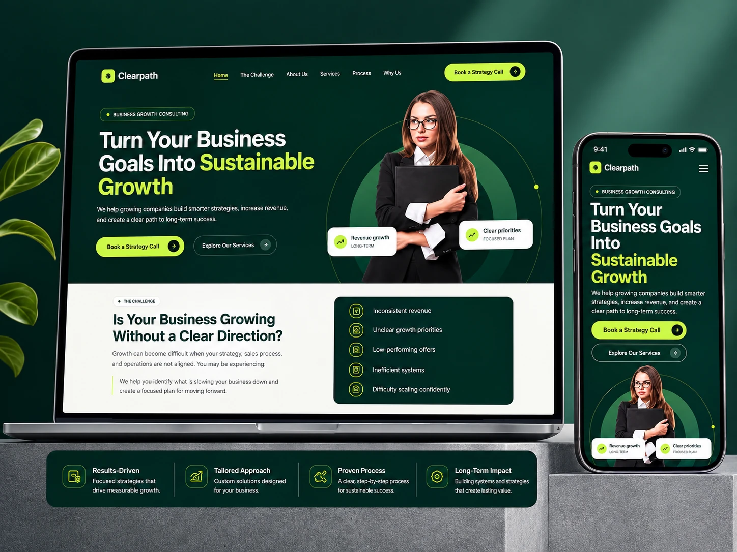
Clearpath - Business Growth Consulting Website
Industry: B2B consulting
Platform: Gohighlevel
Scope: Full website design (Brand identity, desktop, and mobile)
Project Overview
Clearpath needed a website that could do double duty: establish credibility as a growth consultancy while making it dead simple for a visitor to book a strategy call. Consulting sites often lean too far in one direction, either dense and text-heavy (feels academic) or vague and inspirational (feels hollow). The goal here was neither: a site that reads as sharp and results-driven without turning into a wall of jargon.
Brand Identity
The palette pairs a deep forest green with a high-voltage lime-green accent, an unusual combination for a B2B consulting brand, where navy-and-gray is the safe default. The contrast does real work: the dark green carries authority and stability, while the lime green flags exactly where a visitor should look next (CTAs, key stats, active nav states). Nothing competes for attention because only one color is ever used to signal "act here."
Structure & Information Architecture
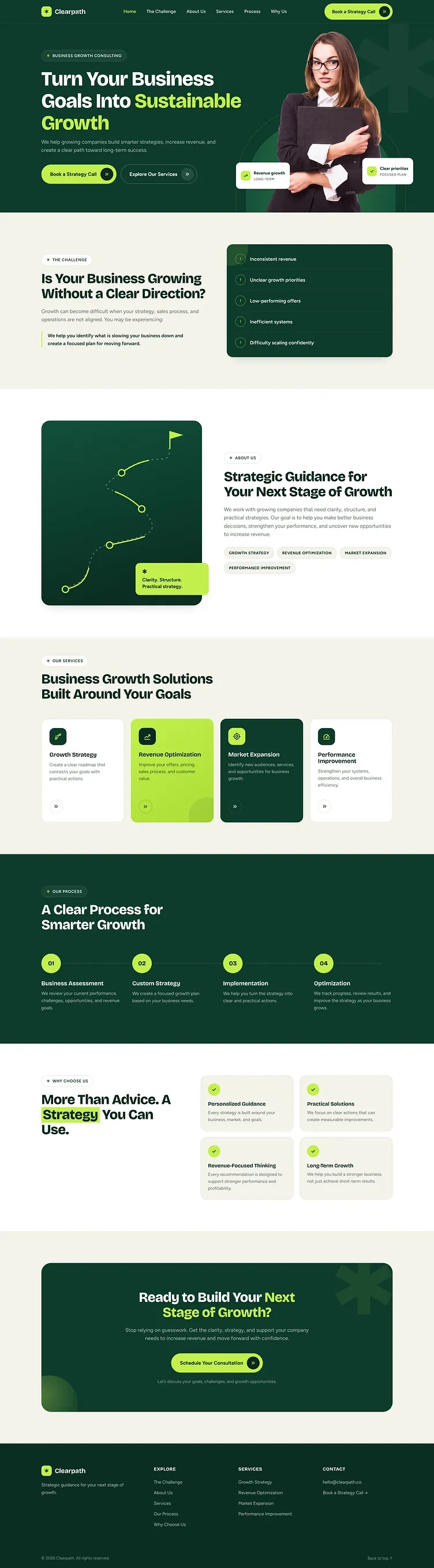
The page follows a deliberate persuasion arc rather than a generic template order:
Hero - leads with outcome language ("Turn Your Business Goals Into Sustainable Growth"), not company description
The Challenge - names the visitor's pain points directly (inconsistent revenue, unclear priorities, low-performing offers) so they see themselves in the problem before being sold a solution
About - an illustrated "path" graphic reinforces the brand name literally and visually, rather than a generic stock photo
Services - four offers presented as outcomes, not deliverables
Process - a numbered four-step framework, which does more to build trust than any amount of "why choose us" copy, since it shows the client exactly what working together looks like
Final CTA - repeats the strategy-call ask once more, low-friction, right before the footer
Responsive Execution
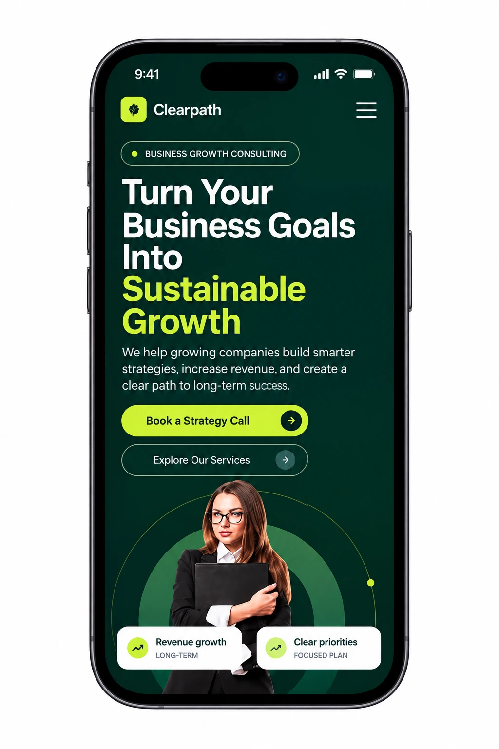
Mobile wasn't an adaptation of the desktop layout; it was designed as its own experience. The hero photo and stat callouts reflow into a single column without losing the circular graphic motif behind the portrait, and the two CTA buttons stack full width for easy thumb access. Section order stays identical across breakpoints, so the persuasion arc doesn't break just because the screen got narrower.
Result
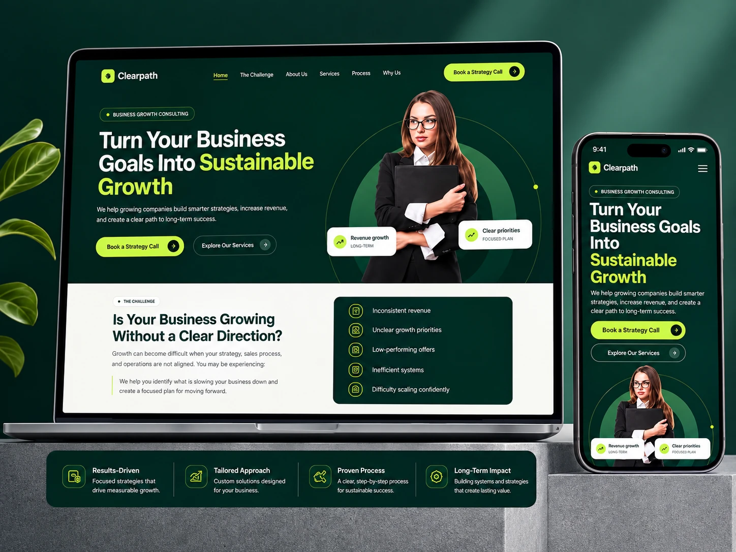
A fully responsive, brand-cohesive site built to move a cold visitor from "who is this?" to "book a call" in one scroll, on any device.
Like this project
Posted Sep 12, 2026
Created a responsive, brand-cohesive consulting website for Clearpath.