Velora - Flight Booking app

Thuy Phan

Overview
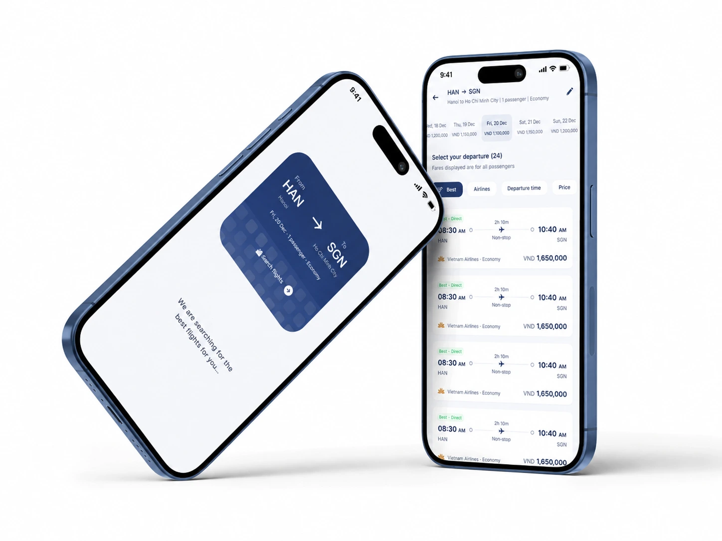
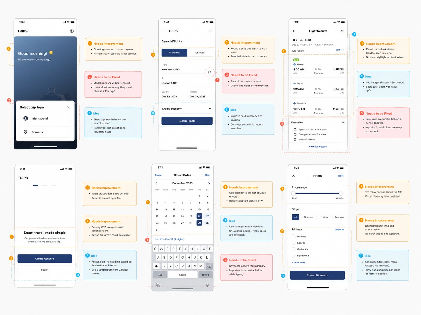
The existing flight booking experience created unnecessary friction during the early stages of trip planning, making it harder for users to move smoothly from discovering a route to completing a reservation.
I conducted a UX audit and competitor analysis to identify usability issues across the search flow, including unclear navigation, weak information hierarchy, unnecessary decision points, and limited support for returning users. The redesigned experience simplifies flight discovery, improves search clarity, and creates a more intuitive path from the homepage to booking.
What is the Platform?
A digital travel booking platform that helps users search and compare domestic flights across Vietnam in one streamlined experience.
The platform brings key travel actions together, from selecting a route and travel date to comparing available flights and continuing to reservation, making trip planning faster and easier for everyday travellers.
Roles & Contributions
My Role: Product Designer
Contributors: Product Manager, Engineers, Marketing Team
Timeline: 12 weeks
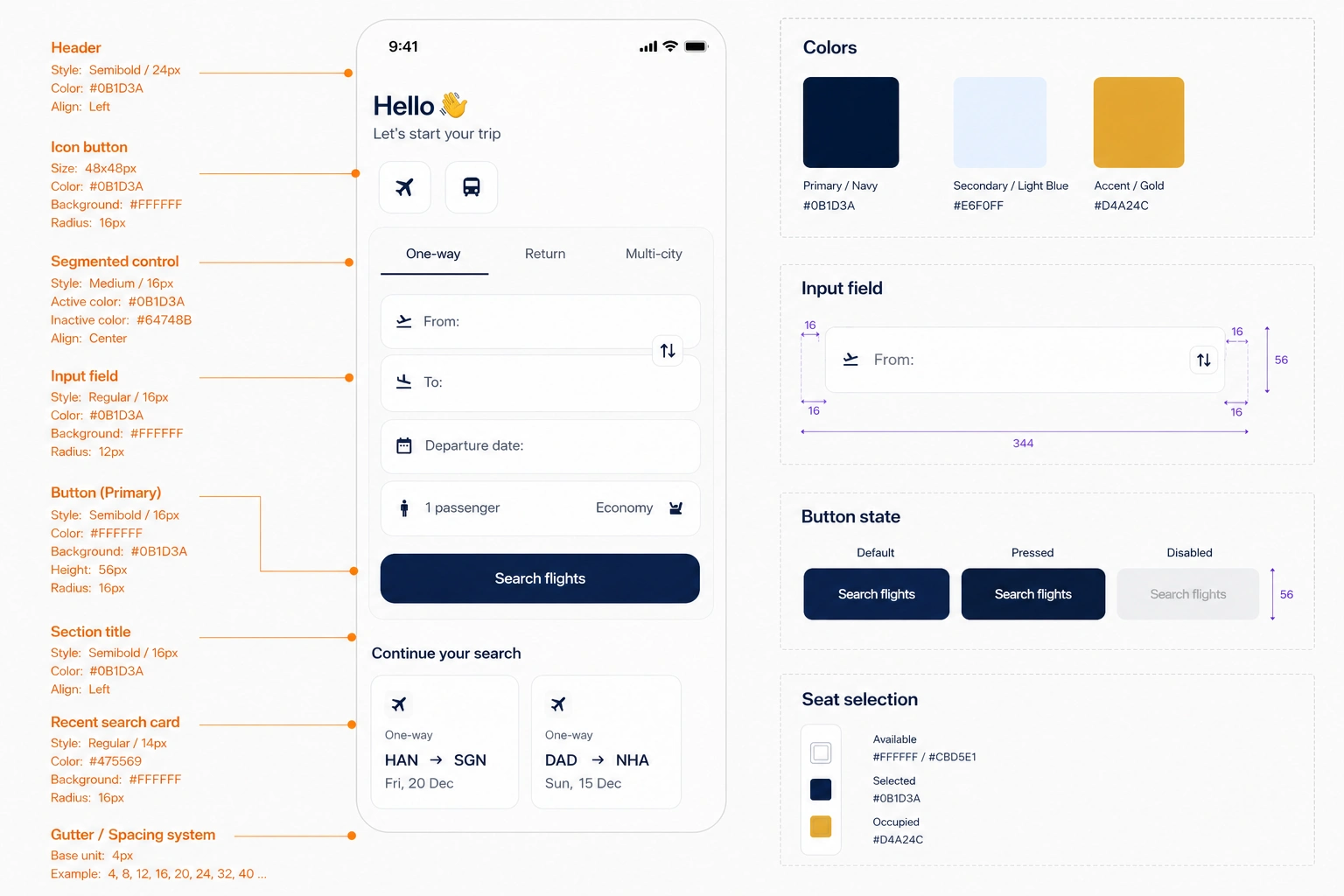
I was responsible for the end-to-end redesign process, including UX audit, competitor research, user flow optimisation, information architecture, wireframing, UI design, prototyping, and design system improvements.
Project Goal
Business Goal:
Increase the number of users successfully progressing from flight search to reservation.
Design Goal:
Create a clearer and more consistent end-to-end booking experience by reducing friction at key decision points and helping users find relevant flights faster.
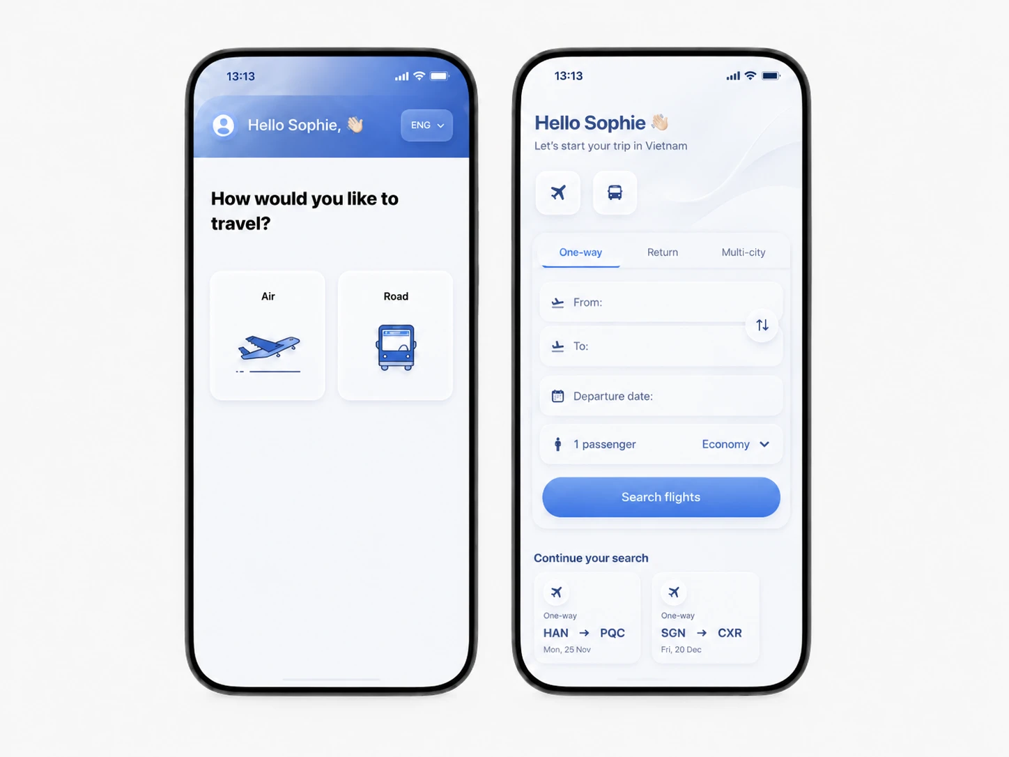
The redesign focused particularly on improving the first-touch experience, search input, route selection, trip configuration, and returning-user journeys.
Technical Constraints
Existing flight search and booking APIs
Airline data and availability integrations
Real-time fare and schedule updates
Mobile-first interface requirements
Existing backend booking logic
Integration with external payment providers
Research
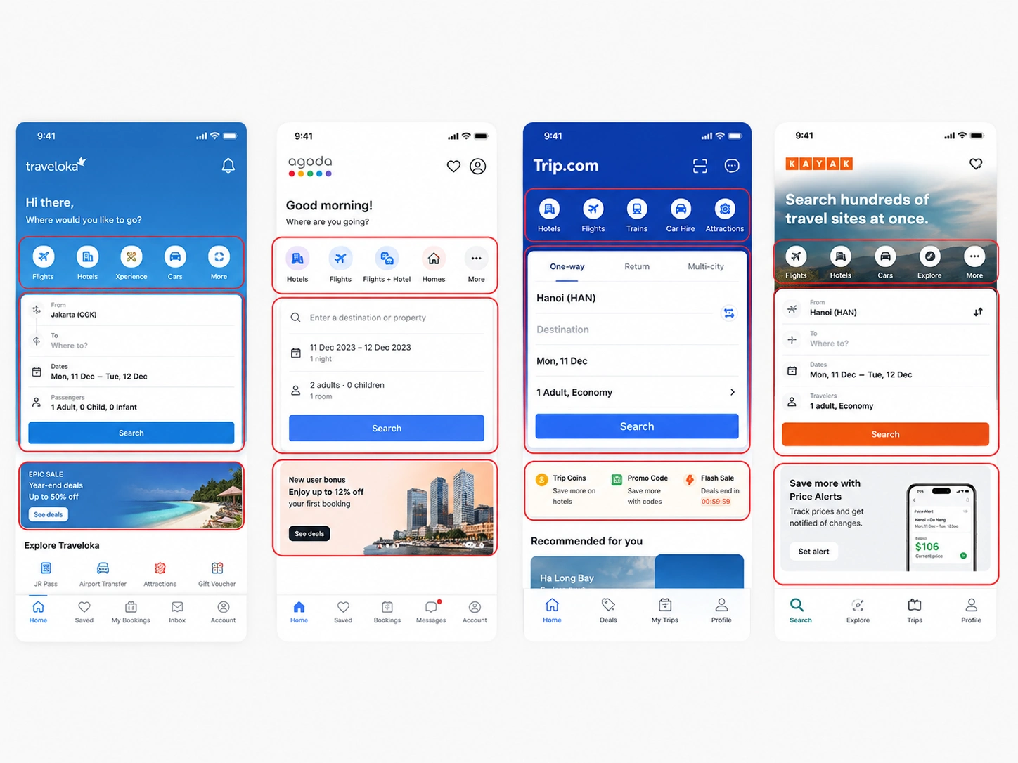
To understand where users experienced friction in the flight booking journey, I combined a UX audit with competitor research across leading travel platforms such as Traveloka, Booking.com, Skyscanner, and Trip.com.
I reviewed their search patterns, navigation structures, booking flows, and returning-user experiences to identify common usability patterns and opportunities for improvement. These findings helped shape a simpler and more focused experience for travellers booking domestic flights in Vietnam.
From the research, I identified three key areas to address:
Navigation
Pain Point:
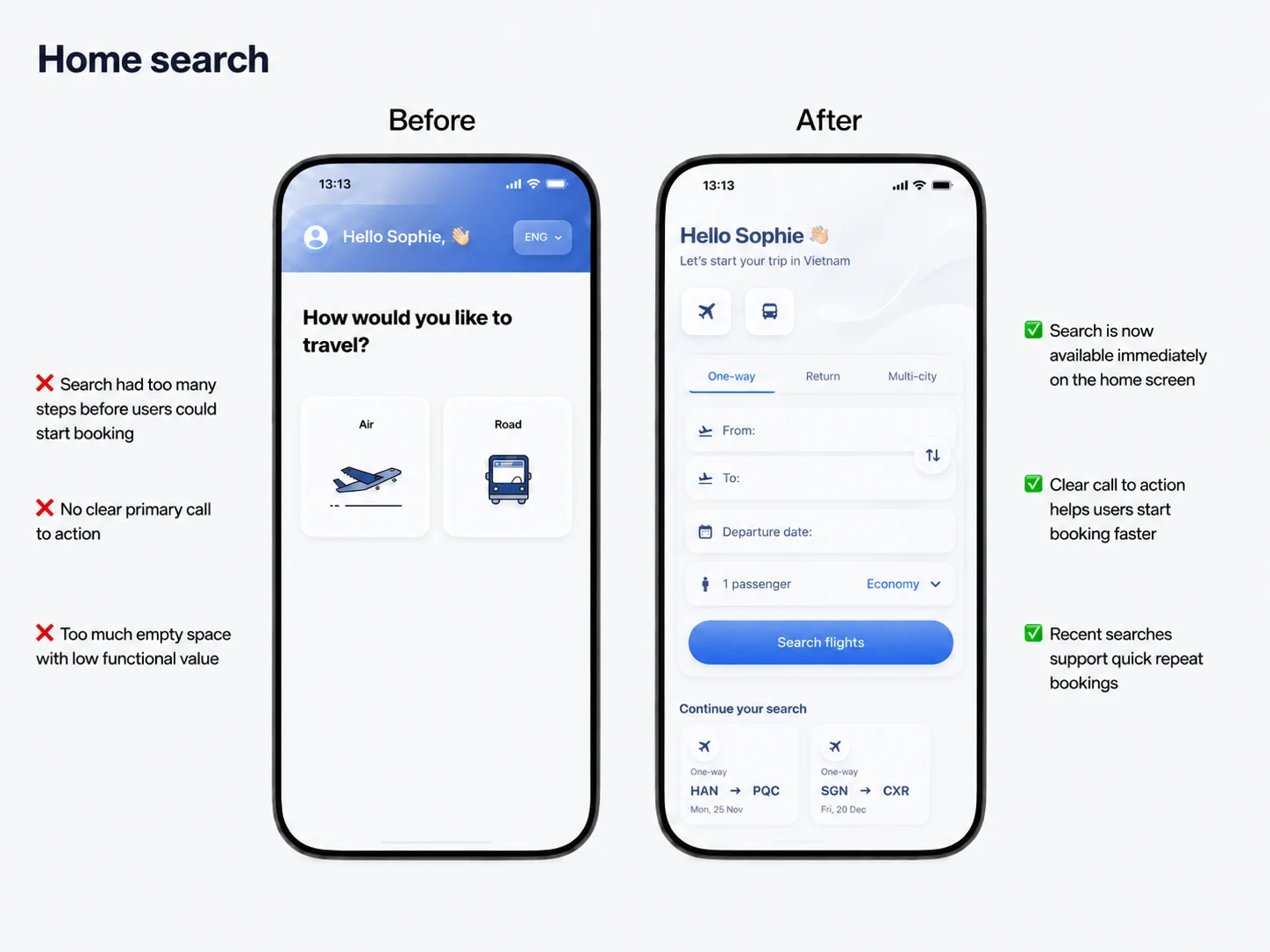
Users had to make several decisions before reaching the actual flight search, making the first interaction feel slower and less direct.
Solution:
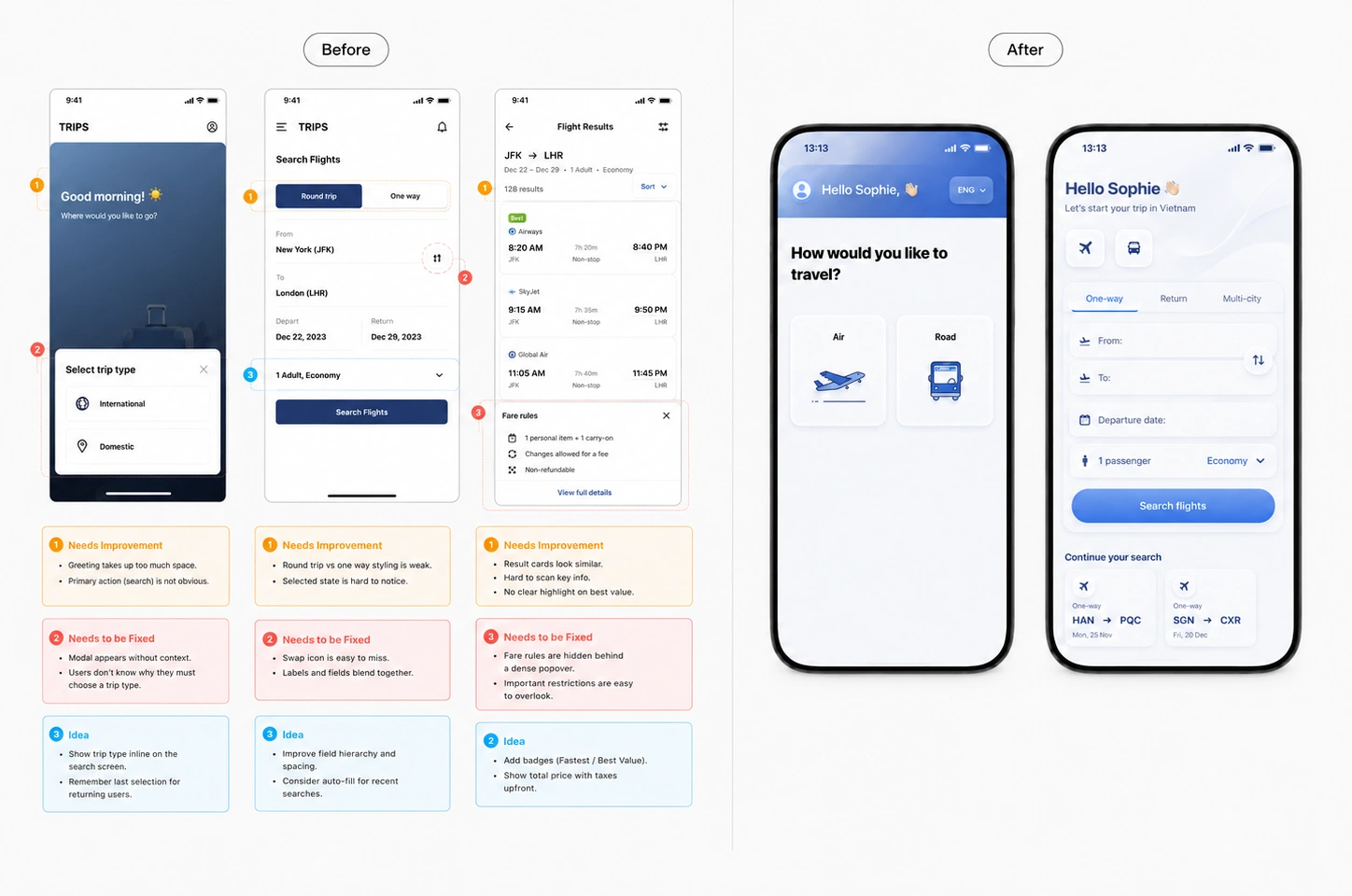
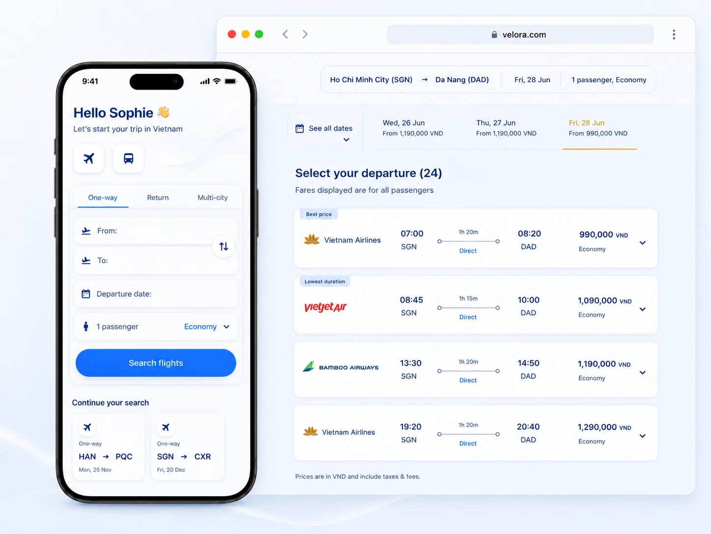
Bring flight search to the homepage, simplify travel options, and introduce recent searches so returning users can quickly repeat or continue previous journeys.
Clarity & Trust
Pain Point:
Important information such as routes, dates, fare conditions, and pricing could become difficult to scan as users moved deeper into the booking flow.
Solution:
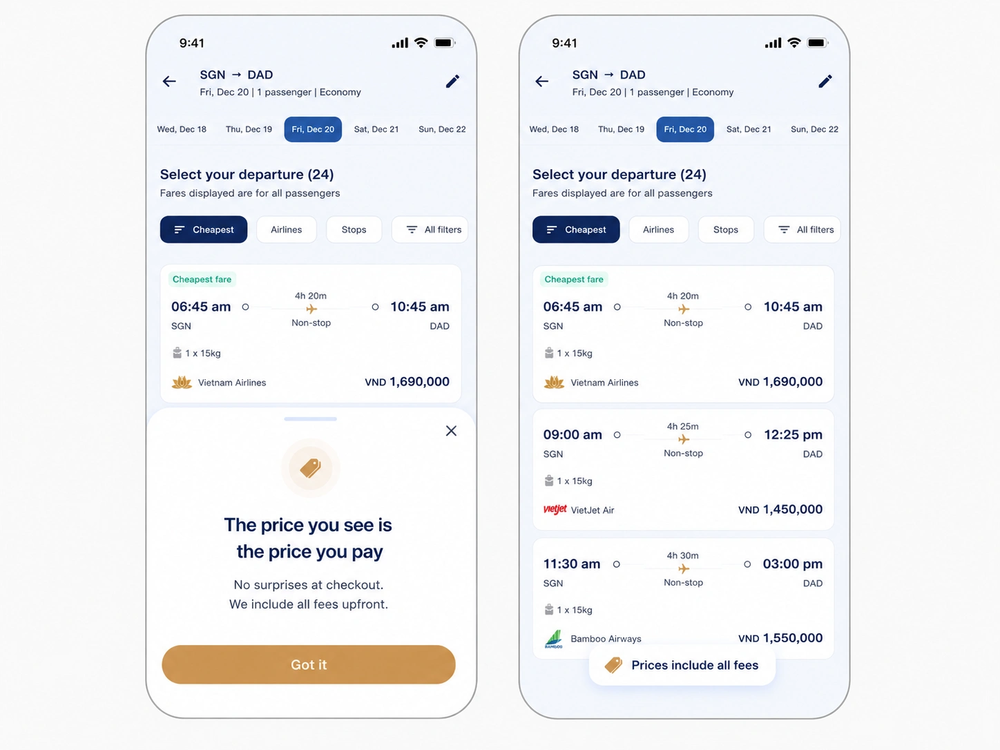
Improve information hierarchy and surface essential flight details earlier, helping users compare options and make decisions with greater confidence.
Booking Process
Pain Point:
The original experience contained unnecessary steps and did not provide enough guidance between search, flight selection, and reservation.
Solution:
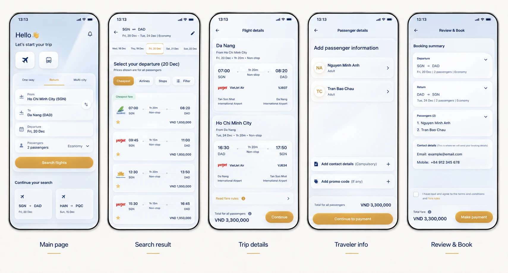
Create a more continuous booking flow with clearer input fields, stronger visual hierarchy, and progressive information disclosure to reduce cognitive load and keep users moving toward reservation.
UX Audit
Competitor Analysis
Searching Feature:
Design & Explorations
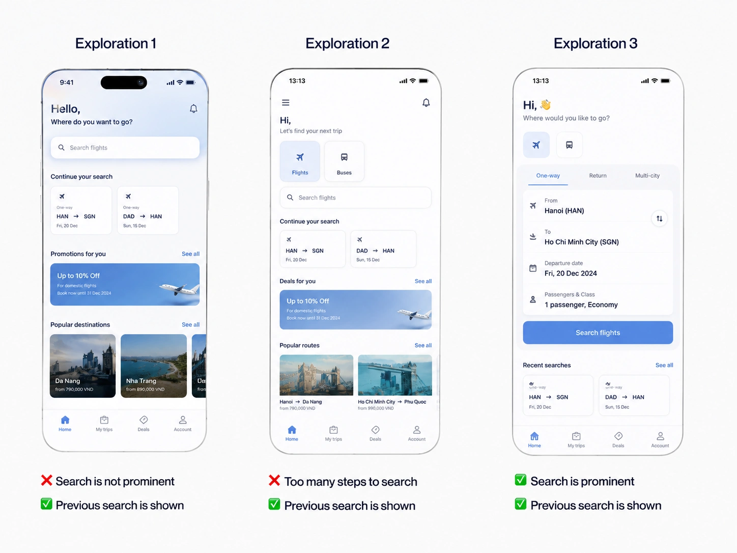
I explored several UI directions for the booking experience, testing different approaches to layout, visual hierarchy, search interaction, and navigation.
Rather than choosing a single concept, I combined the strongest elements from each exploration into the final design, creating an interface that feels more intuitive, visually refined, and consistent throughout the booking journey.
Final Polish :
Design System:
Outcome & Results
Like this project
Posted Aug 25, 2026
Create a clearer and more consistent booking experience by reducing friction at key decision points and helping users find relevant flights faster.
Likes
0
Views
11
Tags