Multi-select for Spotify mobile

ubin williams


01
Case study · Feature proposal
Multi-select for Spotify mobile.
One interaction, proposed as a change to a product I use every day.
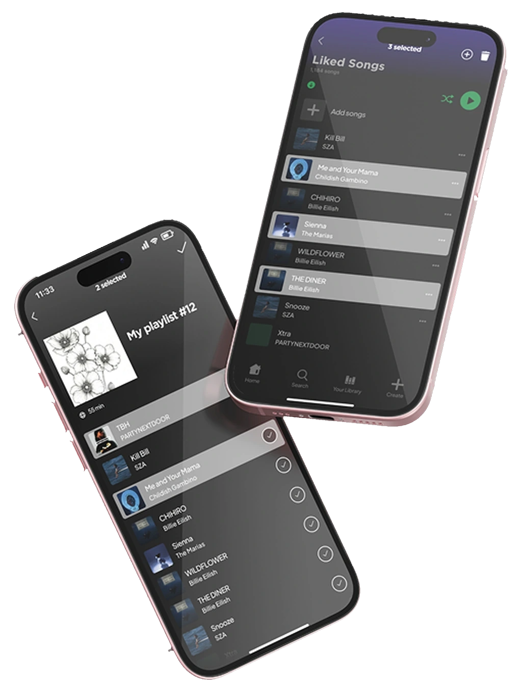
Spotify already has multi-select. It lives on desktop only, and even there it selects everything between the first song and the last. This proposes the mobile version: press and hold a song, tap the others you want, and move only those. The scope is one interaction inside an app that already works.
Role
Solo: research, design, prototype
Year
2025
Scope
One interaction, iOS
Tools
Figma, Procreate
Type
Self-directed feature proposal
02
The product
Spotify finds music quickly. Organising it takes much longer.
As a long-time Spotify user I noticed a gap between two halves of the same app. Discovery is fast. The app surfaces things constantly, and saving a song you like takes one tap.
The organising half is much slower. Building a playlist on your phone means adding one track at a time, and that repetition is enough that a playlist you thought of on the bus usually never gets made.
03
The gap
The feature already exists, just not on the device people use most.
Spotify's own community moderators answer this question directly: multi-select works in the desktop app and it does not work on mobile. What desktop gives you is shift-select, so when you pick two songs that sit far apart, everything between them comes along too. If the tracks you actually want are scattered through a thousand-song library, that hands you hundreds you never asked for.
Every person I spoke to described both their listening and their playlist building as something they do on their phone, which is the one place the feature is missing.
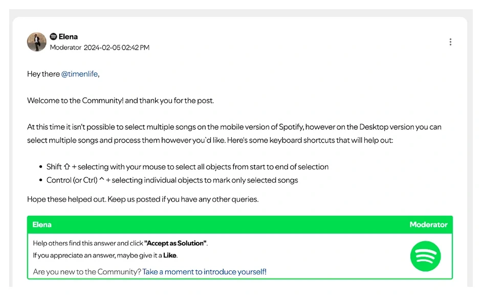
Spotify Community, answered by a moderator. Multi-select is desktop only, and it works through shift-click and control-click.
04
What people said
The interviews kept returning to the same complaint.
I interviewed Spotify users about how they actually build playlists, then sorted what came back into what I learned and what it was costing them.
The questions I asked
What makes you stay loyal as a Spotify user?
How often do you create or update playlists?
Do you more often make your own playlists or use other premade playlists?
How do you feel about the current playlist creation experience on mobile?
Do you experience any pain points when making new playlists and if so, what are they?
How would you ideally want to add or organize multiple songs at once?
What I heard
The cost
Discovery feels effortless. Organising songs into playlists is tedious.
Adding songs individually takes too many steps on mobile.
Most people rarely create or update playlists, despite wanting to.
The repetition discourages spontaneous use.
People prefer making their own playlists over using premade ones.
No bulk selection means less personalisation and less control.
People want a faster, more intuitive way to manage several songs at once.
The current design has no efficient way to add, remove or reorder in bulk.

Interview sessions, recorded and reviewed afterward.
05
The current flow
Building one playlist takes five steps, and only the last one repeats.
The complaint above is a general one, so this is the specific version of it. These are all the steps the app asks for today, from opening your library to getting the first song into a new playlist.
1
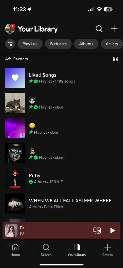
Your Library, then tap Create.
2
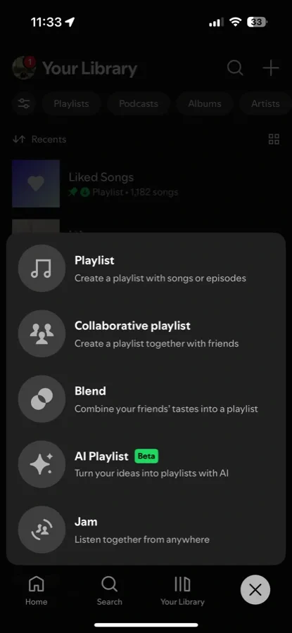
Choose Playlist from the menu.
3
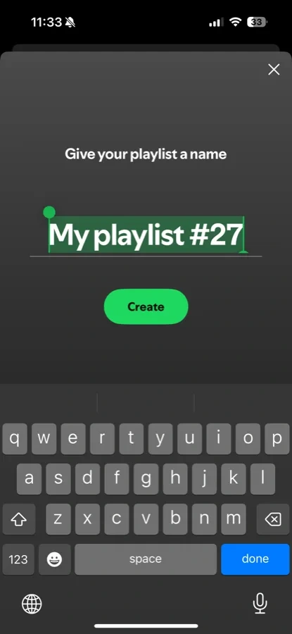
Name it, then tap Create.
4
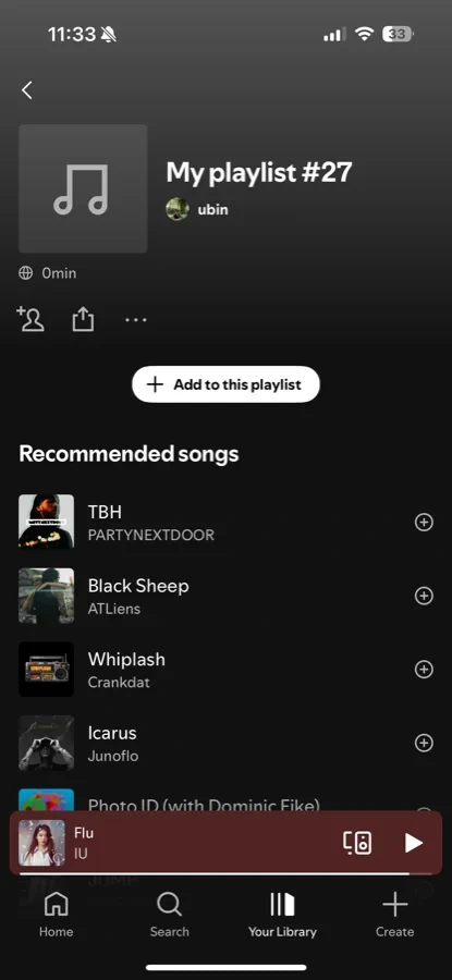
The playlist is empty. Tap Add to this playlist.
5
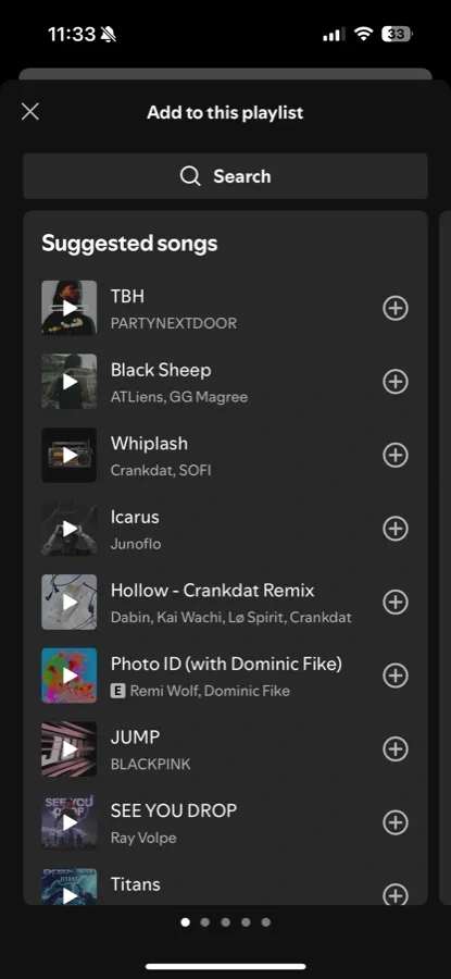
Tap the plus on one song. Then the next. Then the next.
Steps one to four only happen once, but step five happens once for every song you add, and that is the whole problem. The app gives you a way to say this one over and over again, and no way to say these five.
06
Two directions
The interviews pointed at two moments, so I designed for both.
The complaints sorted themselves into two distinct moments. One is picking several songs out of a list you are already looking at, and the other is reaching into a playlist you already have to pull songs out of it. They are different problems that happen to share one gesture, so I sketched each of them against the interview notes before I built either.
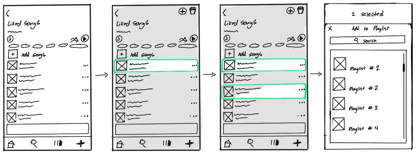
Direction one, from the in-list complaint: press and hold a song to enter selection, then tap to add more.
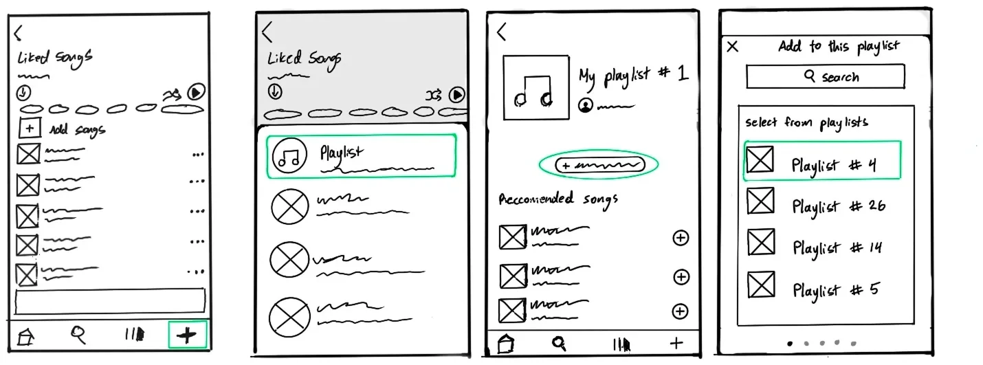
Direction two, from the cross-playlist complaint: reach into a playlist you already have and pull songs across into the one you are building.
Both directions went into the prototype. The first defines the gesture, since it is where someone would meet selection for the first time. The second is where it returns the most work, because pulling from an existing playlist is the case where people move the largest number of songs at once.
07
The feature
Press and hold. Tap the rest. Move them together.
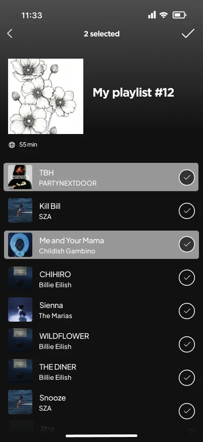
Holding a song opens selection. Unselected rows dim, the header counts what you have picked, and add and delete replace the title.
The same selection, used across playlists: choose the songs, then choose where they land.
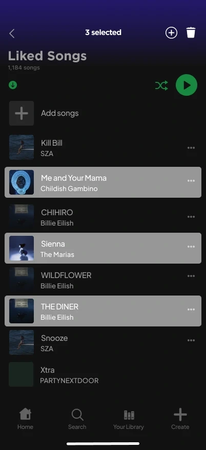
The header becomes the toolbar. A live count, plus add and remove.
Three picked out of nine.
The rows in between stay untouched, and dim. Desktop shift-select cannot do this.
The same header, the same count.
08
The response
Ten people tried the prototype.
I put the prototype in front of ten people and asked two questions.
On a scale of 1 to 5, how intuitive did the feature feel to use?
8 of 10 said 5, extremely intuitive. 2 said 4, very intuitive.
How likely are you to use this feature in your regular Spotify experience?
9 of 10 said 5, extremely likely. 1 said 4, very likely.
09
If it shipped
If this shipped, these are the numbers I would want to watch.
None of this proves the feature would work at Spotify's scale. If it did go out, there are three numbers that would tell me whether the argument held up.
Average time to build a playlist
How many people enter selection mode at all
How often playlists get created and updated
If people never find the gesture, the problem stays exactly where it was.
10
Takeaways
1
Designing with intent
I learned the importance of aligning usability with user intent. Good design should feel invisible. Users should not have to think about how to complete a task. It should just make sense intuitively.
2
Friction impacts engagement
Even small inefficiencies can discourage users from taking action. At times I overrefine my work for the sake of presentation rather than clarity. It is often better to go simpler and focus on making the simple action as close to perfect as I can get it.
3
Thinking holistically
Designing something holistically starts with deeply understanding the problem, the psychology behind user actions, and the small details that shape behavior. Even minor inefficiencies in a flow can lead to larger drops in engagement over time.
Like this project
Posted Sep 1, 2026
Multi-select for Spotify mobile: a self-directed feature proposal for a press-and-hold + tap gesture to select multiple songs on iOS.
Likes
0
Views
1