Built with Kajabi
HIBROWS Masterclass — A Luxe Beauty-Business Academy on Kajabi

John Zimmerman
Verified


HIBROWS Masterclass — A Luxe Beauty-Business Academy on Kajabi
Live site: https://www.hibrowsacademy.com/
The brand
HIBROWS Masterclass is the coaching brand of Yasmine Koblet — the #1 microblading artist in the world and creator of the globally recognized HIBROWS Technique, with a 450,000+ following and a business she scaled from zero to seven figures in a single year. The masterclass teaches beauty and PMU artists how to turn their craft into a real business in 90 days using her method. A brand built on that level of authority and aspiration needed a platform to match — high-end, polished, and unmistakably premium.
A design-first process
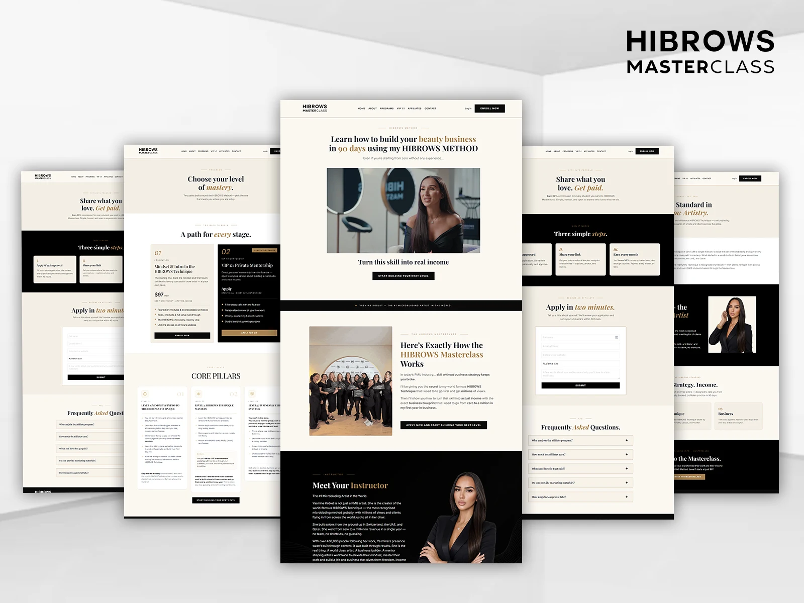
I designed the entire platform from scratch and mocked up every page before building, so Yasmine could see and approve the full experience up front. The direction is luxe editorial — deep black, warm cream, and gold accents, with elegant serif type and italic emphasis — the kind of restrained, expensive look that signals a high-ticket beauty brand. It feels like a luxury studio, not a course template, which is exactly the first impression this audience responds to.
Building it in Kajabi
I hand-built the full platform natively in Kajabi:
A full custom website — Home, About, Programs, VIP 1:1, Affiliates, and Contact — with a cohesive luxe brand throughout
Tiered programs from a $97 foundation up through VIP 1:1 private mentorship, each with its own positioning, offer, and access logic — "a path for every stage"
An application-based enrollment funnel ("Apply in two minutes") that qualifies leads before they buy, ideal for the higher-ticket mentorship
A built-in affiliate program — "Share what you love, get paid" — with a clean apply flow and 30% commissions, so students can promote the masterclass and earn
A custom "Meet Your Instructor" story, Core Pillars, and FAQ sections that build authority and handle objections
A custom course experience, member area, and system pages, plus the automations that tie enrollment to access
Custom-coded sections throughout so nothing reads like an off-the-shelf build
The result
A premium, fully custom Kajabi academy that carries the polish of a luxury beauty brand and monetizes on multiple fronts — tiered programs, a high-ticket mentorship, and an affiliate engine — giving a world-class artist a platform as elevated as her reputation.
Like this project
Posted Aug 19, 2026
A luxe, fully custom Kajabi academy for HIBROWS Masterclass — tiered beauty-business programs, a VIP mentorship, an application funnel, and affiliate program.
Likes
2
Views
21
Clients
HIBROWS ACADEMY