Built with Framer
Framer Landing Page Design for Keel Data

Cheree Zellars



Keeltruss Data
Audit Reconciliation SaaS
About the Company
Keeltruss Data is a fictional SaaS company I created for this concept project. It builds reconciliation and audit-trail software for private equity and private credit funds between $500M and $5B in AUM. Its founder, Renata Kessler, spent four years in fund operations reconciling portfolio data by hand, then built and sold a hedge fund reconciliation company called Fathom. Keeltruss is the version she wanted to build all along, aimed at private markets, where there’s no public pricing and every fund’s data looks different. Keeltruss is a YC W23 company with $14M raised and nine funds running their numbers through it. Its buyers are operations and compliance leads, usually a COO or Director of Fund Operations, whose names are on the number if it’s wrong.
The Project
I made Keel to show what working with me looks like, so I ran it the way I’d run a real engagement. I started with a discovery document, the same one I use with real clients, filled out in Renata’s voice. Her situation was a common one. She built her first website herself the week before her YC interview and never touched it again, and the company has since grown to twenty-two people. The scope was a new Framer site, with structure and design handled by me.
The goals came out of discovery. Credibility came first and lead generation second. Renata didn’t want a “book a demo” button doing the work. She wanted someone to read the methodology and security pages in full and show up to the first call already convinced. She also wanted an investor she hadn’t pitched yet to be able to do diligence from the site alone.
The Approach
Colors
I made blue the primary color because blue reads as trust, and trust is what Keel sells. A keel is the part of a boat that travels the ocean and keeps it steady, so I wanted the blues to feel like calm water. That ties the color to the name as well as to the trust.
Orange is the accent. It’s the color of inspired action and it complements the blue, so I used it on the things I want people to do.

Keeltruss color palette
Gradients
I used different shades of blue to build a light, professional gradient. It makes the transitions between topics easy, so moving down the page feels like one continuous surface instead of a stack of separate blocks. I also wanted the gradient to carry some high-tech neon alongside the cool, calm feeling. It stays within the blue family.

Keeltruss gradients
Buttons
I rounded the buttons to make the site feel inviting, and I carried the same rounded corners onto the photos so the two read as one system.

The Result
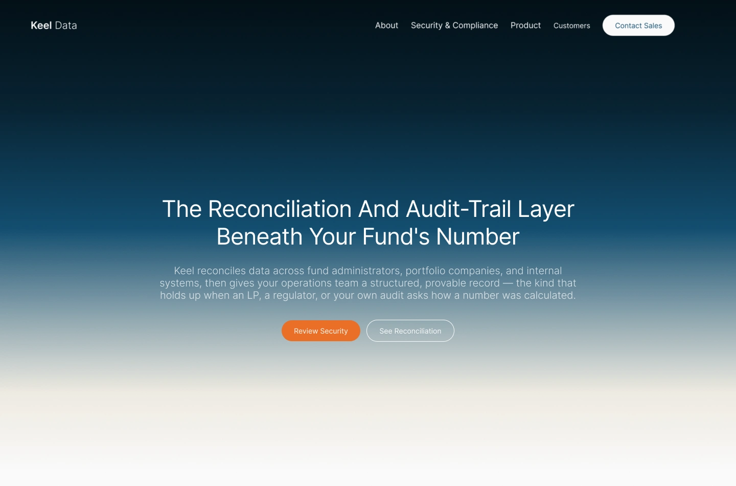
The finished piece is a Framer site built around how Keel’s buyers vet a vendor: what Keel is, how the reconciliation works, whether it’s secure, who already trusts it, and only then a conversation. It has six pages: Home, Product / Methodology, Security & Compliance, Customers, About, and Contact.
Like this project
Posted Oct 11, 2026
Keel Data is a fictional SaaS company for a concept project. It builds reconciliation software for private equity between $500M and $5B in AUM.
Likes
0
Views
1