Transporex Brand Identity design
Abd. Wahab salam
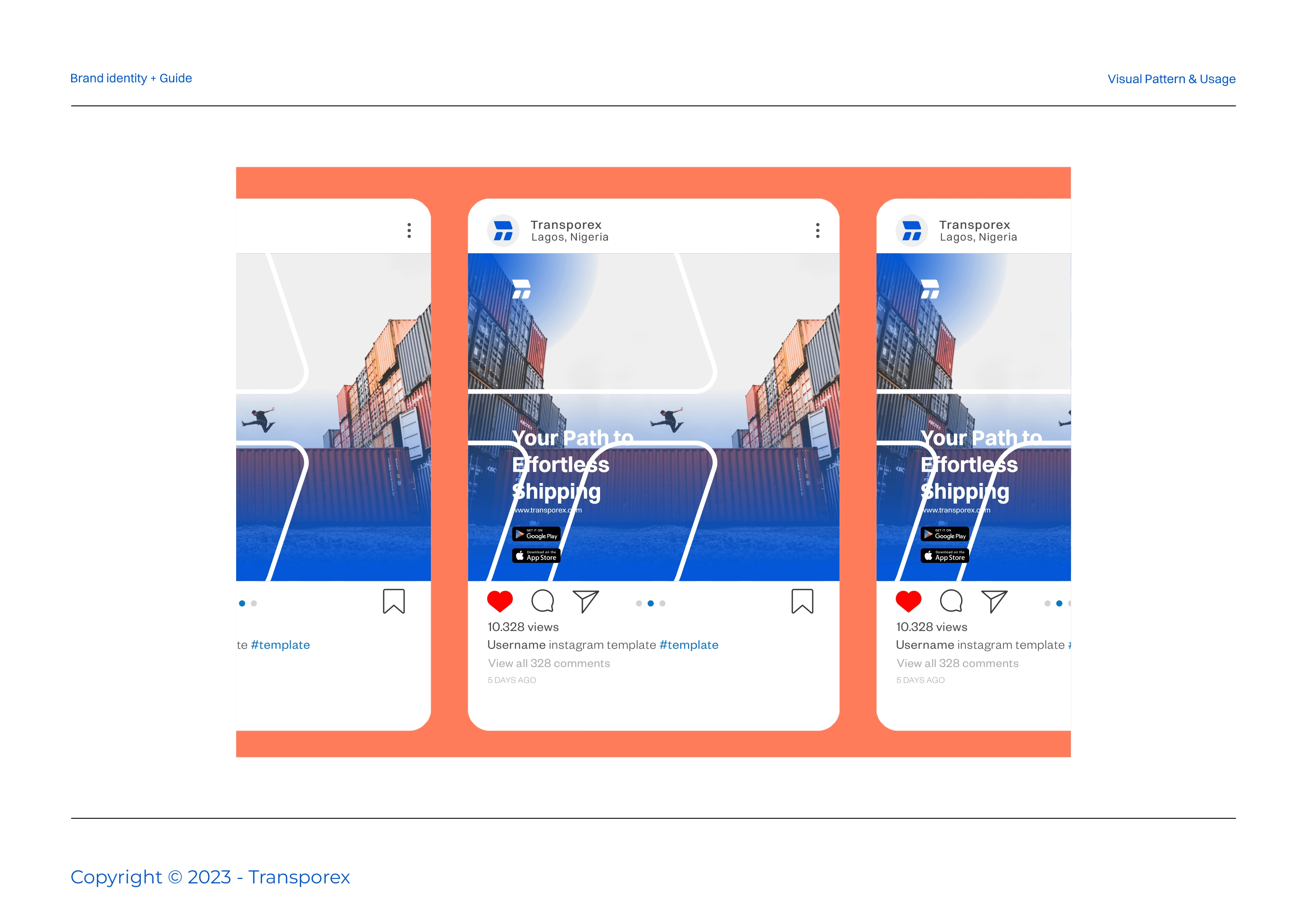
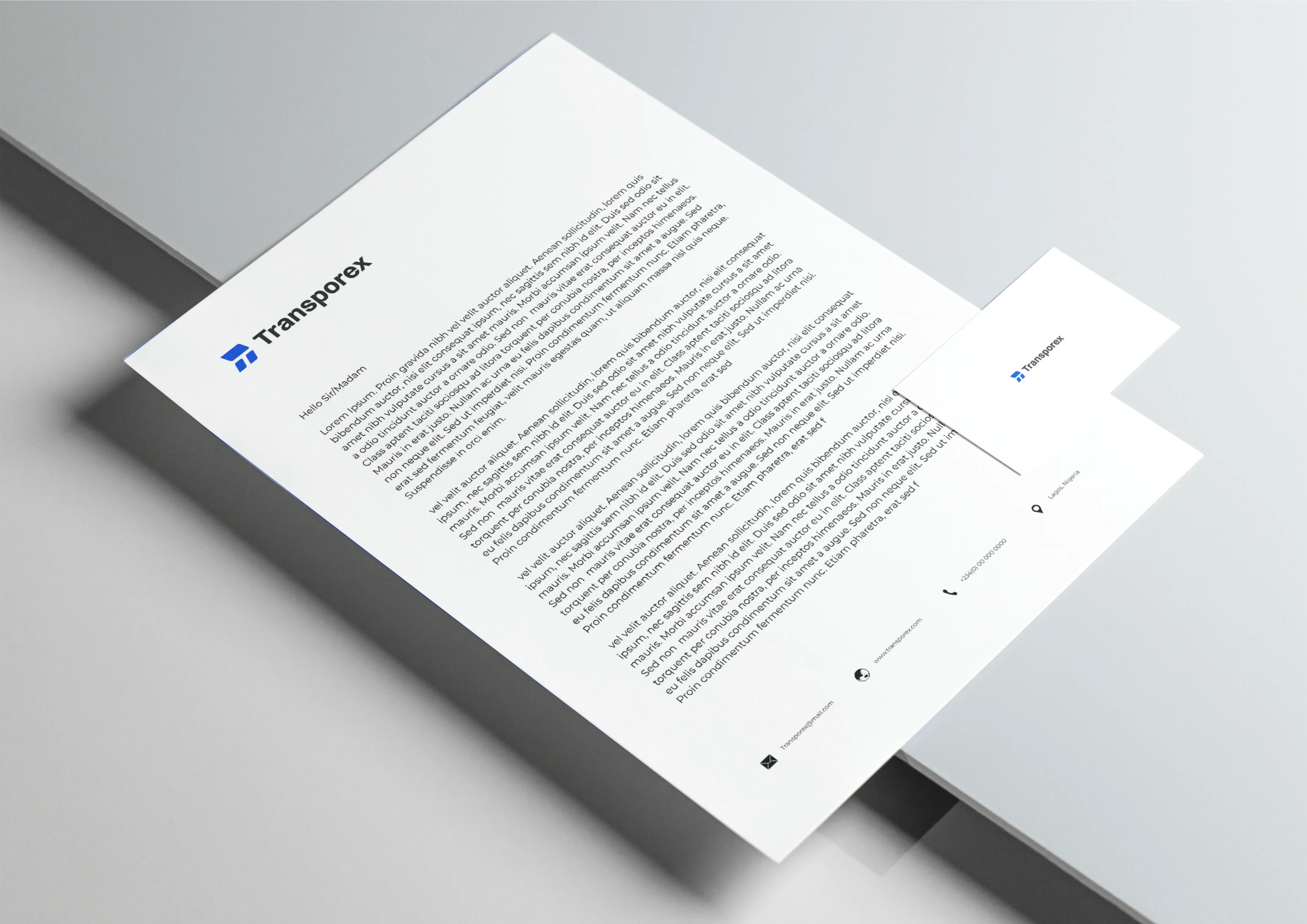
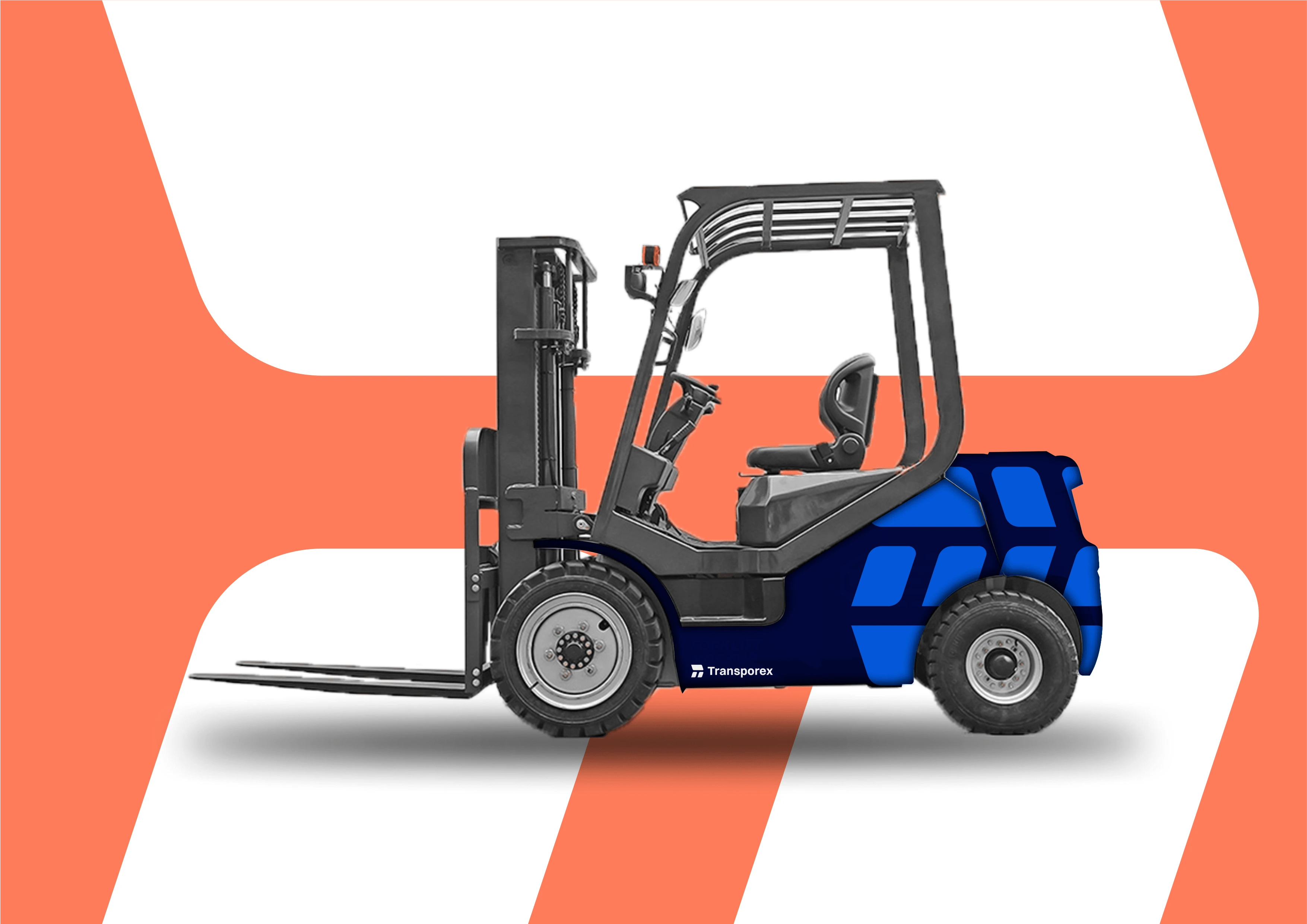
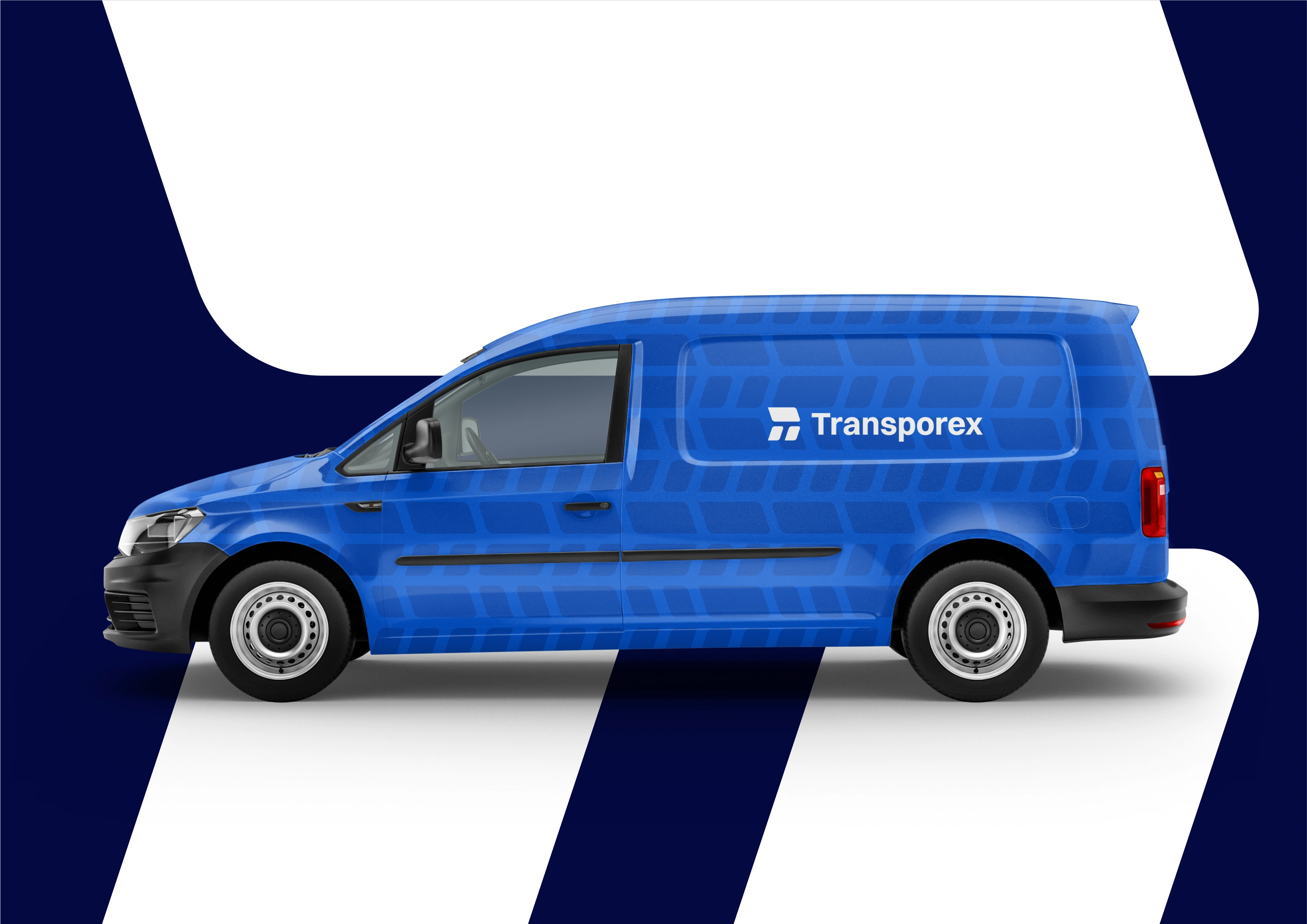
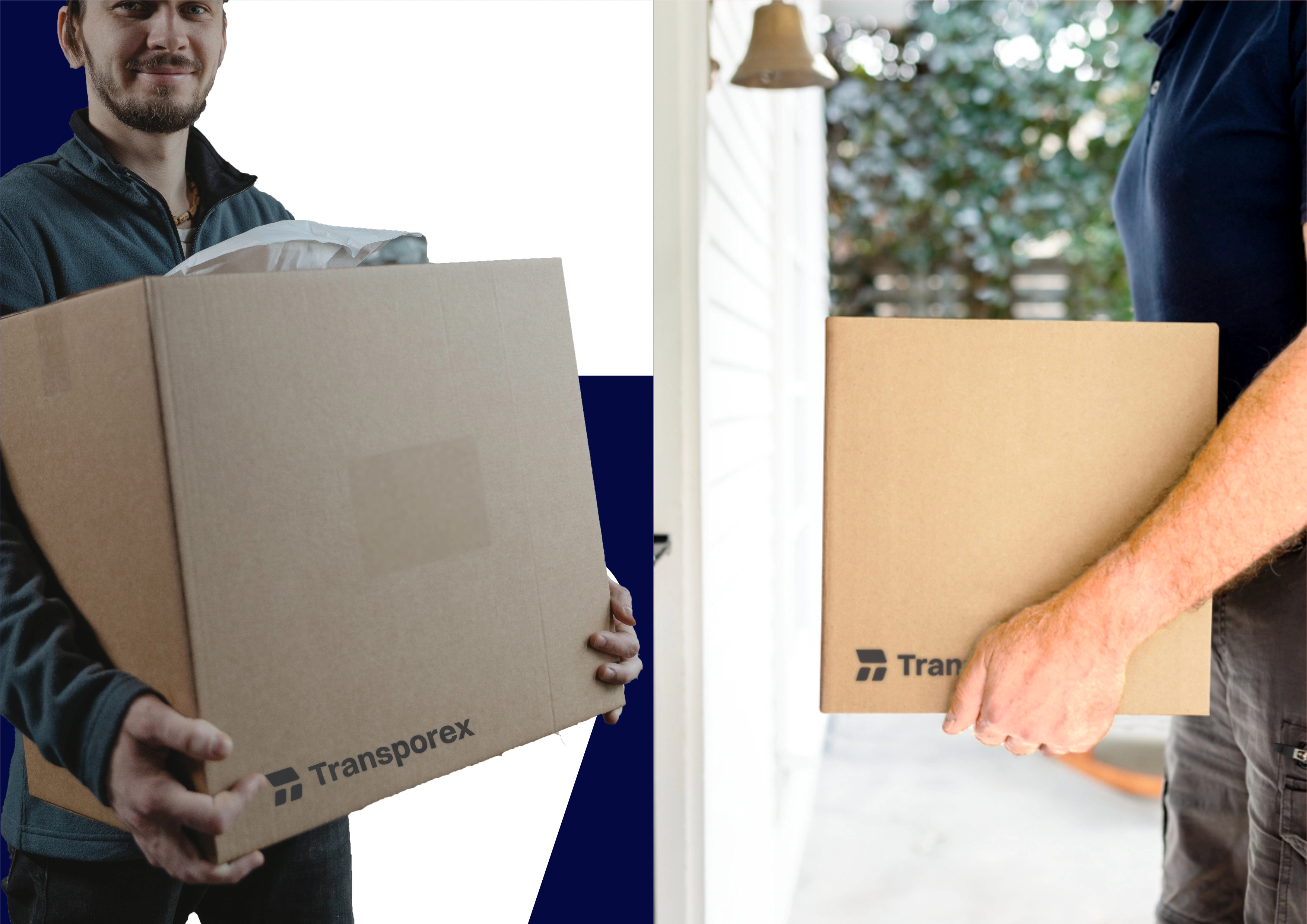
Transporex Brand Identity
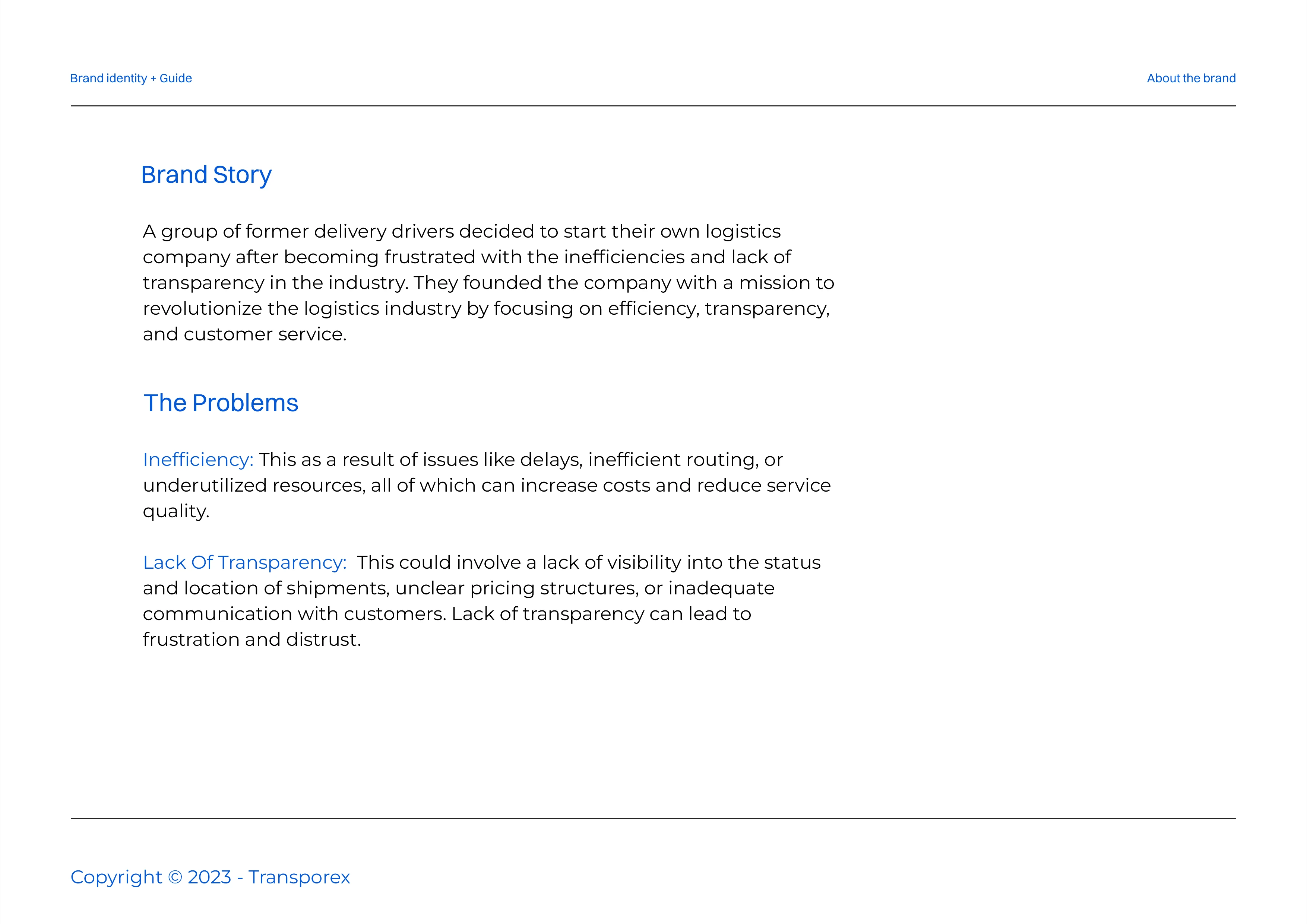
Transporex is a logistics brand founded by three former drivers frustrated by inefficiencies and the lack of transparency in the industry. They created Transporex to address these issues and improve the logistics sector.
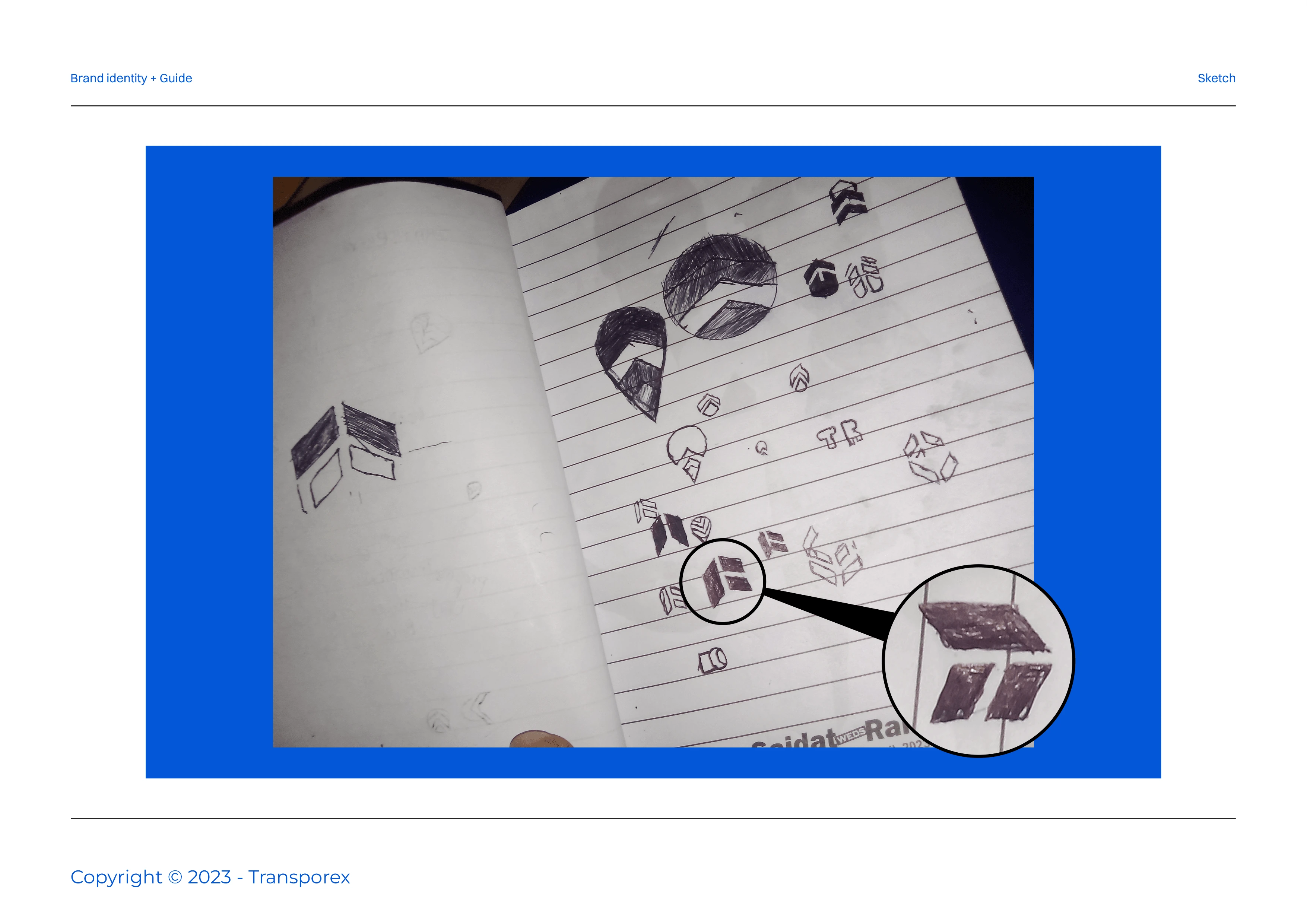
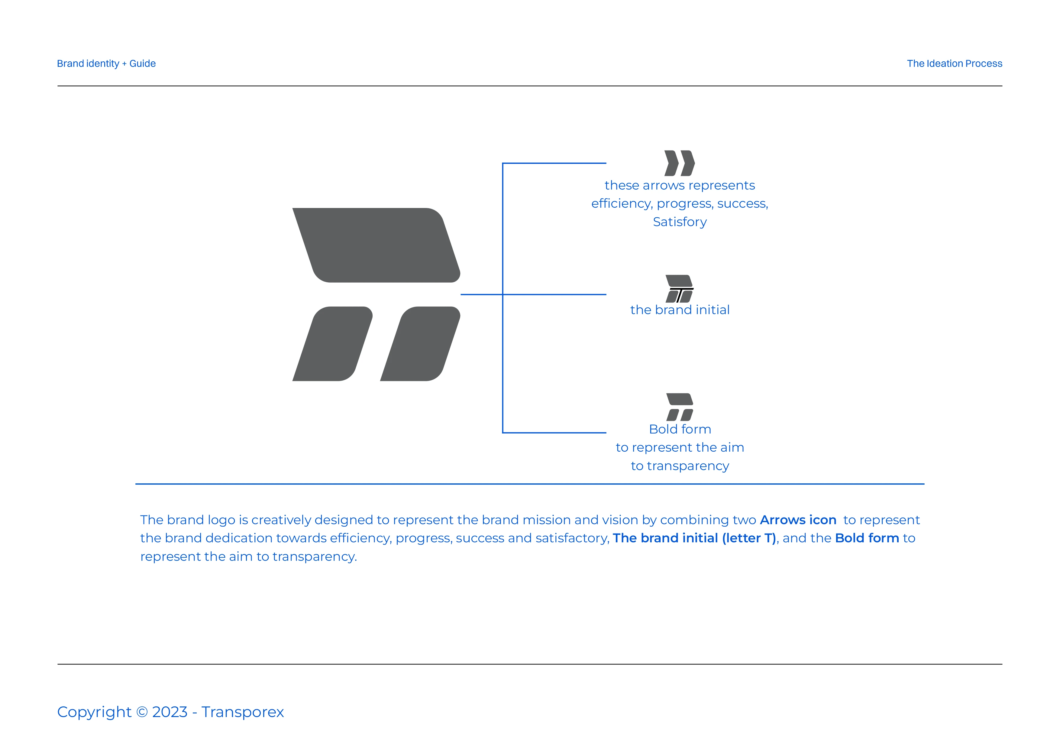
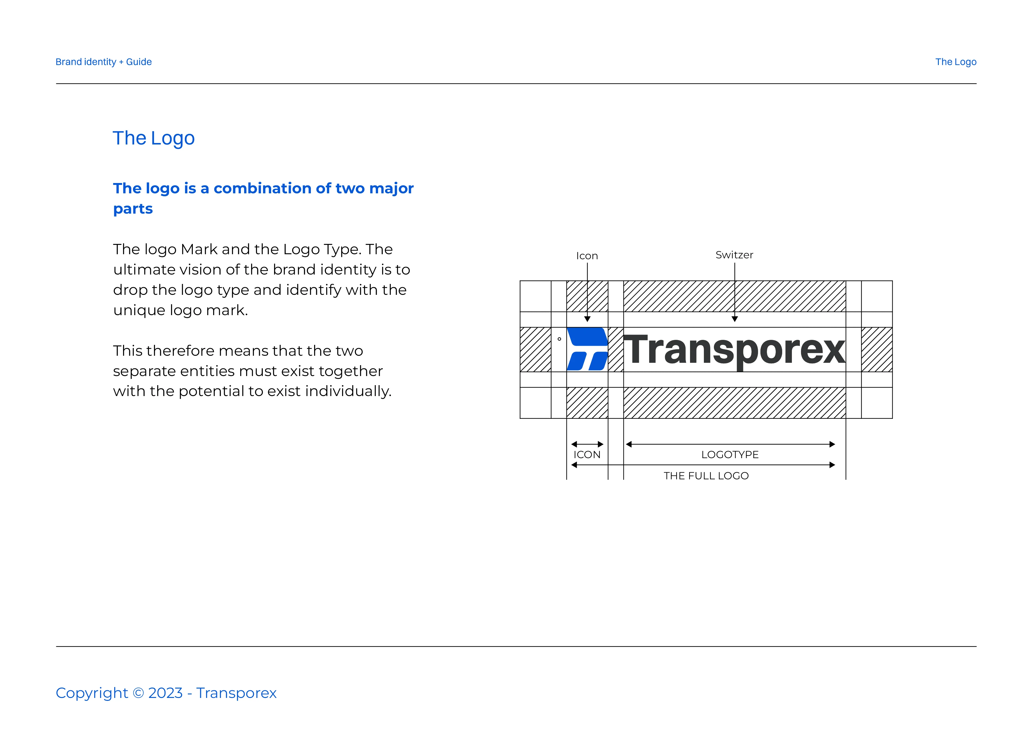
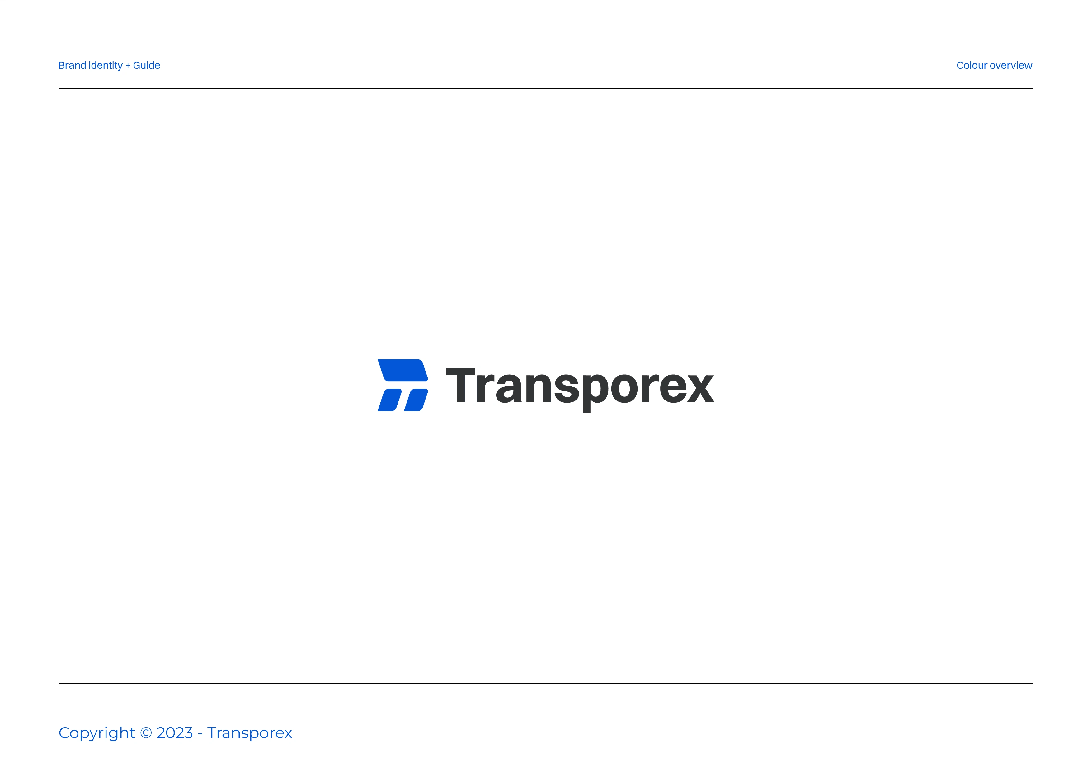
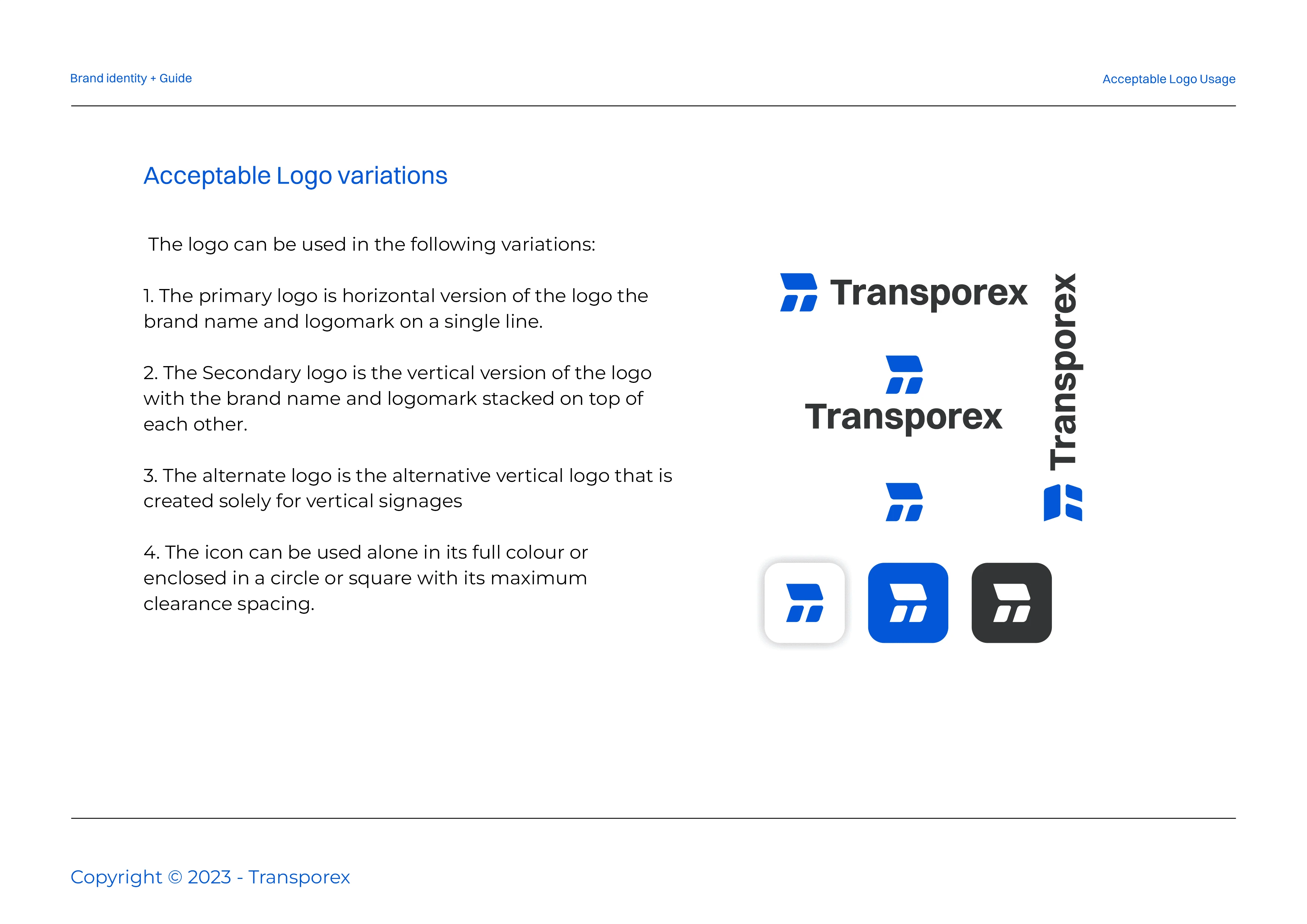
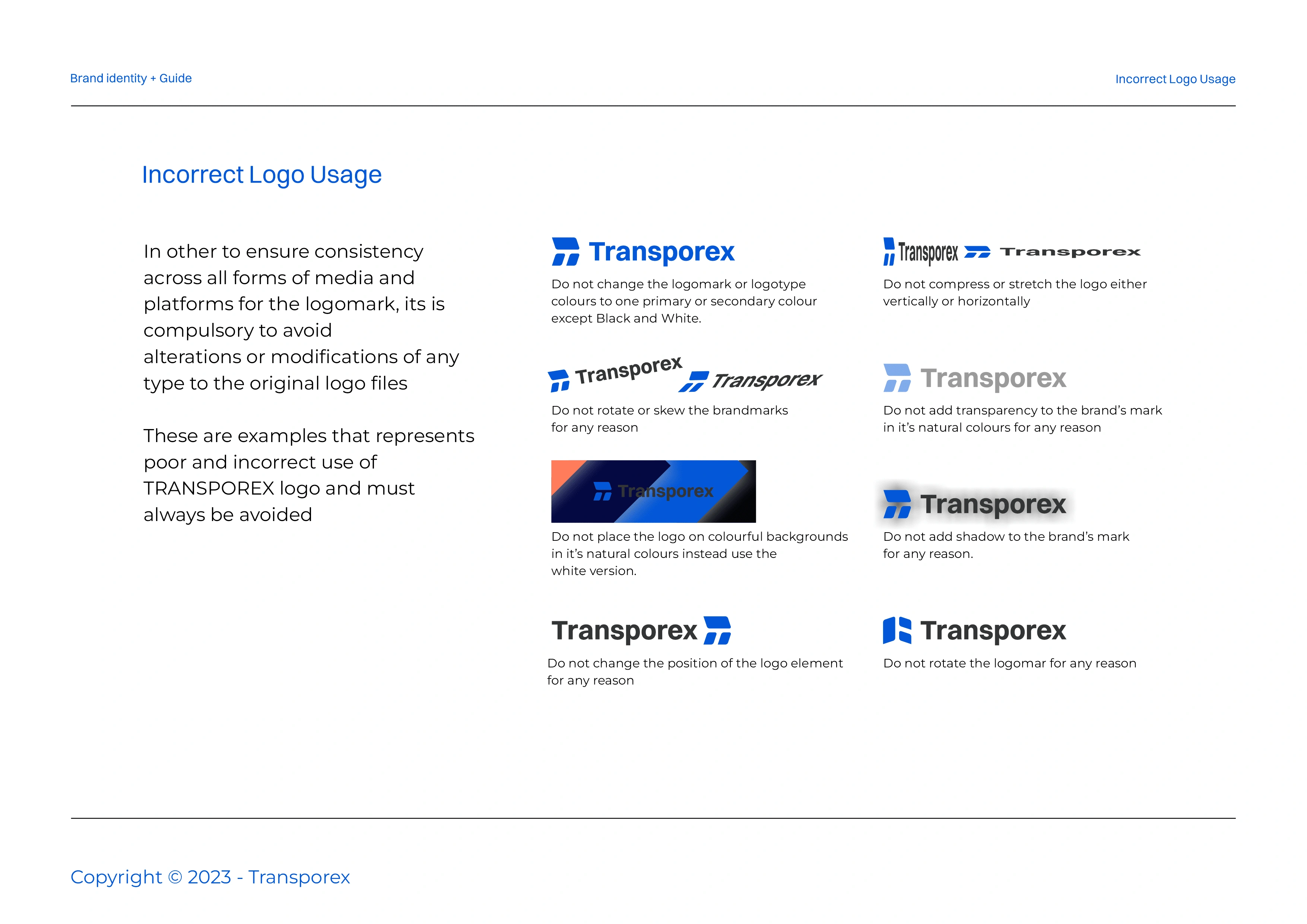
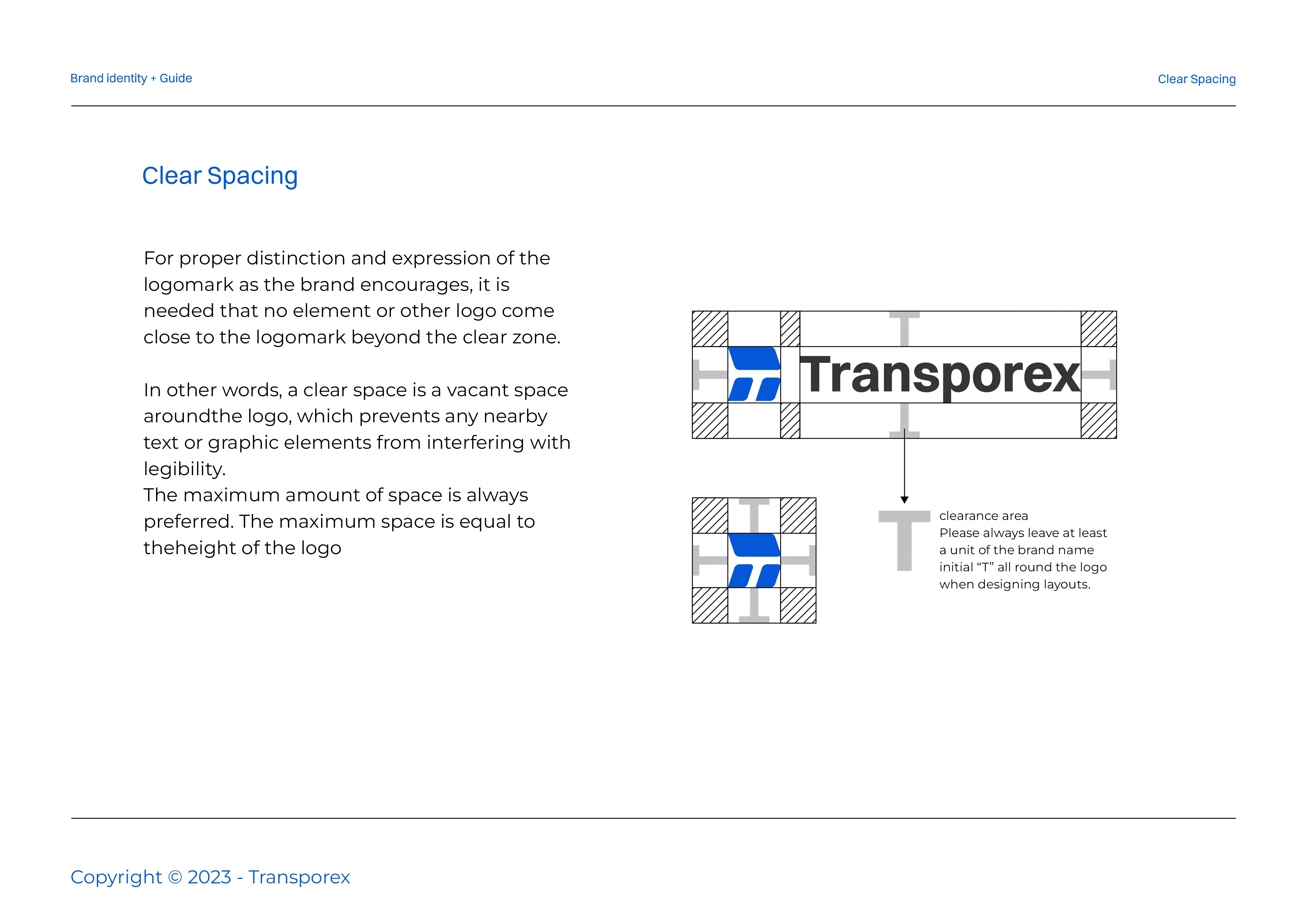
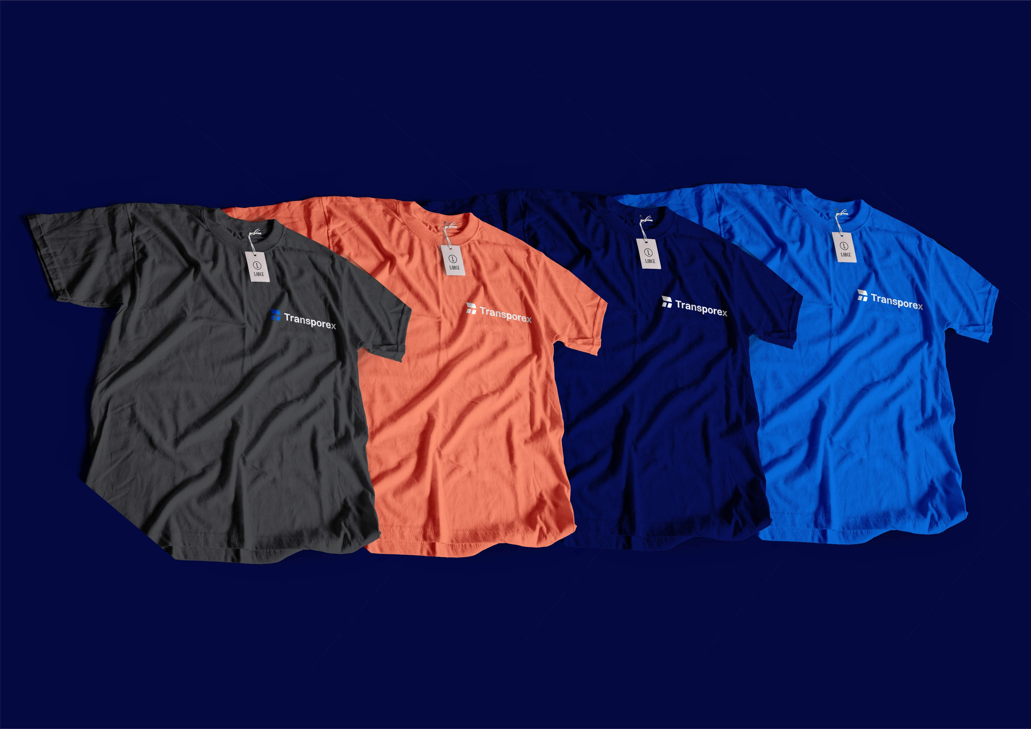
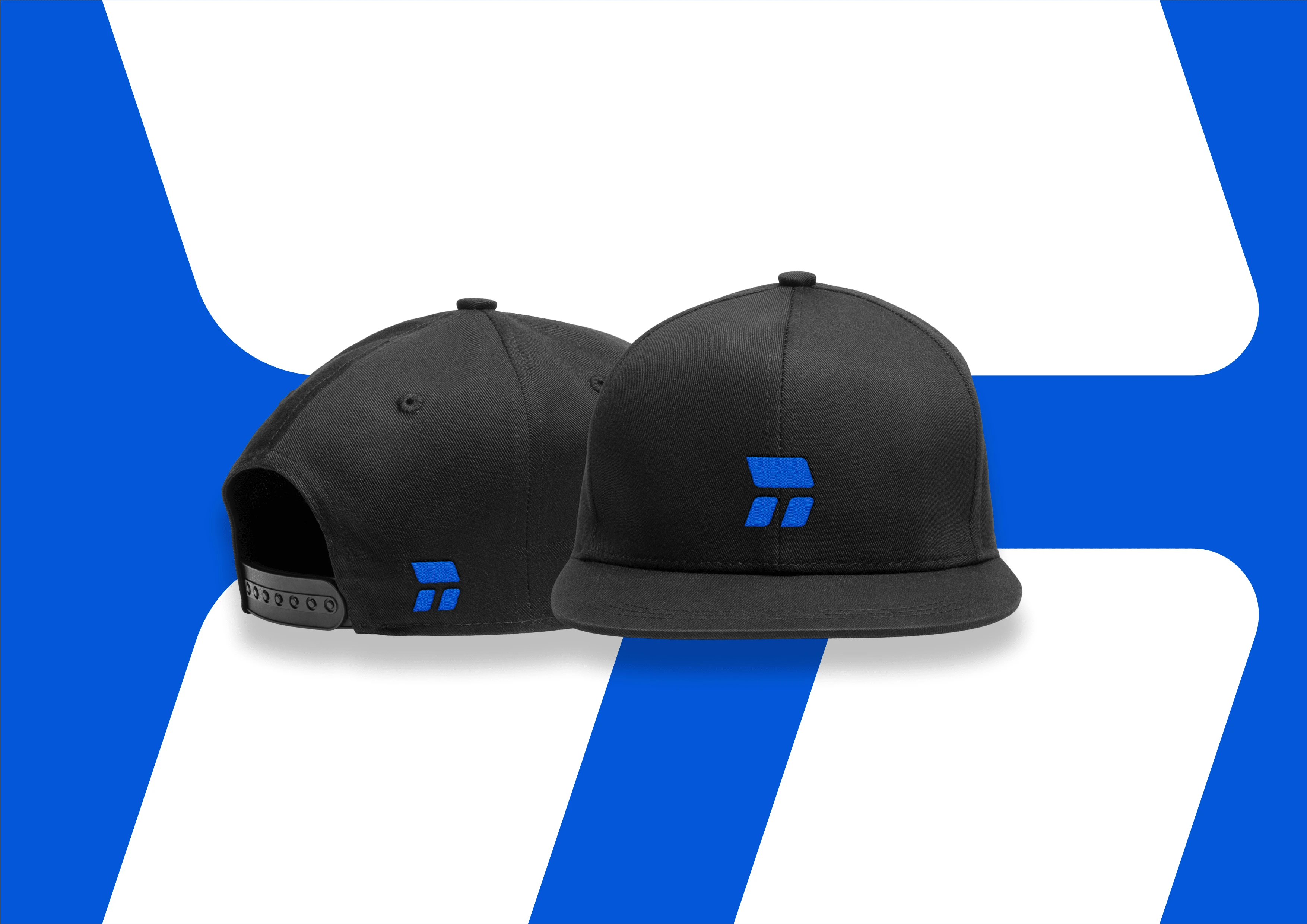
To reflect the brand's mission and vision, a unique identity was designed that captures its core essence. The brand logo combines a bold typeface with an icon. The icon integrates three elements: the brand initial "T" to represent Transporex, an arrow symbolizing the brand's commitment to efficiency and growth, and a bold form to convey trust.

Link to full project on Behance


Like this project
Posted May 23, 2024
Transporex Brand Identity I created a stunning identity that encompasses the core essence of the brand and created a comprehensive brand guide for the brand