Svela — Brand Identity for a Healthcare Design Studio

Svela Studio
Brand Identity for a Healthcare Design Studio
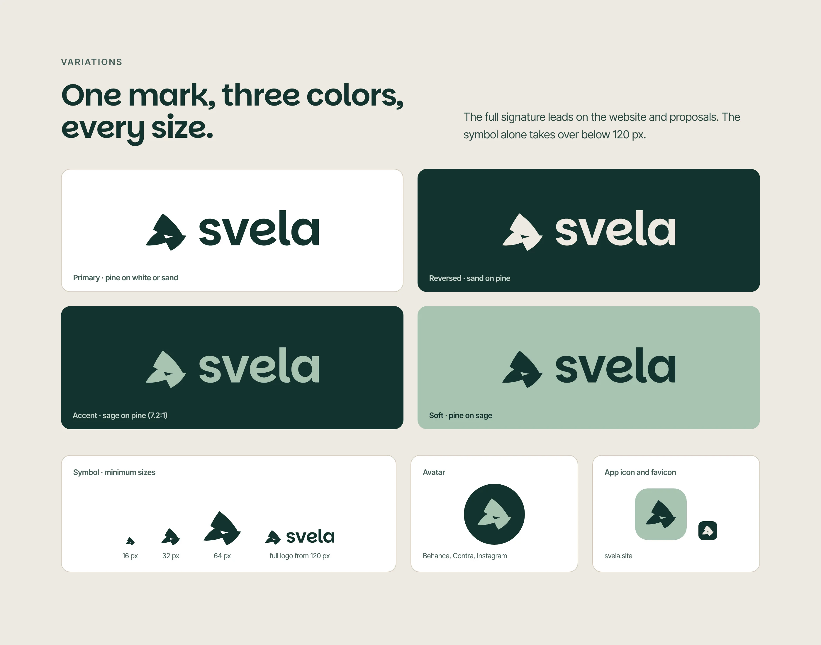
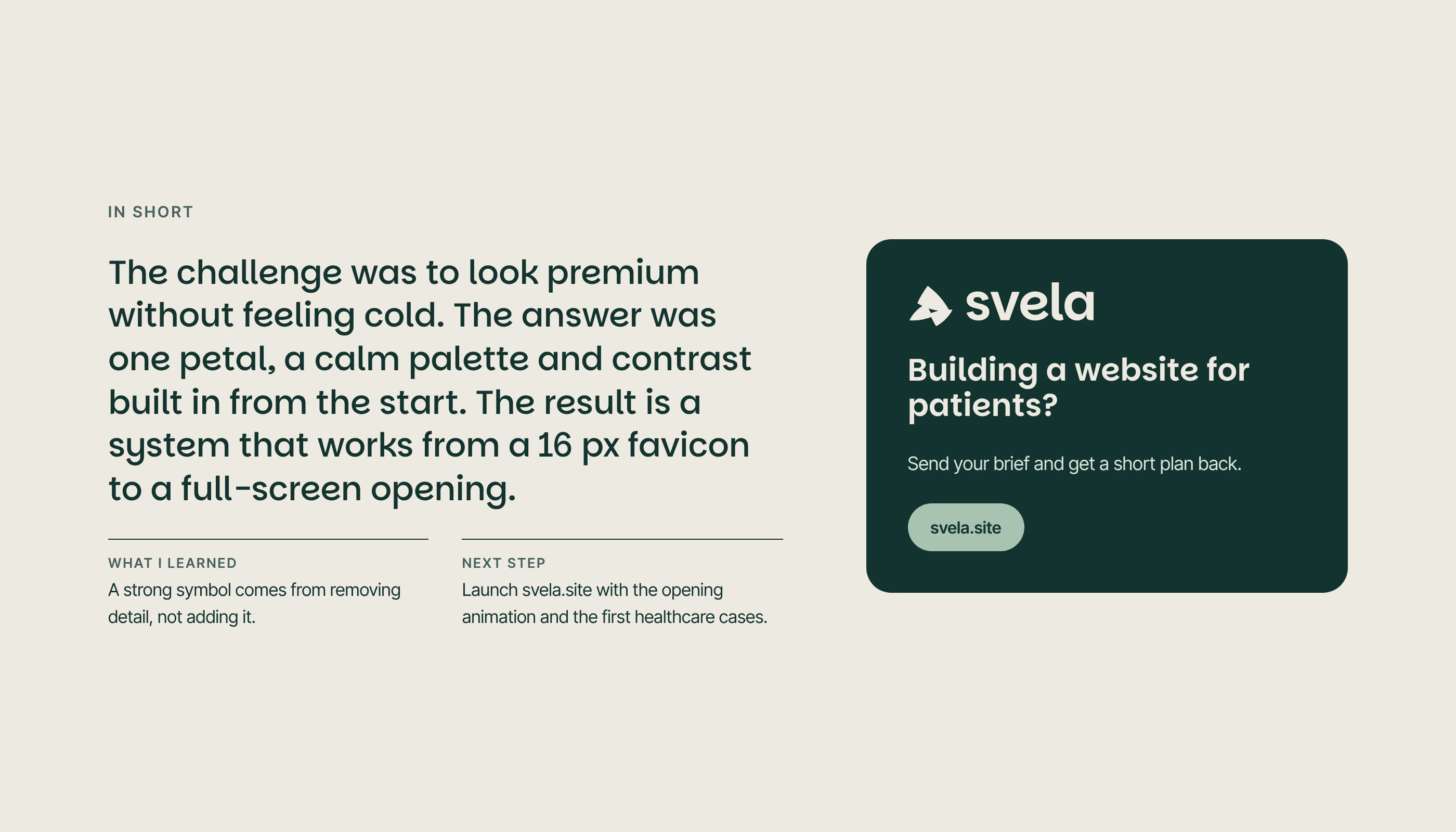
The challenge was to look premium without feeling cold. The answer was one petal, a calm palette and contrast built in from the start. The result is a system that works from a 16 px favicon to a full-screen opening.
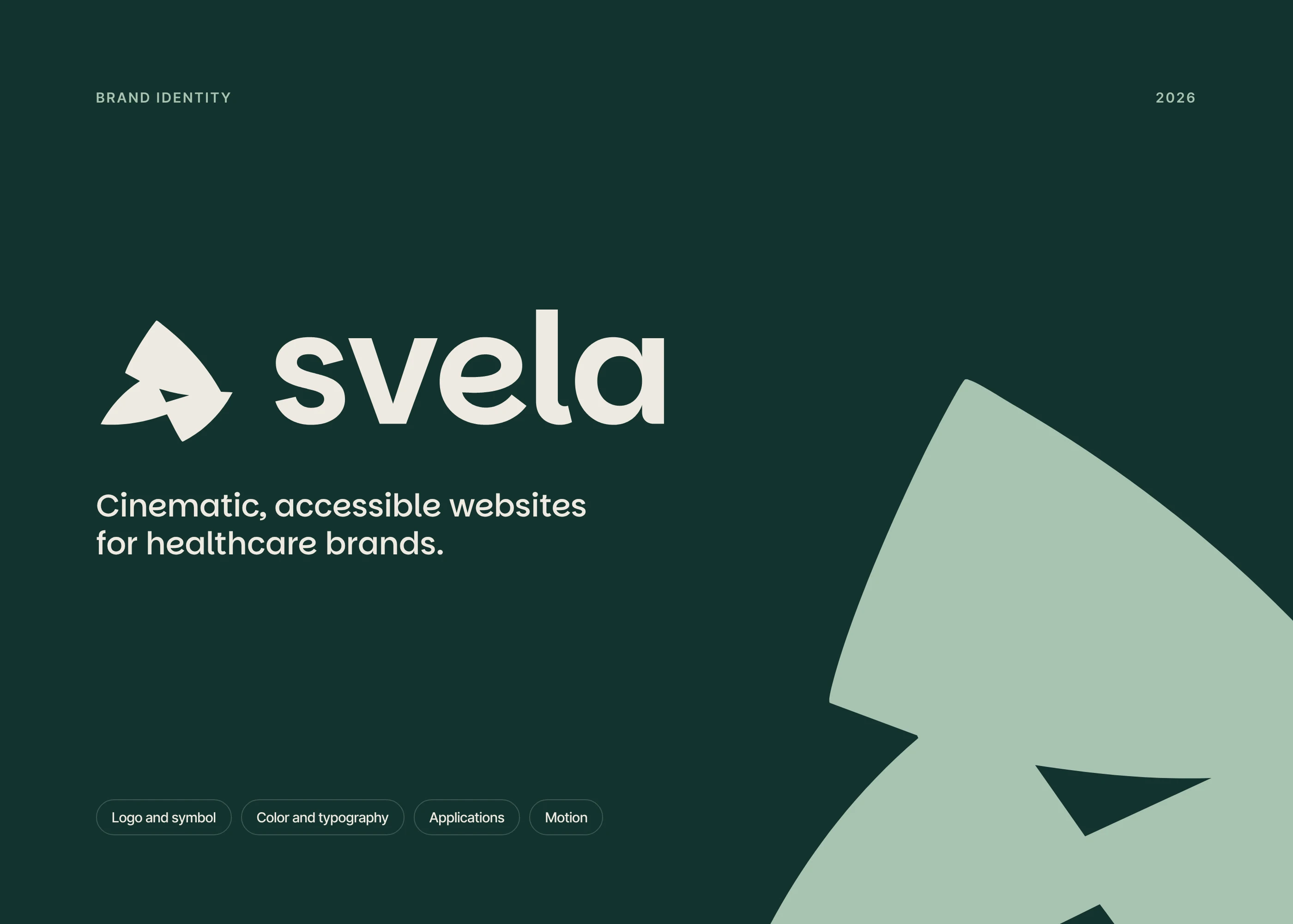
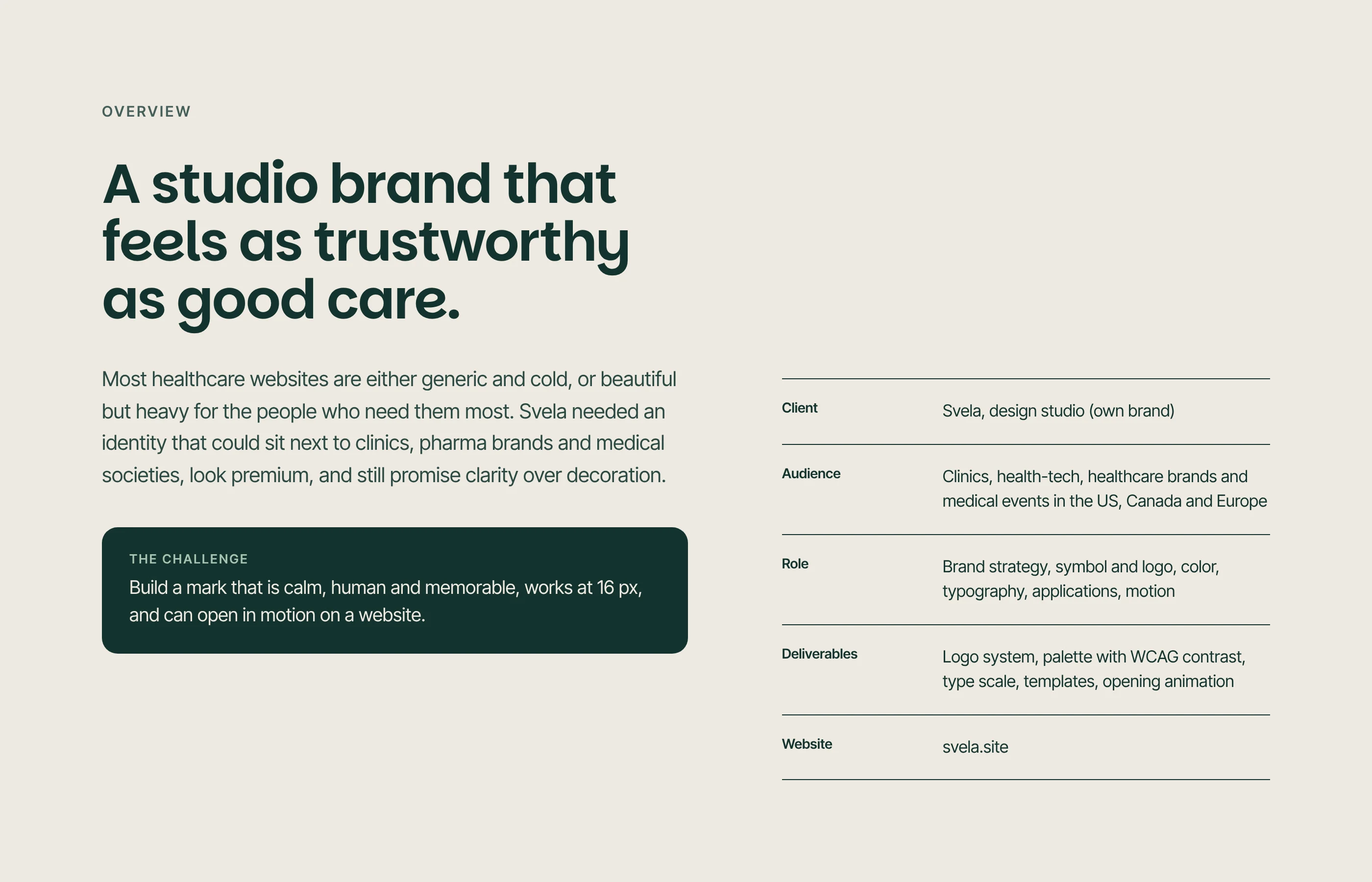
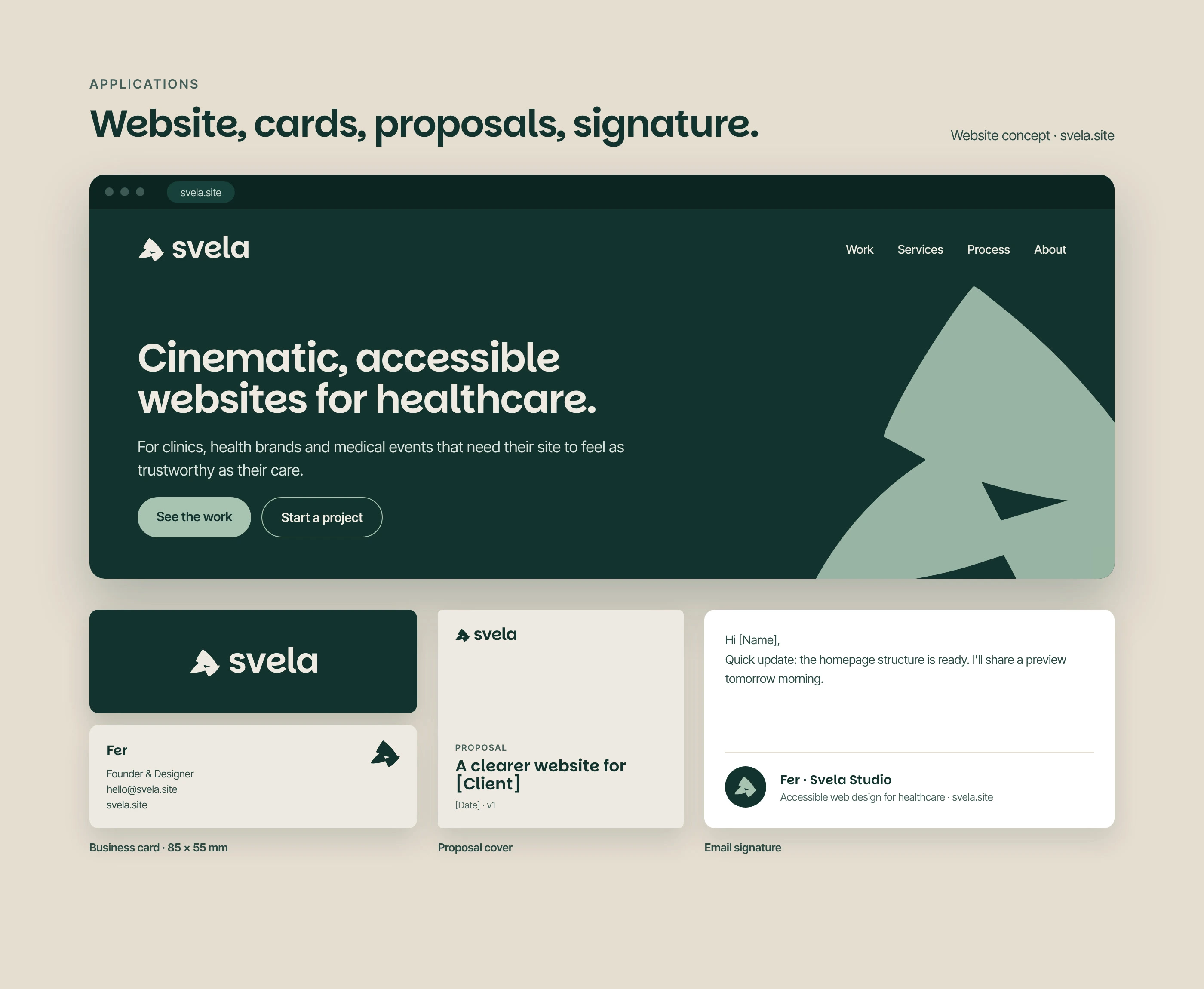
Svela is a design studio creating clear, accessible websites for clinics, health brands and medical events. The name comes from the Italian svela, “reveals”: we turn complex health information into experiences patients understand and trust.
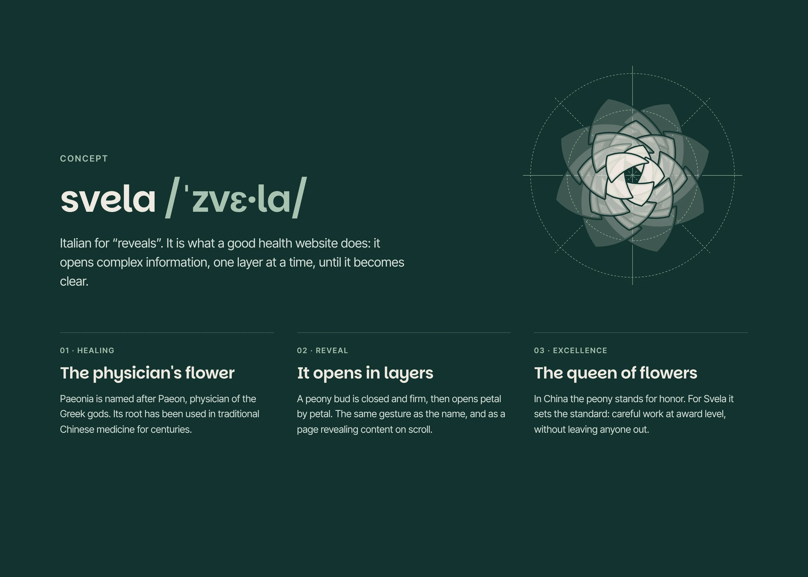
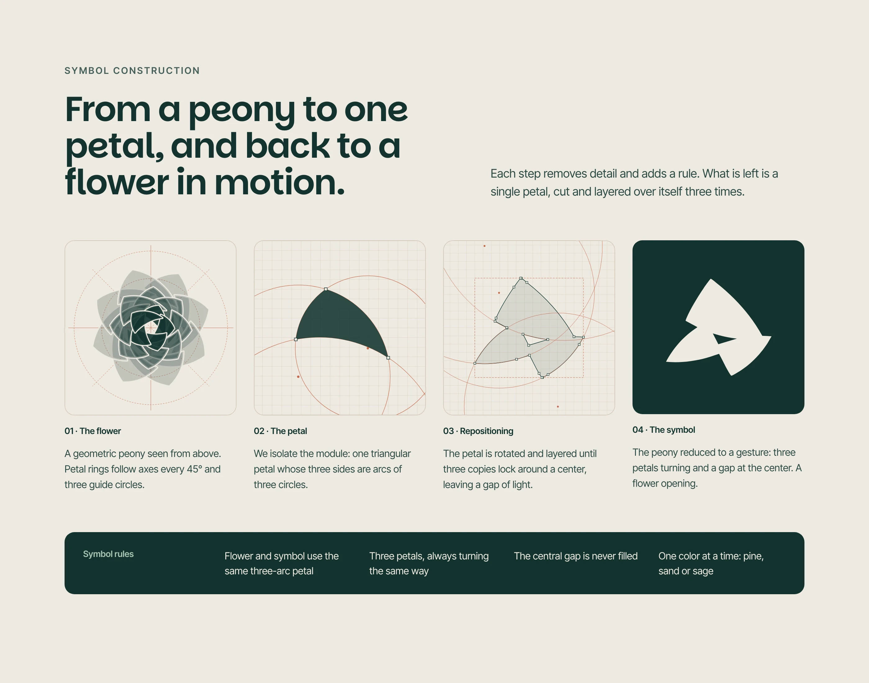
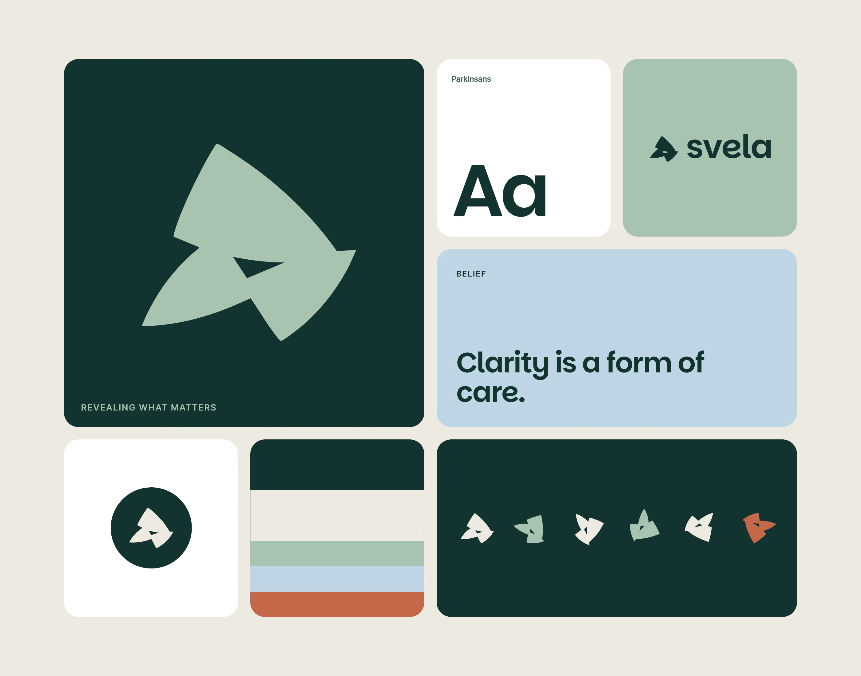
The identity starts from a peony, the flower named after Paeon, physician of the Greek gods. One triangular petal, built from three circle arcs, is cut, rotated and layered three times. The result is a flower in motion with a small gap of light at its center: the moment something opens and becomes clear.
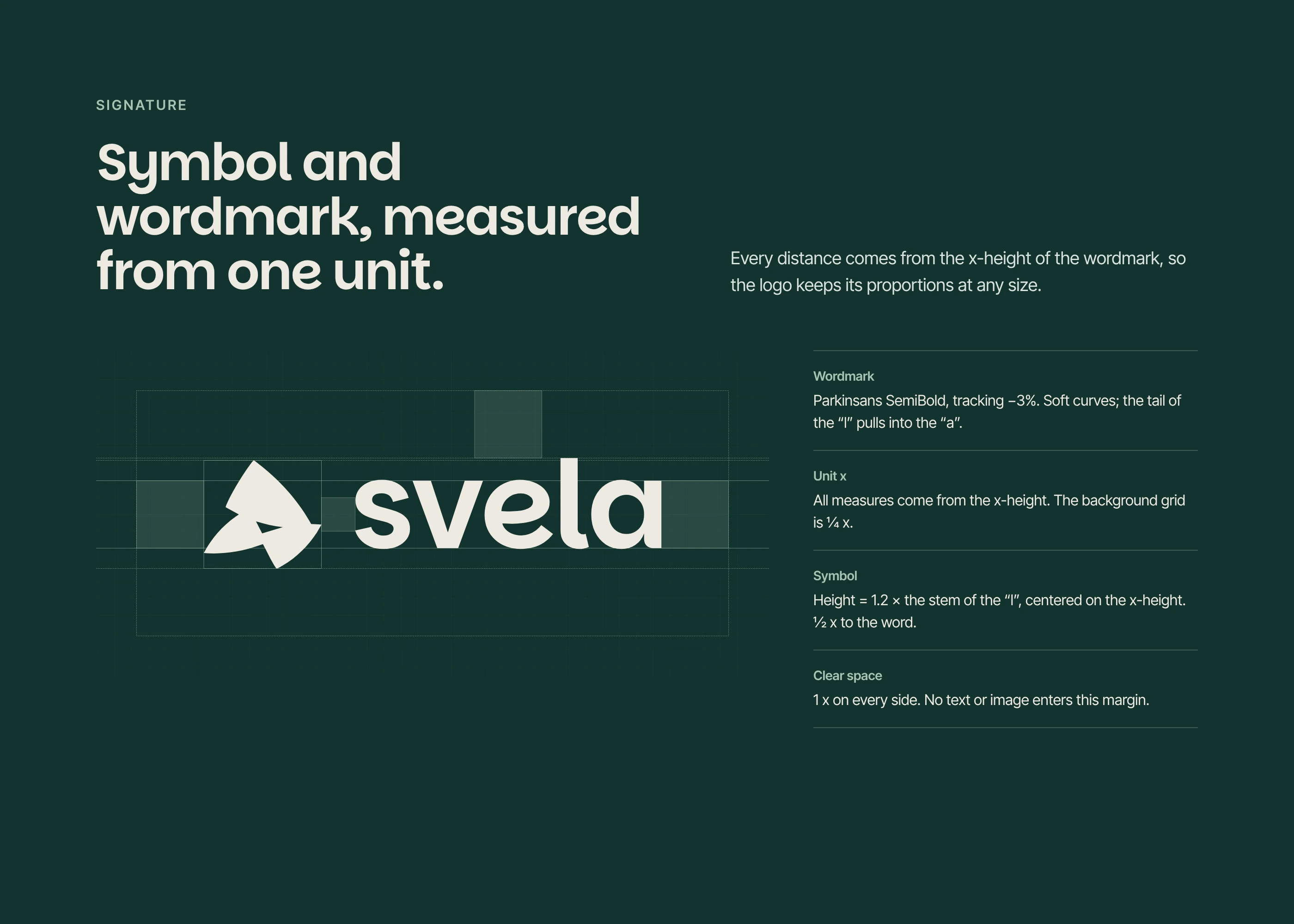
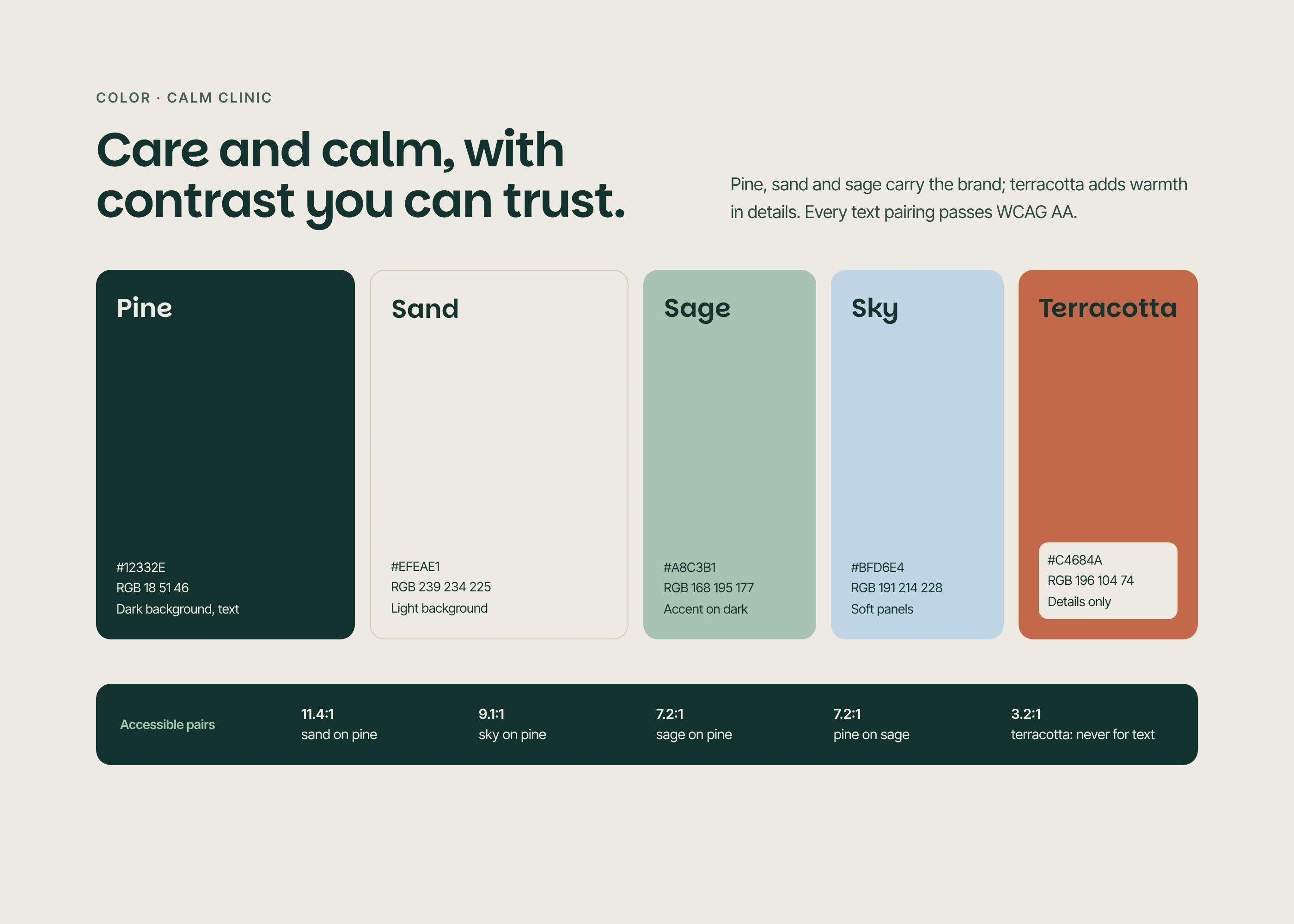
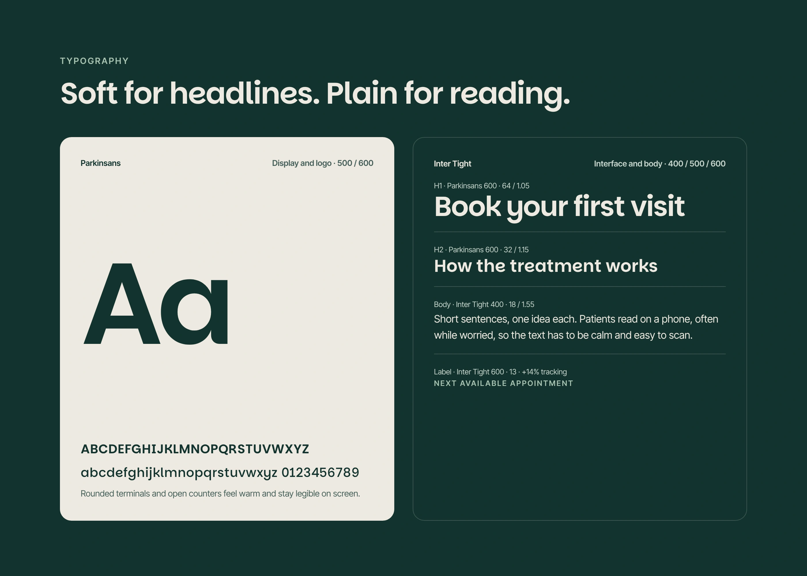
The Calm Clinic palette uses pine, sand and sage with a touch of terracotta, and every text pairing meets WCAG AA contrast. Parkinsans gives the wordmark soft, legible curves; Inter Tight carries the interface text.
Like this project
Posted Nov 5, 2026
Brand identity for Svela, a design studio creating clear, accessible websites for clinics, health brands and medical events. A peony built from one geometric pe
Likes
0
Views
0
Tags