Hostor

Fouad Awad


Hostor
Designed and Developed a responsive portfolio website with React and led the visual direction through Figma, UI components, typography, and brand guidelines. Focused on interaction quality, experimental animations, performance, and a polished deployment workflow.
Web Design & Dev.
Apr 1, 2026
Live Project
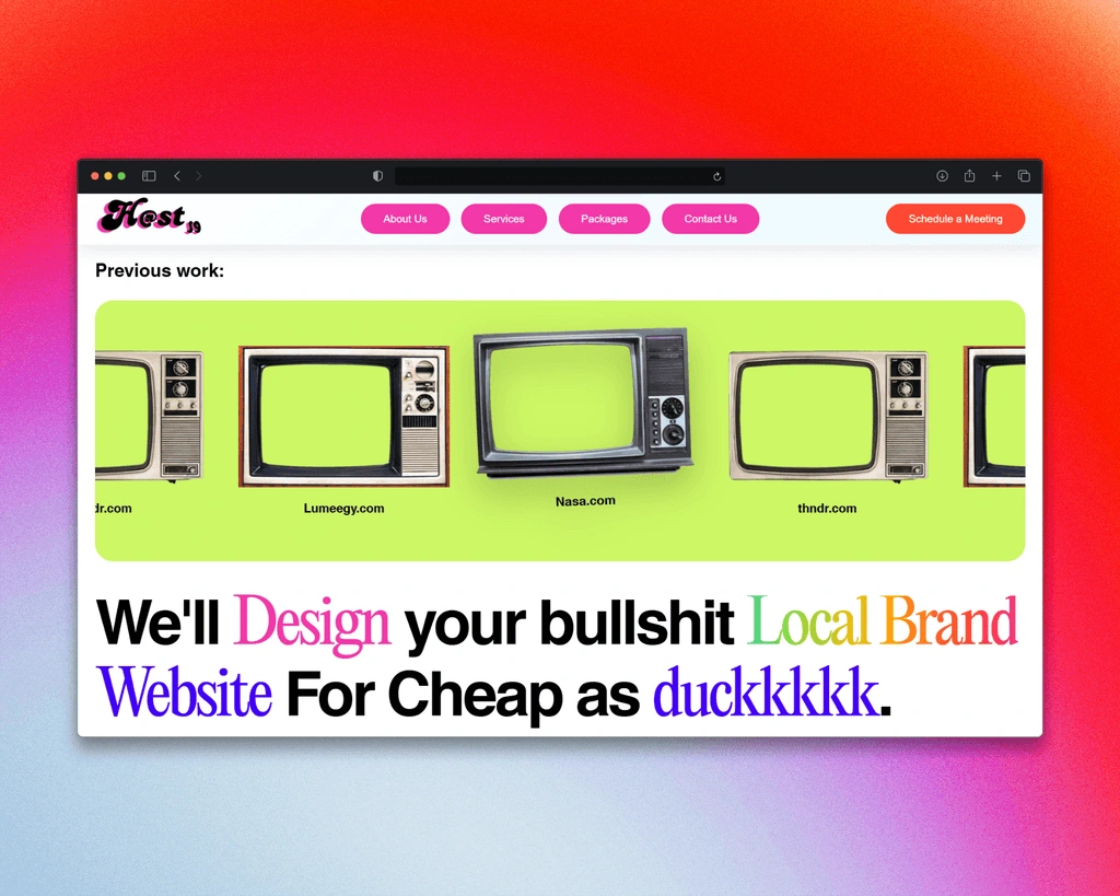
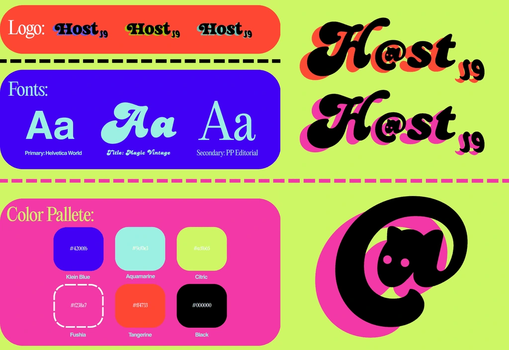
Hostor focused on turning a portfolio concept into a refined web presence. I developed the responsive frontend in React (it was basically my first project where I've done a lot of experimenting with JS animations too), shaped the UI/UX direction through iterative Figma prototypes, created typography and component guidelines, and optimized deployment and assets to achieve strong responsiveness.
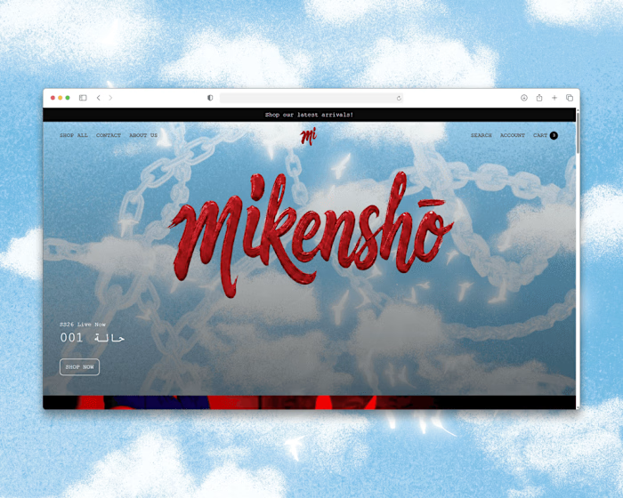
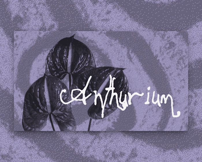
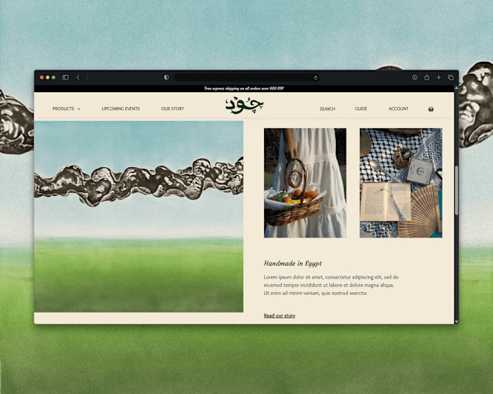
The name of the brand "Hostor" is basically a combination between the word "Host" and the Arabic word "أستر" Which means cover or veil, it's supposed to be a pun or a silly wordplay thing. I've created Hostor as a startup company, and this is basically a company that targets Gen-Z local brand owners and managers in Egypt. The Idea of the funky, simplified design is that it's supposed to go along with the idea of Gen-Z having little to no attention span, Everything is big and clear, wild and chaotic. even the colors are loud and chaotic.
The reason the design is that way is that most young adults are fed up with clean corporate design slop and style, Most Web Agencies just use the same blue + white minimal corporate structure with basic sans serif fonts like inter or so, but young people are just sick of that stuff. That's the main idea of Hostor, it's the exact opposite of usual corporate slop websites, it's wild ,fun and loud, almost like it's about to punch you in the face with how confident and rebellious it is, just like most Gen-Z folk.
Like this project
Posted Aug 22, 2026
Responsive portfolio site built with React; led visual direction in Figma with focus on interactions, animations, and performance.
Likes
0
Views
1