iOS Alert popups Redesign
Steven Mancera
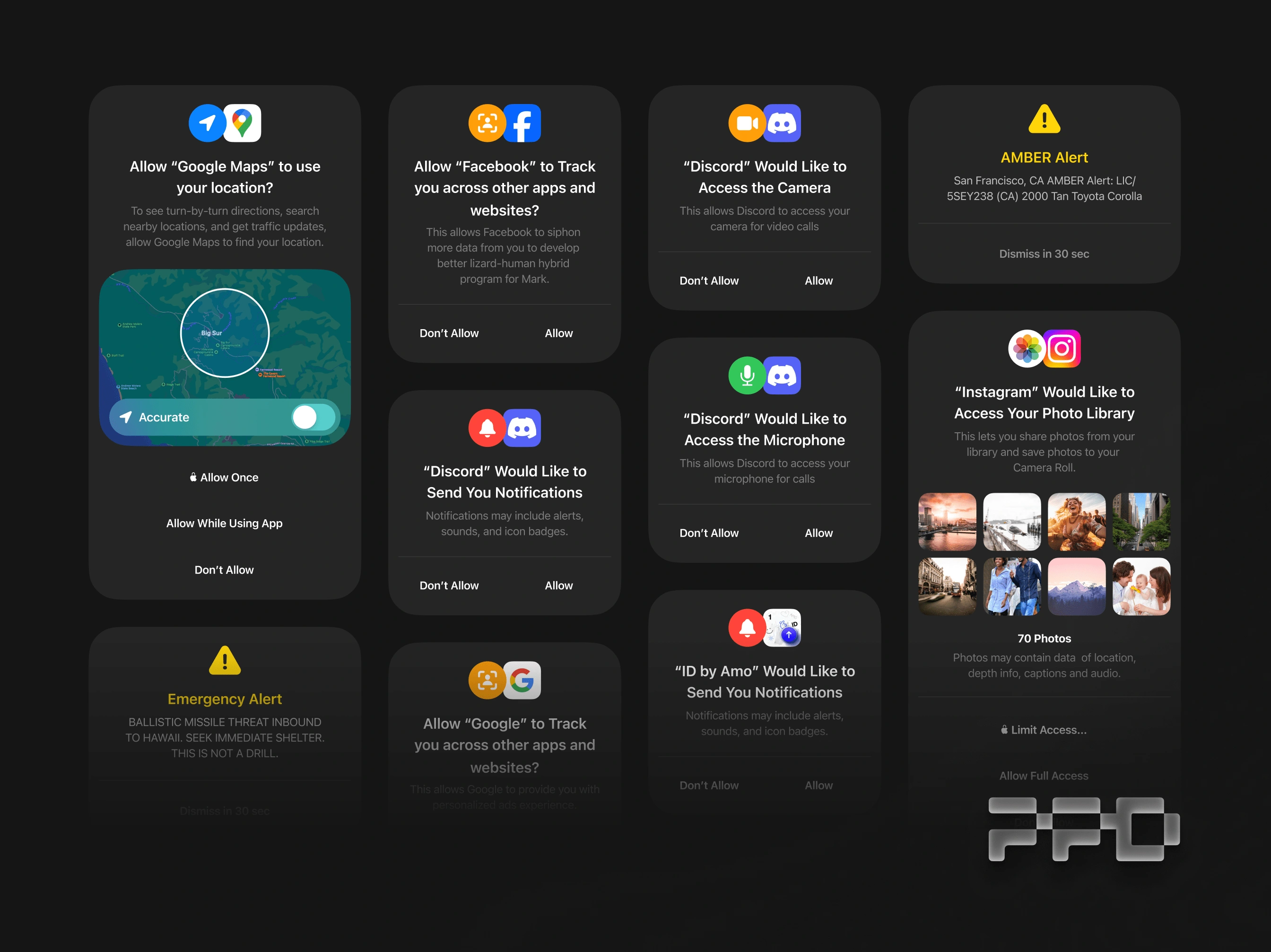
What if iOS Alert popups is modernized to be closer to visionOS?
More rounder UI. Inspired by visionOS popup modals
Complete with new colored icons
Designed for more implicit and intentional decision
Recommended setting with Privacy branded buttons
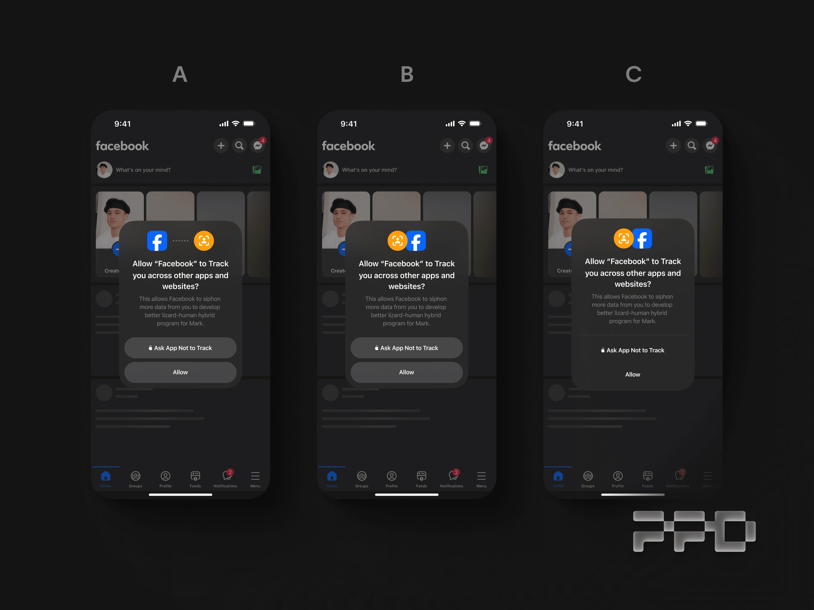
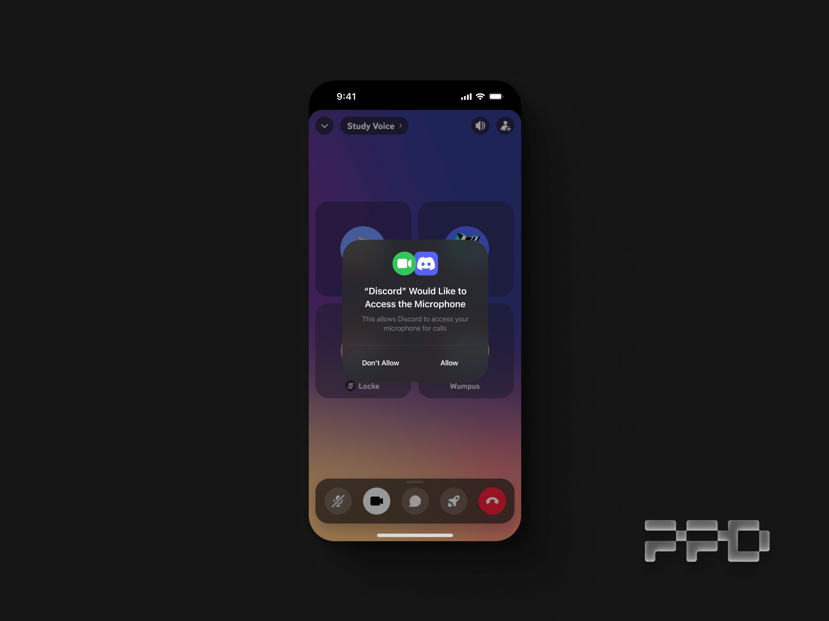
Other design explorations alternates
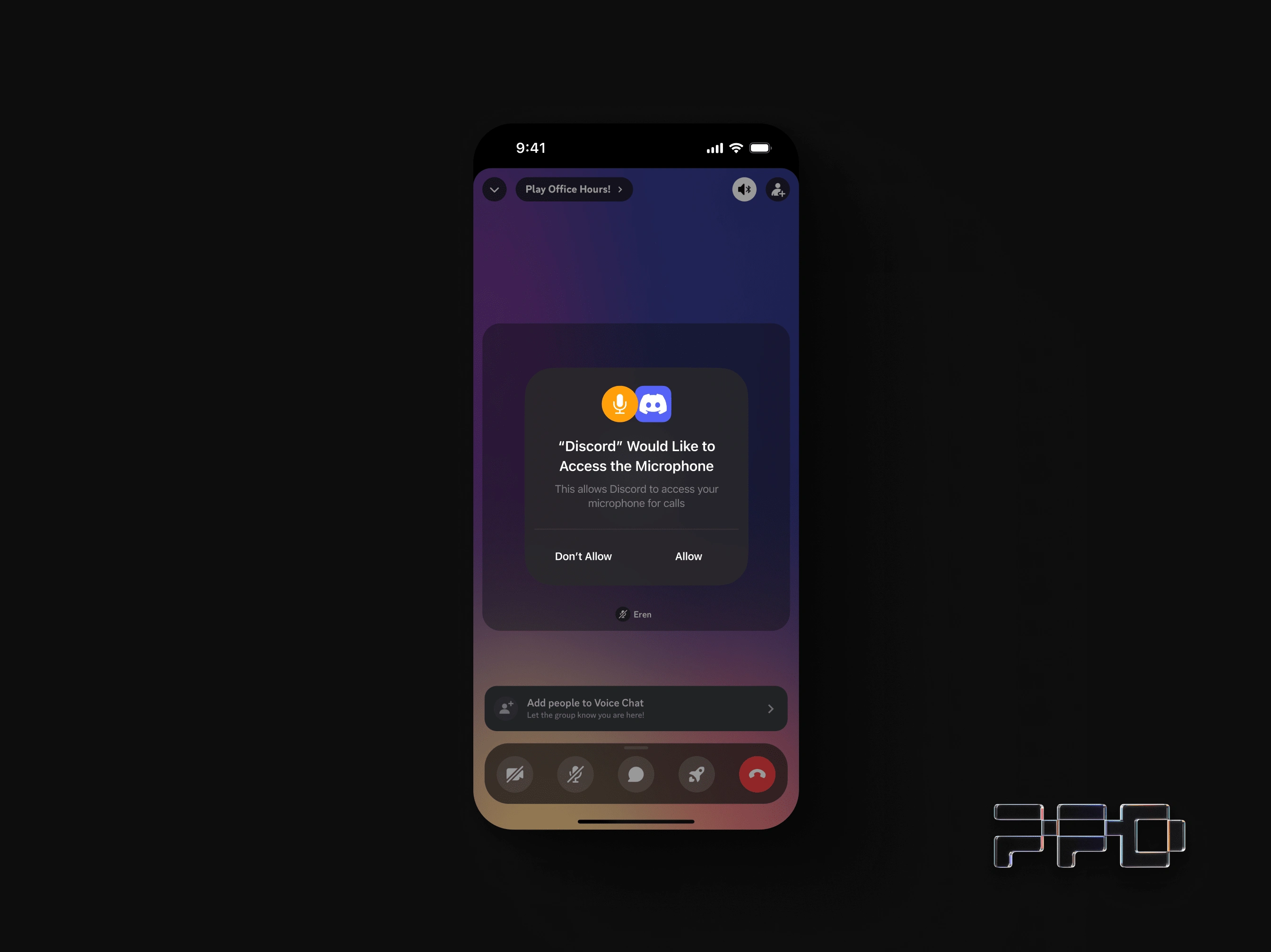
Microphone access. Icon is orange, just like the Privacy indicator
Camera access. Icon is Green, just like the Camera indicator
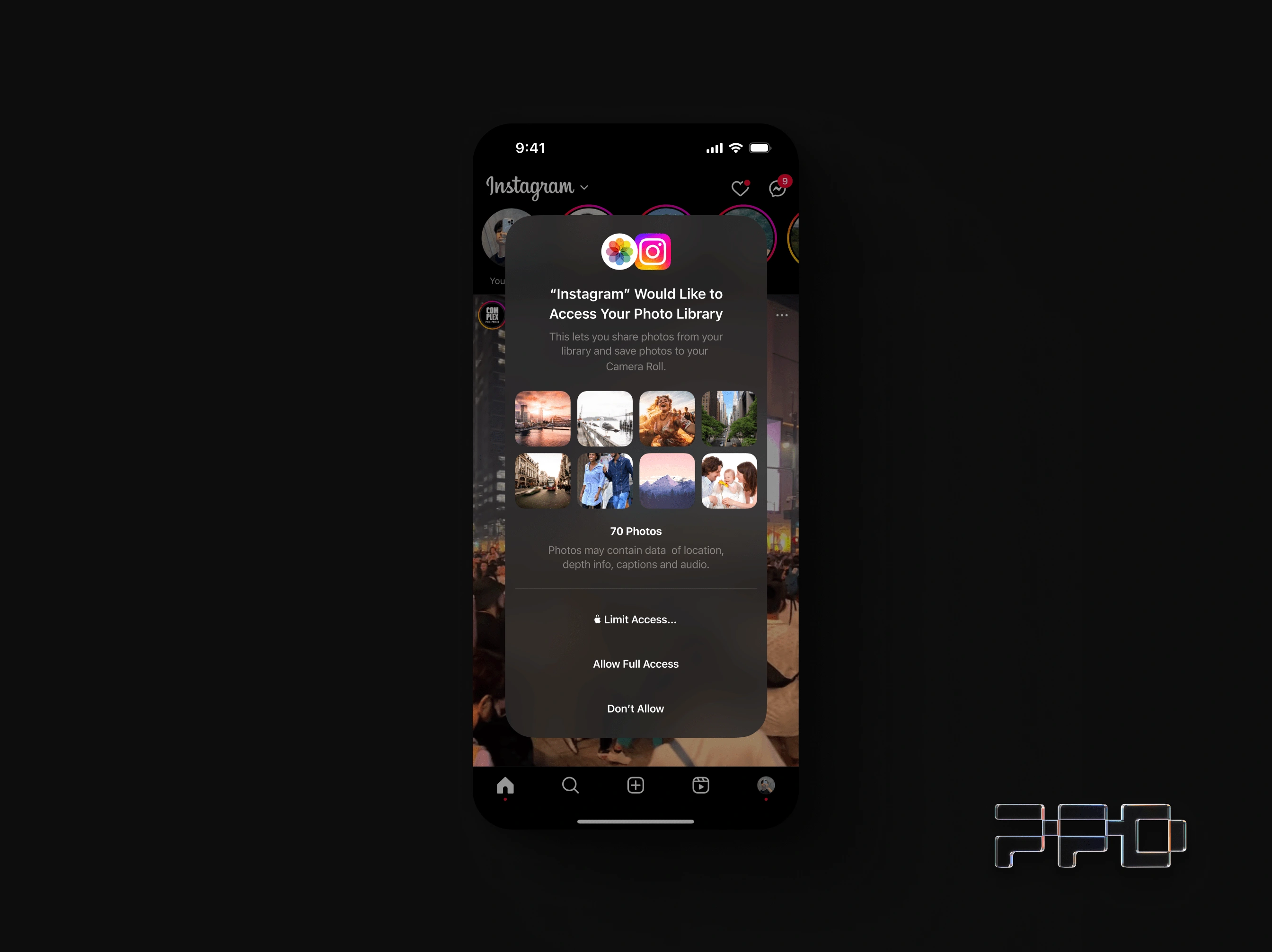
Photo Library access. This one got a bit too long
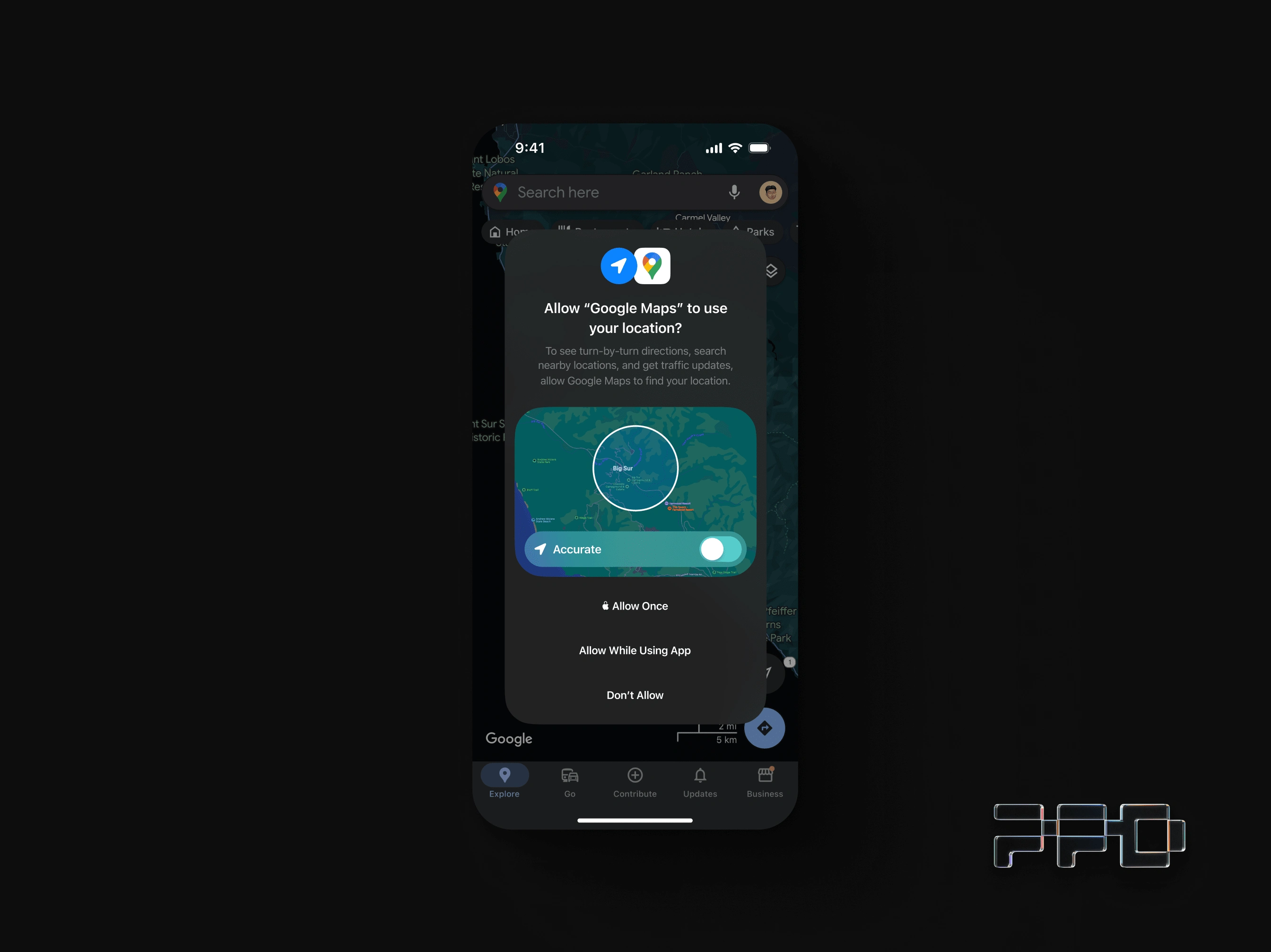
Location access. Blue like the Location indicator.
Easy to reach & highlighted "Location accuracy" toggle
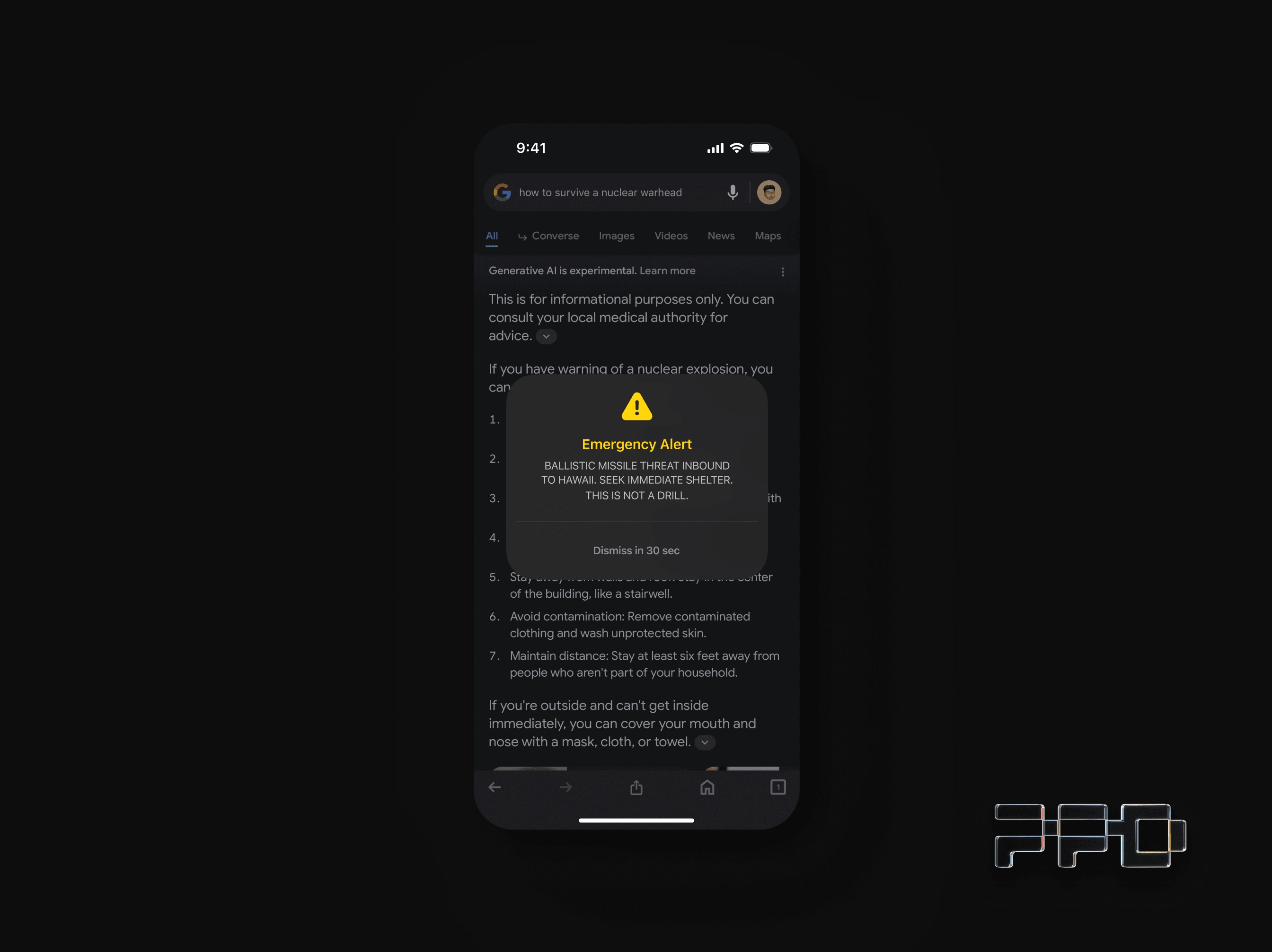
pov: you were in Hawaii January 13, 2018
Like this project
Posted Dec 16, 2023
Inspired by visionOS. A reimagined new look for popup modals for iOS.
Likes
0
Views
29