Built with Framer
Pay4Me Website Redesign
Samuel Nwankwoala
Overview
Pay4Me is a cross-border payment platform that streamlines tuition, SEVIS, and visa application fee payments for international students. Although the platform is operational, its website would benefit from a redesign to enhance user experience, build trust, and increase conversions.
Problem Statement
Although functional, the Pay4Me website presented multiple friction points that hindered user experience:
Key Issues Identified:
Overloaded hero section: Two phone mockups + two buttons + badges create visual clutter and unclear direction.
Low-resolution testimonial carousel: User video thumbnails are blurry, which undermines trust.
Text-heavy sections with weak hierarchy: Core features and benefits are buried in blocks of small text.
Non-interactive elements: Logos and icons (e.g., school affiliations, payment categories) are static and provide little context.
Missing onboarding pathway: No clear steps or flow explaining how the service works from sign-up to successful payment.
Homepage Breakdown (Before):
Hero Section: Competing elements (videos, phones, buttons) make the focus unclear.
Testimonials: Grainy videos don't visually communicate credibility.
Payment Info: Important sections like "Pay for SEVIS, WES, Visa..." are buried and styled like secondary content.
FAQs & Blogs: Disconnected design. FAQs feel generic, and blog cards lack category grouping or preview text.
User Feedback:
I wasn’t sure what the platform did until I scrolled halfway through."
I didn’t trust the video reviews because the low-quality images looked fake at first.
There’s no pricing or onboarding walkthrough (do I have to download the app before knowing what it costs?)
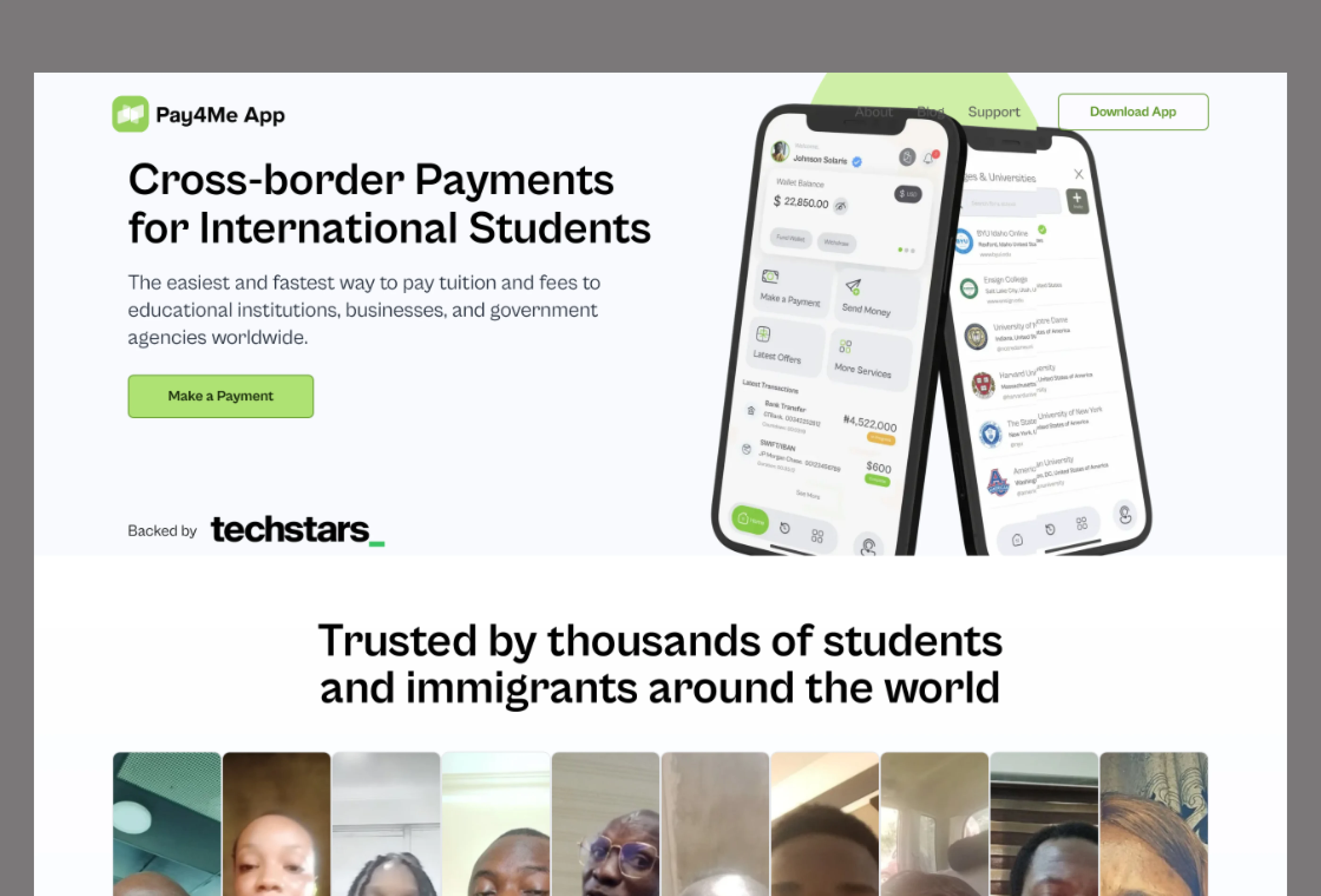
Old Design Hero Section
Goals of the Redesign
Objective (Why It Matters)
Simplify Navigation (Help users find key info faster).
Clarify Value Proposition (Instantly communicate what Pay4Me offers).
Strengthen Trust (Use sharp visuals, verified testimonials, badges).
Improve Visual Hierarchy (Guide users naturally with clean layout and spacing).
Increase Mobile Usability (Optimize all components for touch interaction).
Redesign Solutions
1. User Experience & Interface Design
Simplified the navigation for easy access to core services.
Improved layout spacing and flow to prioritize readability and reduce cognitive load.
Optimized layout for mobile responsiveness, ensuring consistency across devices.
2. Visual Design & Branding
Refreshed the design with a clean, modern aesthetic using whitespace, subtle gradients, and consistent iconography.
Aligned the color palette with Pay4Me’s brand identity (green, black, and white) for a more unified look.
Replaced generic illustrations with custom graphics and mobile mockups showcasing real user scenarios.
Created a visually consistent testimonial section with polished video thumbnails and name badges.
3. Content Strategy
Refined the homepage headline and subtext to clearly communicate the platform's purpose in under 10 seconds.
Reorganized key content blocks (SEVIS, Visa, WES payments) for faster scanning and comprehension.
Enhanced FAQs with categorized questions and improved clarity in answers.
4. Trust & Credibility
Upgraded all testimonial visuals to high-resolution with real names.
Moved the partner and payment provider logos (Stripe, Paystack, Techstars) above the fold for visibility.
Added a “Why We Built Pay4Me” explainer video with real user context to humanize the brand.
5. Technical Performance & Accessibility
Compressed and optimized images and videos to reduce load time.
Improved core web vitals (LCP, CLS, FID) by restructuring the DOM and lazy-loading media.
Ensured WCAG 2.1 compliance with proper contrast ratios, focus indicators, and keyboard navigation.
Added alt tags for all images and ARIA labels to enhance screen reader compatibility.
Expected Impact
Improved user engagement and conversion rates.
Enhanced credibility and trust in the platform.
A smoother payment experience for international students.
You can check it out here
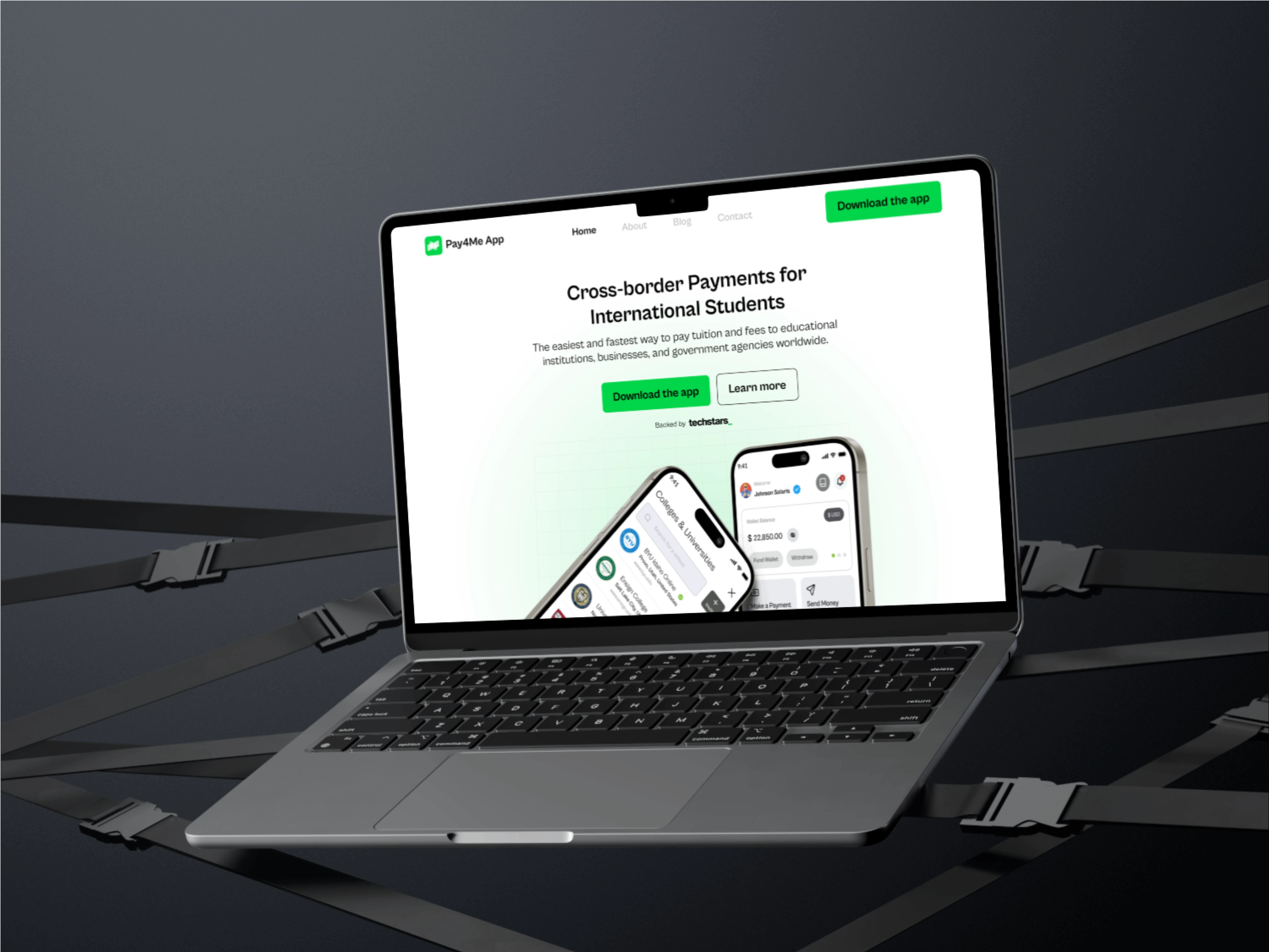
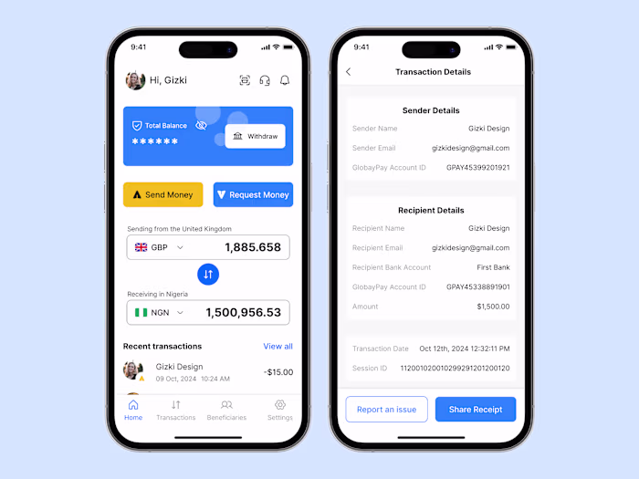
Mockup Preview
Like this project
Posted Jan 10, 2025
Redesigned the Pay4Me website to enhance user experience, build trust, and boost conversions by simplifying navigation and strengthening visual branding.
Likes
2
Views
10
Timeline
Dec 30, 2024 - Dec 31, 2024
Clients
Radius, formerly Pay4Me App